North star · Keep the interface almost-black and typographically restrained; let product visuals carry the color, with acid green as the sole UI accent.
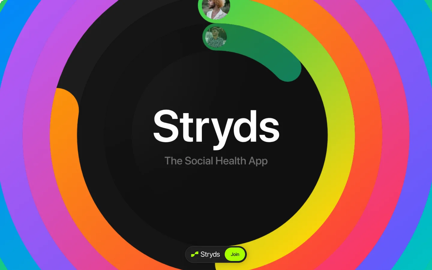
The page uses #101010 as an uninterrupted dark canvas, keeping the interface quiet while the hero’s concentric rainbow bands and app mockups supply vivid visual energy. That rainbow is illustration-led, not a reason to recolor the interface: the measured brand accent is acid green #a6ff00, reserved for the Join CTA and small brand details. Sf Pro Display carries the identity through large, tightly tracked white headings and compact muted-gray supporting copy. The hero centers the Stryds wordmark and short descriptor inside a full-bleed circular visual; a small pill-shaped Join control sits near its lower edge. Farther down, three generous, dark feature cards form a vertically stacked showcase. Their thin gray outlines and rounded corners contain colorful app metrics, activity imagery, and photo collages. Substantial dark gaps between sections give the page a calm, spacious rhythm despite its busy product visuals.
配色
点色块复制色值。用途说明来自对页面的实测位置(背景、文字、描边、按钮)与截图判读。
品牌色
强调色
表层色
中性色
功能色
页面底色 · Night Canvas表层 · Graphite Panel表层 2 · Deep Graphite主文字 · Soft White次要文字 · Quiet Ash弱文字 · Night Canvas描边 · Outline Charcoal强调 · Acid Lime
Display and interface typography, from oversized hero wordmark to feature headings and body copy.
角色
示例
字号
字重
行高
字距
特大标题
Oversized Stryds wordmark within the immersive hero.
Stryds
183.5px
600
1
-0.027em
一级标题
Main hero identity and primary page headline.
Stryds
148.5px
600
1
-0.007em
二级标题
Large feature-showcase headings.
Stryds
108.5px
600
1
-0.023em
三级标题
Secondary feature titles and prominent card messaging.
Stryds
78px
500
1
-0.026em
四级标题
Smaller section headings or card subheads.
Stryds
44px
500
1.1
-0.023em
正文
Feature descriptions, hero descriptor, and supporting interface copy.
The quick brown fox 敏捷的狐狸
16px
500
1.25
-0.012em
间距与布局
基准单位 8px · 密度:适中
80px版块间距
16px元素间距
80px卡片内边距
1062px内容最大宽度
2px
3px
5px
11px
13px
16px
18px
19px
20px
24px
32px
56px
80px
108px
The measured content max width is 1062px, while the hero artwork spans the viewport as a full-bleed focal point. Its wordmark and descriptor are centered; feature-card content is arranged in a left-text, right-visual split. The three cards stack vertically, with generous 80px section gaps and substantial internal card padding. The overall density is comfortable: large dark intervals separate the hero and showcase, while each card keeps copy concise and product imagery prominent.
圆角与层次
按钮 · 9999px
卡片 · 40px
md · other
The interface favors flat dark surfaces over pronounced shadows. Feature cards are distinguished by a fine #3d3d3d outline and rounded corners; the hero’s concentric graphic supplies depth through layered color and overlap. Small app elements and pill controls sit above the visuals, but do not introduce heavy interface elevation.
组件
下面的预览按实测的按钮、输入框、徽标、卡片样式重建(字体用替代字体)。
Hero identity
A centered Stryds wordmark and muted app descriptor sit within a full-bleed, circular rainbow illustration on the near-black canvas.
Join pill
Compact rounded CTA with #a6ff00 fill and #040126 text, visually nested in the hero graphic.
Feature showcase card
Three vertically stacked #171717 panels with 1px #3d3d3d borders, 40px corners, and generous measured 80px padding.
Feature copy
Large white, tightly tracked headings sit above short muted-gray descriptions on the left side of each card.
App activity visuals
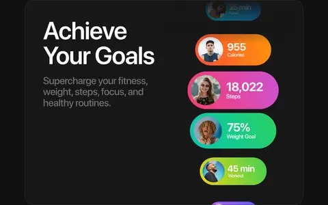
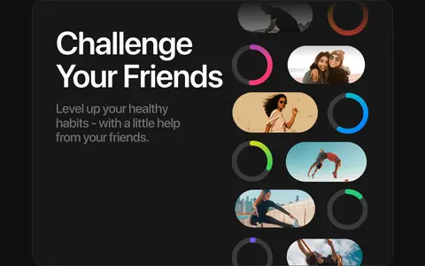
Bright metric pills, progress rings, profile images, and social activity snippets bring feature benefits to life inside the cards.
Journey collage
A loose arrangement of lifestyle photos presents shared personal moments in the final feature card.
Imagery · The hero is dominated by oversized concentric rainbow rings surrounding a dark central disc, with small circular profile images embedded in the artwork. This vivid spectrum belongs to the hero graphic, not the interface palette. Feature cards use app-style activity metrics, progress rings, and candid lifestyle photos, arranged as compact collages against dark panels.
Reserve #a6ff00 for primary actions and small brand details.
Use oversized white display typography with tight tracking.
Keep descriptions short and muted in gray.
Showcase product moments inside rounded, outlined dark cards.
Let colorful app and lifestyle imagery provide visual variety.
✕ 不该做
Do not turn the rainbow illustration colors into interface accents.
Do not use bright section backgrounds behind feature content.
Do not crowd the page with dense navigation or long copy.
Do not flatten the cards into unstructured text blocks.
Do not add heavy shadows or glossy interface treatments.
Do not use sharp-cornered controls or panels.
给 AI 的提示词
想快速出一个同风格的新页面,把这段话连同 DESIGN.md 一起发给 AI。
Build a new page in Stryds’ visual style: use Night Canvas (#101010) as the continuous background, with Soft White (#fdfdfd) for large, tightly tracked SF Pro Display-style headings and Quiet Ash (#6f6f6f) for concise supporting copy. Keep Acid Lime (#a6ff00) for the primary CTA and limited brand details; use near-black Graphite Panel (#171717) cards with fine Outline Charcoal (#3d3d3d) borders and strongly rounded corners. Structure the page as an immersive focal section followed by spacious, vertically stacked product showcases. Balance left-aligned copy with right-side app imagery, leaving generous dark breathing room between sections. Use vivid color in product mockups and lifestyle photography rather than adding more interface colors. Keep shadows restrained and the hierarchy simple.