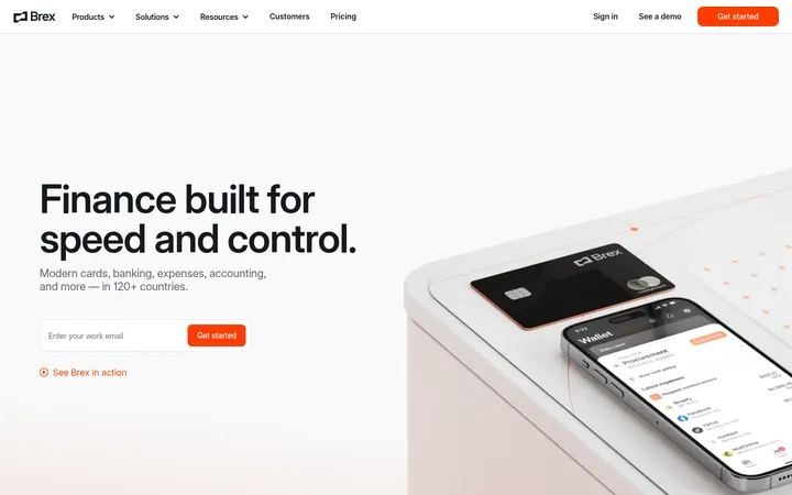
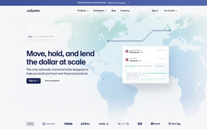
North star · Keep the content calm and highly legible on white, reserving saturated purple drama for imagery and key campaign moments.
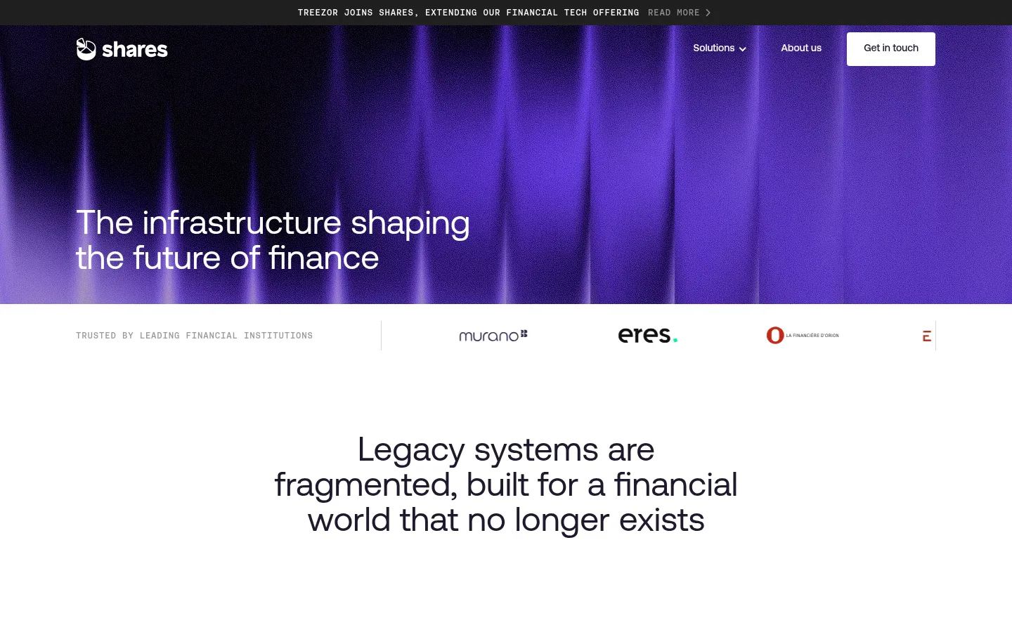
The homepage pairs a predominantly white canvas with a dramatic, image-led purple hero and a matching dark-to-purple footer treatment. Midnight Ink (#20192b) anchors headings and primary copy, while the screenshot’s purple glow is expressed through hero imagery rather than treated as a flat page-wide colour. Aeonik gives headings and navigation a clean, contemporary character; Inter handles compact supporting text, and Aeonikmono marks uppercase eyebrow labels with a technical editorial feel. The opening hero is deliberately sparse: brand navigation sits above a large, left-aligned statement over luminous vertical imagery. Below, centered headline copy and quiet client marks transition into spacious product and capability sections. Cards use fine gray hairlines and restrained framing instead of conspicuous shadows. Product visuals add saturated purple, coral and blue, while case studies and news use image-led panels. The overall effect is institutional and modern without sacrificing visual energy.
Eyebrow labels and technical-style micro-headings.
角色
示例
字号
字重
行高
字距
一级标题
Large hero statement over the purple campaign image.
Shares
48px
400
1.05
0
二级标题
Major section headlines, including the centered legacy-systems statement.
Shares
32px
400
1.15
0
三级标题
Product, capability, case-study, and news-card titles.
The quick brown fox 敏捷的狐狸
24px
400
1.3
0
四级标题
Smaller supporting headings within content blocks.
The quick brown fox 敏捷的狐狸
20px
400
1.5
0
正文
Explanatory copy on product cards and editorial sections.
The quick brown fox 敏捷的狐狸
14px
400
1.5
0
辅助文字
Compact source labels, legal notes, and secondary details.
The quick brown fox 敏捷的狐狸
12px
400
1.5
0
导航
Top-level navigation links and header actions.
The quick brown fox 敏捷的狐狸
14px
500
1
0
眉题
Uppercase section identifiers such as SOLUTIONS and NEWSROOM.
The quick brown fox 敏捷的狐狸
12px
500
1.67
0.067em
代码
Technical or metadata-style uppercase labels where present.
const style = 1;
12px
500
1.67
0.067em
间距与布局
基准单位 4px · 密度:适中
48px版块间距
24px元素间距
—卡片内边距
1224px内容最大宽度
4px
8px
12px
16px
20px
24px
28px
36px
48px
96px
Use a centered content frame with a measured maximum width of 1224px and align most sections to its left edge. The opening hero is full-width and image-led, with its heading anchored low and left; a narrow announcement strip sits above the navigation. Follow with a client-logo row, a centered statement, then spacious product and capability grids. Case studies and news shift to split editorial layouts. The overall density is comfortable, with broad vertical gaps between sections and restrained card padding.
圆角与层次
导航 · 4px
没有测到阴影:页面是扁平的,层次靠底色和描边区分。
The page reads as mostly flat: white sections sit directly on the canvas, with cards distinguished by fine gray borders rather than visible shadows. Image panels provide the main depth and colour contrast. The hero and footer use dark gradients within imagery to create layered atmosphere while preserving readable white text.
组件
下面的预览按实测的按钮、输入框、徽标、卡片样式重建(字体用替代字体)。
Announcement strip
A narrow dark top band with centered uppercase monospace news text and a short read-more action.
Header navigation
White logo and links overlay the hero image; the contact action is a compact white button with dark text.
Client logo row
A restrained trust strip with a small uppercase label, a subtle divider, and horizontally aligned partner marks.
Solution cards
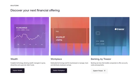
Three equal product columns pair vivid interface imagery with a title, concise explanation, and compact explore action.
Capability cards
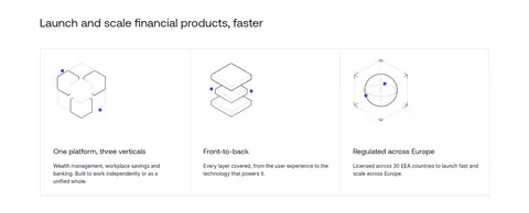
Three outlined columns combine delicate line illustrations, short Aeonik headings, and brief supporting descriptions.
Editorial panels
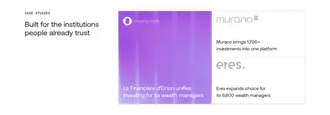
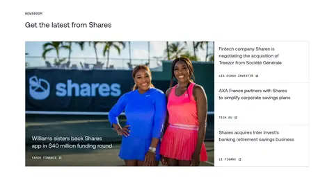
Case studies and news use asymmetrical image-and-text compositions, with light hairlines separating stacked stories.
Closing CTA and footer
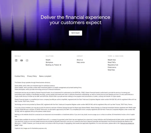
A centered white CTA overlays purple-to-black imagery, followed by a large white information panel on the dark footer ground.
Imagery · Use atmospheric vertical purple light as the hero and closing CTA backdrop, with darkened lower edges for contrast. Product cards show colorful interface imagery, while case studies and news rely on real-world photography and brand marks. Keep diagrams simple and fine-lined; avoid decorative imagery that competes with copy.
Use white space to separate major content chapters.
Reserve saturated purple atmosphere for hero and CTA imagery.
Set headings in Aeonik and supporting copy in Inter.
Use uppercase, spaced monospace eyebrows for section labels.
Frame cards with subtle gray hairlines rather than shadows.
Keep product and editorial copy concise and scannable.
✕ 不该做
Do not turn the whole page into a dark theme.
Do not invent additional brand colours for core UI.
Do not use heavy shadows or rounded, playful card styling.
Do not center every section; preserve left-aligned content grids.
Do not let decorative product imagery overpower its labels.
Do not use oversized, dense blocks of body copy.
给 AI 的提示词
想快速出一个同风格的新页面,把这段话连同 DESIGN.md 一起发给 AI。
Build a new institutional fintech page in the Shares visual style. Use Gallery White (#ffffff) as the main canvas, Midnight Ink (#20192b) for headings and copy, Quiet Gray (#d9d9d9) for hairline borders, and Stage Black (#000000) only for inverse footer or image-backed areas. Keep the layout inside a centered 1224px maximum-width frame, with generous white space and editorial left alignment. Use Aeonik-like sans typography for headings and navigation, Inter-like body copy, and spaced uppercase mono eyebrows. Create a vivid purple atmospheric hero image rather than filling ordinary sections with purple. Prefer crisp product imagery, restrained line illustrations, flat outlined cards, and image-led editorial panels. Keep navigation simple, text concise, and CTA contrast clear.