North star · Keep the interface palette quiet and the typography monumental, while letting an irregular editorial collage provide the page’s energy.
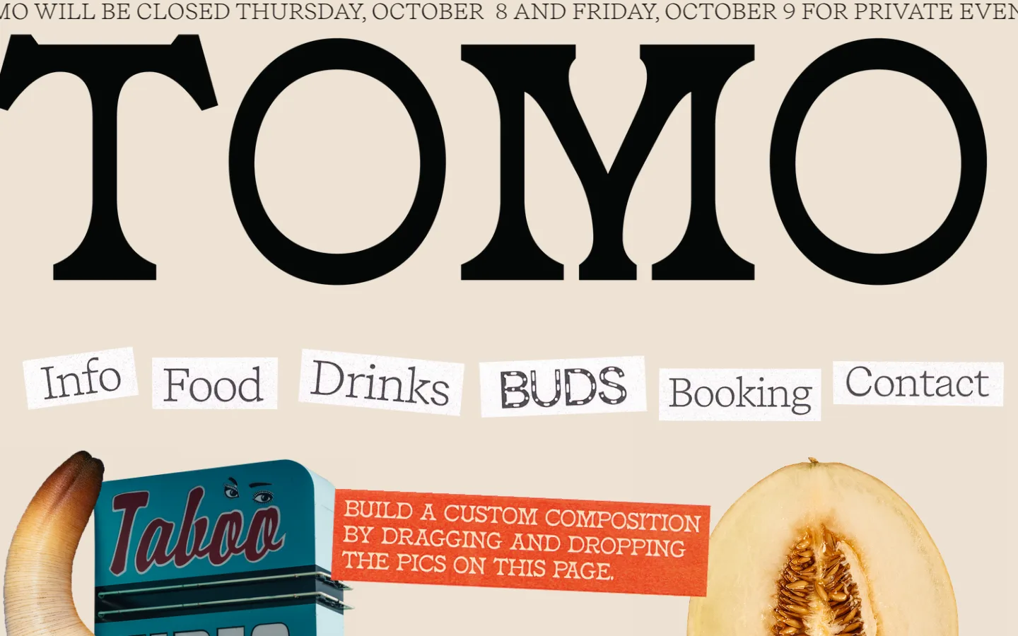
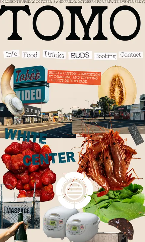
The page is anchored by a warm cream canvas (#eee2d4), giving the oversized near-black TOMO wordmark and delicate serif announcement strong contrast without a stark white backdrop. Recife, measured as a light serif, carries the display lettering and navigation; restrained Arial is reserved for small utility text and button-like controls. A row of individually offset, white-backed navigation labels introduces a handmade, cut-and-paste quality. Below, a loose full-width collage layers food, local streets, signage, and objects over the same canvas; its vivid colors belong to image assets, not a broader interface palette. The composition favors large scale changes and generous open ground around elements rather than card containers. Treat the measured cream, white, charcoal, and black as the interface system, and let collage imagery supply the expressive color.
配色
点色块复制色值。用途说明来自对页面的实测位置(背景、文字、描边、按钮)与截图判读。
品牌色
表层色
中性色
功能色
页面底色 · Warm Parchment表层 · Paper White主文字 · Soft Charcoal描边 · True Black
Display wordmark, announcement, and large serif navigation labels.
Aa 设计
Arial
系统字体 · 字重 400 · 占比 2%
免费替代:Arial
Small utility captions and button text.
角色
示例
字号
字重
行高
字距
正文
Large light-serif editorial text and prominent page lettering.
TOMO
32.5px
300
1
0
辅助文字
Small utility or supporting text.
The quick brown fox 敏捷的狐狸
13.5px
400
normal
0
按钮
Compact text for utility controls.
The quick brown fox 敏捷的狐狸
13.5px
400
normal
0
间距与布局
基准单位 1px · 密度:宽松
389px版块间距
—元素间距
—卡片内边距
—内容最大宽度
1px
3px
6px
13px
65px
70px
75px
76px
80px
85px
111px
115px
131px
161px
A single long, full-width section sits on one uninterrupted cream canvas. The viewport opens with a narrow scrolling-style announcement, a huge centered wordmark, and a horizontal navigation row of separate paper-like labels. Below, the collage spans the available width and is assembled from overlapping, differently scaled cutouts. Preserve generous open canvas around the top elements, but allow the lower composition to become visually dense. Measurements provide no reliable max-width or grid value, so avoid imposing a rigid column system.
圆角与层次
没有测到阴影:页面是扁平的,层次靠底色和描边区分。
The interface is essentially flat: no measured shadows, gradients, or card system. Keep the canvas open and use overlap, image cutouts, and paper-white navigation backings for depth. The measured black border belongs to a small utility control, not general section dividers.
组件
下面的预览按实测的按钮、输入框、徽标、卡片样式重建(字体用替代字体)。
Announcement line
A slim, single-line serif notice runs across the top edge of the warm canvas.
Oversized wordmark
TOMO is set in monumental, near-black serif lettering and dominates the opening viewport.
Paper-label navigation
Six large serif links sit in separate white-backed labels with subtly varied angles and alignment.
Editorial collage
Food, streets, signage, and found objects overlap below the navigation as an irregular full-width composition.
Utility control
A small Arial control may use a browser-like black border; keep it distinct from the editorial navigation.
Imagery · Use an eclectic cutout collage rather than polished, isolated product photography: restaurant food, neighborhood streets, storefront signs, and unexpected objects share the same visual field. Mix photographic source material and graphic lettering; overlap and vary scale, keeping edges intentionally irregular. Bright reds, greens, and other vivid hues come from collage assets, not the measured interface palette.
Make the wordmark dramatically larger than navigation.
Give navigation labels individual paper-white backings.
Build collage layers from varied image scales and cutout edges.
Keep vivid colors confined mainly to image assets.
✕ 不该做
Do not introduce gradients or decorative shadows.
Do not turn the collage into a uniform card grid.
Do not replace the warm canvas with stark white.
Do not make every navigation label identical in placement.
Do not treat illustration colors as interface palette tokens.
Do not crowd the wordmark and navigation with extra UI.
给 AI 的提示词
想快速出一个同风格的新页面,把这段话连同 DESIGN.md 一起发给 AI。
Build a new page in TOMO’s visual style using Warm Parchment (#eee2d4) as the continuous canvas. Use Soft Charcoal (#262626) for the dominant serif display typography, with a light editorial character; keep Arial-like utility text small and restrained. Arrange navigation as separate Paper White (#ffffff) paper labels rather than buttons in a standard bar. Compose the main visual from layered, irregular cutouts—food, neighborhood scenes, signage, and unexpected objects—with their vivid colors contained in the imagery. Preserve open breathing room around the large title and let the collage become denser below. Keep surfaces flat, avoid shadows and gradients, and use True Black (#000000) only for small utility details or borders. Do not invent a rigid grid where the reference feels hand-assembled.