North star · Keep the interface monochrome and spacious, using expressive display type and cinematic color only inside the imagery.
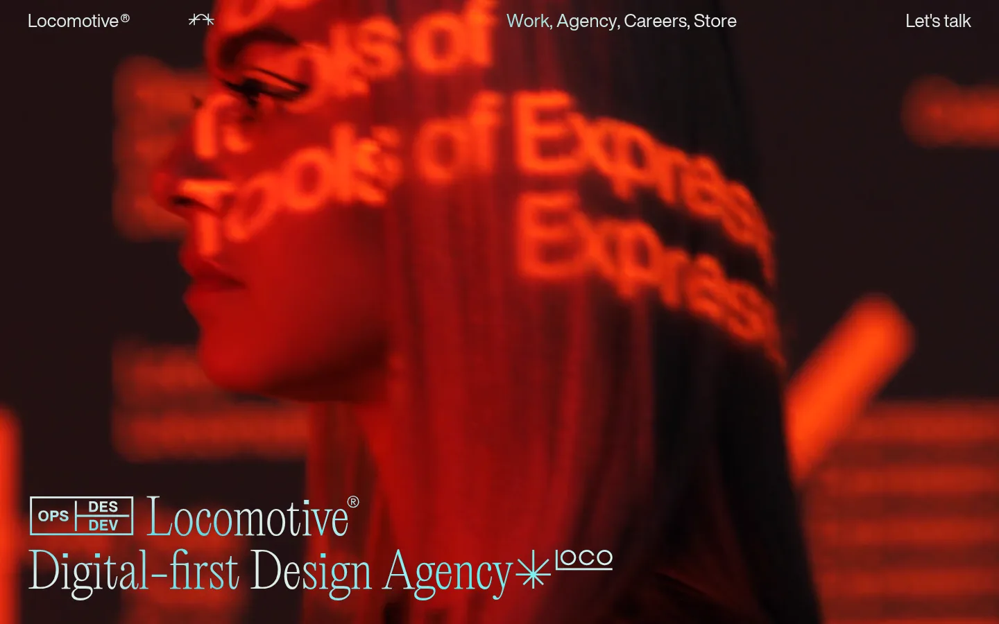
The page uses a restrained measured palette: White (#ffffff) is the canvas throughout the long scroll, while Black (#000000) carries almost all text, links, rules, and the occasional image field. The vivid reds visible above the fold belong to the cinematic hero video, not to the measured interface palette; keep them within media rather than turning them into UI accents. LocomotiveNew supplies tall, distinctive display lettering for the wordmark, hero statement, and featured-work names. HelveticaNowDisplay handles navigation, compact copy, and supporting links. The composition alternates full-bleed video with open white sections, then uses thin black rules to organize project names, articles, culture links, and footer columns. Layouts shift between a centered media moment, a two-column work list, and broad editorial text. Spacious vertical pauses give even small text lists room to breathe. The interface is flat: no measured shadows, gradients, or rounded corners.
配色
点色块复制色值。用途说明来自对页面的实测位置(背景、文字、描边、按钮)与截图判读。
表层色
中性色
页面底色 · Gallery White表层 · Studio Ink主文字 · Studio Ink次要文字 · Gallery White描边 · Studio Ink
文字
背景
对比度
WCAG
#000000 Studio Ink
#ffffff Gallery White
21:1
AAA
#ffffff Gallery White
#000000 Studio Ink
21:1
AAA
字体
字号阶梯:Custom(比例约 1.943,正文 15px)。示例用免费替代字体渲染,数值为实测。
Aa 设计
HelveticaNowDisplay
网络字体 · 字重 400 · 占比 75%
免费替代:Helvetica Neue
Navigation, body copy, links, article lists, and supporting interface text.
Aa 设计
LocomotiveNew
网络字体 · 字重 400 · 占比 25%
免费替代:Bodoni Moda
Display headlines, the brand wordmark, and prominent featured-project names.
角色
示例
字号
字重
行高
字距
特大标题
Oversized hero and brand display lettering.
Locomotive
110px
400
1
0
一级标题
Prominent introductory or editorial headline.
Locomotive
70px
400
1.1
0
二级标题
Section titles and prominent supporting headings.
The quick brown fox 敏捷的狐狸
26px
400
1.2
0
正文
Compact paragraph and descriptive copy.
The quick brown fox 敏捷的狐狸
15px
400
1.3
0
按钮
Large text-style actions and preferences.
The quick brown fox 敏捷的狐狸
26px
400
1.2
0
导航
Primary navigation links across the top.
The quick brown fox 敏捷的狐狸
26px
400
1.2
0
链接
Project, article, culture, and footer links.
The quick brown fox 敏捷的狐狸
26px
400
1.2
0
间距与布局
基准单位 2px · 密度:宽松
150px版块间距
20px元素间距
147px卡片内边距
1360px内容最大宽度
4px
5px
7px
8px
10px
11px
20px
30px
40px
50px
150px
160px
A spacious, long-scroll editorial layout sits on a white canvas, with a full-bleed video opening and later sections arranged as centered media, two-column work lists, broad text passages, and footer columns. The measured page max width is 1360px. Large section pauses separate featured work, studio copy, articles, culture links, merchandise, and contact details; within sections, thin horizontal rules provide alignment and structure. Overall density stays low despite numerous links and repeated lists.
圆角与层次
没有测到阴影:页面是扁平的,层次靠底色和描边区分。
The measured interface is flat, with no shadows, gradients, or rounded component corners. Separate content with whitespace and fine black horizontal rules rather than cards. Media may create its own deep-black fields, but should not appear as raised UI panels.
组件
下面的预览按实测的按钮、输入框、徽标、卡片样式重建(字体用替代字体)。
Top navigation
Place the wordmark at the left, primary links across the top, and a contact link at the right; use black text on white sections and white text over the opening video.
Featured work list
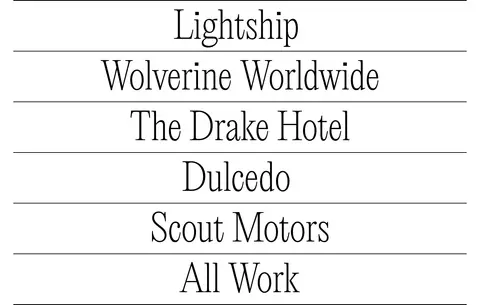
Stack large display-style project names between fine black rules, with compact labels and links supporting the work index.
Studio introduction
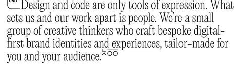
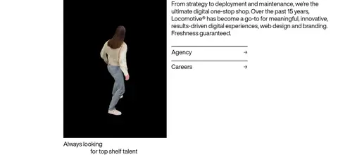
Use a prominent editorial statement followed by compact explanatory copy and simple text links, with a media element alongside supporting content where appropriate.
Editorial link lists
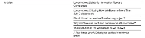
Organize article and culture entries in compact sans-serif rows, aligned with thin horizontal dividers and generous section spacing.
Merchandise grid
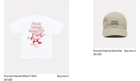
Show products in a two-column image-led arrangement on white; keep product names and purchase links as plain text.
Contact footer
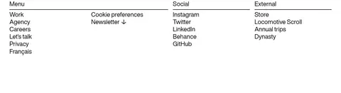
Group menu, social, and external links into three columns, then finish with oversized editorial contact details on the white canvas.
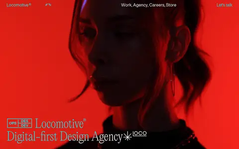
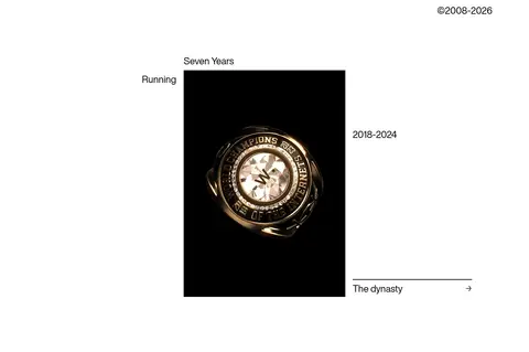
Imagery · The opening is a full-bleed cinematic video with a close, shadowed portrait and saturated red light. Project and studio moments use image or video media, often set against black, while merchandise appears as isolated product photography on pale backgrounds. Keep photographic color inside the media; the interface remains black and white. Avoid decorative illustration or interface gradients.
Use White (#ffffff) as the continuous interface canvas.
Set text, links, and fine dividers in Black (#000000).
Reserve LocomotiveNew for prominent editorial display moments.
Use HelveticaNowDisplay for navigation and supporting copy.
Create hierarchy with whitespace and thin rules.
Keep saturated color within cinematic or project imagery.
✕ 不该做
Do not introduce unmeasured interface colors.
Do not turn the hero video's reds into global UI accents.
Do not add card shadows or gradients.
Do not use rounded interface panels.
Do not compress the generous section rhythm.
Do not make supporting links look like filled buttons.
给 AI 的提示词
想快速出一个同风格的新页面,把这段话连同 DESIGN.md 一起发给 AI。
Build a new Locomotive-style agency page as a spacious editorial canvas. Use Gallery White (#ffffff) as the page surface and Studio Ink (#000000) for text, links, and thin rules; keep vivid color confined to project media. Use LocomotiveNew or a close editorial serif substitute for display headlines and featured project names, paired with HelveticaNowDisplay or a neutral sans-serif substitute for navigation and body copy. Compose a restrained top navigation, a full-bleed cinematic media moment, prominent typographic work listings, and concise studio or editorial sections. Alternate layouts rather than repeating cards: use open text passages, simple columns, and image-led merchandise or project blocks. Preserve generous vertical pauses, low visual density, square edges, and a flat treatment without shadows or gradients.