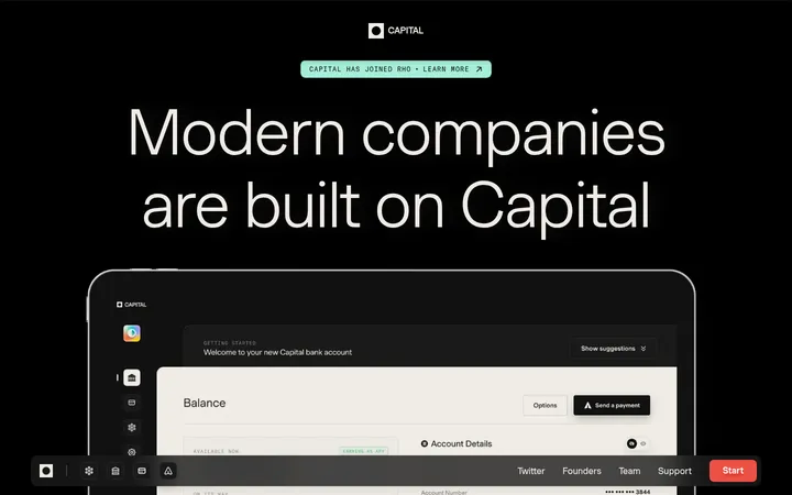
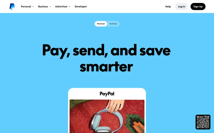
North star · Keep the page calm and pale, then use oversized condensed black type and vivid product imagery as the deliberate points of emphasis.
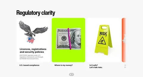
The page is built on a soft light-gray canvas, with black doing nearly all the work in headlines, body copy, and key interface details. White cards provide quiet separation, while electric magenta, cyan, and lime appear as small, high-energy accents or within product imagery rather than as broad site-wide bands. Oversized, tightly tracked condensed display type gives the hero its force; Inter keeps supporting copy and labels legible. A centered, phone-led opening gives way to aligned feature grids and a larger regulatory card row, with generous vertical pauses between sections. Product screens, money imagery, cards, compliance illustrations, video, and merchandise supply color and texture. Most content remains visually flat: rounded media and cards establish grouping without relying on shadows or decorative borders. The result feels editorial and direct, balancing a striking headline with practical financial-product explanations.
Body copy, captions, links, and supporting interface text.
Aa 设计
Helvetica Now Display Cn Bold
网络字体 · 字重 700 / 900 · 占比 15%
免费替代:Barlow Condensed
Display headlines and large uppercase hero statements.
角色
示例
字号
字重
行高
字距
特大标题
Oversized condensed display statement anchoring the hero.
UGLYCASH
164px
700
0.85
-0.033em
一级标题
All-caps hero and major statement headlines.
UGLYCASH
85px
900
0.94
-0.02em
二级标题
Section headings introducing feature and discovery groups.
UGLYCASH
64px
700
0.94
-0.02em
三级标题
Decorative script-style subheading role where present.
UGLYCASH
38px
400
1.2
0
四级标题
Compact bold labels and card titles.
The quick brown fox 敏捷的狐狸
24px
700
1.17
-0.02em
正文
Feature descriptions and standard supporting paragraphs.
The quick brown fox 敏捷的狐狸
18px
500
1.2
0
辅助文字
Small legal, metadata, and understated helper text.
The quick brown fox 敏捷的狐狸
14px
400
1.29
0
链接
Navigation and calls to explore app or related content.
The quick brown fox 敏捷的狐狸
20px
400
1.4
-0.02em
间距与布局
基准单位 2px · 密度:宽松
96px版块间距
10px元素间距
—卡片内边距
1110px内容最大宽度
4px
5px
9px
10px
16px
20px
24px
27px
96px
168px
Use a centered content area capped at the measured 1110px maximum width, with a spacious density and measured 96px section rhythm. The hero is centered and vertically composed around the large headline and phone media. Lower sections shift to left-aligned headings and two- or three-column media cards; the regulatory content uses a denser multi-card row. Keep generous breathing room around groups and let imagery determine each card's visual weight.
圆角与层次
按钮 · 9999px
卡片 · 16px
图片 · 16px
链接 · 16px
没有测到阴影:页面是扁平的,层次靠底色和描边区分。
The measured design is mostly flat, with no recurring shadow system or visible hairline borders. Use the pale canvas and white card surfaces for separation, and measured 16px card and media radii where appropriate. Allow product imagery to supply depth through its own rendering rather than adding interface shadows.
组件
下面的预览按实测的按钮、输入框、徽标、卡片样式重建(字体用替代字体)。
Top navigation
Compact centered pill-like header with the condensed UGLYCASH wordmark, social icons, and a small app link framed by a magenta accent.
Hero product showcase
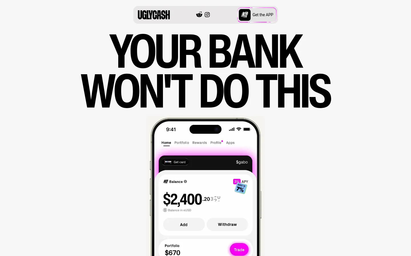
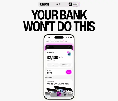
Centered, tightly set uppercase statement above a tall phone mockup; the phone screen supplies the primary product detail.
Feature cards
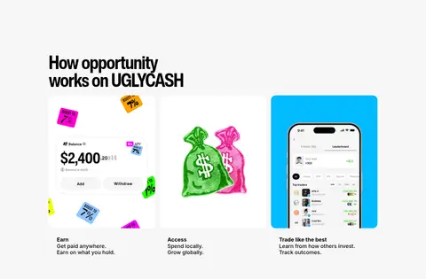
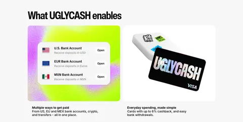
Rounded media cards with concise labels and short descriptions; most use white surfaces, with a cyan card providing a vivid exception.
Regulatory card row
A multi-column collection of compliance and safety topics, mixing illustrations, short labels, and supporting copy.
Editorial video
Large rounded video thumbnail with oversized image typography, paired with a compact heading and dark pill-shaped More videos control.
Discovery cards
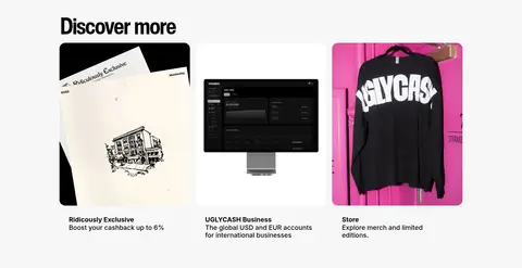
Three visual links for cashback, business accounts, and merchandise, each combining an image with a brief title and description.
Imagery · Lead with a large smartphone product mockup beneath the hero headline. Use app-interface screenshots, money and card visuals, compliance illustrations, merchandise photography, and a prominent editorial video thumbnail. Images are often cropped into rounded card frames; saturated magenta, cyan, and lime primarily live inside these visuals, against the otherwise restrained page.
Set major statements in heavy, condensed uppercase typography.
Keep black text as the primary visual anchor.
Use #fa00ff, #02bbff, and #adff02 as focused accents.
Pair each feature image with a concise title and explanation.
Leave generous vertical space between content groups.
✕ 不该做
Do not turn the page into a dark theme.
Do not use bright accents as full-page background bands.
Do not replace the oversized display type with generic light headings.
Do not add a prominent shadow system or decorative borders.
Do not crowd the hero with multiple competing calls to action.
Do not treat illustration-only colors as core site-wide surfaces.
给 AI 的提示词
想快速出一个同风格的新页面,把这段话连同 DESIGN.md 一起发给 AI。
Build a new UGLYCASH-style fintech page with a calm #f7f7f7 Soft Canvas and Ink Black #000000 typography. Use a heavy condensed display face for oversized, tight-tracked uppercase headlines, paired with Inter for readable body copy and labels. Compose the opening around one assertive headline and a prominent phone or product visual. Organize supporting content into spacious, rounded image cards with short descriptions; use #ffffff Card White for quiet surfaces. Reserve Electric Magenta #fa00ff, Signal Cyan #02bbff, and Acid Lime #adff02 for selective highlights and vivid imagery, not broad background fields. Keep sections centered within a measured 1110px maximum width, with generous vertical separation and grids that adapt to content. Favor flat surfaces and image-led depth over shadows or borders.