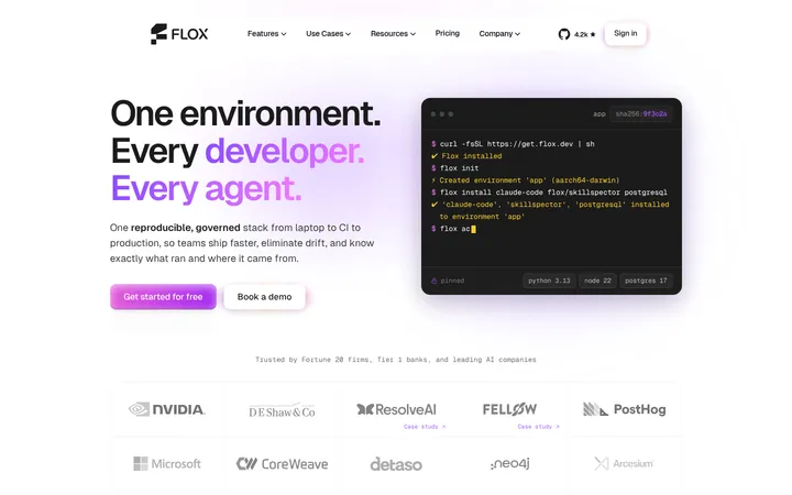
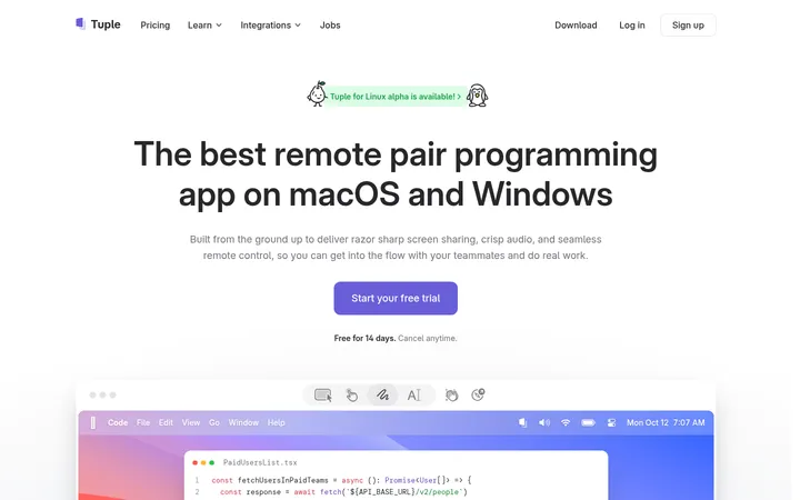
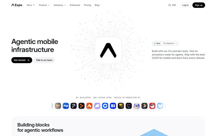
North star · Build a calm, ruled canvas where technical mono typography and product evidence lead, while accent color appears only at key actions.
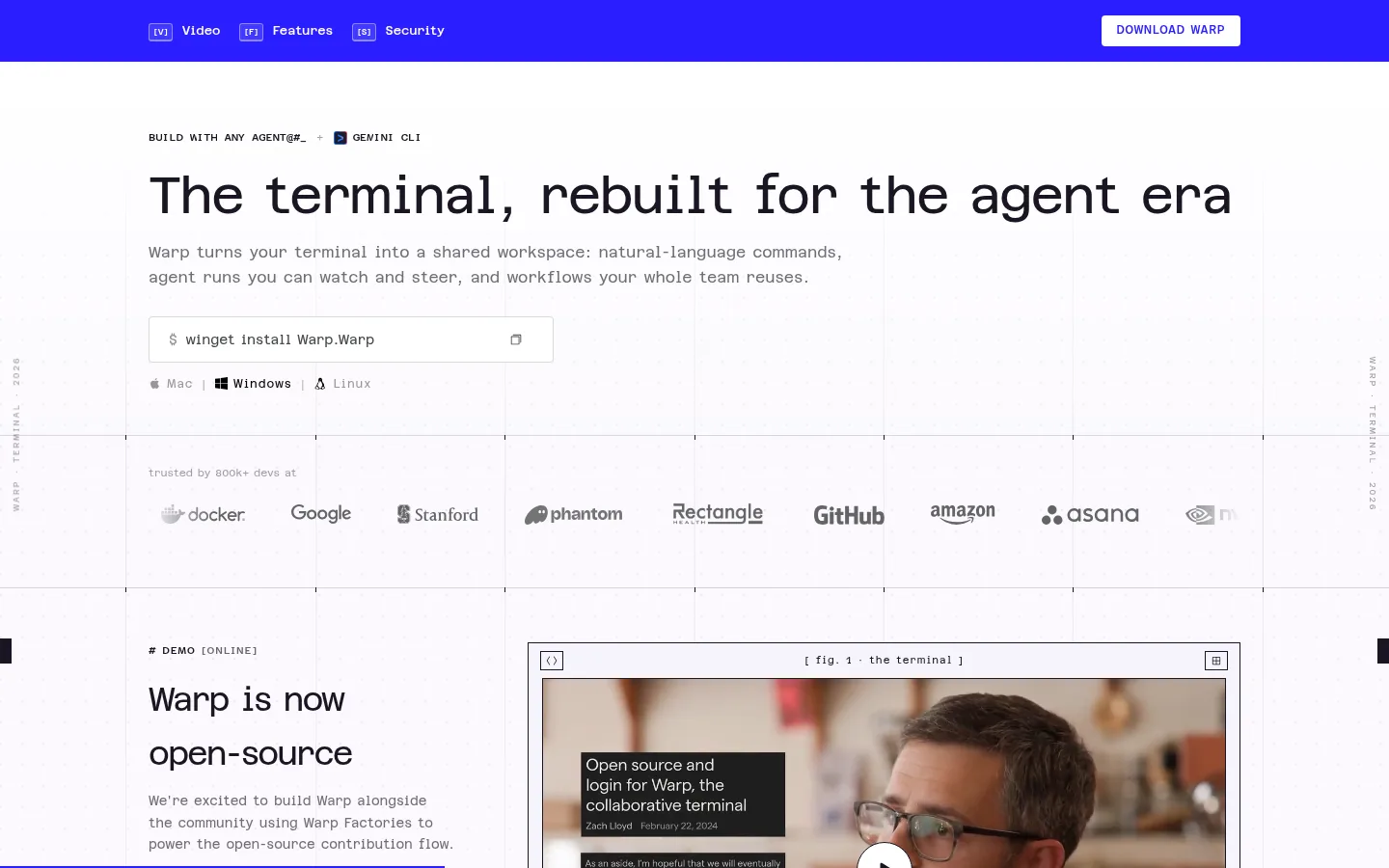
The page uses a near-white lavender canvas (#fbf9fe) as a continuous field, with fine gray rules (#d7d4da) dividing sections and creating a subtle page-wide grid. Dark plum-black (#1a1522) carries headings, navigation, and primary copy; softer gray text keeps supporting information legible without competing. A sharp citron (#eef17c) is reserved for the demo CTA, adding a small, deliberate point of emphasis. Azeret Semi Mono defines nearly all text, giving the page a technical, measured voice; large, lightly weighted headlines contrast with compact uppercase labels and buttons. The layout is centered and wide, but content often aligns to the left within ruled bands. A logo strip, terminal screenshots, and a framed video alternate with open whitespace. Cards stay flat and border-led rather than shadowed, so structure comes from alignment, outlines, and consistent section rhythm.
Primary typeface for headlines, body copy, labels, navigation, buttons, and code-like text.
Aa 设计
theFuture
网络字体 · 字重 700 · 占比 5%
免费替代:Space Grotesk
Minor display or brand treatment; appears in a small share of measured text.
角色
示例
字号
字重
行高
字距
一级标题
Hero headline introducing the terminal for the agent era.
Warp
54px
400
1.05
-0.037em
二级标题
Major section headlines for product and security content.
Warp
34px
400
1.65
-0.059em
正文
Supporting product descriptions and explanatory copy.
The quick brown fox 敏捷的狐狸
13px
400
1.6
0
辅助文字
Compact uppercase labels and metadata.
The quick brown fox 敏捷的狐狸
11px
600
1.27
0.06em
按钮
Uppercase CTA labels, including the demo action.
The quick brown fox 敏捷的狐狸
12px
600
1.65
0.05em
导航
Compact uppercase primary navigation labels.
The quick brown fox 敏捷的狐狸
12px
600
1.65
0.05em
眉题
Small uppercase section markers above headings.
The quick brown fox 敏捷的狐狸
11px
600
1.27
0.06em
代码
Compact technical labels and code-oriented interface details.
const style = 1;
11px
600
1.27
0.06em
间距与布局
基准单位 4px · 密度:适中
56px版块间距
6px元素间距
24px卡片内边距
1132px内容最大宽度
2px
3px
4px
5px
6px
8px
10px
12px
14px
16px
18px
20px
24px
28px
48px
56px
Use a centered content frame with a measured maximum width of 1132px. The page is mostly a single-column sequence, with two-column video and copy, a four-column feature band, and a three-column enterprise section. Align headings and copy to the start of their content areas. Fine horizontal and vertical rules create a quiet grid across the page. Sections are generously separated, with measured 56px section gaps and comfortable density; cards use 24px internal padding.
圆角与层次
按钮 · 1px
导航 · 4px
没有测到阴影:页面是扁平的,层次靠底色和描边区分。
The design is predominantly flat: no measured shadows, and most depth comes from fine #d7d4da borders, ruled bands, and framed media. Use white surfaces against the pale canvas to distinguish cards. Keep corner treatments nearly square; the measured button radius is 1px, with a 4px nav treatment.
组件
下面的预览按实测的按钮、输入框、徽标、卡片样式重建(字体用替代字体)。
Primary navigation
Compact uppercase Azeret Semi Mono links in dark ink on a light surface, with the demo action singled out in citron.
Hero and install command
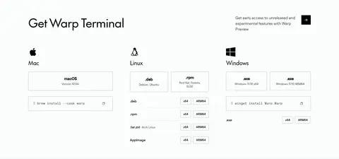
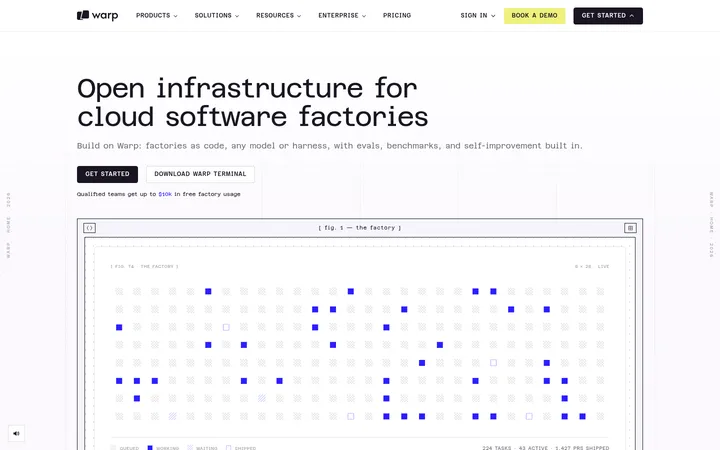
Large left-aligned mono headline, muted two-line supporting copy, bordered command field, and compact platform choices.
Trust logo band
A ruled horizontal strip with a small trust label and a row of subdued customer logos.
Framed video feature
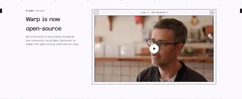
Two-column section pairing a short demo eyebrow and copy with a labeled, thin-bordered video player.
Feature showcase
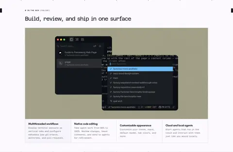
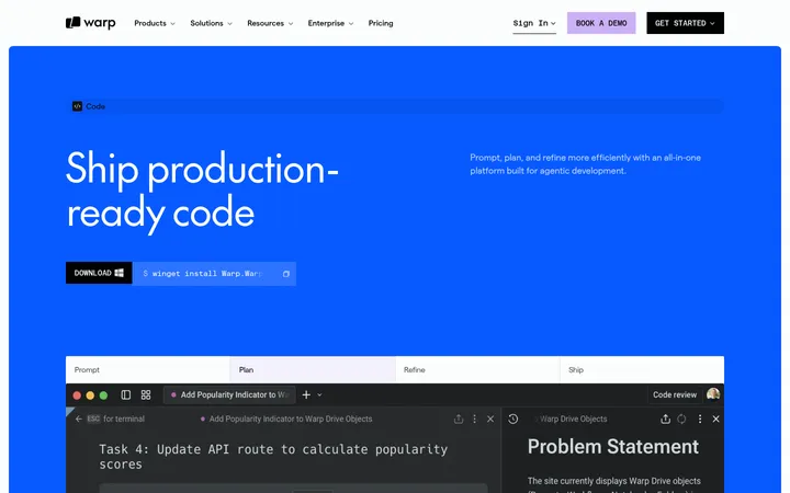
A large terminal product image above four concise feature cards separated by hairlines.
Enterprise controls cards
Flat white cards with 24px measured padding, dark mono text, and restrained border treatment.
Imagery · Use real product screenshots as evidence of the terminal interface, framed in restrained, thin outlines. A video featuring a person provides the main photographic moment; keep it inside a labeled player frame rather than using it as a full-bleed background. Logos form a subdued trust strip. Product imagery may introduce richer colors, but keep those colors inside the media rather than extending them into the page chrome.
Set most content in Azeret Mono or a close mono substitute.
Reserve citron for a prominent action.
Frame product media with quiet borders and labels.
Keep headings left aligned and copy concise.
✕ 不该做
Do not introduce heavy shadows or layered card stacks.
Do not use large areas of saturated accent color.
Do not replace the monospaced voice with generic rounded sans typography.
Do not make every card visibly raised.
Do not let colors inside screenshots redefine the page palette.
Do not crowd the section transitions.
给 AI 的提示词
想快速出一个同风格的新页面,把这段话连同 DESIGN.md 一起发给 AI。
Create a new Warp-style developer product page on a calm #fbf9fe Lavender Mist canvas. Use #1a1522 Plum Ink for headings, navigation, and key copy; #706c76 Soft Graphite for supporting text; and #d7d4da Quiet Rule for subtle grid lines and borders. Reserve #eef17c Citron Signal for the main CTA, with #ffffff Paper White surfaces for framed cards. Use Azeret Mono as the dominant typeface, with large regular-weight headlines and compact uppercase, tracked labels. Center content within a restrained wide frame, align copy to the left, and organize the page with spacious ruled sections. Show authentic product-interface imagery in thin frames; use a human-led video or photo sparingly. Favor flat surfaces and precise alignment over shadows, decorative gradients, or oversized color blocks.