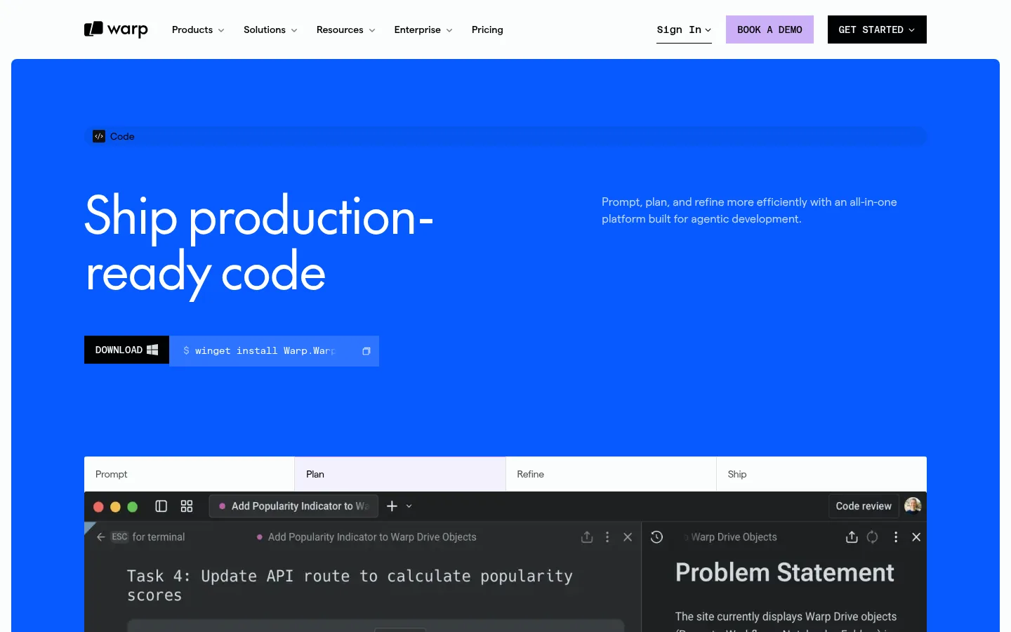
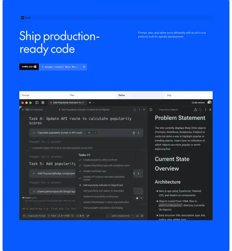
North star · Use a bright blue product moment and generous near-white breathing room to make authentic developer interface imagery the focal point.
The page is organized around a strong contrast: a saturated blue hero panel against a near-white canvas, followed by spacious white sections and pale blue-gray surfaces. Black headings and muted gray supporting text keep the interface legible without competing with the hero. Display and heading text use the light, rounded character of theFuture, with tight negative tracking; Matter handles body copy and navigation, while matterMono gives command snippets and technical labels a terminal-like voice. Layouts alternate between broad text-led introductions, logo rows, and feature areas that place copy beside dark product screenshots. The screenshots are framed as working software rather than decorative imagery. Generous vertical breathing room separates sections, while compact cards and download controls keep the information practical. Fine gray borders and minimal shadows define controls and media edges; lilac is reserved for a small secondary demo action.
Body copy, navigation, captions, buttons, and most interface text.
Aa 设计
theFuture
网络字体 · 字重 400 · 占比 12%
免费替代:Manrope
Display and section headings.
Aa 设计
matterMono
网络字体 · 字重 500 / 400 · 占比 6%
免费替代:IBM Plex Mono
Terminal commands, technical snippets, and uppercase CTA labels.
Aa 设计
Azeret Mono
网络字体 · 字重 500 · 占比 1%
免费替代:IBM Plex Mono
Occasional technical or code-like labels.
角色
示例
字号
字重
行高
字距
特大标题
Large hero messaging and prominent page-level display text.
Warp
72px
400
1.1
-0.035em
一级标题
Main page and primary section headlines.
Warp
50.5px
400
1.25
-0.035em
二级标题
Feature and sub-section headings.
The quick brown fox 敏捷的狐狸
24px
400
1.25
-0.035em
正文
Explanatory paragraphs and standard interface copy.
The quick brown fox 敏捷的狐狸
16px
400
1.5
0
辅助文字
Small supporting notes and product details.
The quick brown fox 敏捷的狐狸
14px
400
1.71
0
按钮
Compact button labels and controls.
The quick brown fox 敏捷的狐狸
12px
500
1.67
0
导航
Header and footer navigation items.
The quick brown fox 敏捷的狐狸
14px
400
2
0
链接
Small uppercase action links and labels.
The quick brown fox 敏捷的狐狸
10px
600
1.5
0.1em
眉题
Uppercase category labels above headings.
The quick brown fox 敏捷的狐狸
10px
600
1.5
0.1em
代码
Terminal commands and monospaced product text.
const style = 1;
14px
400
2
0
间距与布局
基准单位 4px · 密度:适中
64px版块间距
4px元素间距
—卡片内边距
1200px内容最大宽度
4px
6px
8px
10px
12px
14px
16px
20px
24px
40px
64px
The page uses a centered content frame, with the measured maximum width at 1200px, and a wide desktop composition. The hero is a large blue panel inset within the white page, with a left-aligned headline and product imagery below. Subsequent sections shift between logo rows, two-column feature layouts, and multi-column download and footer content. Sections have a comfortable, spacious rhythm, with the measured section gap at 64px. Keep text aligned to clear columns and avoid dense, full-bleed content outside the hero.
圆角与层次
按钮 · 3px
卡片 · 3px
图片 · 2px
导航 · 3px
链接 · 9999px
lg · media
inset · other
inset · other
The design is mostly flat: section backgrounds and whitespace do more work than shadows. Thin gray borders define download controls and small UI elements, while cards use restrained corner rounding. Product media may have a subtle shadow for separation. Keep layering limited to screenshots and the hero panel, with no heavy floating-card effect.
组件
下面的预览按实测的按钮、输入框、徽标、卡片样式重建(字体用替代字体)。
Primary navigation
A compact light header with the Warp mark, product links, sign-in, a lilac BOOK A DEMO action, and a near-black GET STARTED action.
Blue product hero
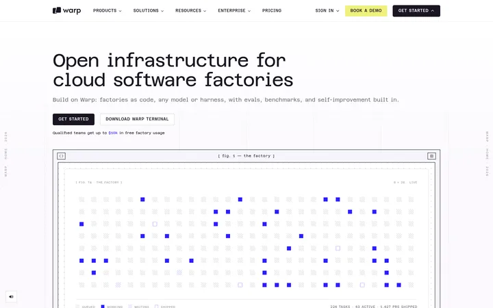
A large inset Warp Blue panel with a small Code label, oversized light headline, supporting copy, download command, and prominent editor screenshot.
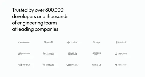
Customer logo cloud
A trust statement followed by multiple rows of understated customer logos on the near-white canvas.
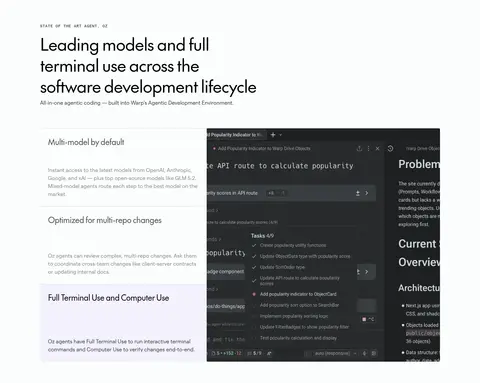
Feature split
Editorial section heading and eyebrow above copy paired with a broad dark terminal screenshot; use pale surfaces to group selected details.
Download controls
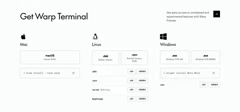
Mac, Linux, and Windows options grouped into columns, with compact outlined platform and architecture selectors plus install commands.
Footer link columns
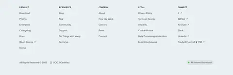
Pale blue-gray footer surface with small uppercase group labels, compact link lists, legal details, and status information.
Imagery · Product imagery is primarily authentic dark terminal and editor interface screenshots, framed in broad rectangular panels. The hero positions a large interface image beneath the headline; later feature areas pair similar screenshots with explanatory text. A customer logo cloud adds small, subdued marks. Keep software visuals crisp and legible, and treat screenshot colors as product content rather than as the brand palette.
Keep the hero as the page's strongest color field.
Use near-white space to separate major content sections.
Pair feature explanations with genuine product-interface imagery.
Set display headlines in a light, rounded sans serif.
Use monospaced type for commands and compact technical CTAs.
Keep borders thin and card treatment restrained.
✕ 不该做
Do not spread accent colors across every section.
Do not substitute generic illustrations for the terminal interface.
Do not turn the page into a dense dashboard layout.
Do not use heavy shadows or floating-card stacks.
Do not set long body copy in uppercase or monospace.
Do not use screenshot colors as the page's brand palette.
给 AI 的提示词
想快速出一个同风格的新页面,把这段话连同 DESIGN.md 一起发给 AI。
Build a new Warp page that follows this measured visual language. Use Gallery White (#fbfdfd) as the canvas, Near Black (#000102) for strong text, Graphite Gray (#44494a) for muted navigation and supporting copy, and Warp Blue (#085aff) for one dominant product-led hero. Reserve Lilac Demo (#cbb0f7) for a secondary demo action and Mist Panel (#eaf0f2) for grouped surfaces. Set large, rounded, lightly tracked headlines in a theFuture-like sans serif; use a Matter-like sans for body and navigation, and monospace for commands. Organize content in a centered wide frame with generous section spacing, clear left alignment, and alternating text-plus-product-interface layouts. Show crisp, dark developer-tool screenshots as real product content. Keep borders delicate, corner treatment restrained, and the overall page flat and breathable.