North star · Pair bold, centered black messaging with spacious white content and restrained pink accents, letting real community imagery supply warmth.
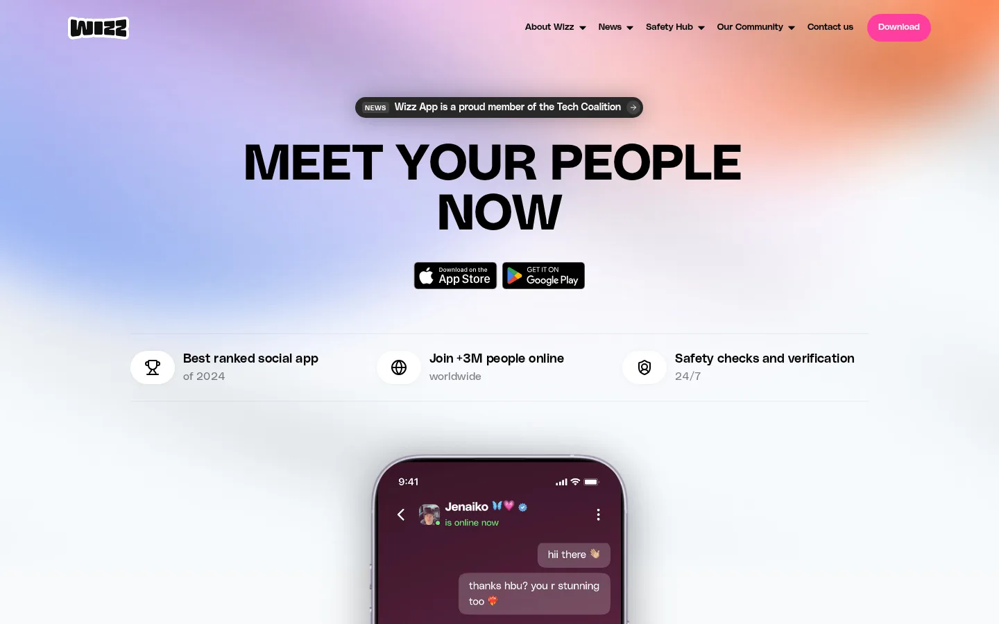
The page balances a vivid, blurred color field in the hero with a predominantly white editorial canvas below. Lavender, peach, and cool pale tones in the hero artwork are atmospheric imagery rather than a reason to invent additional brand color tokens; measured colors remain the source of truth. Black establishes high-contrast headlines and navigation, while #ff3d9e punctuates download actions and small section labels. Typography is geometric and direct: oversized uppercase headings anchor sections, with compact neutral sans-serif copy providing detail. The opening section centers its message, store badges, proof points, and a phone mockup; subsequent content alternates two-column text blocks with centered community content and photography. Generous whitespace separates these varied blocks, keeping the long page light despite its amount of content. Rounded pills, image cards, and the phone add softness without relying on heavy borders or complex shadow systems.
配色
点色块复制色值。用途说明来自对页面的实测位置(背景、文字、描边、按钮)与截图判读。
品牌色
强调色
表层色
中性色
功能色
页面底色 · Wizz Ink表层 · Open Canvas主文字 · Open Canvas次要文字 · Wizz Ink弱文字 · Quiet Gray强调 · Candy Signal
文字
背景
对比度
WCAG
#ffffff Open Canvas
#000000 Wizz Ink
21:1
AAA
#000000 Wizz Ink
#ffffff Open Canvas
21:1
AAA
#dadada Quiet Gray
#000000 Wizz Ink
15.02:1
AAA
#dadada Quiet Gray
#ffffff Open Canvas
1.4:1
不达标
#ff3d9e Candy Signal
#000000 Wizz Ink
6.41:1
AA
#ff3d9e Candy Signal
#ffffff Open Canvas
3.27:1
AA-large
字体
字号阶梯:Custom(比例约 2.186,正文 18px)。示例用免费替代字体渲染,数值为实测。
Aa 设计
PolySans Neutral
网络字体 · 字重 400 · 占比 75%
免费替代:Inter
Default body copy, captions, and general supporting text.
Aa 设计
PolySans Median
网络字体 · 字重 600 / 400 / 700 · 占比 17%
免费替代:Space Grotesk
Display headlines and navigation or other stronger interface labels.
Aa 设计
PolySans Slim
网络字体 · 字重 300 · 占比 7%
免费替代:Inter
Lightweight links, particularly footer and secondary navigation links.
角色
示例
字号
字重
行高
字距
特大标题
Oversized uppercase hero statement and major display messaging.
Wizz
86px
400
0.85
0
一级标题
Large uppercase section titles, including mission and community headings.
Wizz
72px
700
1
0
正文
Explanatory paragraphs and feature descriptions.
The quick brown fox 敏捷的狐狸
18px
400
1.4
0
辅助文字
Compact supporting labels and secondary details.
The quick brown fox 敏捷的狐狸
14px
400
1.2
0
导航
Header navigation links and concise interface labels.
The quick brown fox 敏捷的狐狸
13px
600
2
0
链接
Lightweight text links, especially secondary and footer links.
The quick brown fox 敏捷的狐狸
14px
300
1.1
0
间距与布局
基准单位 4px · 密度:适中
88px版块间距
8px元素间距
—卡片内边距
1064px内容最大宽度
4px
5px
8px
10px
12px
16px
20px
24px
32px
48px
64px
80px
88px
The measured content max width is 1064px, with the hero and community imagery extending visually across the page. The opening message is centered above store badges, a three-item proof strip, and a centered phone mockup. Below, a two-column mission block gives the heading its own column; safety and team content use similarly editorial split layouts. The community section returns to centered alignment with image bands above and below. Sections have generous measured vertical rhythm, while body content remains comfortable rather than dense.
圆角与层次
按钮 · 12px
图片 · 24px
导航 · 9999px
md · other
hairline · nav
lg · button
Most sections are flat and open, with separation created by whitespace rather than prominent borders. The hero announcement and buttons use rounded shapes; the phone mockup supplies the strongest dimensional focal point. Measured button shadowing is subtle-to-large in its component data, but keep shadows selective and do not add card borders where none are evident.
组件
下面的预览按实测的按钮、输入框、徽标、卡片样式重建(字体用替代字体)。
Header navigation
A compact top-row logo and navigation with dark text, dropdown cues, and a pink Download action; navigation links are measured as small, regular sans-serif.
Announcement pill
A dark rounded news capsule centered above the hero headline, with a compact label, short announcement, and arrow affordance.
Download actions
Use the measured #ff3d9e accent for the Download button and news CTA; the measured button radius is 12px for the primary Our News example.
Proof-point strip
Three horizontally aligned claims pair small outlined icons with bold benefit text and quieter supporting details, separated from the hero by fine horizontal rules.
App showcase
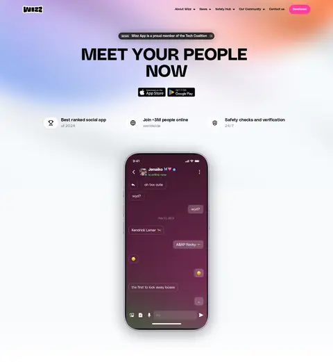
A large, centered phone mockup demonstrates an in-app conversation and gives the otherwise spacious hero a clear product focal point.
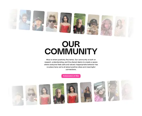
Community portrait bands
Rows of portrait imagery frame a centered community heading and copy; soft fades at the edges blend the cards into the white canvas.
Editorial content split
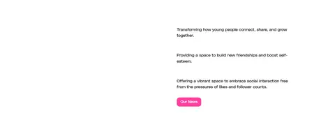
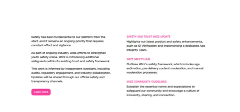
Two-column informational sections use large black uppercase headings beside concise copy, pink subheads, and a small pink CTA.
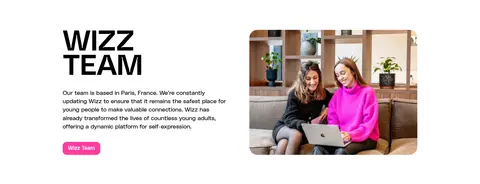
Imagery · The hero combines a softly blurred pastel color field with a large smartphone mockup that makes the app experience tangible. Community imagery is presented as rows of portrait cards with softened, faded edges, contrasting candid faces with the clean white canvas. A team photograph adds a grounded human moment later in the page. Preserve images as the source of their own varied colors rather than extracting them into the interface palette.
Use black uppercase display headlines as strong section anchors.
Keep the hero message centered above the product mockup.
Use #ff3d9e sparingly for actions and small emphasis.
Give white content sections generous breathing room.
Use real portrait and team imagery to express community.
Keep body copy visually quieter than section titles.
✕ 不该做
Do not turn the page into a dark interface; the dark footer is an exception.
Do not use pink as a large-area background color.
Do not invent additional brand colors from photographs or mockups.
Do not crowd the hero with multiple competing messages.
Do not add heavy borders or shadows to every content block.
Do not replace the human imagery with generic abstract illustrations.
给 AI 的提示词
想快速出一个同风格的新页面,把这段话连同 DESIGN.md 一起发给 AI。
Build a new Wizz-style social app page with a light, editorial feel. Use #ffffff as the primary content surface and #000000 for high-contrast text; reserve #ff3d9e for compact CTAs and selective labels. A soft pale gradient may set the hero atmosphere, with #f7fafc as a measured light stop, but do not treat photo colors as brand tokens. Set bold uppercase display headlines in a geometric sans-serif, then use restrained neutral sans-serif body copy and muted #dadada secondary text. Center the hero message and app mockup, then alternate spacious two-column editorial sections with centered community imagery. Favor portrait photos, rounded pills, and clear alignment. Keep depth subtle and let whitespace, hierarchy, and real people carry the page.