North star · Keep the page immersed in a near-black violet canvas, and let a single luminous product showcase carry the visual drama.
The page is built on a continuous near-black violet canvas (#0a0118), so the experience reads as one immersive environment rather than a stack of contrasting bands. White display headlines provide crisp hierarchy, while muted lavender-gray copy keeps supporting information quiet. Saturated violet is reserved for key emphasis and subtle atmospheric light; purple gradients and glows are concentrated behind the hero product preview instead of becoming a general background treatment. Rebond Grotesque gives large headings a distinctive, rounded presence, paired with Inter V for navigation, body copy, labels, and controls. The centered hero introduces the product before a wide, dark interface screenshot anchors the page. Customer marks, feature panels, FAQ rows, and footer columns continue the same restrained palette. Generous vertical gaps separate major sections, while fine dark borders and pill-shaped controls define interaction without heavy shadows.
Navigation, body copy, links, labels, buttons, and FAQ text.
Aa 设计
Rebond Grotesque
网络字体 · 字重 700 · 占比 9%
免费替代:Space Grotesk
Display headlines and prominent feature headings.
角色
示例
字号
字重
行高
字距
特大标题
Large, bold hero or campaign headline.
Wope
72px
700
1.11
-0.02em
一级标题
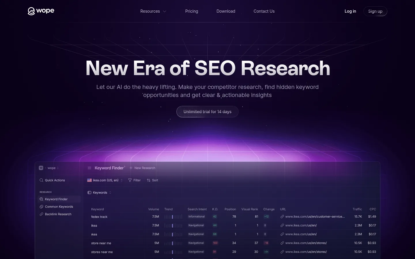
Primary page headline: “New Era of SEO Research.”
Wope
56px
700
1.14
0
二级标题
Supporting section introduction and secondary headline.
Wope
28px
400
1.43
-0.02em
三级标题
Feature titles and prominent FAQ heading.
The quick brown fox 敏捷的狐狸
24px
700
1.33
0
正文
Hero description and explanatory feature copy.
The quick brown fox 敏捷的狐狸
18px
400
1.56
-0.01em
辅助文字
Small interface labels and supporting notes.
The quick brown fox 敏捷的狐狸
14px
400
1.71
-0.01em
按钮
Trial and account actions.
The quick brown fox 敏捷的狐狸
14px
500
1.71
-0.01em
导航
Top navigation and footer navigation.
The quick brown fox 敏捷的狐狸
14px
400
1.71
-0.01em
链接
Inline links, footer destinations, and secondary actions.
The quick brown fox 敏捷的狐狸
14px
400
1.71
-0.01em
眉题
Compact uppercase markers such as the FAQ badge.
The quick brown fox 敏捷的狐狸
14px
500
1.71
0.08em
间距与布局
基准单位 4px · 密度:宽松
124px版块间距
8px元素间距
—卡片内边距
1248px内容最大宽度
1px
4px
7px
8px
12px
14px
16px
20px
22px
24px
28px
32px
40px
64px
80px
124px
Use a centered content frame with a measured maximum width of 1248px, keeping the page visually open and aligned around the central message. The hero is centered, followed by a wide product preview and a horizontal customer-logo row. Feature content sits in a restrained multi-column arrangement, then gives way to centered FAQ content and a multi-column footer. Preserve the measured spacious section rhythm and small, consistent gaps between related elements; avoid crowding the dark canvas with dense ornament.
圆角与层次
按钮 · 9999px
徽标 · 9999px
导航 · 9999px
没有测到阴影:页面是扁平的,层次靠底色和描边区分。
The page is mostly flat and tonal, with no measured shadow system. Separate dark content using very fine plum borders and restrained contrast rather than raised cards. Create depth through the layered hero screenshot, violet glow, and faint grid; keep controls outlined or pill-shaped and avoid heavy drop shadows.
组件
下面的预览按实测的按钮、输入框、徽标、卡片样式重建(字体用替代字体)。
Top navigation
A restrained horizontal bar with the Wope mark, centered navigation links, and account actions; white and muted lavender text sits on the dark canvas.
Hero headline and trial action
Centered bold display heading, muted two-line supporting copy, and a compact outlined pill labeled “Unlimited trial for 14 days.”
Product preview
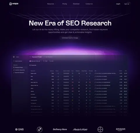
Wide dark SEO dashboard screenshot layered above a violet perspective grid and soft glow; it dominates the hero visual.
Customer logo strip
A compact horizontal row of customer marks beneath the hero showcase, rendered discreetly against the continuous dark background.
Feature panels
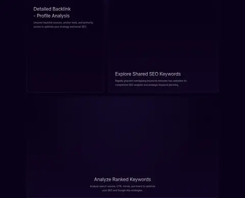
Dark, lightly bordered product feature areas with interface imagery, concise headings, and quiet explanatory copy.
FAQ list
Centered section heading and compact badge above stacked question rows, subtle divider lines, and plus-shaped expand affordances.
Footer
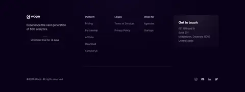
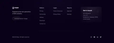
Three link columns, Wope summary and trial action, contact card, and a low-contrast bottom row for copyright and social icons.
Imagery · The hero uses a wide screenshot of the SEO research interface, framed as a floating dark product window over a glowing violet perspective grid. Treat the interface preview as the key visual, with subdued detail and atmospheric purple light around its edges. Customer logos act as a compact trust strip. Feature panels use dark imagery or interface visuals rather than lifestyle photography; the page is product-led, with no prominent video treatment.
Keep the page canvas near-black violet throughout.
Reserve bright purple glow for product imagery and key emphasis.
Use white for headline hierarchy and lavender-gray for secondary copy.
Center the hero headline and supporting message.
Give major sections generous vertical separation.
Use fine dark borders and restrained pill-shaped controls.
✕ 不该做
Do not introduce bright white section backgrounds.
Do not spread saturated purple across large flat surfaces.
Do not add heavy shadows or thick card outlines.
Do not let product screenshots overpower the main message.
Do not use decorative colors outside the measured palette.
Do not compress the page into a dense dashboard layout.
给 AI 的提示词
想快速出一个同风格的新页面,把这段话连同 DESIGN.md 一起发给 AI。
Build a new page in Wope’s visual style: an immersive dark SaaS experience on Void Violet (#0a0118), with Clear White (#ffffff) display headlines and Lavender Haze (#9b96b0) for secondary copy and links. Use Rebond Grotesque or a close display substitute for bold headings, and Inter for navigation, body text, labels, and controls. Keep the layout centered and spacious, with a clear hero followed by a wide product-interface showcase. Use Electric Violet (#713dff) sparingly for primary emphasis and atmospheric product lighting, supported by subtle purple gradients. Keep surfaces mostly flat; define panels with Plum Hairline (#231b30), not heavy shadows. Include concise feature sections, a simple FAQ, and a restrained multi-column footer. Prioritize clear hierarchy and let product imagery provide the visual drama.