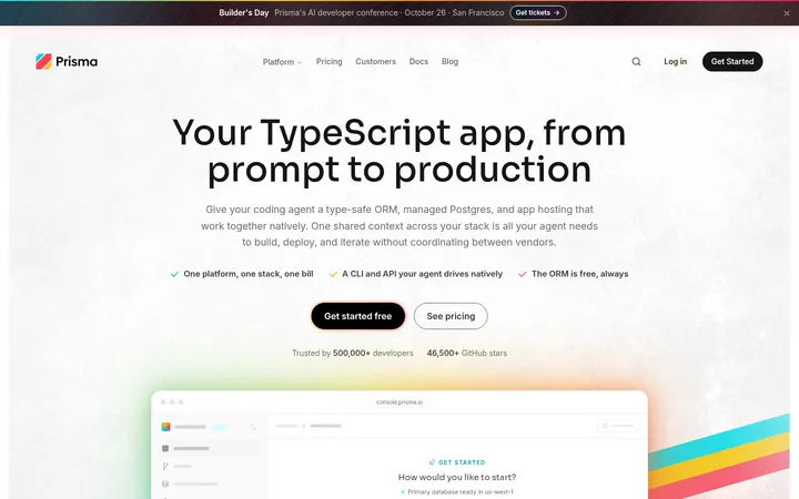
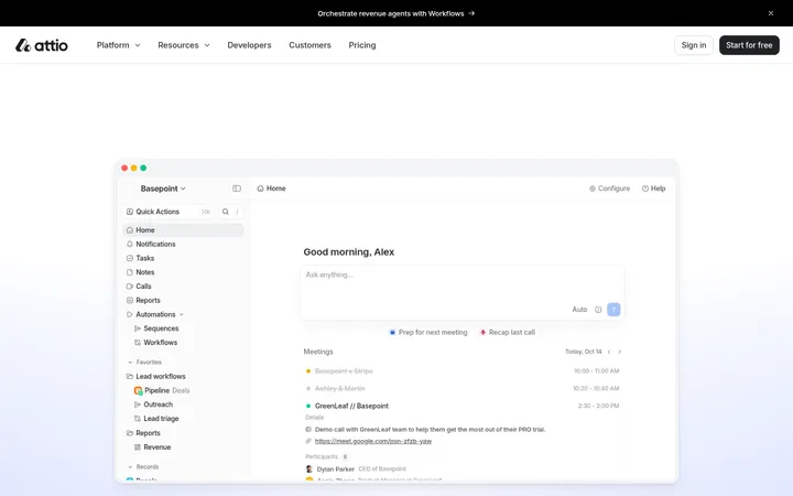
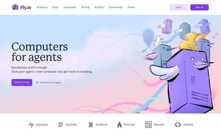
North star · Keep the page predominantly white and spacious, using soft pastel gradients as occasional atmosphere and violet to mark meaningful actions.
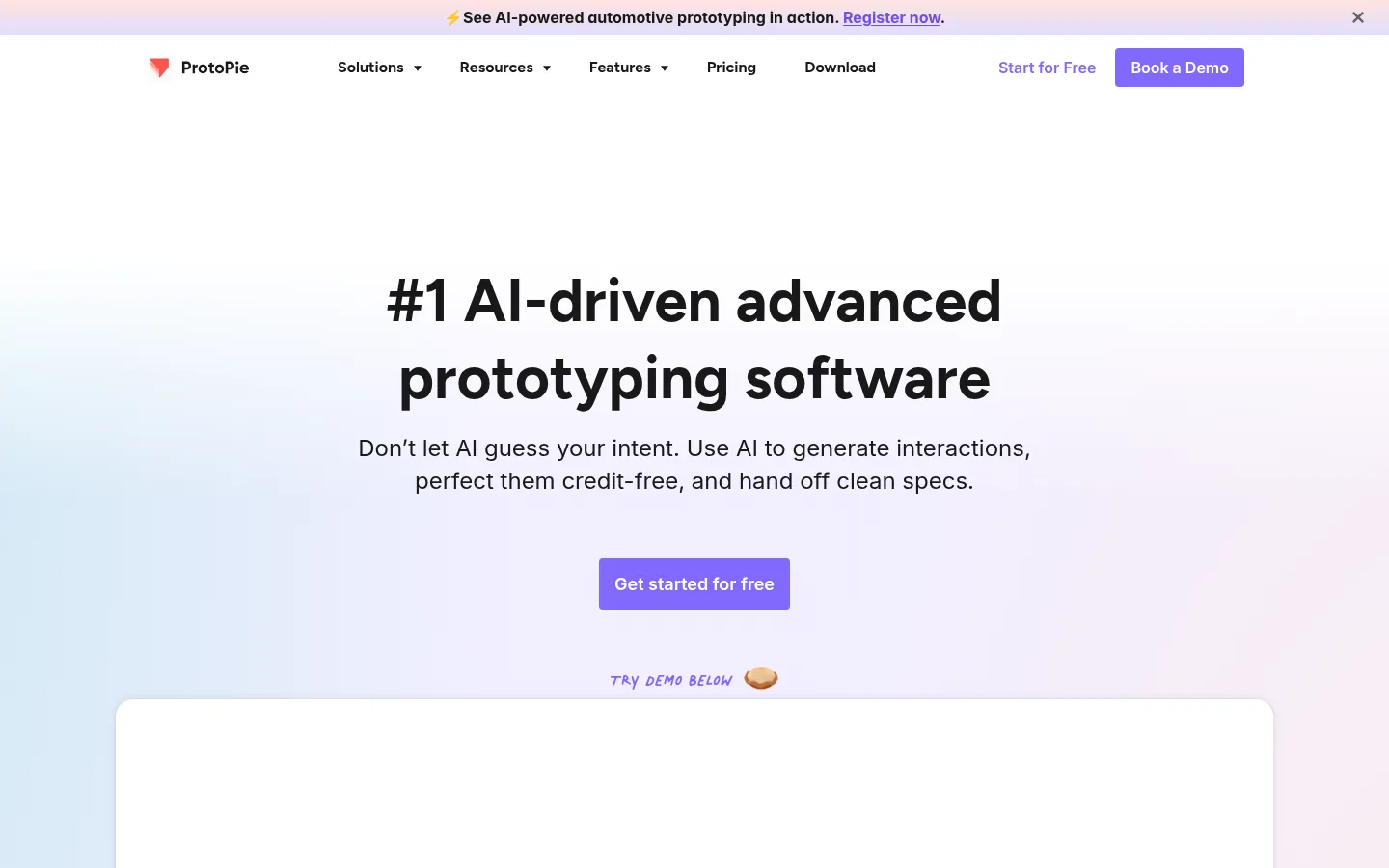
The page uses white as its dominant canvas, letting the product narrative breathe while pale lavender, blush, and aqua gradients gently distinguish selected bands. Violet is the clearest brand signal: it appears on primary calls to action, selected links, and small emphasis details rather than overwhelming large surfaces. Typography is strongly hierarchical: bold Figtree headlines anchor centered sections, while Inter handles navigation, body copy, and supporting labels. A handwritten display face appears as a small expressive accent. The layout alternates wide, quiet text-led sections with focused product demos, testimonial media, resource cards, comparison content, and a gallery. Broad whitespace separates these chapters; rounded cards and media containers soften the otherwise clean geometry. Photography and interface captures demonstrate practical product use, while playful 3D-like illustrations add character in promotional areas. The overall effect is polished and approachable, with product clarity taking precedence over decorative complexity.
Bold section headlines and prominent feature titles.
ProtoPie
28px
700
1.4
0
四级标题
Supporting subsection headings.
The quick brown fox 敏捷的狐狸
24px
400
1.4
0
正文
Paragraphs, feature descriptions, and general copy.
The quick brown fox 敏捷的狐狸
16px
400
1.5
0
辅助文字
Small labels, notes, and supporting metadata.
The quick brown fox 敏捷的狐狸
14px
400
1.4
0
导航
Bold primary navigation labels.
The quick brown fox 敏捷的狐狸
16px
700
1.4
0
链接
Inline links and secondary calls to action.
The quick brown fox 敏捷的狐狸
16px
400
1.5
0
间距与布局
基准单位 8px · 密度:适中
64px版块间距
8px元素间距
32px卡片内边距
1072px内容最大宽度
4px
6px
8px
10px
12px
14px
16px
20px
22px
24px
30px
32px
40px
48px
64px
Use a centered content frame with a measured maximum width of 1072px, and align most hero and section introductions centrally. The page is comfortable rather than dense: substantial open space separates chapters, with an 8px base spacing system and measured section gaps of 64px. Alternate text-led introductions with wide product media, card groups, and gallery rows. Keep navigation compact and horizontal on desktop, and preserve broad margins around the content frame.
圆角与层次
按钮 · 4px
卡片 · 20px
图片 · 50%
导航 · 4px
链接 · 12px
sm · card
md · link, card
sm · link
sm · card
The page is largely flat, with white space and pastel gradients doing most of the separation work. Cards use rounded corners and restrained shadows rather than strong borders. Layer product media and small decorative elements selectively; keep shadows soft and localized so the interface remains light.
组件
下面的预览按实测的按钮、输入框、徽标、卡片样式重建(字体用替代字体)。
Primary CTA
Compact violet button with a 4px measured radius; use for actions such as free signup and demo requests.
Top navigation
Single horizontal row with brand mark, grouped navigation links, a text-style signup action, and a prominent demo button.
Announcement strip
Slim tinted banner above the navigation, with a short message, an emphasized registration link, and a close affordance.
Hero product demo
Centered bold headline and supporting copy sit above a violet CTA; a broad rounded media area anchors the demonstration.
Feature card
Rounded content card with generous padding; measured card radius is 20px, with pale neutral backing used for a feature example.
Resource cards
Three adjacent cards pair concise descriptions and links with illustrative product-related imagery.
Footer link columns
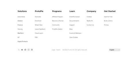
Multi-column navigation groups use compact headings and muted links, with a subdued utility row beneath.
Imagery · Product imagery centers on interface demonstrations: device mockups, software captures, and video-style testimonial media show the prototyping workflow. Supporting sections use gallery previews and small product-related illustrations, including playful dimensional objects. Keep media in clean, rounded containers and allow it to sit against white or softly tinted backgrounds. Use decorative graphics as accents, not as substitutes for clear product evidence.
Reserve violet for primary actions and meaningful emphasis.
Use pale gradients to softly distinguish selected sections.
Center hero and section introductions.
Give product demonstrations room to breathe.
Use bold Figtree for headlines and Inter for supporting copy.
✕ 不该做
Do not turn the page into a dark interface.
Do not fill every section with a colored background.
Do not use violet as a large, dominant page field.
Do not crowd product media with decorative elements.
Do not introduce heavy borders or dramatic shadows.
Do not apply the handwritten typeface to long body copy.
给 AI 的提示词
想快速出一个同风格的新页面,把这段话连同 DESIGN.md 一起发给 AI。
Build a new page in ProtoPie’s airy product-storytelling style. Use Gallery White (#ffffff) as the dominant canvas, with Soft Ink (#181818) headlines and readable Inter supporting copy. Set large, friendly headings in bold Figtree and reserve the handwritten accent for brief expressive moments. Make Proto Violet (#8169ff) the clear primary-action color, using Vivid Violet (#6d4ff0) for select links. Add Lavender Mist (#e9e5ff), Lilac Wash (#f1efff), Blush Haze (#ffece9), or Aqua Veil (#dff6f6) as restrained gradient atmosphere, not dense panels. Center section introductions in a broad content frame, separate chapters with generous whitespace, and pair concise copy with clear product captures or demonstrations. Favor rounded media and cards, soft shadows, and a compact desktop navigation. Keep illustration playful but subordinate to product clarity.