North star · Keep the interface nearly black and typographic; reserve cinematic color for the hero artwork and use fine outlines to structure content.
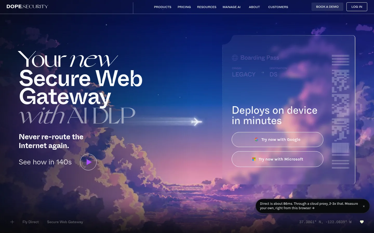
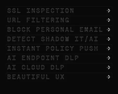
The page uses #090909 as a nearly continuous canvas, with little tonal separation between sections. The visual contrast comes from pale typography and the opening hero artwork: a saturated blue-violet sky with pink clouds and a translucent boarding-pass-style product panel. That scenic palette belongs to the hero image, not the interface’s core color system. Whyte Inktrap carries the large, compact headlines and lighter body copy; Whyte Inktrap Mono gives feature labels a technical, uppercase, widely tracked outline treatment. Navigation is small and uppercase. Content is mostly left-aligned and vertically spacious, with a single-column flow and thin outlined feature rows rather than filled cards. White and cool off-white mark headings, controls, and links; muted gray is reserved for secondary details and hairlines. Purple is a restrained accent, most visible in the play control and subtle glow. Rounded pill actions contrast with the otherwise precise, flat-edged layout.
配色
点色块复制色值。用途说明来自对页面的实测位置(背景、文字、描边、按钮)与截图判读。
品牌色
强调色
表层色
中性色
功能色
页面底色 · Night Canvas主文字 · Signal White次要文字 · Quiet Graphite描边 · Quiet Graphite强调 · Violet Signal
Display and headline face, body copy, navigation, and links.
Aa 设计
Whyte Inktrap Mono
网络字体 · 字重 400 · 占比 19%
免费替代:Space Mono
Oversized feature labels and technical uppercase headings.
Aa 设计
Karla
网络字体 · 字重 400 / 700 · 占比 10%
免费替代:Karla
Captions and the small latency callout.
Aa 设计
GrandSlang
网络字体 · 字重 400 · 占比 1%
免费替代:Cormorant Garamond
Rare decorative emphasis in display copy.
角色
示例
字号
字重
行高
字距
特大标题
Oversized hero display copy with expressive capitalization.
dope.security
88px
500
0.8
-0.03em
一级标题
Primary hero headline, set in bold, tightly tracked lines.
dope.security
80px
700
0.9
-0.07em
二级标题
Large uppercase mono feature-section heading.
dope.security
73.5px
400
0.9
0.2em
三级标题
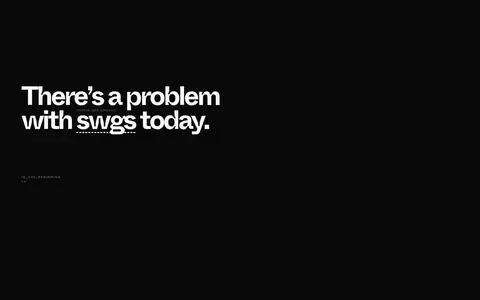
Prominent section headlines, including the SWG problem statement.
dope.security
48px
400
1.2
0
四级标题
Secondary feature or product panel headings.
dope.security
40px
500
1.2
0
正文
Light-weight explanatory copy and hero supporting text.
The quick brown fox 敏捷的狐狸
20px
300
1.6
0
辅助文字
Small annotations and product-interface details.
The quick brown fox 敏捷的狐狸
13px
400
1.3
0
导航
Compact uppercase site navigation.
The quick brown fox 敏捷的狐狸
12px
400
1
0
眉题
Technical uppercase labels above or beside content.
dope.security
73.5px
400
0.9
0.2em
代码
Oversized mono-style technical feature labels.
const style = 1;
73.5px
400
0.9
0.2em
间距与布局
基准单位 8px · 密度:适中
72px版块间距
16px元素间距
—卡片内边距
1294px内容最大宽度
1px
3px
6px
8px
9px
10px
12px
15px
16px
18px
20px
24px
26px
32px
40px
64px
The page follows a single-column section flow on a near-black canvas, with a measured page max width of 1294px. The opening viewport places large, left-aligned headline copy opposite a translucent product panel over full-bleed hero imagery. Subsequent features use horizontal outlined rows with generous separation, followed by a sparse problem statement and long dark intervals. The measured spacing system uses an 8px base unit, a 72px section gap, and comfortable density. Keep the composition open rather than filling every region with cards.
圆角与层次
按钮 · 9999px
导航 · 11px
链接 · 8px
hairline · nav
md · button
The interface is mostly flat, with no prominent card-shadow system. Thin gray and white borders define navigation, feature rows, and controls. The hero panel gains depth through translucency and layered image gradients rather than a raised card. A small latency callout uses a dark fill, charcoal border, and measured soft shadow.
组件
下面的预览按实测的按钮、输入框、徽标、卡片样式重建(字体用替代字体)。
Top navigation
Compact horizontal menu on the dark canvas, with uppercase links, a fine divider, and outlined login action.
Hero headline
Large left-aligned display statement, combining bold sans-serif lines with a more expressive treatment for selected words.
Product panel
Translucent boarding-pass-style panel over the hero image, containing a short deployment message and pill-shaped sign-in actions.
Feature list
Stacked, thinly outlined horizontal rows; oversized uppercase mono labels and a right-aligned arrow keep each item scannable.
Video affordance
Small circular outlined play control paired with a short watch-time prompt and a restrained violet play symbol.
Latency callout
Small black rounded callout with compact Karla copy, charcoal border, and subtle shadow.
Imagery · The hero is defined by cinematic sky imagery: deep blue and violet tones, pink clouds, and a luminous horizon. A translucent boarding-pass-inspired product panel overlays the right side, while headline and play affordance sit left. Use dark gradients at image edges to blend into the black canvas. Later imagery is sparse; the page’s saturated colors are chiefly part of the hero artwork, not the interface palette.
Keep headings bright and clearly separated from muted copy.
Use the mono face for technical uppercase feature labels.
Structure features with thin outlined rows instead of filled cards.
Let hero imagery carry the saturated blue-violet and pink tones.
Use rounded pill shapes for primary sign-in actions.
✕ 不该做
Do not spread vivid gradients across the whole interface.
Do not introduce unmeasured colors or decorative surface fills.
Do not crowd the page with dense card grids.
Do not use the mono face for long body paragraphs.
Do not give secondary text the same emphasis as the main headline.
Do not add heavy shadows to otherwise flat content.
给 AI 的提示词
想快速出一个同风格的新页面,把这段话连同 DESIGN.md 一起发给 AI。
Build a new page in the dope.security visual style. Use Night Canvas (#090909) for the dominant background, Cool Porcelain (#f7f9fa) and Signal White (#ffffff) for key text and controls, and Quiet Graphite (#6b6b6b) for muted details and hairlines. Keep Violet Signal (#6c4bd6) as a small accent. Set large, tightly tracked headlines in a Whyte Inktrap-like sans; use a widely tracked uppercase mono for technical labels. Maintain a single-column section flow with generous dark breathing room and fine outlined feature rows. If using a hero image, keep its color cinematic and blend its edges into the canvas with dark overlays. Prefer flat surfaces, subtle borders, and pill-shaped primary actions over raised cards or busy grids.