North star · Treat the page as a living editorial poster: let oversized condensed type, precise pink grid lines and sparse playful graphics organize the experience.
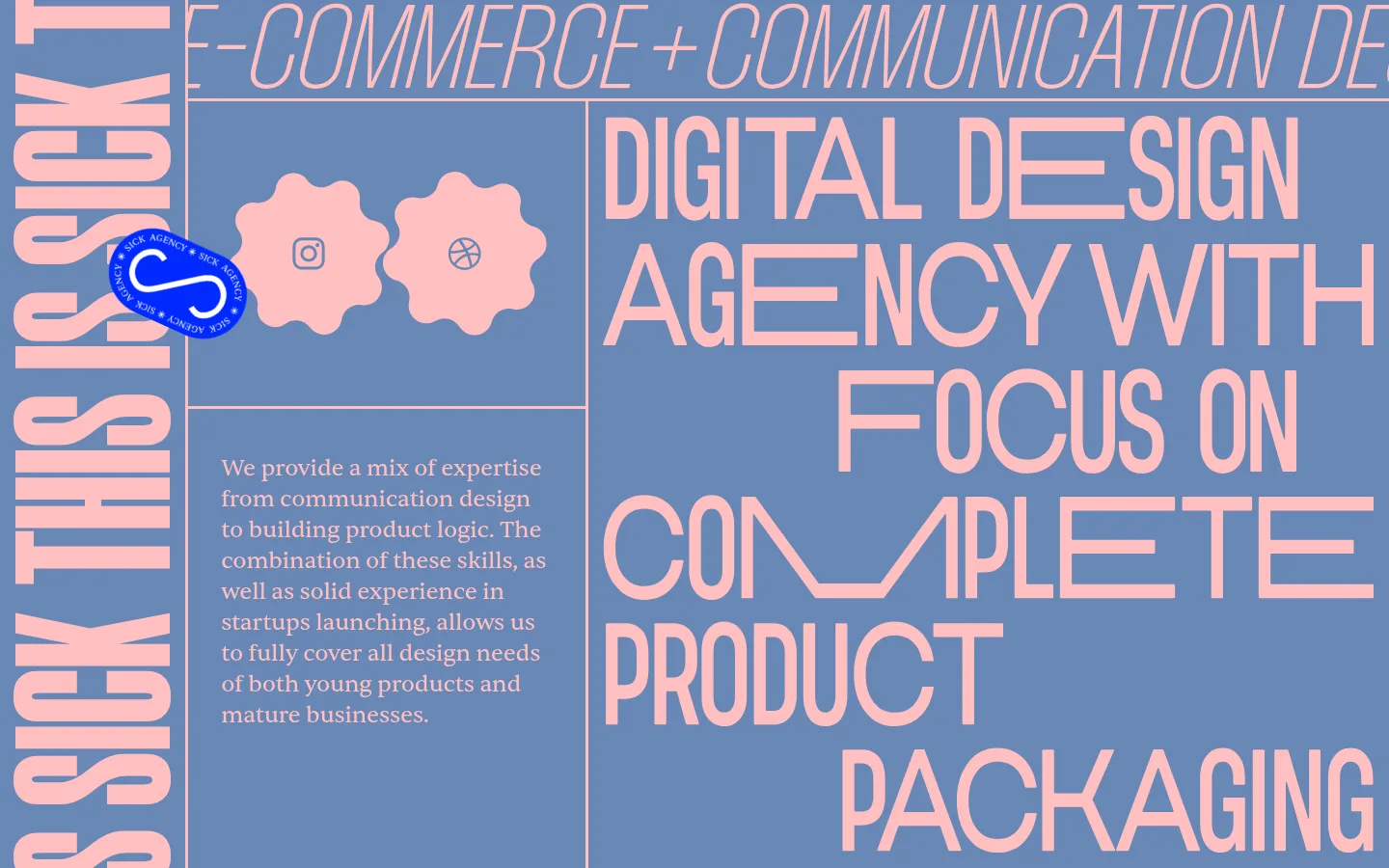
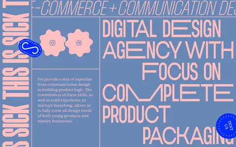
The page is built around a restrained, memorable palette: muted blue fills the canvas, while pale pink carries nearly all of the headline and body text. Fine pink rules divide the canvas into an asymmetric editorial grid; a vivid blue button and sticker-like marks provide small, high-energy interruptions. Display typography does most of the visual work. Tall, tightly set uppercase letters create a monumental headline that occupies the right side and continues beyond the viewport, while a vertical phrase anchors the left edge. A small serif paragraph balances the condensed typography with a quieter reading texture. The image area is sparse rather than photographic: simple social icons sit inside pink scalloped shapes, and circular graphic badges add personality. Broad open blue areas keep the dense type legible. The overall effect is flat, graphic, and intentionally poster-like, with generous section-scale breathing room rather than conventional cards or soft effects.
配色
点色块复制色值。用途说明来自对页面的实测位置(背景、文字、描边、按钮)与截图判读。
品牌色
强调色
表层色
页面底色 · Muted Periwinkle表层 · Pure Black主文字 · Blush Signal描边 · Electric Cobalt强调 · Blush Signal强调 2 · Muted Periwinkle强调 3 · Electric Cobalt
文字
背景
对比度
WCAG
#ffbfbf Blush Signal
#6888b7 Muted Periwinkle
2.32:1
不达标
#ffbfbf Blush Signal
#000000 Pure Black
13.46:1
AAA
#ffbfbf Blush Signal
#6888b7 Muted Periwinkle
2.32:1
不达标
#ffbfbf Blush Signal
#000000 Pure Black
13.46:1
AAA
字体
字号阶梯:Custom(比例约 3.089,正文 24px)。示例用免费替代字体渲染,数值为实测。
Aa 设计
Sentient
网络字体 · 字重 400 · 占比 60%
免费替代:Cormorant Garamond
Editorial paragraph copy and CTA label
Aa 设计
Thunder
网络字体 · 字重 300 · 占比 35%
免费替代:Oswald
Large uppercase headline and prominent vertical lettering
Aa 设计
Morganite
网络字体 · 字重 900 · 占比 5%
免费替代:Bebas Neue
Measured display role; not clearly distinguishable in the supplied first viewport
角色
示例
字号
字重
行高
字距
特大标题
Oversized typographic emphasis, not prominent in the supplied first viewport.
SICK AGENCY
229px
900
0.7
0
一级标题
Main uppercase agency services manifesto on the right.
SICK AGENCY
122px
300
0.65
0
正文
Compact agency introduction in the lower-left text panel.
The quick brown fox 敏捷的狐狸
24px
400
1.33
-0.01em
按钮
Label inside the rounded TEXT US call-to-action.
The quick brown fox 敏捷的狐狸
24px
400
1.1
0
间距与布局
基准单位 4px · 密度:宽松
172px版块间距
—元素间距
—卡片内边距
—内容最大宽度
1px
5px
6px
8px
12px
14px
16px
36px
48px
120px
172px
A full-canvas, two-column editorial composition is subdivided with thin pink rules into unequal panels. A narrow vertical strip at the far left carries oversized rotated lettering; the central-left column holds small graphic marks above a compact paragraph, while the right side is dominated by a very large, right-aligned headline. The headline intentionally runs beyond the viewport. The page feels spacious at section scale but densely composed within its grid, with no measured maximum width or conventional card system.
圆角与层次
按钮 · 50%
没有测到阴影:页面是扁平的,层次靠底色和描边区分。
The composition is predominantly flat, with no measured shadow system. Thin pink rules create structure and separation instead of card surfaces. The blue CTA and circular graphic badges may overlap nearby elements like stickers, but keep layering limited and edges sharp rather than adding soft depth effects.
组件
下面的预览按实测的按钮、输入框、徽标、卡片样式重建(字体用替代字体)。
Editorial grid
Use thin blush rules to divide the blue canvas into asymmetrical panels, including a narrow left rail and a large headline field.
Oversized manifesto
Set the service statement in tall, light, uppercase condensed lettering with dramatic line breaks and deliberate cropping.
Vertical brand phrase
Place oversized blush lettering vertically along the far-left edge as a strong graphic anchor.
Intro copy panel
Set a short serif paragraph in a compact block, aligned within the lower-left grid panel.
Social icon badges
Use simple icons centered in flat blush scalloped shapes, keeping illustration secondary to the headline.
Contact CTA
Use a rounded electric-cobalt button with white Sentient text; measured styling uses a 50% radius.
Imagery · The opening view uses graphic illustration rather than photography: two pink scalloped badges contain simple social symbols, accompanied by small circular sticker-like marks. Keep these elements crisp, flat and secondary to the typography. Use them as playful punctuation within the grid, not as large hero media or realistic product imagery.
Use cobalt #0029ff only for small, high-contrast accents.
✕ 不该做
Do not replace the poster-like grid with generic cards.
Do not introduce gradients or decorative shadows.
Do not use photography as the main visual anchor.
Do not crowd the headline with extra interface controls.
Do not add colours outside the measured palette.
Do not make every graphic element equally prominent.
给 AI 的提示词
想快速出一个同风格的新页面,把这段话连同 DESIGN.md 一起发给 AI。
Build a new page in the SICK AGENCY visual style as a graphic editorial poster, not a conventional card-based agency template. Use Muted Periwinkle (#6888b7) as the dominant canvas and Blush Signal (#ffbfbf) for headlines, copy and thin structural rules. Organize content with an asymmetric grid, a narrow vertical typographic rail, compact editorial text, and a dominant oversized statement in light, tall uppercase lettering. Keep body copy serif-led and readable. Use Electric Cobalt (#0029ff) sparingly for a rounded, high-contrast CTA or small sticker-like accent; reserve white for text on that button. Add only a few flat, playful icons or badges. Preserve open areas around the typography, allow intentional crop at the viewport edge, and avoid gradients, heavy shadows and generic card surfaces.