North star · Let the yellow canvas and bold black graphic language lead, then use food imagery and varied content blocks to sustain the pace.
The homepage commits to a vivid yellow canvas, using black as the principal ink for navigation, headings, outlines, mascot art, and compact calls to action. White and warm off-white surfaces appear selectively: the recipe feed sits on white, while product cards use a softer cream that distinguishes packaging without weakening the overall yellow identity. Typography supplies much of the personality. Large, rounded display lettering anchors the hero; a grotesque sans handles navigation, headlines, and uppercase buttons; a practical sans supports body copy. The layout alternates expansive, centered brand moments with product cards, testimonial content, a full-bleed video area, and a recipe feed. Food photography and hand-drawn character illustrations add texture to otherwise flat color fields. Dark hairlines define section boundaries and card edges, while generous open areas keep the page energetic rather than cluttered.
Navigation, headings, buttons, links, and captions.
Aa 设计
Gooper
网络字体 · 字重 400 / 700 · 占比 16%
免费替代:Fraunces
Decorative display lettering, especially the oversized brand wordmark.
角色
示例
字号
字重
行高
字距
特大标题
Oversized expressive wordmark and brand-led decorative display moments.
Yellowbird
91px
400
1.05
-0.028em
一级标题
Primary page headline or prominent introductory statement.
Yellowbird
61px
400
1.1
-0.04em
二级标题
Uppercase section titles and emphatic editorial headings.
Yellowbird
45px
400
0.9
-0.04em
三级标题
Secondary feature and content-feed headings.
Yellowbird
40.5px
400
1.1
-0.03em
四级标题
Compact supporting headings and product-category labels.
Yellowbird
30px
400
0.78
-0.006em
正文
Introductory paragraphs and readable explanatory copy.
The quick brown fox 敏捷的狐狸
16px
400
1.46
-0.012em
辅助文字
Small recipe labels, attribution, and supporting metadata.
The quick brown fox 敏捷的狐狸
13.5px
400
1.2
-0.014em
按钮
Large uppercase primary actions.
Yellowbird
45px
400
0.9
-0.04em
导航
Main store navigation and menu labels.
Yellowbird
30px
400
0.78
-0.006em
链接
Recipe titles and prominent inline links.
The quick brown fox 敏捷的狐狸
27px
400
1.2
-0.03em
眉题
Small uppercase section markers and labels.
The quick brown fox 敏捷的狐狸
16px
600
1.2
0.05em
间距与布局
基准单位 1px · 密度:宽松
50px版块间距
75px元素间距
108px卡片内边距
1434px内容最大宽度
6px
10px
13px
15px
17px
18px
20px
24px
30px
50px
75px
A spacious, long-form storefront arranged as full-width horizontal bands, with a narrow announcement strip and a bordered navigation bar above the hero. The measured page maximum width is 1434px; content shifts between centered single-column statements, three product cards, a multi-column recipe feed, and a tiled social gallery. The rhythm is intentionally varied: large graphic pauses are followed by denser product and media sections. Use the measured spacing scale and section gaps, keeping card and image groupings clearly separated rather than adding a uniform grid everywhere.
圆角与层次
按钮 · 50%
卡片 · 30px
图片 · 30px
没有测到阴影:页面是扁平的,层次靠底色和描边区分。
The visual language is mostly flat: strong yellow fields, black typography, and thin black section dividers do the structural work instead of shadows. Cards and media rely on measured black outlines and rounded corners, with the cream product surfaces visibly distinct from the canvas. Layer small illustrated labels and mascot graphics over content sparingly.
组件
下面的预览按实测的按钮、输入框、徽标、卡片样式重建(字体用替代字体)。
Store navigation
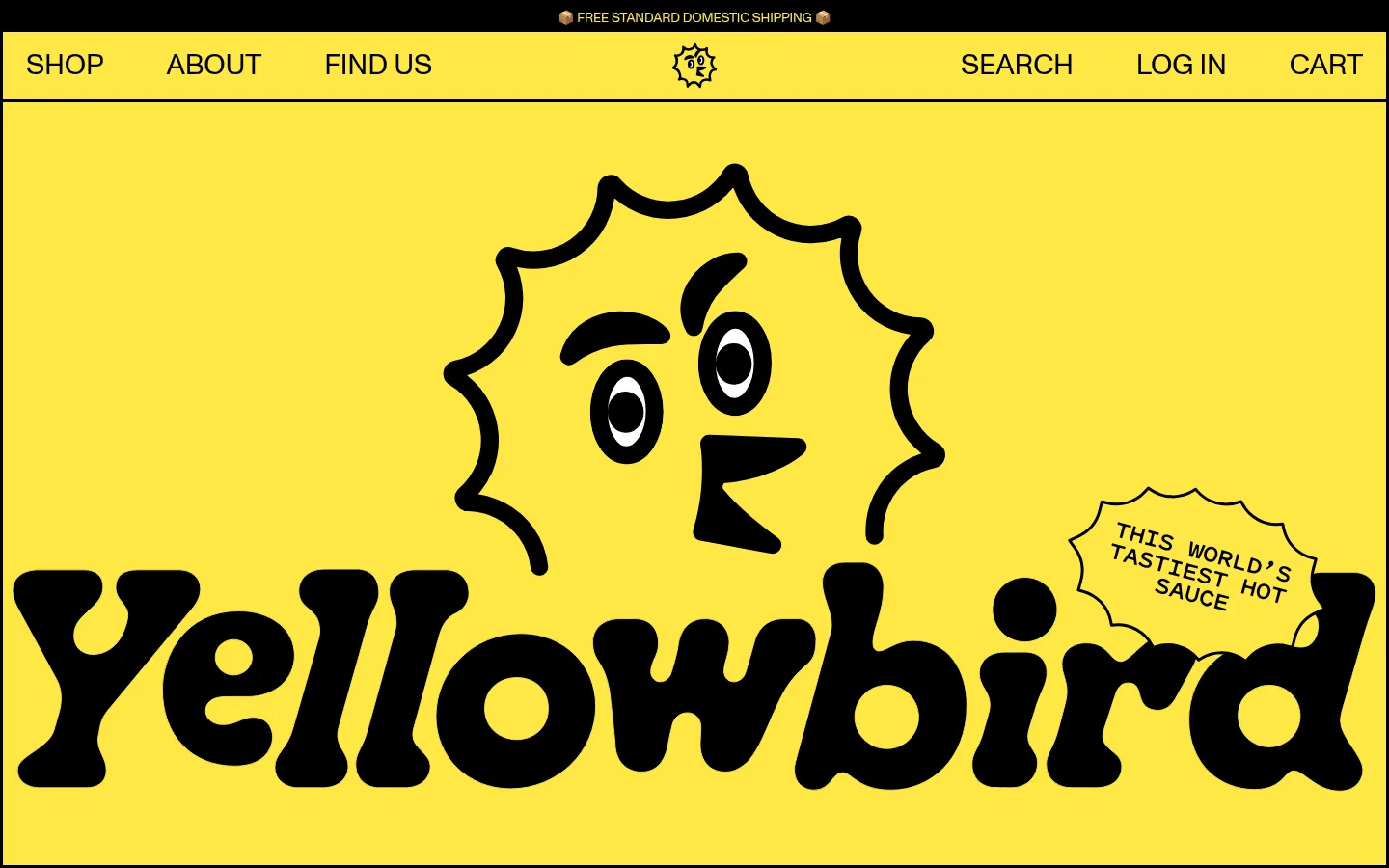
Yellow horizontal bar with black, oversized grotesque links, centered mascot mark, and black divider rules.
Hero wordmark
Large black display lettering and hand-drawn mascot artwork dominate the yellow hero field; a small irregular label carries the brand claim.
Product category cards
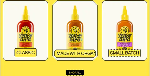
Three bottle-led cards use a warm cream surface, black outlines, rounded corners, and compact yellow category labels.
Shop CTA
Black rectangular action with yellow uppercase text, shown between product content and subsequent sections.
Testimonial panel
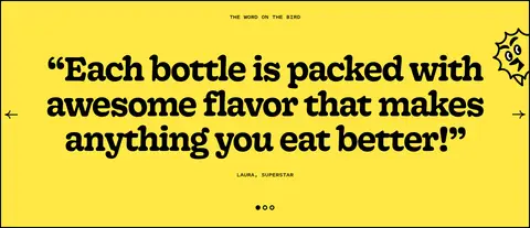
Centered oversized quote on yellow, supported by a small uppercase attribution, carousel arrows, and pagination dots.
Recipe cards
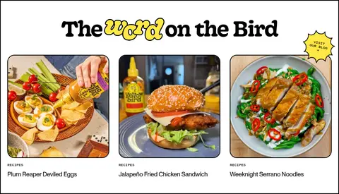
White editorial section with food photography, black rounded outlines, small category captions, and prominent recipe titles.
Newsletter footer
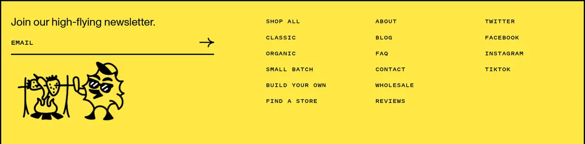
Yellow footer combines an email field with black underline, compact link columns, mascot artwork, and small legal links.
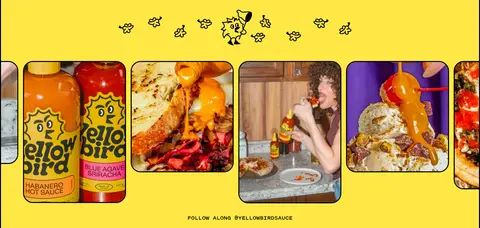
Imagery · Pair crisp bottle photography and colorful prepared-food images with hand-drawn black mascot illustrations. Product shots sit inside warm cream cards; editorial food photography is framed as recipe content on white. A prominent media band uses video with a dark surround and rounded frame, while the social gallery uses a row of varied lifestyle and product images. Keep imagery vivid and relatively natural, not heavily filtered.
Keep Bird Yellow (#ffe845) as the dominant canvas.
Use Sauce Ink (#000000) for strong text and outlines.
Reserve white and cream for clearly defined content surfaces.
Pair expressive display lettering with practical sans-serif copy.
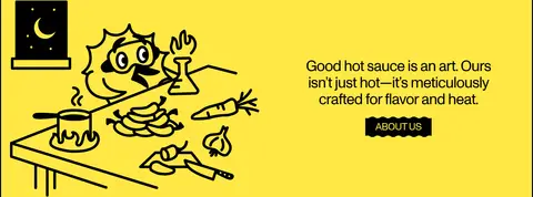
Use hand-drawn mascot art as a recurring brand accent.
Alternate broad color fields with compact image-led grids.
✕ 不该做
Do not soften the palette with unmeasured colors.
Do not use shadows to replace the black outline system.
Do not make every section the same grid or density.
Do not use decorative display type for long paragraphs.
Do not crowd the large yellow areas with unnecessary elements.
Do not treat product photography as generic background texture.
给 AI 的提示词
想快速出一个同风格的新页面,把这段话连同 DESIGN.md 一起发给 AI。
Build a new Yellowbird-style storefront page with a bold, playful food-brand identity. Use Bird Yellow (#ffe845) as the main canvas and Sauce Ink (#000000) for typography, mascot art, borders, and prominent actions. Use Gallery White (#ffffff) for a distinct editorial content band and Bottle Cream (#fbfaf2) for product cards. Pair rounded expressive display lettering for brand moments with a clean grotesque for navigation, headings, and uppercase buttons, plus readable sans-serif body copy. Structure the page as varied horizontal bands: brand-led hero, product cards, editorial or testimonial content, and image-rich media. Favor hand-drawn mascot illustrations and vivid, natural food photography. Keep surfaces flat, define cards with black outlines, and use generous open space between content groups.