North star · Keep the interface quiet and spacious, then use one confident purple, media-rich split hero to make the product feel human and capable.
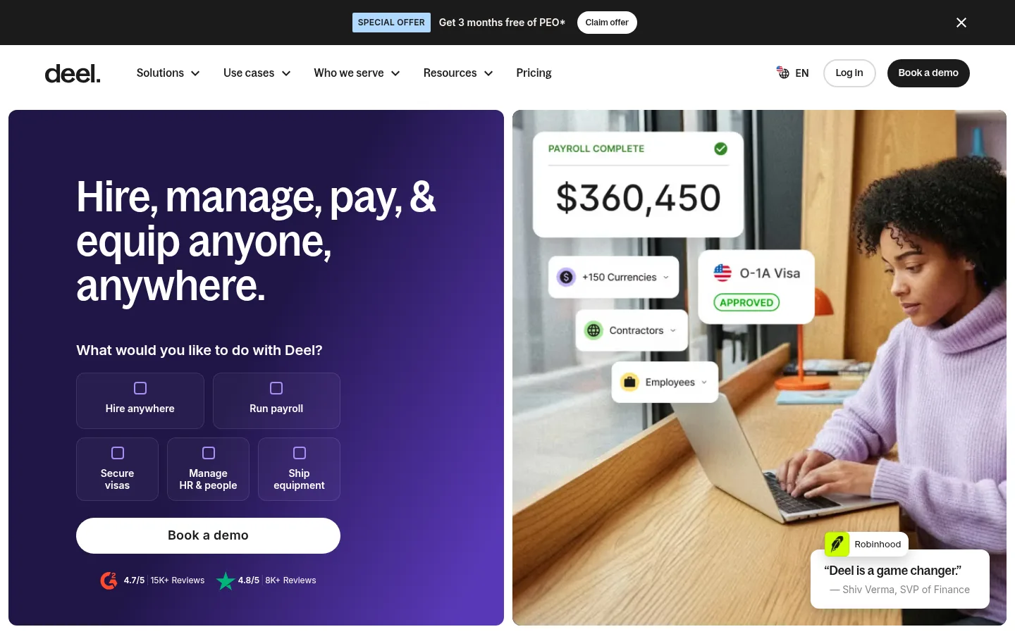
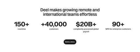
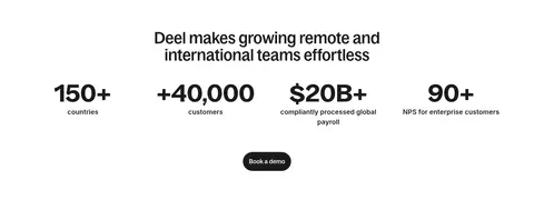
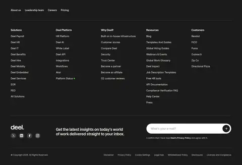
The page establishes a bright, white foundation, with near-black text and restrained pale borders keeping navigation and long-form content calm. Its opening hero is the visual exception: a rounded, two-part composition pairs a deep purple gradient and large white headline with a lifestyle photograph overlaid by payroll and visa interface cards. Purple also marks interactive product choices, but the purple and blue tones inside screenshots, customer logos, and photography should be treated as media content rather than a reason to recolor the whole interface. Bagoss Condensed gives headlines a distinctive, compact silhouette; Inter handles navigation, body copy, and utility text, while Bagoss Standard appears on buttons. The main content alternates spacious white sections, pale product cards, and a large charcoal product showcase. A centered metrics block creates a simple pause before the dense dark footer. Rounded cards and pill controls soften the otherwise crisp grid; subtle shadows are reserved for layered interface elements.
Navigation, body and caption copy, utility labels, and most interface text.
Aa 设计
BagossCondensedFont
网络字体 · 字重 500 / 400 · 占比 10%
免费替代:Barlow Condensed
Display and page headings, including the prominent hero headline.
Aa 设计
BagossStandardVF
网络字体 · 字重 500 · 占比 4%
免费替代:Inter
Button labels and selected short action text.
角色
示例
字号
字重
行高
字距
特大标题
Large condensed statements and standout section headings.
Deel
60px
500
1.05
-0.003em
一级标题
The split-hero headline introducing Deel’s global workforce platform.
Deel
44px
500
1.05
-0.005em
二级标题
Section headings for product, reviews, and supporting content.
The quick brown fox 敏捷的狐狸
24px
500
1.15
0
正文
Descriptive copy, product explanations, and supporting hero text.
The quick brown fox 敏捷的狐狸
20px
400
1.6
-0.01em
辅助文字
Small card details, testimonials, and secondary information.
The quick brown fox 敏捷的狐狸
16px
400
1.7
-0.005em
按钮
Short action labels such as Book a demo.
The quick brown fox 敏捷的狐狸
15px
500
1.6
0.025em
导航
Header navigation and page-level menu labels.
The quick brown fox 敏捷的狐狸
14px
600
1.7
0
眉题
Uppercase section markers and compact category labels.
The quick brown fox 敏捷的狐狸
12px
700
1.7
0.06em
间距与布局
基准单位 4px · 密度:适中
64px版块间距
4px元素间距
20px卡片内边距
1312px内容最大宽度
2px
4px
6px
8px
12px
16px
20px
24px
32px
48px
64px
The page uses a centered, wide content frame measured at a 1312px maximum, with a comfortable density and clear section breaks. The hero is a broad two-column split: text and action tiles on the left, photographic product proof on the right. Below it, a logo cloud and product grid give way to centered product storytelling, reviews, and statistics. The footer is a dark, multi-column information area. Preserve the generous white intervals and align repeated content to consistent edges rather than compressing every section.
圆角与层次
按钮 · 9999px
输入框 · 9999px
卡片 · 24px
图片 · 24px
导航 · 2px
链接 · 16px
xl · other
lg · other, card
Most sections are flat, with whitespace doing the work of separation. Use fine measured gray borders where controls need definition and reserve soft layered shadows for floating interface or media elements. Cards and media have generous rounding; the hero’s gradient and image carry more visual depth than ornamental shadows.
组件
下面的预览按实测的按钮、输入框、徽标、卡片样式重建(字体用替代字体)。
Announcement and navigation
A dark offer strip sits above a white navigation row. Keep the announcement compact, with a contrasting claim action and a separate dark pill-shaped demo action in the header.
Split hero
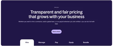
Pair a rounded purple-gradient text panel with a rounded workplace photo. Set the condensed white headline above selectable action tiles and a prominent white demo button.
Hero action tiles
Present task choices as outlined, translucent tiles with small icon marks and concise labels. Keep them grouped beneath the supporting prompt, inside the hero panel.
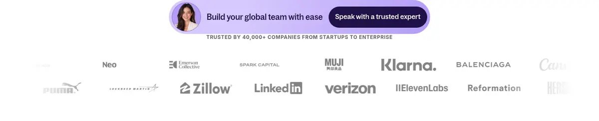
Customer logo cloud
Follow the hero with a compact trust statement and a horizontal field of customer marks on white; keep logos secondary and visually quiet.
Product card grid
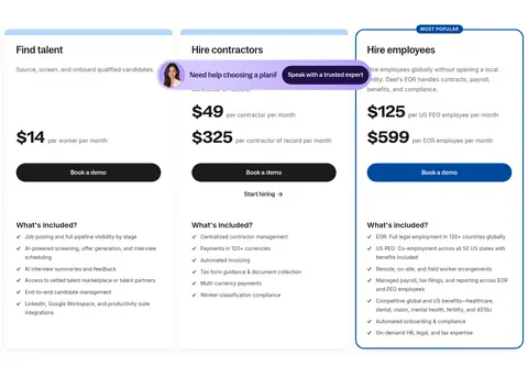
Use a two-row product overview with pale, rounded cards, concise titles, short descriptions, and interface imagery contained within each card.
Product showcase
Create a large rounded charcoal section with a heading, short proof points, and expansive product imagery; use dark-on-dark panels as supporting content.
Footer
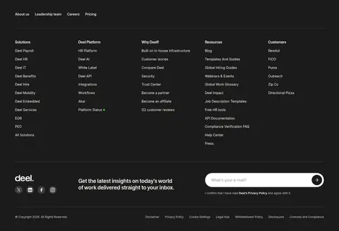
Use a near-black full-width area for reviews, grouped navigation links, newsletter signup, and legal details, with subdued warm-gray secondary text.
Imagery · Lead with human workplace photography paired with floating payroll, currency, and visa interface cards. Product imagery elsewhere is presented in pale rounded cards and a large dark product-showcase band; customer logos and testimonial video thumbnails add proof. Keep photography natural and spacious, and let overlaid interface details remain legible. Purple and blue colors inside interface mockups or photos belong to the imagery, not necessarily to the surrounding UI palette.
Keep the main canvas white and content areas visibly separated by whitespace.
Use Bagoss Condensed-style typography for high-impact headings.
Reserve Deel Violet for focal accents and localized gradient surfaces.
Pair product interface mockups with human-centered photography.
Use near-black surfaces for the footer and selected product storytelling.
Keep controls rounded and labels concise.
✕ 不该做
Do not turn the whole page purple or dark.
Do not treat colors inside photos and product mockups as global UI colors.
Do not crowd the large white intervals between homepage sections.
Do not use generic geometric sans headlines in place of the condensed display voice.
Do not add decorative shadows to every card.
Do not make the footer visually as light as the main canvas.
给 AI 的提示词
想快速出一个同风格的新页面,把这段话连同 DESIGN.md 一起发给 AI。
Build a new Deel-style SaaS page with a Gallery White (#ffffff) foundation, Soft Ink (#1b1b1b) text, and restrained Quiet Rule (#dadada) borders. Use Deel Violet (#5938b7) for a localized gradient focal area, not as a blanket background. Set display headlines in a Bagoss Condensed-like face and use Inter for navigation, body, and supporting labels. Organize the page with a clear header, a human-centered split hero, compact product cards, spacious proof sections, and a deep charcoal footer. Combine real workplace photography with legible product-interface overlays; keep interface mockup colors local to their imagery. Favor rounded panels, pill actions, and flat surfaces, adding soft depth only to layered media or UI. Keep sections calm, aligned, and generously separated.