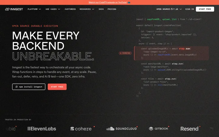
North star · Keep a near-black, sharply structured developer interface and reserve vivid Nuxt green for decisive emphasis.
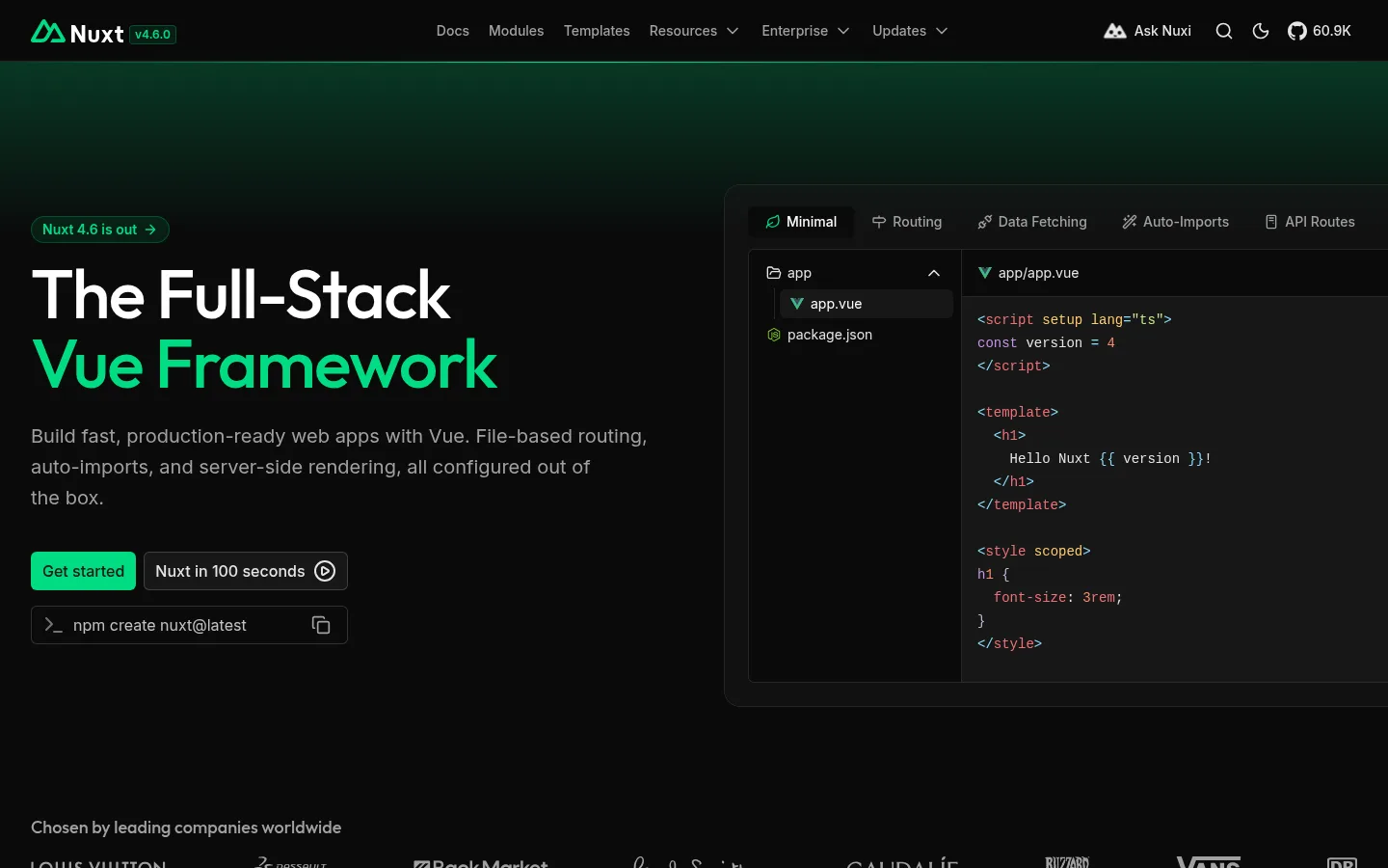
The page is built on a near-black canvas (#0a0a0a), with slightly lighter charcoal surfaces separating cards, media, and testimonial bands. White titles carry the main hierarchy; muted gray supports navigation and body copy, while Nuxt green marks the hero phrase, primary actions, small icons, and selected links. Inter handles most interface and reading text, paired with Outfit for the large hero display. The opening section uses a left-aligned message and CTA beside a dark code-editor preview, with a soft green atmospheric glow behind them. Below, the page alternates centered statements with compact grids, proof points, community portraits, and sponsor logos. Thin charcoal borders define boundaries without making cards feel heavy. Spacing is generous between major sections but dense within feature and sponsor grids, keeping the long page scannable and distinctly technical.
Body copy, navigation, controls, links, and most interface text.
Aa 设计
Outfit
网络字体 · 字重 500 · 占比 6%
免费替代:Outfit
Large hero display and primary headline styling.
Aa 设计
ui-monospace
系统字体 · 字重 400 · 占比 3%
免费替代:JetBrains Mono
Code samples, install commands, and developer-oriented snippets.
角色
示例
字号
字重
行高
字距
特大标题
Hero display headline, with tight tracking and a green-highlighted phrase.
Nuxt
72px
500
1
-0.025em
一级标题
Large page or section heading, chiefly the hero title.
Nuxt
48px
500
1
-0.025em
二级标题
Supporting section headings and explanatory statements.
The quick brown fox 敏捷的狐狸
20px
400
1.6
0
正文
Feature descriptions, testimonials, and general explanatory copy.
The quick brown fox 敏捷的狐狸
15px
400
1.5
0
辅助文字
Compact metadata, card details, labels, and secondary notes.
The quick brown fox 敏捷的狐狸
14px
400
1.43
0
按钮
Primary and secondary action labels.
The quick brown fox 敏捷的狐狸
16px
500
1.5
0
导航
Top-level navigation links.
The quick brown fox 敏捷的狐狸
14px
500
1.43
0
链接
Inline links and text-based calls to action.
The quick brown fox 敏捷的狐狸
16px
400
1.5
0
代码
Install commands and code-editor examples.
const style = 1;
14px
400
1.71
0
间距与布局
基准单位 4px · 密度:紧凑
32px版块间距
4px元素间距
—卡片内边距
1376px内容最大宽度
4px
6px
8px
10px
12px
16px
24px
32px
64px
72px
128px
The homepage uses a broad centered content area with a measured maximum width of 1376px. Its opening hero is a two-column split: copy and actions on the left, a code-interface preview on the right. Later sections shift between centered headings, multi-column feature and proof grids, and image-led split layouts. Major sections have generous breathing room, while cards, sponsor tiles, and feature descriptions are compact. Thin horizontal boundaries and alternating charcoal bands create rhythm without introducing bright backgrounds.
圆角与层次
按钮 · 6px
输入框 · 6px
卡片 · 8px
图片 · 8px
徽标 · 6px
导航 · 4px
链接 · 6px
hairline · card, section
inset · button, badge, input
hairline · card
inset · button, text
The page relies on flat dark surfaces and fine outlines rather than pronounced drop shadows. Cards and media are separated with charcoal hairlines; inset control edges add subtle definition. Layer the hero preview and atmospheric green glow over the canvas without creating a glossy or heavily raised effect.
组件
下面的预览按实测的按钮、输入框、徽标、卡片样式重建(字体用替代字体)。
Hero actions
Pair a Nuxt Green primary button with a dark outlined secondary action and a compact install-command control.
Code preview
Frame a dark editor mockup with a tab strip, file tree, and syntax-coloured code on a charcoal surface.
Feature cards
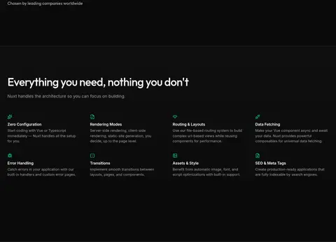
Use compact, text-led cards with small green icons, bright titles, muted descriptions, and subtle boundaries.
Proof points
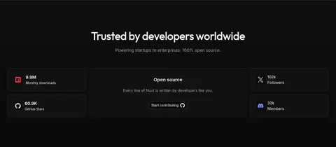
Present download, star, and community metrics in dark tiles with concise labels and restrained icon accents.
Module cards
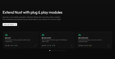
Show package identity, short descriptions, ecosystem metrics, and small actions in a dense card grid.
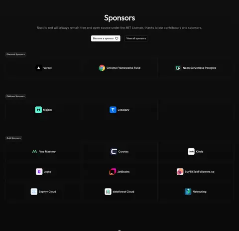
Sponsor tiles
Arrange partner marks in bordered dark cells grouped under compact sponsor-tier labels.
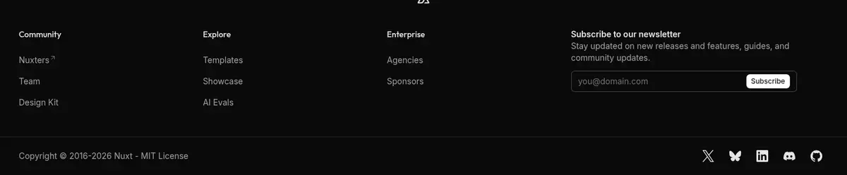
Footer columns
Use muted link groups, a newsletter field, and a low-contrast legal and social row.
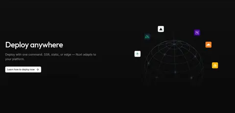
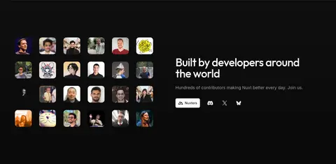
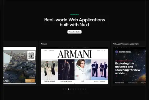
Imagery · The hero pairs its text with a framed code-editor interface, not a lifestyle photograph. Later imagery includes developer portraits, product-site screenshots, sponsor marks, and a subtle deployment illustration. Keep screenshots and logos inside dark, bounded frames; use portrait thumbnails as a consistent grid. Green glows and gradients are atmospheric accents behind the interface, while colourful partner assets remain confined to their own images.
Reserve #00dc82 for primary actions and focused brand emphasis.
Set major display headlines in Outfit and interface copy in Inter.
Use charcoal surfaces and fine borders to distinguish cards.
Keep explanatory text muted and easy to scan.
Use dark-framed product imagery and compact logo grids.
✕ 不该做
Do not introduce large bright section backgrounds.
Do not use green as the default colour for all text.
Do not add heavy shadows or glossy card effects.
Do not let partner artwork dictate the page palette.
Do not use decorative display type for long body copy.
Do not crowd major sections together.
给 AI 的提示词
想快速出一个同风格的新页面,把这段话连同 DESIGN.md 一起发给 AI。
Build a new Nuxt-style developer page on a #0a0a0a Carbon Canvas. Use #111111 Graphite Surface for cards and testimonial bands, and #262626 Border Charcoal for restrained outlines. Set display headlines in Outfit with tight tracking; use Inter for navigation, body copy, and controls, plus a monospace face for code. Apply #ffffff Display White to key headings and #a1a1a1 Quiet Gray to secondary copy. Reserve #00dc82 Nuxt Green for the primary CTA, brand details, and selected headline emphasis; use other accent colours sparingly. Structure content as a wide hero split with a dark product-interface preview, followed by scannable grids, proof points, image-led sections, and a quiet footer. Keep spacing generous between sections and compact inside cards. Prefer flat surfaces, hairlines, and crisp alignment over shadows.