North star · Let a quiet, sharply indexed monochrome catalog frame the assets, never compete with them.
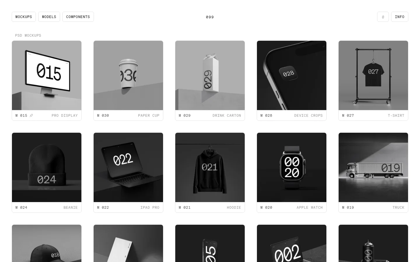
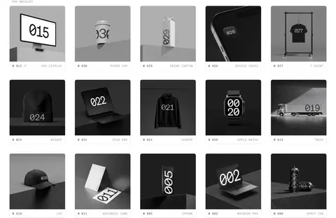
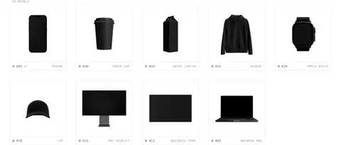
The page uses a near-pure white canvas as a quiet gallery, with near-black text and fine pale borders defining navigation controls and asset cards. Mid-gray is reserved for subdued labels and metadata; the darker charcoal appears primarily in the asset imagery rather than as a broad page surface. Soehne Mono gives the interface a technical, catalog-like voice: headings and labels use uppercase styling and generous tracking, while item names and identifiers remain compact and orderly. The main content is a repeated five-column grid, with each image presented in a restrained rounded card and a slim metadata strip below. Product imagery is mostly monochrome, combining polished mockup renders with clean 3D object previews and simple component demonstrations. Generous white intervals separate the catalog sections without interrupting the browsing rhythm. The result feels more like a carefully indexed design archive than a conventional retail storefront.
All interface typography, headings, navigation, labels, metadata, and controls.
角色
示例
字号
字重
行高
字距
一级标题
Large central wordmark or primary page heading.
099 SUPPLY
54.5px
400
1
0.025em
二级标题
Uppercase catalog section headings.
The quick brown fox 敏捷的狐狸
26px
500
normal
0.18em
正文
Uppercase catalog labels and short interface copy.
The quick brown fox 敏捷的狐狸
12px
400
normal
0.08em
辅助文字
Small card metadata and supporting captions.
The quick brown fox 敏捷的狐狸
11px
400
1.5
0
按钮
Uppercase text in compact bordered controls.
The quick brown fox 敏捷的狐狸
12px
400
1
0.08em
导航
Uppercase navigation links and page controls.
The quick brown fox 敏捷的狐狸
12px
400
1
0.12em
眉题
Small uppercase labels introducing a section.
The quick brown fox 敏捷的狐狸
12px
400
normal
0.08em
代码
Technical identifiers and component-style labels.
const style = 1;
12px
400
normal
0.08em
间距与布局
基准单位 2px · 密度:紧凑
40px版块间距
6px元素间距
—卡片内边距
1360px内容最大宽度
2px
3px
4px
6px
8px
10px
11px
12px
40px
The page is organized around a measured 1360px maximum content width and a compact five-column asset grid. Navigation sits in a slim top band, with controls grouped left, a centered wordmark, and utility actions right. Section headings align to the grid's leading edge. Three catalog bands follow one another with clear white intervals; cards repeat consistently, while their image areas and metadata rows remain visually distinct. Maintain the dense browsing rhythm without crowding the large white margins.
圆角与层次
按钮 · 6px
输入框 · 6px
卡片 · 8px
徽标 · 9999px
链接 · 8px
没有测到阴影:页面是扁平的,层次靠底色和描边区分。
The interface is largely flat: no measured shadows define the page. Thin #e0e0e0 outlines separate white cards and controls, with restrained corner rounding. Imagery supplies most of the depth through its own rendered lighting and dark backdrops; preserve a clean layer order and avoid adding dramatic elevation.
组件
下面的预览按实测的按钮、输入框、徽标、卡片样式重建(字体用替代字体)。
Top navigation
Compact outlined category controls on the left, centered 099 wordmark, and small utility actions on the right.
Catalog section
Uppercase monospace heading followed by a five-column grid of linked assets.
Asset card
Rounded, finely bordered preview with a large image area and narrow metadata strip for identifier and asset name.
Asset metadata
Small monospace item code and muted uppercase title aligned to opposite ends beneath each preview.
Outlined control
White or transparent control with #101010 text, a 1px #e0e0e0 border, and compact rounded corners.
Component preview tile
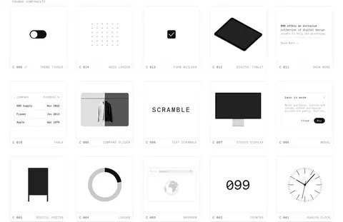
A bordered gallery card containing a small interface, device, diagram, or typography specimen.
Imagery · The archive relies on product mockup photography and rendered 3D objects, not lifestyle scenes. Previews are predominantly grayscale, often centered against simple studio backgrounds, with subtle shadows and crisp silhouettes. Component cards mix small interface demonstrations, diagrams, and typography samples. Keep imagery contained within uniform card frames and avoid decorative overlays that obscure asset details.
Keep navigation, headings, and labels in a consistent monospace voice.
Organize asset previews into an orderly five-column grid.
Place concise identifiers and names beneath each preview.
Use thin pale borders to define cards and controls.
Keep preview imagery neutral and product-focused.
✕ 不该做
Don't add bright colors to the core interface palette.
Don't use heavy shadows or layered card effects.
Don't let decorative copy compete with the asset archive.
Don't vary card framing from item to item.
Don't use oversized rounded pills for ordinary controls.
Don't fill the white space with unrelated promotional sections.
给 AI 的提示词
想快速出一个同风格的新页面,把这段话连同 DESIGN.md 一起发给 AI。
Build a new page in the 099 SUPPLY visual style: a precise, compact design-resource archive. Use Gallery White (#ffffff) as the canvas, Catalog Ink (#101010) for primary text, Rule Line (#e0e0e0) for fine borders, and Archive Gray (#999999) or Muted Graphite (#555555) for secondary metadata. Use a monospace family such as Space Mono throughout, with uppercase, tracked navigation and section labels. Center a small wordmark in a restrained top navigation, then organize content into clearly titled, five-column asset grids. Each asset card should pair a monochrome preview with a narrow identifier-and-name strip. Keep surfaces flat, corners modest, and spacing generous between sections but compact within the catalog. Avoid promotional clutter, colorful accents, and pronounced shadows.