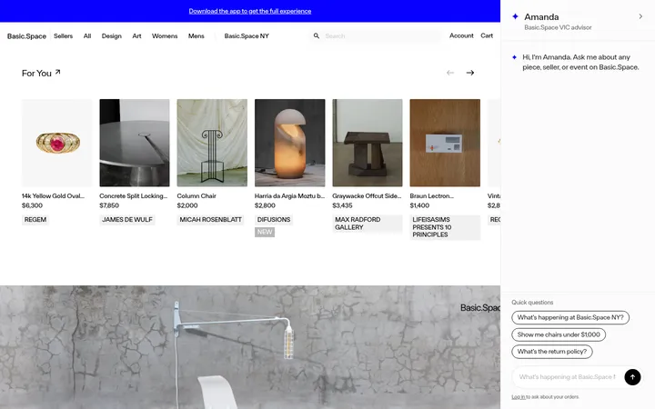
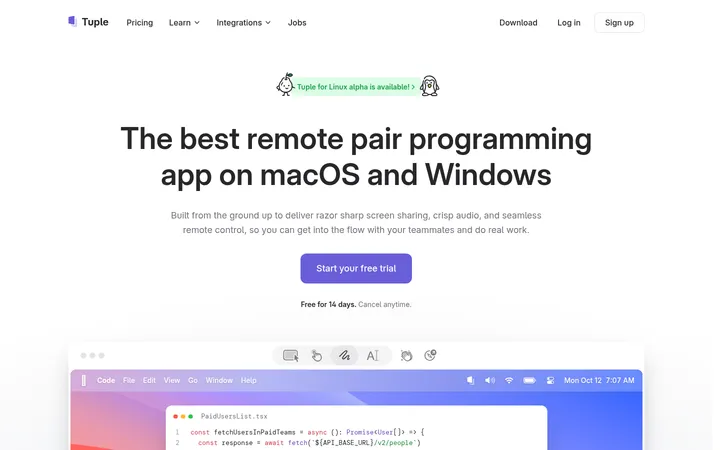
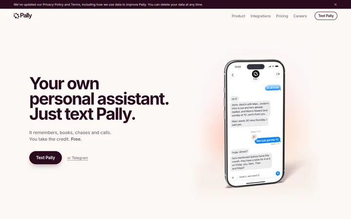
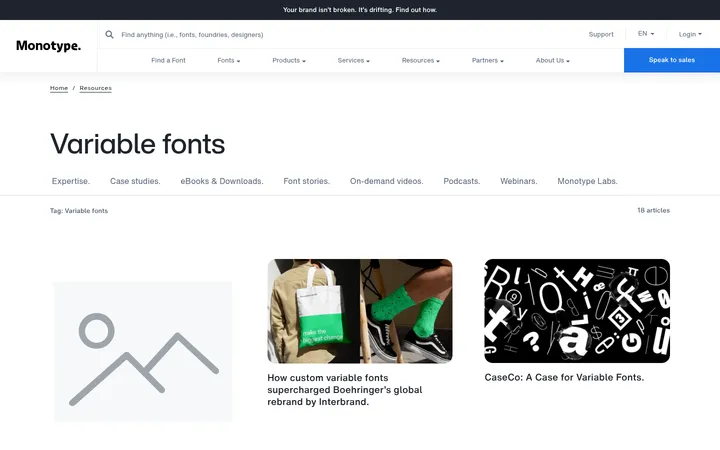
North star · Keep the interface quiet and precise so warm, art-directed product imagery carries the visual emphasis.
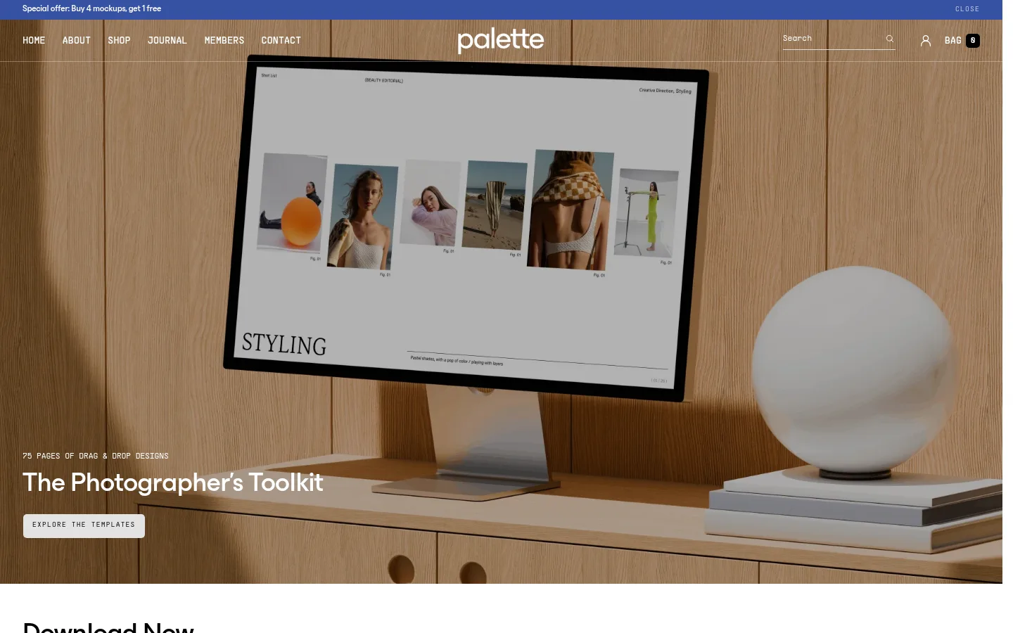
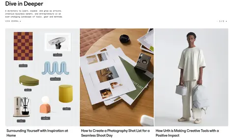
The page is built on a white canvas with black typography and very restrained gray rules, keeping attention on the products and photography rather than decorative UI. A vivid blue appears in the top promotion strip and small brand details; it is an accent, not the dominant page colour. PP Supply Mono establishes the compact, technical character of navigation, captions, labels, and body copy, while ES Build gives larger headings and product links a softer, contemporary presence. The opening hero is a full-bleed warm wood interior with white overlaid copy and a small light CTA. Below it, broad white sections alternate between product detail, collection cards, split-image storytelling, and journal content. Product imagery supplies muted browns, greens, and warm neutrals that are not interface tokens. Layouts rely on generous whitespace around large image panels, while cards remain flat and square-edged with fine gray borders rather than shadows.
配色
点色块复制色值。用途说明来自对页面的实测位置(背景、文字、描边、按钮)与截图判读。
品牌色
强调色
表层色
中性色
页面底色 · Gallery White表层 · Studio Ink主文字 · Studio Ink次要文字 · Gallery White描边 · Soft Rule强调 · Supply Blue
Navigation, body copy, captions, labels, and small interface text.
Aa 设计
ES Build
网络字体 · 字重 500 · 占比 33%
免费替代:Manrope
Main headings, section titles, and prominent product links.
角色
示例
字号
字重
行高
字距
一级标题
Hero title, set prominently over the full-bleed opening image.
Palette Supply
38px
500
1.3
-0.02em
二级标题
Section headings and feature titles.
The quick brown fox 敏捷的狐狸
22.5px
500
1.3
-0.02em
正文
Product explanations and descriptive editorial copy.
The quick brown fox 敏捷的狐狸
16px
300
1.5
0
辅助文字
Small product, image, and supporting labels.
The quick brown fox 敏捷的狐狸
12px
300
1.5
0
导航
Uppercase header navigation and menu labels.
The quick brown fox 敏捷的狐狸
14px
400
1.5
-0.02em
链接
Prominent product titles and editorial links.
The quick brown fox 敏捷的狐狸
19px
500
1.2
-0.02em
眉题
Compact uppercase section and hero overlines.
The quick brown fox 敏捷的狐狸
10px
300
1.2
0.12em
代码
Small technical or utility-style interface details.
const style = 1;
12px
300
1.5
0
间距与布局
基准单位 2px · 密度:紧凑
32px版块间距
8px元素间距
18px卡片内边距
—内容最大宽度
2px
4px
5px
6px
7px
8px
10px
12px
13px
14px
16px
18px
32px
48px
64px
The homepage uses a full-bleed hero followed by a sequence of white, wide content bands. Sections shift between two-column product detail and editorial splits, multi-column product grids, and image-led feature panels. Align headings and copy to the left; reserve broad negative space around imagery and avoid enclosing every block in a card. The measured page has no fixed maximum-width value, so reproduce its generous desktop composition without inventing one. Overall density is compact in text and navigation but spacious between major image-led sections.
圆角与层次
按钮 · 5px
导航 · 5px
链接 · 5px
没有测到阴影:页面是扁平的,层次靠底色和描边区分。
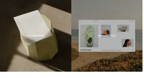
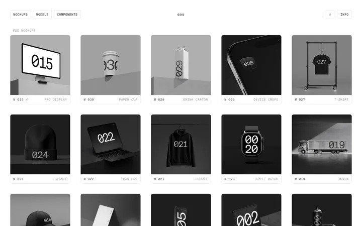
The interface is mostly flat: no measured shadow system is present, and card outlines are thin and pale. Product images provide their own depth through photographed paper, devices, and mockup layering. Keep panels square-edged and avoid adding decorative shadows; use subtle borders only where product cards or controls need separation.
组件
下面的预览按实测的按钮、输入框、徽标、卡片样式重建(字体用替代字体)。
Hero banner
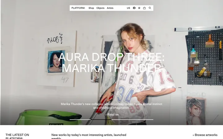
Full-bleed interior photograph with a small uppercase eyebrow, large white title, and compact light CTA positioned over the image.
Announcement strip
Narrow blue promotional band above the image-led header, with small high-contrast offer text.
Product detail feature
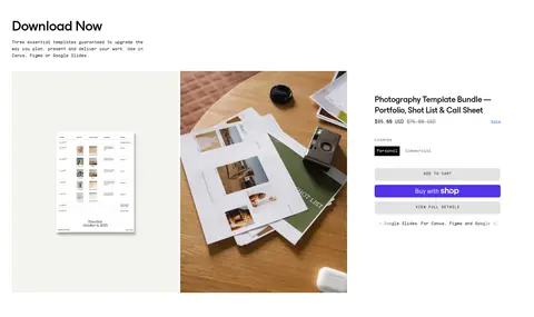
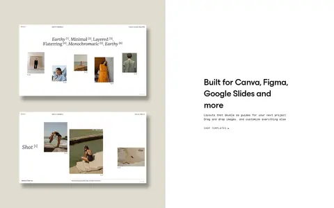
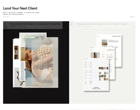
Two-column presentation pairing template imagery with product title, concise copy, variant controls, and purchase actions.
Product card
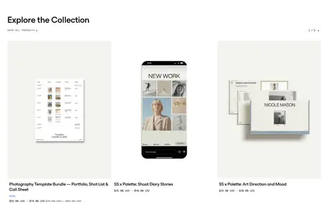
Flat product tile with a large image, prominent sans-serif title, compact monospaced details, and a fine #f6f6f6 border where measured.
Split editorial feature
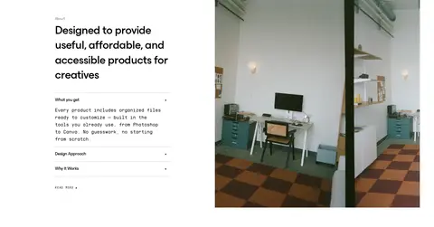
Large rectangular image beside a short heading and compact explanatory copy, with generous white space.
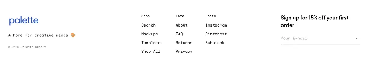
Footer signup
Multi-column footer navigation with a concise brand note and a simple email signup field.
Imagery · Photography is the dominant visual material: warm wood interiors, studio scenes, printed templates, devices, and product mockups. Use large, rectangular crops and full-bleed hero imagery; keep the photos natural and softly toned rather than applying graphic filters. Template previews appear as carefully arranged flat layouts or device mockups. Warm browns and muted colors belong to the photographic assets, not the interface palette.
Keep interface text predominantly black and restrained.
Pair monospaced utility text with clean sans-serif headings.
Let full-size photography lead image-rich sections.
Use blue sparingly for promotional emphasis.
Keep cards flat with thin, pale outlines.
✕ 不该做
Do not turn the warm photo colors into interface tokens.
Do not add gradients or a decorative shadow system.
Do not round product cards into pill-like containers.
Do not crowd image panels with extra labels.
Do not use oversized, colorful buttons as the main visual focus.
Do not invent fixed spacing or maximum-width values.
给 AI 的提示词
想快速出一个同风格的新页面,把这段话连同 DESIGN.md 一起发给 AI。
Build a new Palette Supply page as a quiet, editorial storefront. Use Gallery White (#ffffff) as the canvas and Studio Ink (#000000) for primary text; reserve Soft Rule (#f6f6f6) and Pale Graphite (#d2d2d2) for subtle borders, Muted Type (#707070) for secondary copy, and Supply Blue (#3651a2) for restrained promotional accents. Use PP Supply Mono or a close monospace substitute for navigation, captions, and body text, paired with a medium-weight, softly geometric sans serif for headings and product titles. Favor large, natural product photography, rectangular image panels, asymmetric splits, and clean product grids. Keep controls compact, cards flat, and major sections separated by generous whitespace. Avoid gradients, ornamental shadows, invented color accents, and decorative UI that competes with the photography.