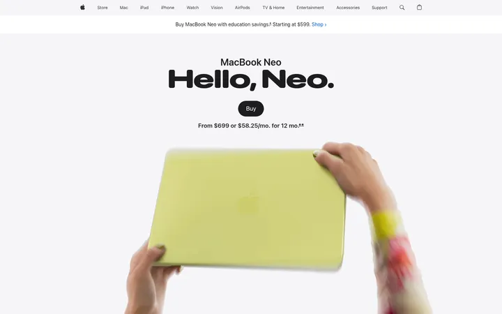
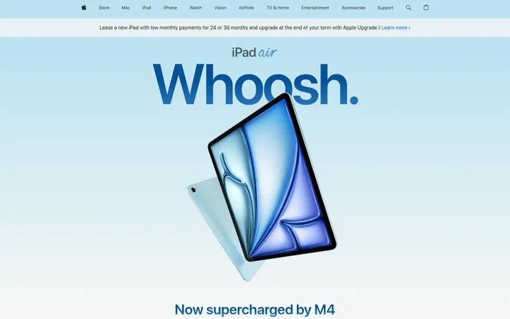
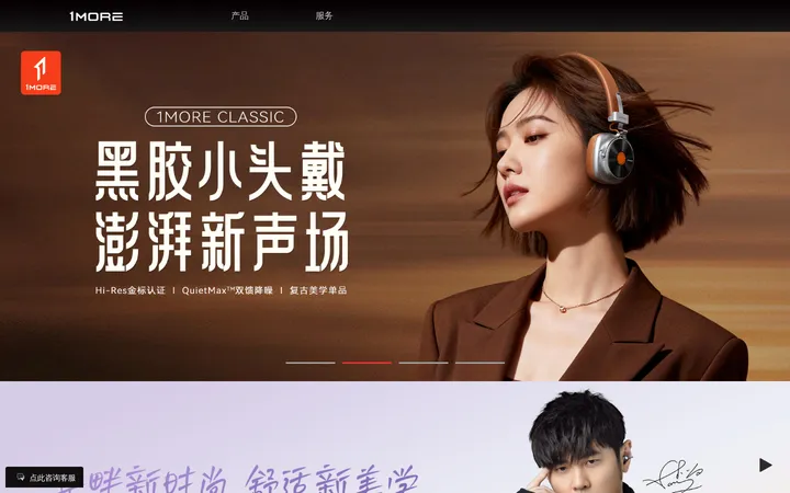
North star · Give each product image and short editorial statement room to breathe, using blue only as a precise point of emphasis.
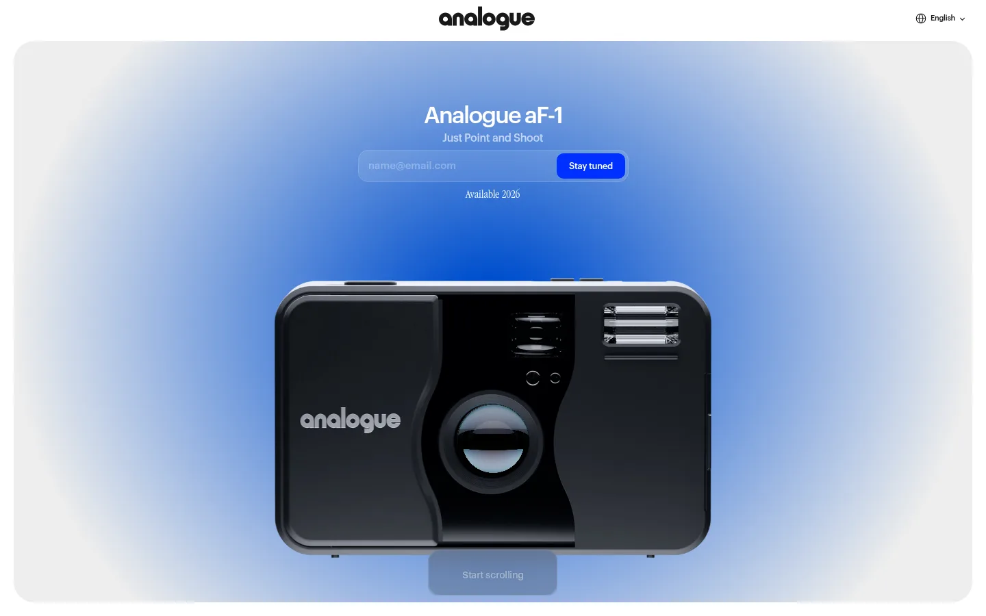
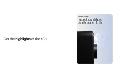
The visual system is built around a clean white canvas interrupted by long, near-black storytelling sections. In the first viewport, a blue atmospheric gradient frames the black camera, while a compact saturated-blue CTA supplies the only strong interface accent. Graphik Medium carries the modern, tightly tracked interface and headings; ITC Garamond Std Light Narrow adds a contrasting editorial voice in product-oriented moments. The page uses a single-column, full-width narrative rather than a dense catalogue: large media areas and generous vertical pauses let each claim or image register on its own. Camera photography and rendered product imagery stay central, with dark surfaces and luminous blue lighting creating contrast. Rounded controls and media frames soften the otherwise sharply minimal composition. Treat blue and charcoal gradient stops as atmosphere and imagery where appropriate, not as additional UI colours.
配色
点色块复制色值。用途说明来自对页面的实测位置(背景、文字、描边、按钮)与截图判读。
品牌色
强调色
表层色
中性色
页面底色 · Gallery White表层 · Soft Graphite表层 2 · Deep Black表层 3 · Pure Black主文字 · Soft Graphite次要文字 · Gallery White弱文字 · Pure Black强调 · Electric Blue
文字
背景
对比度
WCAG
#171717 Soft Graphite
#ffffff Gallery White
17.93:1
AAA
#171717 Soft Graphite
#070707 Deep Black
1.12:1
不达标
#171717 Soft Graphite
#000000 Pure Black
1.17:1
不达标
#ffffff Gallery White
#171717 Soft Graphite
17.93:1
AAA
#ffffff Gallery White
#070707 Deep Black
20.14:1
AAA
#ffffff Gallery White
#000000 Pure Black
21:1
AAA
字体
字号阶梯:Custom(比例约 1.69,正文 14px)。示例用免费替代字体渲染,数值为实测。
Aa 设计
Graphik Medium
网络字体 · 字重 400 · 占比 58%
免费替代:Inter
Primary headings, body copy, and interface controls.
Aa 设计
ITC Garamond Std Light Narrow
网络字体 · 字重 400 · 占比 38%
免费替代:Cormorant Garamond
Editorial contrast in selected product and campaign copy.
Aa 设计
sans-serif
系统字体 · 字重 400 · 占比 4%
免费替代:Inter
Small captions and secondary card labels.
角色
示例
字号
字重
行高
字距
一级标题
Hero product name and primary launch statement.
Analogue
40px
400
1
-0.045em
二级标题
Feature and campaign section headlines.
Analogue
34px
400
1
-0.053em
正文
Supporting product descriptions and form text.
The quick brown fox 敏捷的狐狸
14px
400
1.2
-0.021em
辅助文字
Small image notes, availability text, and labels.
The quick brown fox 敏捷的狐狸
12px
400
normal
0
间距与布局
基准单位 2px · 密度:宽松
100px版块间距
10px元素间距
20px卡片内边距
1400px内容最大宽度
3px
4px
5px
10px
11px
14px
15px
20px
25px
40px
50px
100px
115px
200px
A spacious, single-column story spans a measured maximum content width of 1400px, with full-bleed media used to break up text-led sections. The hero centres its title, signup form, and camera image inside a large framed panel; later headings alternate between left and centred alignment. Section gaps are generous, around the measured 100-unit rhythm, while controls and cards use tighter internal spacing. Keep density low: avoid packing feature copy into a conventional multi-column catalogue.
圆角与层次
按钮 · 10px
输入框 · 15px
卡片 · 20px
图片 · 20px
inset · input
hairline · other
The page is mostly flat, with contrast created by white and near-black section bands rather than stacked cards. Media and hero frames have rounded corners, and controls are softly rounded. Avoid prominent drop shadows; the measured input inset highlight is subtle and the general interface has no strong border system.
组件
下面的预览按实测的按钮、输入框、徽标、卡片样式重建(字体用替代字体)。
Hero signup
Centred product title and short line sit above an email form, with a blue Stay tuned button and a small availability caption.
Email input
Dark or translucent field with white text, a 15px radius, generous measured padding, and a fine inset white highlight.
Primary CTA
Electric-blue #002fff fill, white Graphik Medium label, 10px radius, and compact horizontal padding.
Product media frame
Large camera image or video set within a clean frame; measured media and cards use a 20px radius.
Feature card
Dark #171717 product detail surface with concise copy and a rounded media-led presentation.
Editorial section
Single short headline placed in generous white or dark space, with left or centred alignment depending on the narrative beat.
Imagery · Use large, carefully lit product photographs or realistic camera renders, framed as the visual anchor rather than decoration. The hero places a black compact camera against a pale blue-to-white glow; later media may be full bleed or contained in rounded frames. Keep product surfaces dark and reflective, and use motion/video for a small number of cinematic feature moments.
Keep the interface palette predominantly white, charcoal, and black.
Reserve #002fff for the primary CTA or a tiny interface accent.
Let product photography occupy generous, uninterrupted areas.
Alternate white editorial space with near-black cinematic sections.
Use Graphik-style sans-serif typography with tight headline tracking.
Keep signup and feature copy short and visually secondary to the camera.
✕ 不该做
Do not introduce extra UI colours from the photography palette.
Do not turn the page into a dense product catalogue or dashboard.
Do not add heavy borders, shadows, or decorative card stacks.
Do not crowd the hero camera with supporting elements.
Do not use the blue gradient as a repeated section background everywhere.
Do not replace editorial whitespace with repetitive grids.
给 AI 的提示词
想快速出一个同风格的新页面,把这段话连同 DESIGN.md 一起发给 AI。
Build a new product page in Analogue’s restrained camera-launch style. Use Gallery White (#ffffff) as the main canvas, Soft Graphite (#171717) for text and dark feature surfaces, and Deep Black (#070707) for occasional cinematic sections. Give the product a large, carefully lit photographic or rendered showcase; a pale blue atmospheric glow may surround imagery, using Deep Cobalt (#00368c), Luminous Cobalt (#004fce), and Mist Grey (#ededed) as image-gradient stops rather than routine UI fills. Set headings and controls in a Graphik-like sans serif with tight tracking, with an optional narrow editorial serif accent. Keep the layout spacious and mostly single-column, using long section pauses and alternating light and dark storytelling bands. Make the primary action the sole vivid interface accent: an Electric Blue (#002fff) rounded button. Keep borders and shadows minimal.