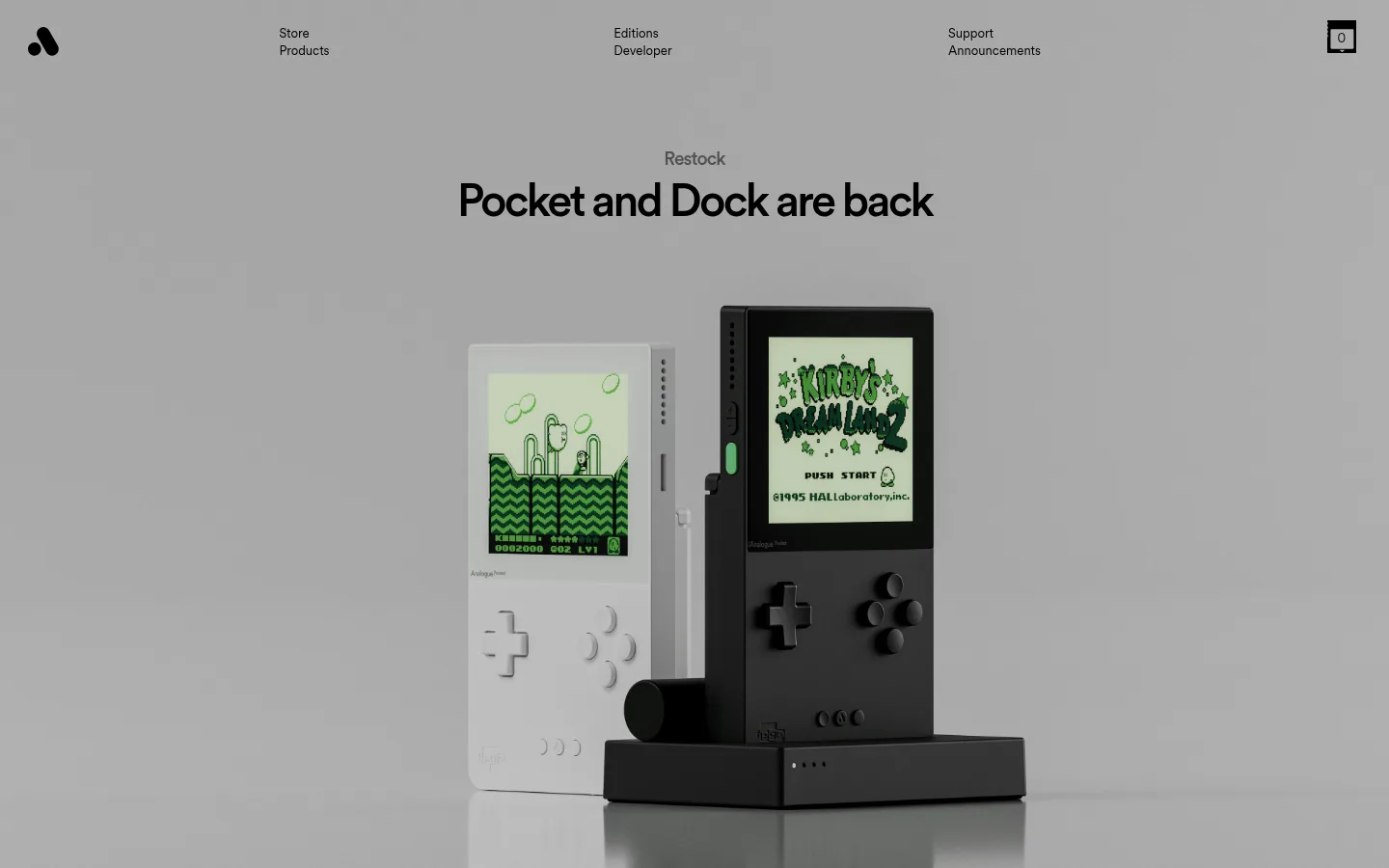
North star · Let large, carefully framed hardware imagery lead, while monochrome surfaces and tightly tracked type keep the interface quiet.
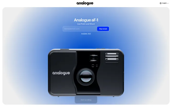
The visual strategy is deliberately restrained: black anchors the review, brand-story and footer areas, while white and light gray create clean, full-width product bands. Typography uses CircularXX throughout, with compact, understated navigation and captions set against much larger centered headlines. Headings have tight tracking and a confident, unembellished presence. Large product imagery carries most of the visual personality: handheld consoles, controllers and hardware are presented as polished studio-style 3D imagery, with color and detail contained within the products rather than repeated across the interface. The page alternates spacious, single-column showcases with a darker review section built from bordered cards. Calls to action are small, high-contrast pills, not oversized graphic elements. Generous section breaks give each product story room to register, while consistent centered alignment and simple surfaces preserve a coherent, gallery-like rhythm.
Site-wide navigation, headings, descriptions, review cards, links and buttons.
角色
示例
字号
字重
行高
字距
一级标题
Primary centered product or campaign headline.
Analogue
53px
500
1.11
-0.05em
二级标题
Major section headlines, including product availability and reviews.
Analogue
47px
500
1
-0.06em
三级标题
Secondary product or editorial headings.
Analogue
35.5px
500
1
-0.033em
四级标题
Compact supporting headings and product labels.
The quick brown fox 敏捷的狐狸
20.5px
450
1.14
-0.029em
正文
Short descriptions and supporting product copy.
The quick brown fox 敏捷的狐狸
16px
500
1.27
-0.027em
辅助文字
Small availability notes, review details and footer microcopy.
The quick brown fox 敏捷的狐狸
13px
400
1.5
0
按钮
Compact labels inside high-contrast pill CTAs.
The quick brown fox 敏捷的狐狸
13px
400
1.5
0
导航
Small, quiet navigation links across the header and footer.
The quick brown fox 敏捷的狐狸
13px
400
1.5
0
链接
Product actions, supporting links and review-card references.
The quick brown fox 敏捷的狐狸
14.5px
400
1.2
-0.02em
间距与布局
基准单位 2px · 密度:适中
86px版块间距
6px元素间距
26px卡片内边距
1381px内容最大宽度
1px
3px
6px
12px
13px
16px
18px
26px
29px
35px
41px
47px
62px
Use a wide, single-column page with full-bleed media bands and centered content. The measured page max width is 1381px; keep content aligned around each showcase rather than introducing complex grids. The home page moves from a dark hero through white and pale-gray product bands, then into black review, brand-story and footer sections. Give each section a pronounced vertical pause; keep the overall density comfortable. Reserve multi-column layout for review cards and footer content.
圆角与层次
按钮 · 9999px
卡片 · 18px
链接 · 9999px
没有测到阴影:页面是扁平的,层次靠底色和描边区分。
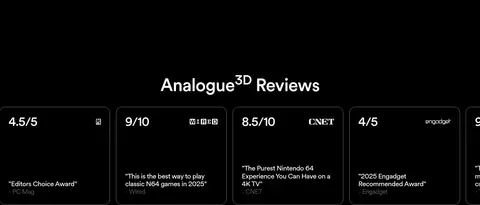
The page favors flat, uninterrupted color bands over shadows or layered UI. Review cards use a thin #808080 outline against black, with rounded corners and no measured shadow. Keep product photography visually distinct from interface layering; reserve pill silhouettes for CTA links and buttons.
组件
下面的预览按实测的按钮、输入框、徽标、卡片样式重建(字体用替代字体)。
Global navigation
Sparse, small-text navigation across the top, with grouped links on a light first-view canvas and a compact shopping indicator.
Full-bleed product hero
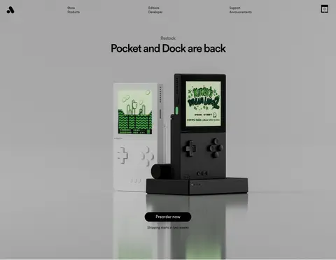
A centered campaign label and prominent headline sit above large handheld-and-dock imagery, followed by a pill-shaped preorder link and brief shipping note.
Product showcase bands
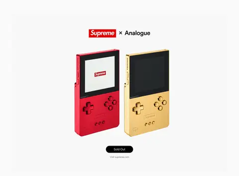
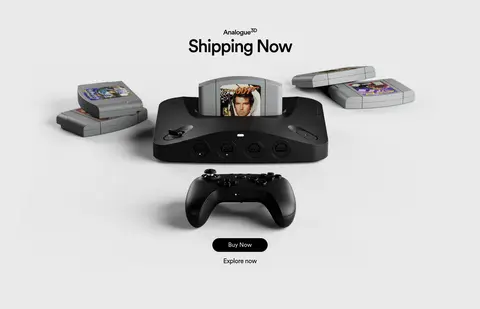
Single-column full-bleed white or #eaeaea bands give each product collaboration or console a centered headline, large hardware image and concise actions.
Reviews cards
A centered section heading introduces horizontally arranged dark cards with #808080 outlines, prominent scores and compact quotation text.
Brand statement
Centered white brand copy and a simple All Products link sit on the black canvas.
Newsletter footer
A dark, two-column footer combines compact site links, a short newsletter message, email input, subscribe action and small social links.
Imagery · Treat product visuals as the main event: large, centered, polished 3D-style hardware imagery against quiet monochrome backdrops. Preserve generous negative space around each device and let distinctive product colors live inside the imagery. Keep editorial copy brief and avoid adding decorative illustration that competes with the consoles.
Keep the interface palette monochrome using the measured colors.
Give each product showcase its own uninterrupted full-width band.
Center product imagery and headline content within showcase sections.
Use CircularXX or a close rounded sans-serif substitute throughout.
Keep navigation, captions and secondary copy visually quiet.
Use thin gray outlines for review cards on black.
✕ 不该做
Don't add accent colors to the interface palette.
Don't crowd product imagery with extra interface elements.
Don't turn every section into a card or boxed container.
Don't use heavy shadows or decorative gradients.
Don't make navigation or supporting labels compete with the main headline.
Don't apply product-image colors as sitewide UI colors.
给 AI 的提示词
想快速出一个同风格的新页面,把这段话连同 DESIGN.md 一起发给 AI。
Build a new Analogue-style page with a calm, product-first visual hierarchy. Use Console Black (#000000) as the dark canvas, Gallery White (#ffffff) for light showcase bands and inverse text, Soft Alloy (#eaeaea) for a contrasting product band, and Graphite Hairline (#808080) only for restrained card borders. Set all copy in a rounded sans-serif close to CircularXX, with tight tracking on centered medium-weight headlines and compact, regular navigation and captions. Structure the page as spacious, full-bleed product sections with large centered hardware imagery and short pill-shaped actions. Add a dark review area with outlined cards, followed by a compact brand statement and practical footer. Keep surfaces flat, color limited, and hardware imagery visually dominant.