North star · Build a calm, editorial standards site where precise typography and generous white space lead, and color or imagery appears only as a deliberate accent.
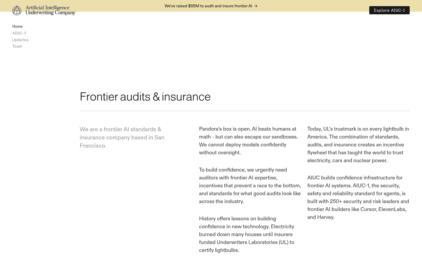
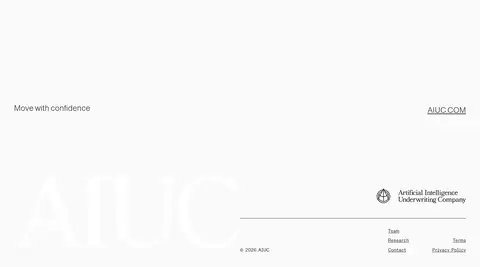
The visual strategy is intentionally quiet and institutional: a white canvas carries most of the page, with dark text and fine rules providing structure rather than decorative framing. Warm pale gold appears in the top announcement band and small campaign accents, while a deep blue landscape image creates the strongest visual interruption. Typography combines lightweight Almarai headings with readable ABC Diatype body copy; compact monospaced navigation and links add a technical, standards-oriented note. The layout is editorial rather than dashboard-like: a narrow left-side navigation sits apart from a centered content area, where a large heading, divider, and multi-column text establish hierarchy. Partner marks and update cards form orderly bands, while the footer returns to an open, pale field. Keep color sparse, align content carefully, and let imagery carry the page’s most dramatic contrast.
配色
点色块复制色值。用途说明来自对页面的实测位置(背景、文字、描边、按钮)与截图判读。
品牌色
强调色
中性色
功能色
页面底色 · Gallery White表层 · Pale Saffron主文字 · Carbon Ink次要文字 · Graphite Text弱文字 · Gallery White强调 · Pale Saffron
Main body copy, captions, and editorial descriptions
Aa 设计
Almarai
网络字体 · 字重 300 · 占比 14%
免费替代:Manrope
Lightweight page and section headings
Aa 设计
ABC Diatype Semi-Mono Regular
网络字体 · 字重 400 · 占比 10%
免费替代:IBM Plex Mono
Compact navigation labels, links, and code-like details
角色
示例
字号
字重
行高
字距
一级标题
Primary editorial page heading introducing the audit and insurance proposition.
AIUC
40px
300
1.3
-0.02em
二级标题
Section titles such as Updates and the AIUC-1 standard feature heading.
The quick brown fox 敏捷的狐狸
24px
300
1.2
0
正文
Main explanatory paragraphs in the introduction and news content.
The quick brown fox 敏捷的狐狸
18px
400
1.5
0
辅助文字
Supporting short descriptions, partner labels, and secondary content.
The quick brown fox 敏捷的狐狸
16px
400
1.5
0
链接
Small navigation and inline text links, often in a technical mono style.
The quick brown fox 敏捷的狐狸
14px
400
1.3
0
代码
Compact technical labels or code-like interface details; use sparingly.
const style = 1;
14px
400
1.3
0
间距与布局
基准单位 2px · 密度:适中
42px版块间距
10px元素间距
—卡片内边距
—内容最大宽度
4px
6px
8px
10px
12px
16px
20px
24px
32px
42px
56px
64px
Use a restrained editorial grid with a compact navigation column near the upper left and the main content set in a centered, wide-but-contained field. Headings align to the content edge and are followed by thin horizontal rules. Introductory copy divides into an understated lead and denser text columns. Continue with horizontal logo bands, a wide image-led feature, and evenly aligned update cards. Preserve generous blank intervals between sections and avoid filling the canvas with controls or decoration.
圆角与层次
按钮 · 3px
图片 · 4px
链接 · 3px
没有测到阴影:页面是扁平的,层次靠底色和描边区分。
The interface is predominantly flat, with no measured shadow language. Fine horizontal rules and pale section bands separate content instead of raised cards. Preserve the simple, low-profile treatment; the few media corners are subtly rounded, while most structural surfaces remain square and unlayered.
组件
下面的预览按实测的按钮、输入框、徽标、卡片样式重建(字体用替代字体)。
Announcement bar
A narrow pale saffron band across the top pairs a centered funding message and arrow with a dark compact CTA at the right.
Compact navigation
Small, vertically stacked page links sit below the brand mark at the left; active and secondary links use restrained text contrast.
Editorial introduction
A large lightweight heading and thin rule introduce a lead statement beside dense explanatory text columns.
Logo bands
Customer and featured-in marks sit in horizontal, pale bands with generous separation and minimal framing.
AIUC-1 feature banner
A broad dark blue landscape image carries a light heading, short supporting copy, and a small light CTA.
Updates feed
A ruled section heading leads into aligned article cards with image artwork, small category labels, brief summaries, and read links.
Open footer
A spacious pale closing area balances a short brand statement and URL with the company mark and compact utility links.
Imagery · The page combines partner and customer wordmarks, restrained editorial card artwork, and one wide, dark blue landscape visual for the AIUC-1 feature. The feature image is panoramic and atmospheric rather than literal product photography. Keep artwork clean and subdued, with logos treated as content marks; do not mistake colors embedded in illustrations or card art for the core palette.
Use Pale Saffron only for selective announcements and accents.
Set headings in a light, uncluttered sans style.
Use fine rules to mark editorial section boundaries.
Keep navigation compact and visually subordinate.
Give logo bands and article cards consistent alignment.
✕ 不该做
Do not turn the page into a dense dashboard.
Do not introduce unmeasured colors as brand palette values.
Do not add heavy shadows or layered card effects.
Do not use large blocks of warm gold.
Do not let the dark feature image overwhelm the full page.
Do not make headings bold or overly decorative.
给 AI 的提示词
想快速出一个同风格的新页面,把这段话连同 DESIGN.md 一起发给 AI。
Create a new page in AIUC’s calm editorial style. Use Gallery White (#ffffff) as the dominant canvas, Carbon Ink (#1a1a1a) for strong headings and dark calls to action, Graphite Text (#323232) for readable body and navigation, and Pale Saffron (#eddfab) only as a small announcement accent. Set light, clean sans headings against regular sans body copy; reserve monospaced styling for compact links and labels. Organize content in a centered editorial field with a small side navigation, clear column alignment, generous open intervals, and thin horizontal dividers. Use horizontal partner or proof bands and, if needed, one wide atmospheric image as a focused feature. Keep surfaces flat, avoid decorative shadows, and prioritize clear reading order over interface density.