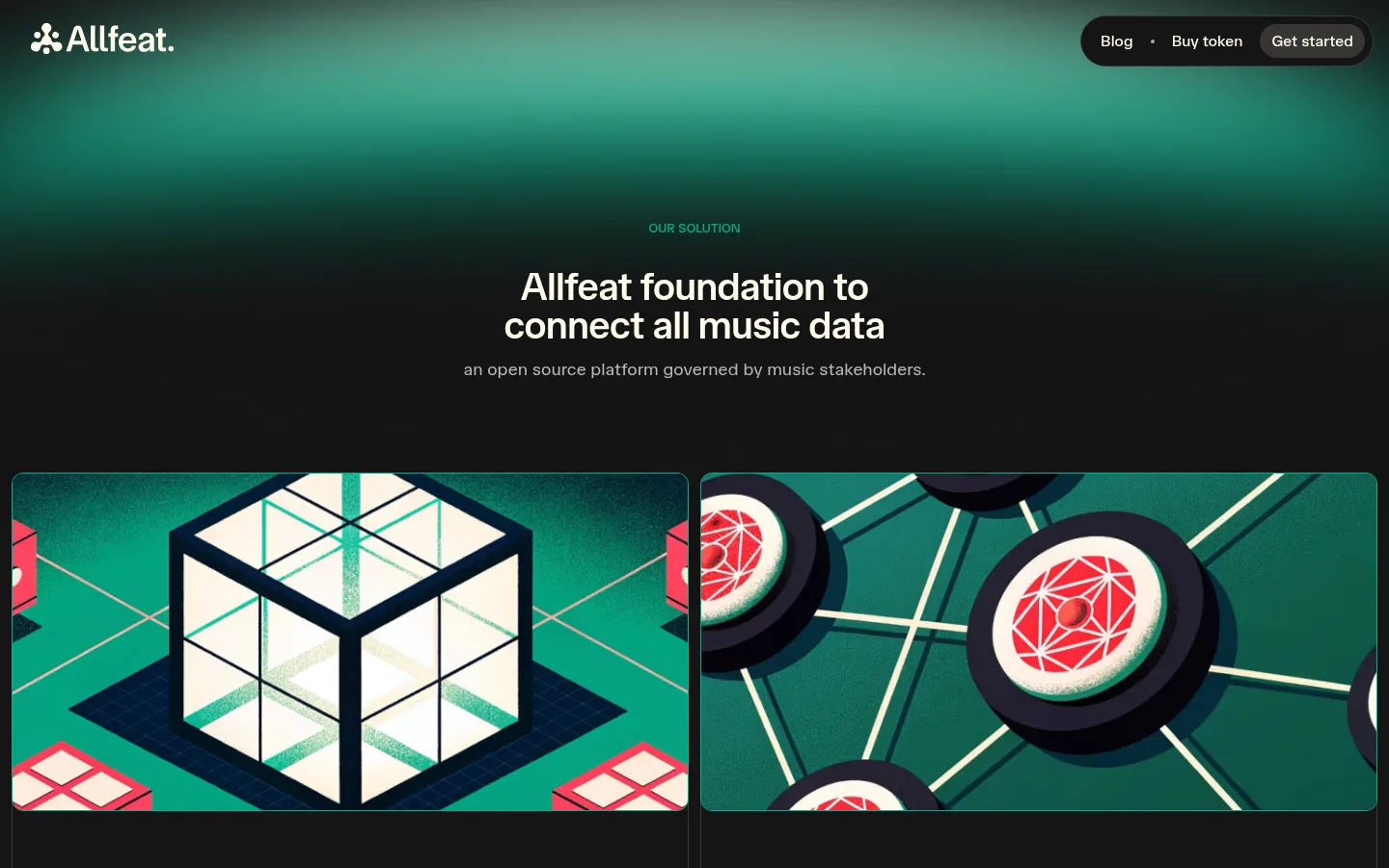
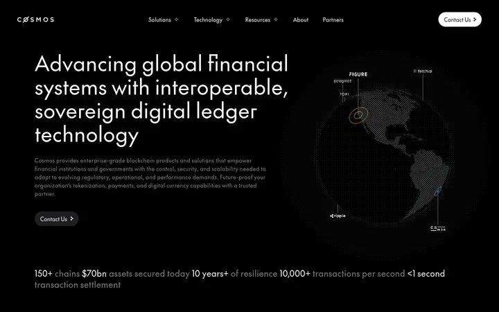
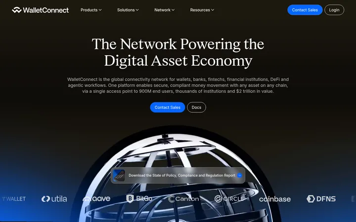
North star · Let a nearly black canvas and generous breathing room frame ivory editorial type, with green and coral used as precise signals.
The page is anchored by a near-black canvas (#151515), giving the content a quiet, high-contrast foundation. Warm ivory (#fffbeb) carries primary headings and the occasional light card, while muted gray (#b8b8b8) softens supporting copy. Green (#00b18c) marks solution-oriented actions and small labels; coral (#ff4a5f) appears as a contrasting call to action and in atmospheric gradients. TASA Orbiter is used throughout, with compact, confidently weighted headlines and restrained body copy. The layout moves from a centered hero into a two-column feature-card row, then alternates open narrative sections and wider visual blocks. Large intervals of dark canvas preserve a spacious rhythm. Artwork uses crisp geometric network and data motifs, often with deep teal and cream; these are illustrations, not the page’s foundational palette. Rounded pills, modest card corners, and thin inset borders keep the interface tactile without adding heavy shadows.
All page typography, including display headings, body copy, navigation, buttons, and labels.
角色
示例
字号
字重
行高
字距
特大标题
Large hero or statement headlines.
Allfeat
56px
600
0.95
-0.02em
一级标题
Primary page headline in the hero.
Allfeat
54px
600
0.87
-0.02em
二级标题
Major section headings and prominent statements.
Allfeat
40px
600
1
-0.02em
三级标题
Feature-card and sub-section titles.
The quick brown fox 敏捷的狐狸
25px
600
1.2
0
四级标题
Compact secondary headings in content blocks.
The quick brown fox 敏捷的狐狸
24px
600
1.1
-0.02em
正文
Explanatory paragraphs and general content.
The quick brown fox 敏捷的狐狸
16px
400
1.2
0
辅助文字
Small labels, footnotes, and auxiliary copy.
The quick brown fox 敏捷的狐狸
14px
400
1.2
0
按钮
Primary action labels in pill-shaped controls.
The quick brown fox 敏捷的狐狸
20px
600
1
-0.02em
导航
Header navigation links and compact menu actions.
The quick brown fox 敏捷的狐狸
16px
500
1.2
0
链接
Inline or standalone text links, including contact prompts.
The quick brown fox 敏捷的狐狸
18px
400
1.2
0
间距与布局
基准单位 8px · 密度:宽松
101px版块间距
16px元素间距
16px卡片内边距
—内容最大宽度
4px
8px
9px
11px
12px
16px
18px
22px
24px
32px
56px
64px
90px
180px
The homepage uses broad, spacious sections on a dark canvas, with content grouped into centered statements, paired feature cards, and full-width visual bands. The hero centers its eyebrow, headline, and supporting line; the header places the logo opposite a compact pill navigation. Feature cards form a two-column desktop row, with imagery above concise copy and actions. Later sections alternate centered messaging with split panels and FAQ rows. Measurements do not establish a page maximum width; preserve generous outer breathing room and allow content to expand responsively. Keep the density low and section gaps conspicuous.
圆角与层次
按钮 · 9999px
卡片 · 12px
图片 · 12px
导航 · 9999px
链接 · 50%
inset · card, other
inset · button
The interface is mostly flat: dark surfaces sit directly on the canvas, and cards are distinguished by subtle outlines or tonal shifts rather than drop shadows. Use inset hairlines for dark card boundaries and the measured pale inset treatment on primary buttons. Keep layering restrained, with imagery and gradient bands supplying most visual depth.
组件
下面的预览按实测的按钮、输入框、徽标、卡片样式重建(字体用替代字体)。
Header navigation
Ivory logo at left and a compact dark pill at right containing navigation links and a slightly emphasized Get started action.
Hero statement
Centered green eyebrow above a tightly set ivory headline and muted supporting sentence on a near-black background.
Feature cards
Paired image-led cards with rounded media, concise explanatory copy, dark framing, and small green pill actions.
Primary action
Compact pill-shaped CTA with dark text on green or coral, semibold TASA Orbiter, and a subtle pale inset outline.
Statement band
Spacious dark narrative section with a prominent editorial statement and selective coral or green visual emphasis.
FAQ rows
A vertically stacked set of dark, rounded question rows with fine outlines and small circular expand controls.
Footer
Quiet dark close with grouped text links, restrained captions, and low-contrast legal details.
Imagery · Use geometric, technology-led illustrations rather than conventional product photography. The feature artwork depicts connected data structures with bold dark outlines, teal fields, warm ivory surfaces, and occasional coral details. Frame images in wide rounded rectangles and pair them with concise explanatory copy. Reserve large gradients and abstract line patterns for atmospheric section backgrounds; colors inside artwork should not displace the measured interface palette.
该做与不该做
✓ 该做
Use #151515 as the dominant page canvas.
Set primary headings in warm ivory #fffbeb.
Reserve #00b18c and #ff4a5f for clear action or emphasis.
Use generous dark intervals between major content groups.
Pair feature illustrations with concise supporting copy.
Keep buttons and navigation actions pill-shaped.
Use subtle outlines instead of heavy shadows.
✕ 不该做
Do not turn the page into a light-first layout.
Do not use accent colors as broad solid section fills.
Do not crowd the hero or feature-card content.
Do not introduce decorative drop shadows.
Do not use unrelated stock photography.
Do not make all text equally bright or prominent.
给 AI 的提示词
想快速出一个同风格的新页面,把这段话连同 DESIGN.md 一起发给 AI。
Build a new Allfeat-style page on a Midnight Canvas (#151515), using TASA Orbiter or a close sans-serif substitute. Set primary headings in Warm Ivory (#fffbeb), supporting copy in Soft Ash (#b8b8b8), and use Blockchain Green (#00b18c) or Coral Signal (#ff4a5f) sparingly for labels and actions. Favor a centered editorial hero, broad dark sections, paired rounded feature cards, and generous vertical breathing room. Use geometric music-data illustrations with teal, cream, and coral details, clearly treating those colors as artwork rather than interface foundations. Keep controls pill-shaped, cards subtly outlined in Graphite Panel (#383835) or Quiet Divider (#504f4b), and surfaces mostly flat. Maintain clear typographic hierarchy and restrained motion; avoid dense layouts, heavy shadows, and generic stock imagery.