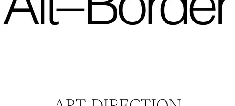
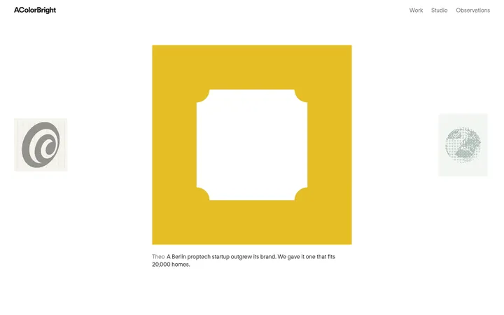
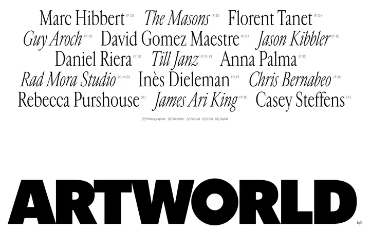
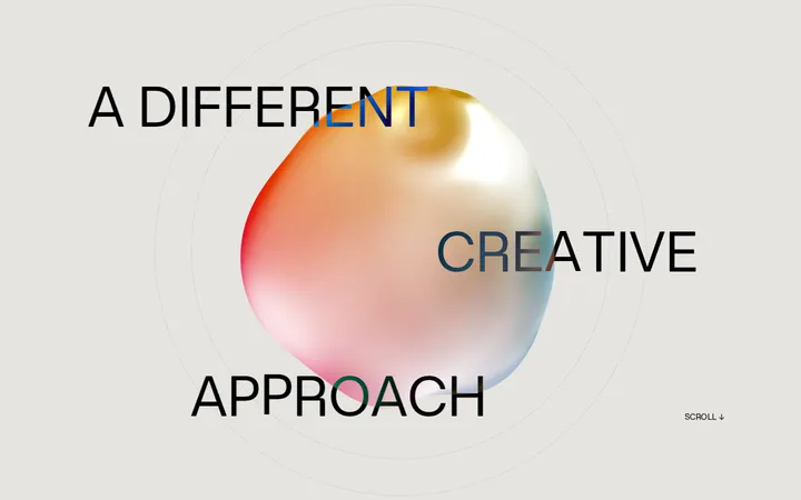
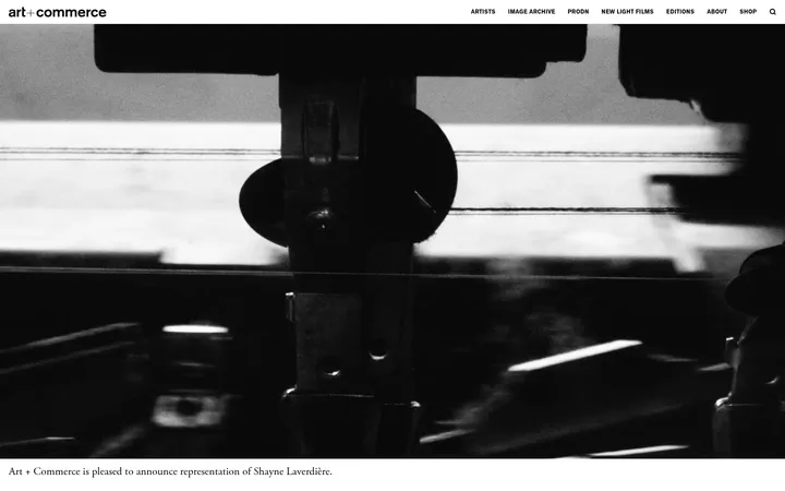
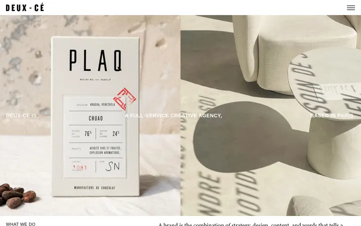
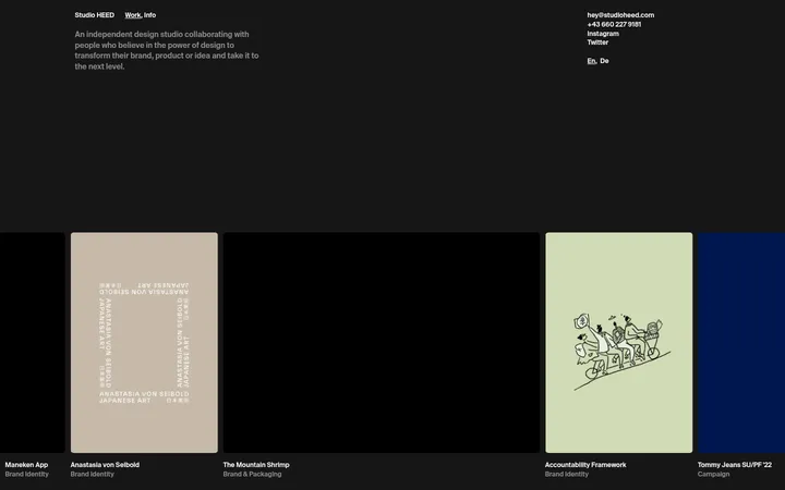
North star · Keep the interface monochrome and let oversized typography and carefully selected project imagery create the visual impact.
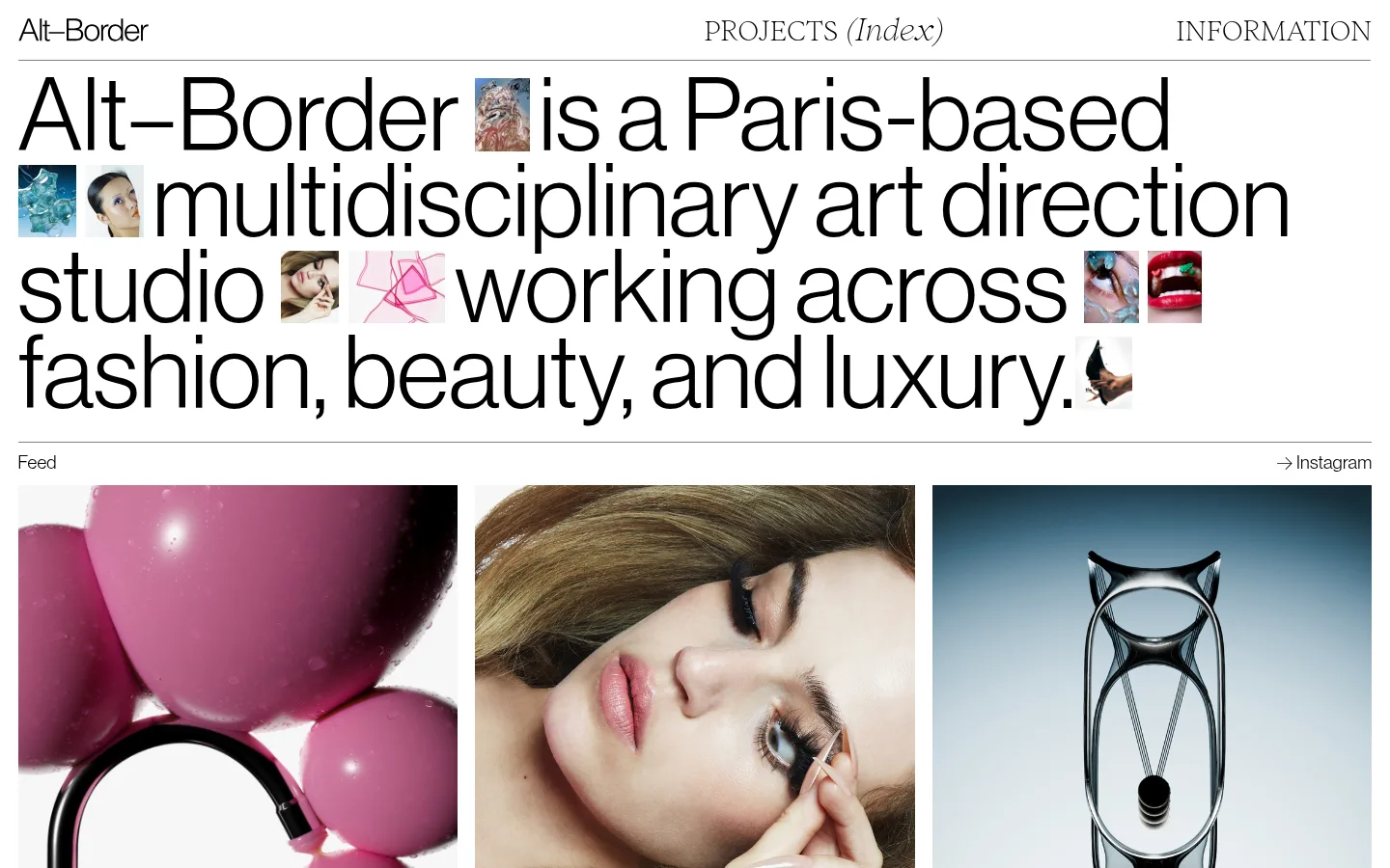
The visual identity is built on a pure white canvas, black type, and fine grey rules. Colour is deliberately absent from the interface itself: the saturated pinks, soft skin tones, cool blues, and dark objects belong to portfolio imagery, not to the brand palette. An oversized, lightweight sans-serif statement dominates the opening, with small editorial images inserted inline to make the introduction feel like a visual composition. A delicate serif display face adds contrast to navigation, labels, and selected links. The page alternates this typographic introduction with a three-column image feed, a large studio statement, project listings, and a monumental studio wordmark. Content aligns to a broad, consistent page width, while thin rules distinguish sections without adding visual weight. Comfortable spacing and simple rectangular image crops keep the dense portfolio legible. There are no decorative gradients, card shadows, or prominent coloured buttons; the work supplies the drama.
配色
点色块复制色值。用途说明来自对页面的实测位置(背景、文字、描边、按钮)与截图判读。
品牌色
表层色
中性色
页面底色 · Gallery White主文字 · Studio Ink描边 · Rule Grey
文字
背景
对比度
WCAG
#000000 Studio Ink
#ffffff Gallery White
21:1
AAA
字体
字号阶梯:Custom(比例约 1.846,正文 19px)。示例用免费替代字体渲染,数值为实测。
Aa 设计
Neuehaasdisplay
网络字体 · 字重 300 · 占比 89%
免费替代:Inter
Oversized introductory statement and lightweight sans-serif text.
Aa 设计
Inferi
网络字体 · 字重 200 / 300 · 占比 11%
免费替代:Cormorant Garamond
Serif display accents, navigation, project links, and prominent studio lettering.
角色
示例
字号
字重
行高
字距
特大标题
Monumental serif studio wordmark and display lettering.
Alt–Border
119.5px
200
0.69
0
一级标题
Oversized opening statement introducing the studio.
Alt–Border
105px
300
0.92
0
二级标题
Editorial studio statement and section-level display text.
Alt–Border
34px
200
0.69
0
正文
Supporting studio copy and compact interface labels.
The quick brown fox 敏捷的狐狸
19px
300
normal
0.01em
链接
Serif navigation, project titles, and prominent text links.
Alt–Border
34px
200
0.69
0
间距与布局
基准单位 1px · 密度:适中
—版块间距
19px元素间距
—卡片内边距
1403px内容最大宽度
2px
5px
7px
9px
11px
14px
19px
21px
28px
37px
Use a broad page canvas capped at the measured 1403px maximum width, with content aligned to consistent outer edges. The opening navigation runs across the top; below it, the oversized statement fills the available width and wraps naturally around inline images. Follow with a three-column feed, then a single-column studio introduction and a two-column project listing. Keep sections clearly separated by fine rules and generous breathing room. The overall density is comfortable, with a compact header and substantial space for imagery and display type.
圆角与层次
hairline · other
hairline · section
The page is essentially flat: white backgrounds, rectangular imagery, and thin grey separators provide structure. Avoid card shadows, gradients, and raised surfaces. Measured white box-shadow rules function as subtle section hairlines rather than visible elevation. Keep image and text layers cleanly aligned, with inline images treated as part of the typography.
组件
下面的预览按实测的按钮、输入框、徽标、卡片样式重建(字体用替代字体)。
Editorial header
A restrained top row with the Alt–Border wordmark at left, serif project navigation near the centre, and information navigation at right.
Inline-image statement
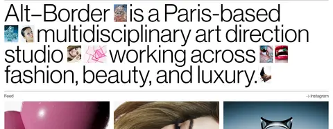
A large, lightweight sans-serif studio introduction with small portfolio images embedded between words and lines.
Project feed
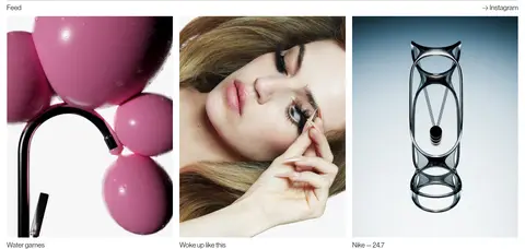
A feed label and Instagram link sit above a three-column row of image-led work with short captions.
Studio introduction
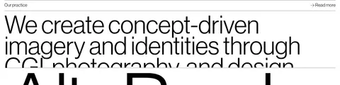
A small section label and read-more link introduce a large, left-aligned statement in a single-column block.
Project listing
A two-column selection of dated campaign and editorial projects, led by simple titles and media.
Oversized wordmark
A monumental Alt–Border typographic signature anchors the lower page and contrasts with smaller studio lettering.
Footer navigation
A minimal copyright line and back-to-top link finish the page without a coloured footer band.
Imagery · Use art-directed fashion, beauty, product, and campaign photography as the main source of colour and mood. The opening statement incorporates small image snippets inline; the feed uses larger, simple rectangular crops in a three-column row. Project imagery remains visually varied, mixing close portraits, objects, and campaign compositions. Preserve the source artwork’s colour and texture rather than applying a uniform overlay.
Pair the clean sans-serif with a delicate serif display face.
Let campaign imagery provide the page’s colour.
Use thin grey rules to distinguish content sections.
Keep project images rectangular and visually prominent.
✕ 不该做
Do not add a coloured brand background or gradient.
Do not turn projects into elevated, shadowed cards.
Do not apply one colour treatment across varied portfolio images.
Do not replace oversized editorial type with compact headings.
Do not clutter the header with controls or badges.
Do not use decorative borders beyond restrained hairlines.
给 AI 的提示词
想快速出一个同风格的新页面,把这段话连同 DESIGN.md 一起发给 AI。
Build a new page in the Alt–Border visual style: a quiet white (#ffffff) canvas, black (#000000) typography, and fine grey (#808080) section rules. Use lightweight oversized sans-serif type for the main statement, paired with a delicate serif for navigation, project links, and display accents. Make the layout broad and editorial, with a compact three-part header, a statement that may weave in small project images, and clean image-led portfolio rows. Let the photographs supply colour; do not introduce interface colours absent from the measured palette. Keep images rectangular, align content to consistent outer edges, and allow generous space around major sections. Avoid cards, gradients, and raised shadows. The result should feel like a design studio’s image-rich portfolio, not a conventional agency marketing template.