North star · Alternate calm, high-contrast story bands with spacious white product walkthroughs, using blue only to signal action or emphasis.
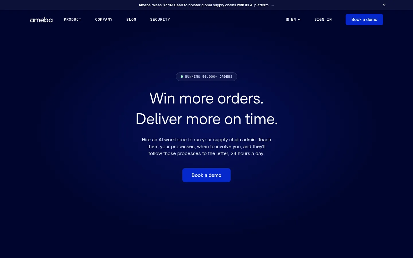
The visual system alternates deep navy storytelling bands with generous white product-explanation sections, giving the long homepage a steady, legible rhythm. Midnight Ink (#00052e) carries the hero, security, and closing CTA; White Canvas (#ffffff) gives process and FAQ content room to breathe. Electric Blue (#0428cb) is reserved for primary actions, links, and selected workflow states rather than broad decoration. Pale Lavender (#efeff7) distinguishes the customer proof band and soft interface surfaces. F37 Bolton supplies the expressive, lightly tracked display headings, while Open Sauce Sans keeps explanatory copy and controls practical. IBM Plex Mono marks navigation and small uppercase labels, adding an operational, systems-oriented tone. Product imagery is mostly composed interface mockups in rounded, colored frames, with a customer video adding a human moment. Spacious section gaps, centered dark-band copy, and alternating two-column feature layouts keep the complex product story approachable.
配色
点色块复制色值。用途说明来自对页面的实测位置(背景、文字、描边、按钮)与截图判读。
品牌色
强调色
表层色
中性色
功能色
页面底色 · White Canvas表层 · Midnight Ink表层 2 · Pale Lavender表层 3 · Deep Indigo主文字 · Midnight Ink次要文字 · Muted Slate弱文字 · Soft Graphite描边 · Pale Lavender强调 · Electric Blue强调 2 · Indigo Badge
Use a spacious single-page flow with a centered content width capped at the measured 1216px. The opening and closing dark bands center their copy; white product sections switch between left-aligned headings and alternating two-column text-plus-mockup rows. Keep section transitions generous, with the measured 96px section rhythm and compact 8px element rhythm as references. The page is intentionally low-density: let each workflow step and customer proof block read as its own moment, rather than compressing content into a dashboard-like grid.
圆角与层次
按钮 · 9999px
输入框 · 8px
卡片 · 16px
图片 · 16px
徽标 · 50%
sm · text
xl · card
xl · card
hairline · other
Most sections remain flat, with contrast and whitespace doing the structural work. Product mockups and selected white cards gain separation through subtle borders and deeper shadows; use rounded corners consistently. Keep controls and text surfaces clean, and avoid adding shadows to broad page bands or headings.
组件
下面的预览按实测的按钮、输入框、徽标、卡片样式重建(字体用替代字体)。
Primary demo CTA
Electric Blue (#0428cb) button with white text, rounded treatment, and concise Open Sauce Sans label; use as the main conversion action.
Mono navigation
Compact uppercase IBM Plex Mono navigation with generous letter spacing, set directly against the dark header.
Eyebrow label
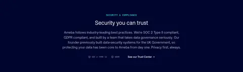
Small uppercase IBM Plex Mono label above section headings, often used to identify product steps or compliance content.
Workflow feature row
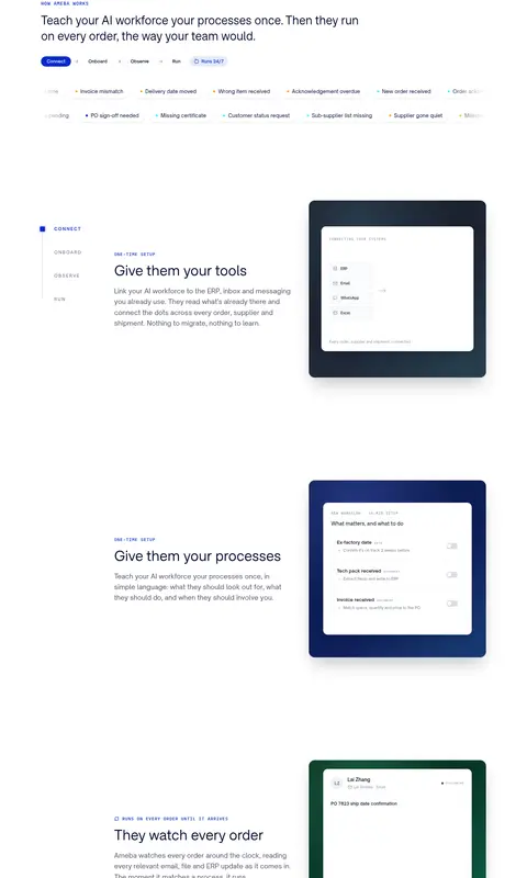
Alternating two-column white-section layout pairing concise explanatory copy with a rounded interface preview.
Product mockup frame
Rounded colored frame around a clean white application panel; use subtle elevation and let the UI remain legible.
Customer proof block
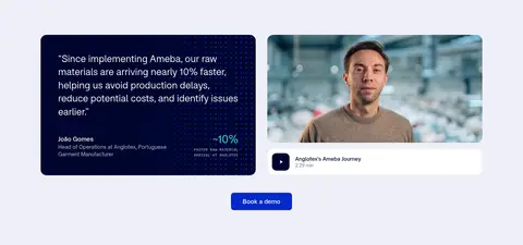
Pale Lavender (#efeff7) band with a dark quote card, customer video, attribution, and a centered demo action.
FAQ accordion
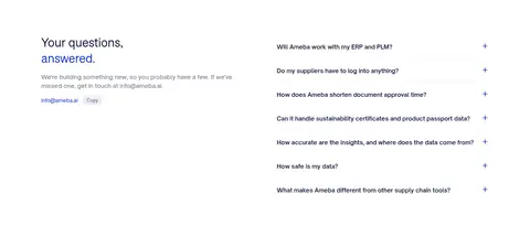
White, restrained question list with fine lavender-gray separators, compact plus controls, and readable dark text.
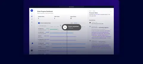
Imagery · Lead with a dark, softly radial-lit hero and use large product-interface previews to make workflows tangible. Mockups sit in rounded frames that may use navy, green, or burgundy gradients; these frame colors belong to the illustrations, not the core brand palette. A customer testimonial combines a dark quote card with a real person on video. Favor crisp UI screenshots, restrained glow, and realistic human footage over decorative stock imagery.
Alternate deep navy bands with clean white content sections.
Reserve Electric Blue (#0428cb) for actions and focused states.
Use mono uppercase labels to signal product and system context.
Give feature rows generous breathing room and clear reading order.
Show product workflows in realistic interface mockups.
Keep headings composed and sentence case.
✕ 不该做
Do not turn every section into a dark panel.
Do not use bright blue as a large decorative background.
Do not crowd the page with dense cards or tiny copy.
Do not mistake mockup frame gradients for core brand colors.
Do not apply mono typography to body paragraphs.
Do not add heavy shadows to broad section backgrounds.
给 AI 的提示词
想快速出一个同风格的新页面,把这段话连同 DESIGN.md 一起发给 AI。
Build a new Ameba page with the same calm, operational confidence: alternate Midnight Ink (#00052e) story bands with White Canvas (#ffffff) content sections, and reserve Electric Blue (#0428cb) for primary actions. Use Pale Lavender (#efeff7) for soft proof or interface surfaces and keep supporting text in muted slate tones. Set display headings in a Bolton-like sans, body copy in a clean sans, and small uppercase labels in IBM Plex Mono. Maintain a spacious centered content width, generous section breaks, and alternating two-column workflow rows. Illustrate the product with crisp UI mockups in rounded frames; treat frame gradients as illustration-only. Keep elevation selective, borders subtle, and the overall page easy to scan.