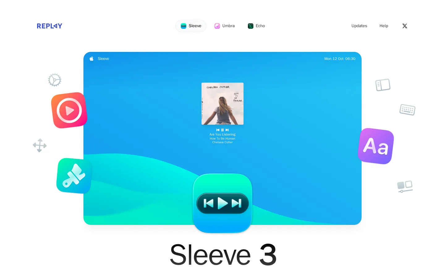
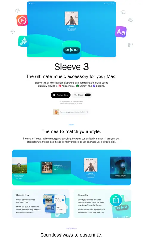
Sleeve 以充足留白、清晰文字和鲜亮的蓝绿色产品画面,展示一款 Mac 音乐伴侣。页面采用居中长页面结构,在界面预览与精简功能卡片之间交替呈现。
North star · Keep the page quiet and white so colorful, rounded product-interface artwork carries the visual emphasis.
The page uses pure white as its dominant canvas, keeping attention on the oversized Sleeve interface artwork and black editorial-style product heading. Blue and turquoise gradients belong mainly to the product mockups and illustrations rather than the site-wide UI; surrounding text, navigation, and controls stay restrained. The system sans-serif type is clean and unornamented, with a large bold hero title, lighter supporting headings, and readable body copy. A broad centered content column organizes a long sequence of product demonstrations, feature explanations, and integration details. Sections are separated primarily through generous whitespace instead of strong background bands. Pale gray cards provide soft grouping, while rounded corners and subtle shadows lend interface previews a tactile, floating quality. Small captions and uppercase labels establish hierarchy without competing with the imagery.
Site-wide navigation, headings, body copy, labels, and buttons.
角色
示例
字号
字重
行高
字距
一级标题
Large centered product name beneath the hero visual.
Sleeve
48px
700
1
0
二级标题
Section headings and product-story introductions.
The quick brown fox 敏捷的狐狸
24px
400
1.33
0
正文
Feature descriptions and supporting product explanation.
The quick brown fox 敏捷的狐狸
18px
400
1.56
0
辅助文字
Compact notes and card-level supporting labels.
The quick brown fox 敏捷的狐狸
13px
600
1.5
0
按钮
Primary and secondary purchase actions.
The quick brown fox 敏捷的狐狸
18px
500
1.56
0
导航
Header product links and utility navigation.
The quick brown fox 敏捷的狐狸
14px
400
1.43
0
眉题
Small uppercase labels introducing feature sections.
The quick brown fox 敏捷的狐狸
13px
600
1.5
0.05em
间距与布局
基准单位 8px · 密度:适中
80px版块间距
16px元素间距
—卡片内边距
1200px内容最大宽度
4px
6px
8px
12px
16px
24px
28px
32px
36px
40px
44px
48px
64px
160px
A centered page column sits within a wide white canvas, with the measured content max width at 1200px. The header aligns the brand left, product navigation near center, and utility links right. The hero is centered around a large interface image, followed by title, copy, and purchase actions. Long feature sections alternate centered showcases, paired cards, and split image-and-copy rows. Comfortable density and generous section gaps let each demonstration read independently.
圆角与层次
按钮 · 9999px
卡片 · 24px
图片 · 24px
徽标 · 9999px
导航 · 9999px
inset · other, card, button
xl · other
md · other, card, media
lg · card
Most page areas remain flat and white, with pale surfaces distinguishing feature cards. Product previews and selected cards use restrained soft shadows for a floating desktop-interface effect. Large rounded media and card frames contrast with fine, low-contrast hairlines; avoid heavy outlines or dramatic ambient shadows.
组件
下面的预览按实测的按钮、输入框、徽标、卡片样式重建(字体用替代字体)。
Product navigation
Minimal header with the Replay wordmark, pill-like product links, and compact utility links aligned across the white canvas.
Hero showcase
Large centered blue-and-turquoise desktop player mockup followed by a bold product title, short description, and two pill-shaped purchase actions.
Purchase buttons
Use a black filled Mac App Store action and a pale gray direct-purchase action with black text; both are fully rounded.
Feature cards
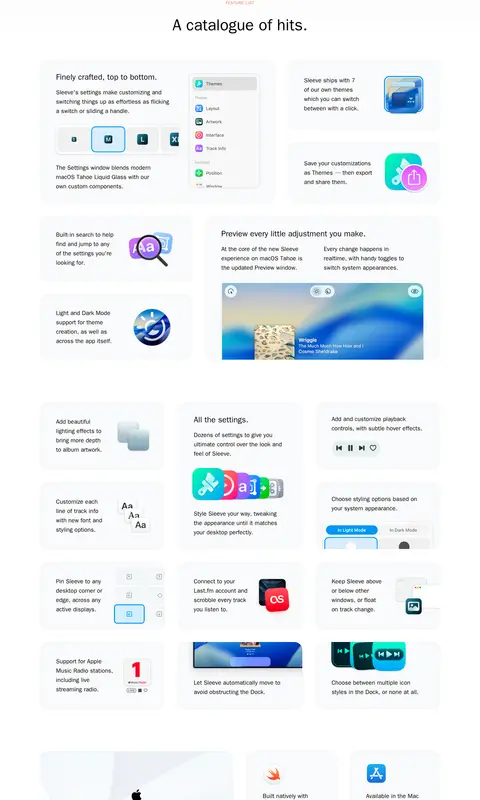
Soft #f9fafb surfaces group concise feature copy with colorful illustrations or product-interface previews.
Settings preview
Show stacked, rounded settings windows with light borders and restrained shadows to make customization controls legible.
Integration panel
Pair compact music-service iconography and explanatory copy within pale, softly colored cards.
Imagery · The page relies on polished product-interface mockups rather than lifestyle photography. A large desktop playback window anchors the hero, while smaller settings panels, app icons, keyboard imagery, and feature illustrations explain capabilities. Artwork uses vivid blue-to-cyan and turquoise gradients, rounded framing, and soft depth; surrounding presentation stays light and uncluttered.
Use #000000 for crisp, high-contrast headings and navigation.
Reserve vivid blue and cyan gradients for product artwork.
Center major product showcases and section introductions.
Use pale cards to group related feature copy and imagery.
Give interface mockups rounded frames and restrained depth.
✕ 不该做
Do not make the whole page blue or gradient-filled.
Do not introduce unmeasured brand colors.
Do not let decorative UI artwork overwhelm explanatory copy.
Do not replace generous whitespace with dense layouts.
Do not use heavy borders or dramatic shadows on every card.
Do not use display typography that departs from the clean sans-serif system.
给 AI 的提示词
想快速出一个同风格的新页面,把这段话连同 DESIGN.md 一起发给 AI。
Build a product page in Sleeve’s restrained Mac-software style. Use Gallery White (#ffffff) as the page canvas and Ink Black (#000000) for navigation and core text. Keep the header compact, then center a large, rounded product-interface showcase above the product name, concise explanation, and pill-shaped purchase actions. Use Cloud Surface (#f9fafb) for subtle card grouping and Mist Divider (#f0f1f2) for quiet hairlines. Reserve Showcase Blue (#3876c2), Electric Sky (#0e95ee), and Pool Cyan (#27c9f5) for interface artwork and demonstrations, not broad page backgrounds. Build a spacious centered content column with alternating feature showcases, split explanations, and compact cards. Use a clean system sans, generous section whitespace, soft preview shadows, and minimal borders.