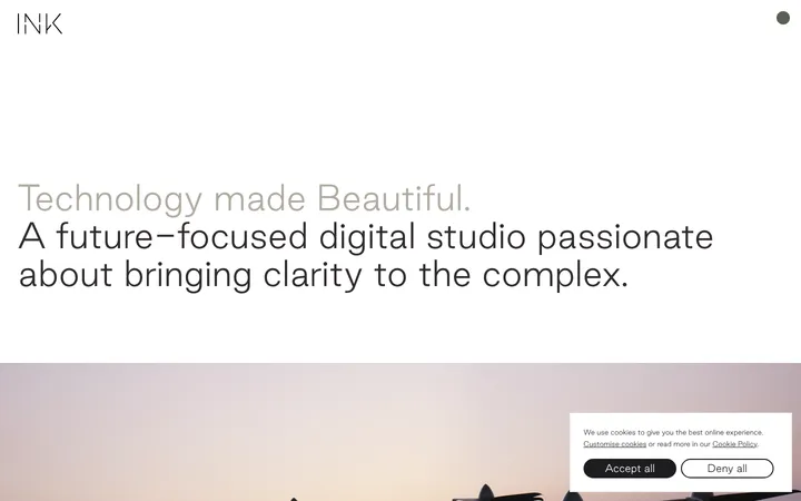
North star · Keep the interface quiet and spacious so oversized white statements and campaign photography command attention.
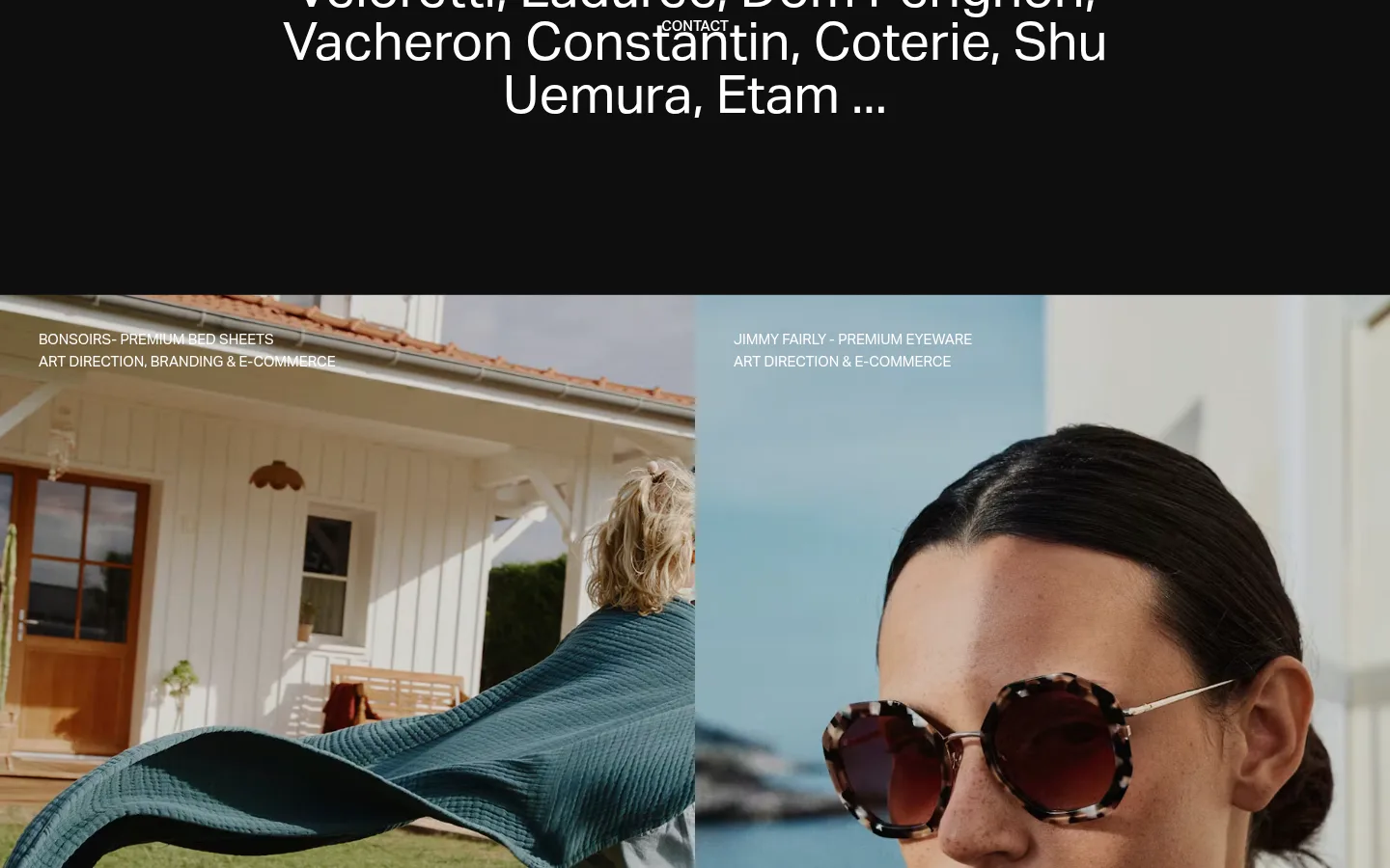
The page is built on a near-black canvas (#0e0e0e), with white type (#ffffff) providing clear contrast and a muted gray (#4f4f4f) reserved for fine footer rules. A warm muted brown (#bc9873) appears as a large, restrained color field near the end of the page; the colorful campaign imagery remains photographic content rather than a broader interface palette. Aktiv Web sans-serif gives headings a clean, contemporary voice, while uppercase labels and navigation provide compact editorial details. Large centered statements alternate with full-width campaign photographs and image tiles, creating a portfolio rhythm rather than a conventional service-card layout. Generous dark intervals separate content groups, and image captions sit directly over or beside the work in small white type. The page stays visually flat: no visible shadows, rounded cards, or decorative gradients. A large wordmark anchors the footer and adds a distinctive typographic finish.
Page-wide sans-serif for display statements, section headings, labels, navigation, and body copy.
角色
示例
字号
字重
行高
字距
一级标题
Large opening statement and prominent editorial copy.
Numbered
55px
400
1
0
二级标题
Uppercase section headings, including the case-studies label.
The quick brown fox 敏捷的狐狸
25px
400
1.2
0
正文
Uppercase service, project, and supporting copy.
The quick brown fox 敏捷的狐狸
15px
400
1.5
0
辅助文字
Small uppercase project labels and compact footer details.
The quick brown fox 敏捷的狐狸
13px
400
2
0
导航
Uppercase navigation and contact links.
The quick brown fox 敏捷的狐狸
13px
400
2
0
间距与布局
基准单位 1px · 密度:宽松
180px版块间距
—元素间距
—卡片内边距
—内容最大宽度
3px
20px
35px
50px
60px
80px
120px
180px
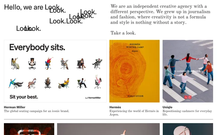
Use broad full-width bands on a dark page, alternating centered text blocks with expansive portfolio imagery. The portfolio includes paired side-by-side images and larger single-image moments; captions stay close to their relevant work. Keep content alignment varied but deliberate: centered statements contrast with small left-aligned labels. The measured spacing scale is spacious, with substantial vertical pauses between major blocks. Avoid imposing a fixed card grid or max-width value not established by the reference.
圆角与层次
没有测到阴影:页面是扁平的,层次靠底色和描边区分。
Keep surfaces flat and avoid drop shadows, rounded cards, or floating UI. Separation comes from generous dark space, changes in image content, and occasional full-width color fields. Use the measured graphite only for subtle footer hairlines; do not add decorative borders around portfolio images.
组件
下面的预览按实测的按钮、输入框、徽标、卡片样式重建(字体用替代字体)。
Contact navigation
Compact uppercase white contact links sit against the dark canvas; one contact treatment is visibly heavier than the surrounding navigation.
Editorial statement
Large regular sans-serif copy forms centered or left-aligned blocks, with deliberate line breaks and ample dark space around it.
Project image tile
Use large photographic crops, sometimes paired side by side, with compact uppercase white project and service labels near the image edge.
Case-studies heading
A concise uppercase heading introduces the portfolio, with a small view-all link positioned separately.
Warm color band
A broad muted-ochre (#bc9873) section creates a rare color interruption before the dark footer.
Footer wordmark
A very large white Numbered wordmark dominates the footer, above compact navigation, contact, and subscription details.
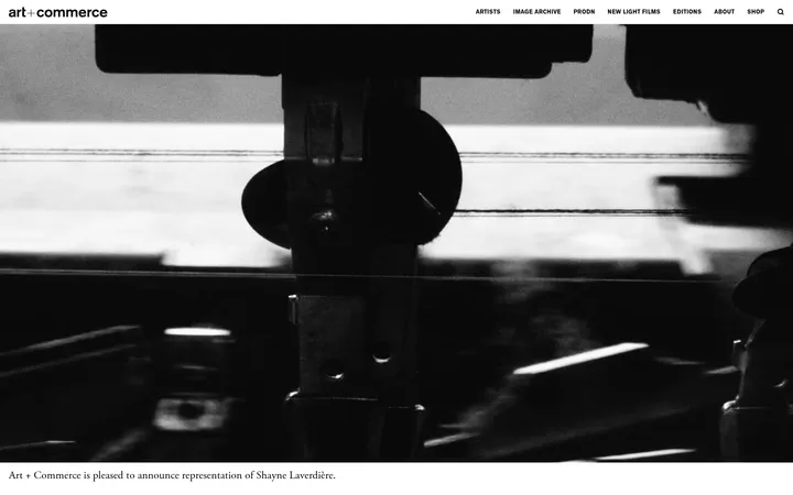
Imagery · Use polished campaign photography as the main visual content, including fashion, lifestyle, product, and brand work. Images appear as large edge-to-edge panels or paired tiles with tight crops and natural photographic color. Place small white uppercase project names and service descriptors over image corners. Some sections have very little visible imagery, preserving long stretches of dark canvas.
该做与不该做
✓ 该做
Use #0e0e0e as the dominant canvas.
Set primary text and project labels in #ffffff.
Let large campaign photography define portfolio sections.
Separate content with generous dark intervals.
Keep project captions compact and uppercase.
Reserve #bc9873 for a deliberate broad section field.
✕ 不该做
Do not introduce a bright multi-color interface palette.
Do not turn portfolio work into rounded cards.
Do not add shadows or gradients for depth.
Do not crowd the page with persistent UI controls.
Do not apply the warm accent to every link or button.
Do not treat colors inside campaign photographs as interface tokens.
给 AI 的提示词
想快速出一个同风格的新页面,把这段话连同 DESIGN.md 一起发给 AI。
Build a new agency page with Numbered’s restrained editorial character. Use Studio Black (#0e0e0e) as the dominant canvas and Gallery White (#ffffff) for clear, high-contrast typography. Set the page in a clean Aktiv Web-like sans-serif, using generous regular-weight statements and compact uppercase navigation, captions, and project labels. Structure the page as broad sections with spacious pauses, alternating concise text blocks and large campaign photographs; use paired image tiles where useful, with captions close to the images. Keep surfaces flat, without shadows or rounded cards. Graphite Line (#4f4f4f) may appear as a subtle footer divider. Reserve Muted Ochre (#bc9873) for one intentional large color field rather than repeated controls. Let the imagery, not interface decoration, provide visual richness.