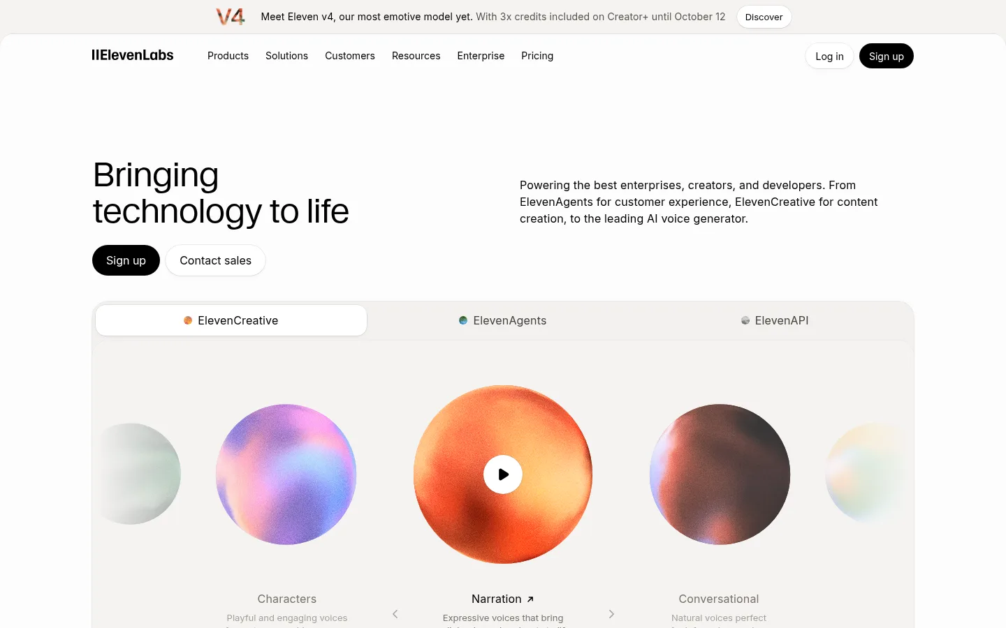
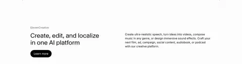
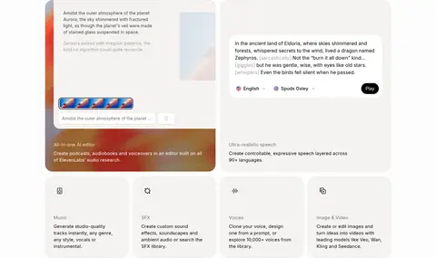
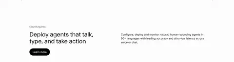
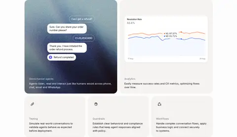
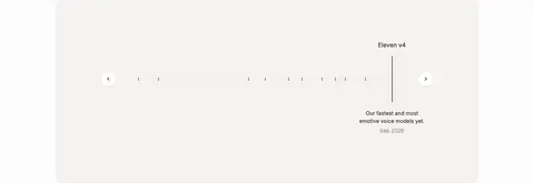
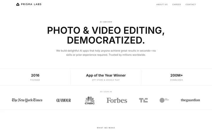
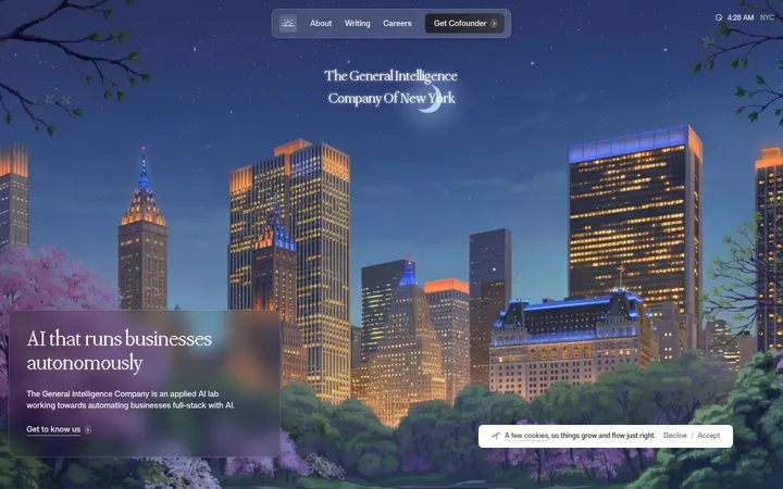
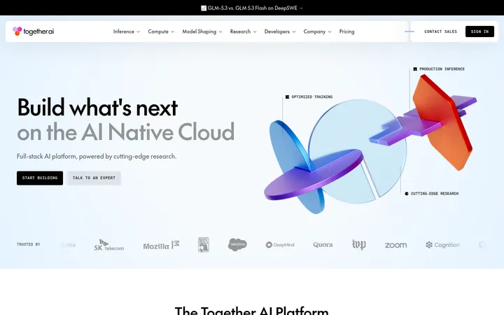
North star · Keep the interface nearly monochrome and spacious, reserving vivid color for the product and its media.
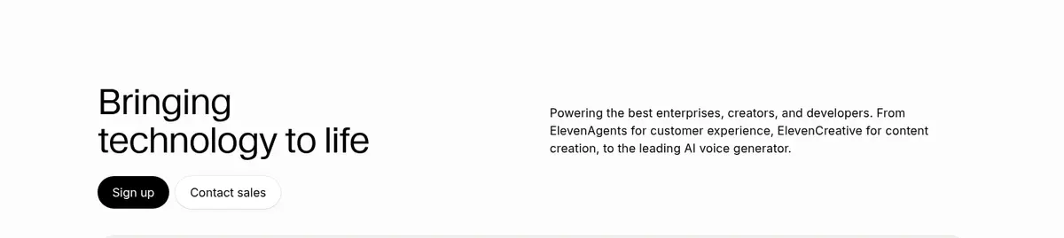
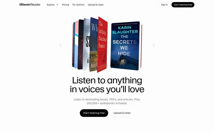
ElevenLabs builds its visual identity around an almost-white canvas (#fdfcfc), black typography, and warm off-white panels (#f5f3f1). This restrained palette gives long-form product storytelling room to breathe; color is concentrated in voice-demo spheres, interface previews, customer stories, and update artwork rather than used as a broad decorative system. Headlines use light Waldenburg with compact line spacing and subtle negative tracking, while Inter keeps navigation, labels, and body copy crisp and familiar. The page alternates between paired text-and-description layouts, broad product demonstrations, and soft-cornered feature cards inside a measured central content width. Generous vertical gaps distinguish a long sequence of sections without relying on strong background bands. Rounded black pill CTAs provide the clearest action contrast, while secondary actions remain white with quiet shadows. Borders and elevation stay delicate, preserving a calm canvas that lets product visuals carry the expressive moments.
Navigation, body copy, controls, captions, links, and most interface text
Aa 设计
Geist Mono
网络字体 · 字重 400 · 占比 6%
免费替代:IBM Plex Mono
Code snippets and API examples
Aa 设计
Waldenburg
网络字体 · 字重 300 · 占比 4%
免费替代:Inter
Primary display headings and section headlines
角色
示例
字号
字重
行高
字距
一级标题
Light display headline for the hero’s primary statement.
ElevenLabs
48px
300
1.08
-0.02em
二级标题
Large light-weight section headings throughout the product story.
ElevenLabs
36px
300
1.17
0
三级标题
Feature titles and smaller card or subsection headings.
The quick brown fox 敏捷的狐狸
20px
400
1.35
0
正文
Descriptions, explanatory copy, and supporting product text.
The quick brown fox 敏捷的狐狸
15px
400
1.47
0.01em
辅助文字
Compact labels, metadata, and card captions.
The quick brown fox 敏捷的狐狸
14px
500
1.5
0.01em
按钮
Primary and secondary action labels.
The quick brown fox 敏捷的狐狸
16px
400
1.5
0
导航
Top-level navigation and compact navigation items.
The quick brown fox 敏捷的狐狸
14px
400
1.43
0
链接
Inline links and text-based calls to action.
The quick brown fox 敏捷的狐狸
16px
400
1.5
0.01em
代码
API examples and developer code snippets.
const style = 1;
13px
400
1.69
0
间距与布局
基准单位 2px · 密度:适中
48px版块间距
8px元素间距
—卡片内边距
1174px内容最大宽度
4px
6px
8px
9px
10px
12px
14px
16px
18px
20px
24px
28px
32px
40px
48px
64px
The homepage uses a centered content area capped at the measured 1174px maximum, with two-column text-and-description sections, wider product demonstrations, and denser multi-column card groups. Hero content is left aligned, while select research or showcase areas center their headings. A comfortable density and recurring generous section gaps separate the long narrative without heavy color bands. Keep card content aligned and let broad media blocks span the available content width; use small consistent element gaps within each group.
圆角与层次
按钮 · 9999px
卡片 · 24px
图片 · 50%
导航 · 9999px
链接 · 4px
sm · button, other, card
inset · other
inset · other, card
sm · other, text
The page is mostly flat, with warm-gray card surfaces and faint hairlines doing most of the separation. Use the measured soft shadow on raised white buttons and selected cards, not as a repeated heavy effect. Layer product screenshots and media within rounded panels; maintain clear contrast without thick borders.
组件
下面的预览按实测的按钮、输入框、徽标、卡片样式重建(字体用替代字体)。
Pill action buttons
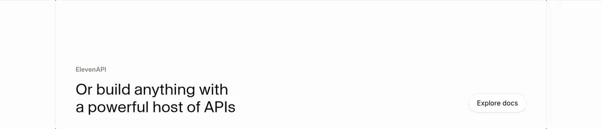
Black sign-up actions and white secondary actions use fully rounded pill ends; secondary white buttons receive a faint shadow.
Product category demo
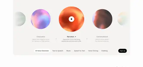
A broad warm-gray panel combines a pill-like category selector, colorful voice spheres, captions, and a compact action row.
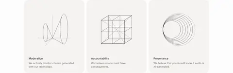
Feature cards
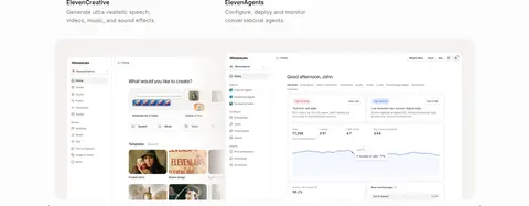
Warm-gray cards with large rounded corners hold product explanations, screenshots, and short supporting copy.
Paired feature introduction
A left-aligned heading and CTA sit opposite a concise descriptive paragraph in a two-column section.
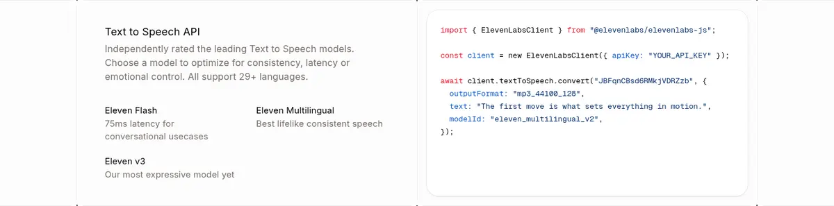
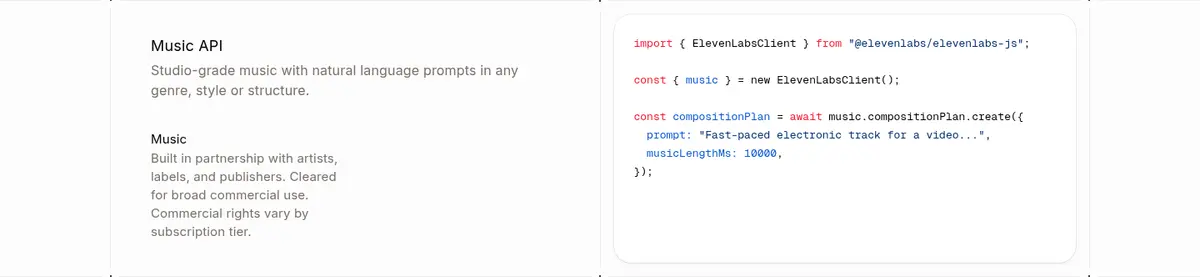
API code panel
Developer examples pair explanatory API text with a white, softly elevated code card using Geist Mono.
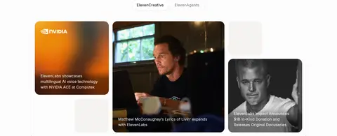
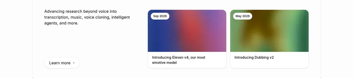
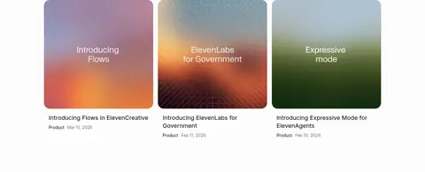
Story and update cards
Rounded image tiles use vivid gradients or photography, with compact overlaid or adjacent titles and metadata.
Imagery · Product UI previews and voice interfaces sit beside colorful media: luminous spherical voice samples, gradient artwork, and customer-story imagery. Most of the interface remains light and neutral, so these vivid assets carry the emotional color. Frame media in large rounded panels or cards; use contained screenshots for product proof and darker overlays only where text must sit on imagery.
Keep the page canvas close to white and warm in tone.
Use black for primary text and the strongest CTA.
Reserve vivid color for product media and story artwork.
Set display headings in a light, editorial style.
Separate long sections with generous whitespace.
Use warm-gray cards with soft rounded corners.
Keep shadows subtle and limited to raised elements.
✕ 不该做
Do not add large saturated background bands.
Do not use heavy headline weights or all-caps styling.
Do not turn sparse blue accents into a dominant theme.
Do not crowd sections with dense, uniform card grids.
Do not add strong borders or dramatic drop shadows.
Do not treat illustration-only gradient grays as core UI colors.
给 AI 的提示词
想快速出一个同风格的新页面,把这段话连同 DESIGN.md 一起发给 AI。
Build a new page in the ElevenLabs visual style: a bright, spacious AI product interface with Porcelain Mist (#fdfcfc) as the canvas, Warm Plaster (#f5f3f1) for quiet panels, and Deep Ink (#000000) for primary text and the main pill CTA. Use light Waldenburg-style display headings with Inter for navigation and body copy; reserve a mono face for code. Compose content in a centered, measured-width layout with paired text-and-description blocks, broad product demonstrations, and rounded feature cards. Use generous section spacing and subtle hairlines or shadows. Keep the UI mostly neutral; put vivid gradients and expressive imagery inside product media and editorial story cards. Secondary actions should remain understated white pills. Avoid decorative color bands, heavy borders, and visually dense layouts.