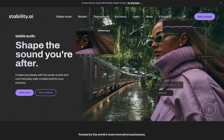
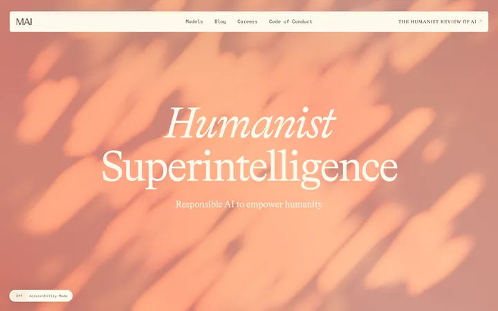
North star · Keep the page quiet and paper-like, then let cinematic imagery and real product previews supply the contrast.
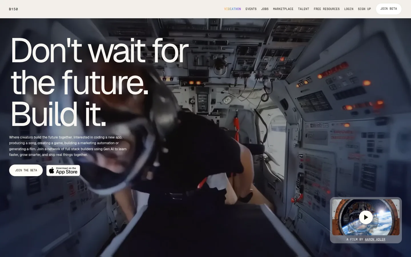
The visual identity balances a warm paper-like canvas with near-black ink and cinematic, cool-toned video. Most of the long page stays on the same pale background, so the photography and product interface captures provide the contrast rather than frequent colored section bands. Geist carries the oversized, tightly tracked headlines and readable supporting copy; Fragment Mono adds a precise, uppercase editorial layer to navigation, labels, and tiny interface cues. The opening is a full-bleed video hero with white text over a darkened image, followed by open, spacious sections, compact trust marks, and a four-column benefits area. Product features alternate the copy and interface preview from side to side. Pale surfaces, fine gray borders, rounded media frames, and restrained shadows make interface mockups feel lifted without adding heavy card decoration. Pill-shaped beta actions are the most distinct recurring control.
Display headlines, section titles, body copy, and interface text.
Aa 设计
Fragment Mono
网络字体 · 字重 400 / 700 / 600 · 占比 26%
免费替代:Space Mono
Navigation, eyebrow labels, captions, and compact uppercase links.
角色
示例
字号
字重
行高
字距
特大标题
Oversized hero and campaign headlines.
B150
120px
400
0.93
-0.067em
一级标题
Primary page headline and major display statements.
B150
96px
500
0.91
-0.031em
二级标题
Feature and section headlines.
B150
48px
500
1
-0.042em
三级标题
Smaller section titles and supporting feature headings.
B150
32px
500
1.12
-0.031em
正文
Compact descriptive copy and supporting explanations.
The quick brown fox 敏捷的狐狸
12px
400
1.7
0
辅助文字
Uppercase micro-labels and image captions.
The quick brown fox 敏捷的狐狸
10px
400
1.33
0.03em
导航
Uppercase primary navigation items.
The quick brown fox 敏捷的狐狸
10px
700
1
0.03em
链接
Small uppercase links such as contact and beta actions.
The quick brown fox 敏捷的狐狸
10px
400
1.33
0.03em
眉题
Section category labels above feature headlines.
The quick brown fox 敏捷的狐狸
10px
400
1.33
0.03em
代码
Compact monospaced interface-style labels and metadata.
const style = 1;
10px
400
1.33
0.03em
间距与布局
基准单位 8px · 密度:紧凑
40px版块间距
12px元素间距
—卡片内边距
1376px内容最大宽度
4px
8px
10px
12px
16px
20px
24px
32px
40px
48px
64px
80px
96px
120px
The page uses a broad centered content area, measured at a 1376px maximum width, with a compact top navigation and a full-bleed opening video. Below, the canvas remains visually continuous while content alternates between centered or left-led editorial blocks, multi-column benefit copy, and side-by-side product showcases. Feature rows switch which side holds copy and imagery, creating rhythm without changing the overall grid language. Sections are generously separated; individual labels and descriptions stay compact, keeping the page airy rather than dense.
圆角与层次
按钮 · 9999px
卡片 · 16px
图片 · 8px
链接 · 8px
md · media
The page is mostly flat: separation comes from the warm canvas, pale inset surfaces, and fine gray hairlines rather than heavy shadows. Product previews sit slightly above the background with restrained soft shadowing and rounded media corners. Use dark image overlays for text legibility, while keeping buttons and navigation visually light.
组件
下面的预览按实测的按钮、输入框、徽标、卡片样式重建(字体用替代字体)。
Compact navigation
A restrained top bar with B150 identity, uppercase Fragment Mono links, and a pale pill-shaped beta action.
Video hero
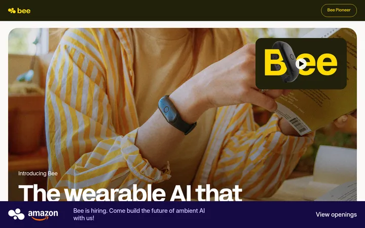
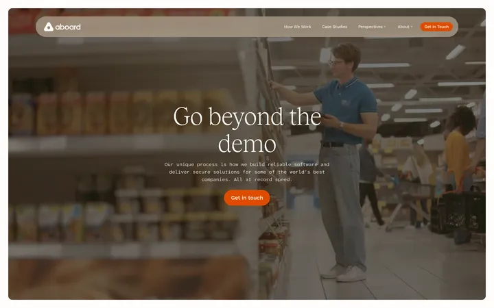
Full-bleed cinematic media with a large white multiline headline, short supporting copy, beta action, and a small film preview.
Benefit grid
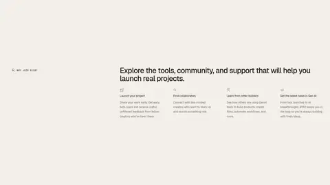
A four-column set of compact reasons to join, with small labels, concise descriptions, and generous surrounding space.
Creator gallery
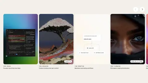
A horizontal strip of rounded creator-work cards, combining imagery, category labels, and small author chips.
Product feature row
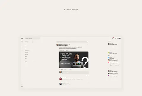
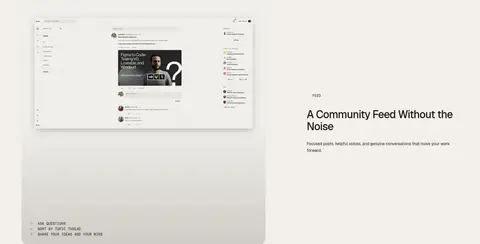
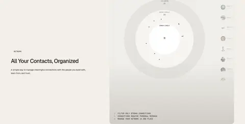
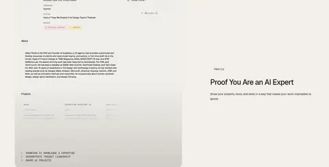
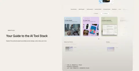
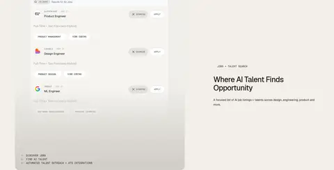
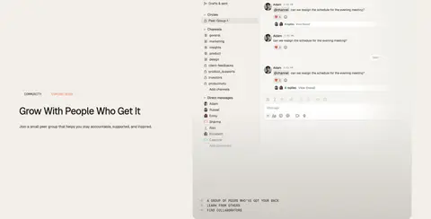
Alternating copy and interface-preview layouts; use compact uppercase eyebrows, short headlines, and pale framed screenshots.
Beta pill
An uppercase join action in a white or warm-white pill, with a fine pale border and restrained visual emphasis.
Trust strip
A small centered trust label above a horizontal partner-logo row divided by thin gray rules.
Imagery · Use cinematic photographic video for the hero and closing call to action, darkened enough for white headline contrast. Product sections should show believable interface screenshots in softly framed, pale panels, with subtle gradient fading near their lower edges. Include creator and product imagery in the horizontal work gallery. Keep imagery rectangular and crisp; avoid decorative illustration or synthetic 3D as the main visual language.
Reserve Fragment Mono for compact uppercase labels.
Let real imagery and product UI provide visual interest.
Alternate the alignment of product showcase rows.
Use fine borders and rounded media frames.
Keep beta actions light, pill-shaped, and understated.
✕ 不该做
Do not introduce bright accent colors absent from the measured palette.
Do not divide every section with a new background color.
Do not use heavy shadows or dense card decoration.
Do not make the supporting copy as prominent as the headlines.
Do not replace interface screenshots with abstract illustrations.
Do not use monospaced type for long paragraphs.
Do not let navigation compete with the hero.
给 AI 的提示词
想快速出一个同风格的新页面,把这段话连同 DESIGN.md 一起发给 AI。
Build a new B150-style page with a restrained editorial shell and a clear emphasis on creators and product. Use Soft Parchment (#f2efe9) as the continuous canvas, Warm Ink (#1f1915) for primary text, and Porcelain (#f7f5f1) for occasional inset surfaces. Set expressive headlines and readable copy in Geist; use Fragment Mono for compact uppercase navigation, category labels, and metadata. Start with cinematic full-bleed media and legible white copy, then alternate spacious text-and-product-preview rows. Frame interface previews with Quiet Line (#e6e3dd), rounded corners, and very subtle elevation. Keep calls to action pale and pill-shaped. Preserve generous whitespace, concise supporting text, and a calm rhythm; avoid bright accents, busy decoration, and excessive card treatment.