North star · Keep the interface nearly black and spacious, letting monumental white condensed headlines and cinematic media carry the story.
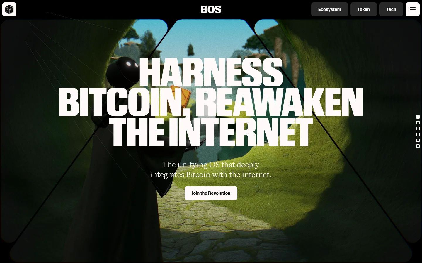
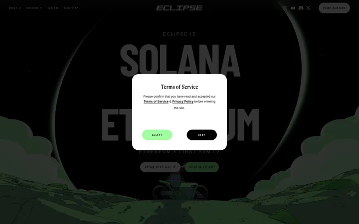
The page is anchored by a near-black canvas (#101010), which fills the long scroll and keeps attention on bright type and media. Warm off-white (#fffafa) carries the main display headlines, body copy, links, and inverse CTA surfaces; muted charcoal tones define quiet navigation controls and fine boundaries. The hero uses cinematic, full-bleed imagery behind a tightly stacked, oversized uppercase headline. Review Condensed gives display copy an emphatic poster-like silhouette, while Review handles compact bold labels and Kalice adds an editorial, literary counterpoint in paragraphs and supporting statements. Content is arranged as a sequence of expansive dark sections, with substantial empty space between narrative moments and smaller, carefully grouped content such as partner marks and explanatory points. Cards and buttons remain simple and flat, using restrained radii and subtle borders rather than shadows. Image colors can vary within the artwork, but the page’s defining identity remains monochrome.
Editorial body copy and literary supporting statements
Aa 设计
Review
网络字体 · 字重 700 / 900 · 占比 39%
免费替代:Montserrat
Bold navigation, captions, and uppercase section headings
Aa 设计
Review Condensed
网络字体 · 字重 900 · 占比 4%
免费替代:Oswald
Oversized hero display headline
角色
示例
字号
字重
行高
字距
特大标题
Oversized uppercase hero headline over cinematic imagery
BitcoinOS
128px
900
0.8
0
一级标题
Bold uppercase section titles and major narrative headings
BitcoinOS
32px
900
0.75
-0.01em
二级标题
Serif section statements and supporting subheads
The quick brown fox 敏捷的狐狸
24px
400
1.4
0.04em
正文
Editorial paragraphs, vision copy, and explanatory text
The quick brown fox 敏捷的狐狸
16px
400
1.6
0.06em
辅助文字
Bold compact labels and small section markers
The quick brown fox 敏捷的狐狸
14px
700
1
0.02em
导航
Bold compact navigation labels and control text
The quick brown fox 敏捷的狐狸
14px
700
1
0.02em
间距与布局
基准单位 8px · 密度:宽松
128px版块间距
8px元素间距
24px卡片内边距
1042px内容最大宽度
8px
12px
16px
21px
24px
32px
96px
128px
A single, spacious long-form page sits on a dark canvas, organized as sequential full-width narrative sections. The measured content max width is 1042px, with three columns appearing in the partner-logo area and single-column storytelling elsewhere. The hero centers its headline and supporting copy over media; later content alternates between centered statements and compact left-aligned details. Generous section spacing creates a deliberate slow scroll, with low information density and broad areas of negative space.
圆角与层次
按钮 · 8px
卡片 · 8px
图片 · 16px
导航 · 16px
链接 · 2px
没有测到阴影:页面是扁平的,层次靠底色和描边区分。
The interface is mostly flat, with no measured shadows or gradients. Subtle charcoal borders separate selected media and controls from the canvas. Buttons and cards use modest measured radii, while media and navigation can be more rounded. Maintain contrast through light surfaces and outlines, not stacked elevation effects.
组件
下面的预览按实测的按钮、输入框、徽标、卡片样式重建(字体用替代字体)。
Hero headline
Large centered uppercase Review Condensed display type, stacked over cinematic media with a short serif supporting statement.
Primary CTA
Light #fffafa button with #101010 Review text and an 8px measured radius.
Navigation controls
Compact bold Review labels; dark #272727 controls sit against the black canvas, with a light menu control visible in the screenshot.
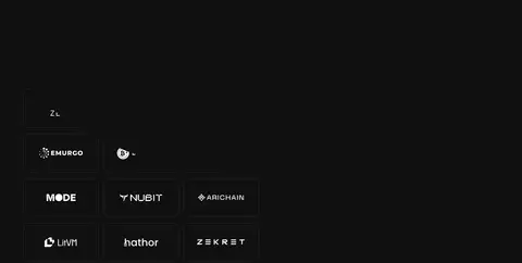
Partner mark grid
A measured three-column area of image marks, set on the dark background with restrained fine boundaries.
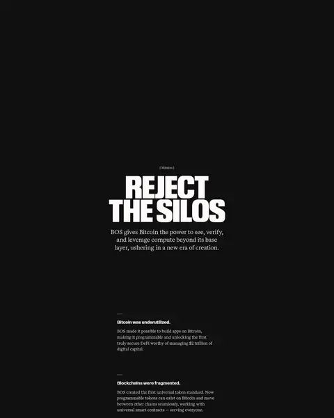
Narrative section title
Bold uppercase Review heading paired with a smaller Kalice serif statement and ample surrounding space.
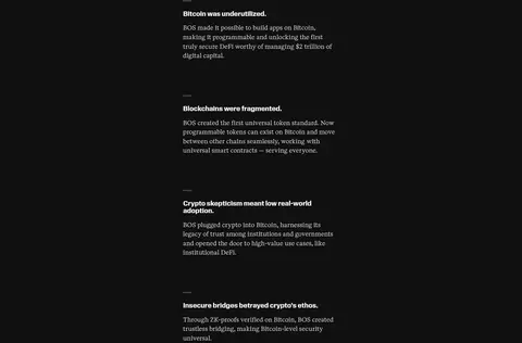
Explanatory copy
Compact editorial paragraphs in Kalice, grouped into separated points rather than dense interface cards.
Section navigation markers
Small stacked outline indicators positioned at the hero edge to suggest progress through the long page.
Imagery · The hero is a cinematic, full-bleed scene with deep greens, shadows, and a central path, framed by dark geometric edges. Its colors belong to the image rather than the core brand palette. Partner marks appear as a compact grid of image assets. The page otherwise relies on typography and open dark space; avoid adding decorative illustrations or generic stock photography.
Set major headlines in heavy, uppercase condensed type.
Use #fffafa for primary text and the prominent CTA surface.
Pair bold sans-serif labels with editorial serif copy.
Preserve generous negative space between story sections.
Use imagery as cinematic section media, not as interface decoration.
✕ 不该做
Do not introduce unmeasured brand colors into the interface.
Do not fill the page with dense cards or dashboards.
Do not add heavy shadows, gradients, or glossy effects.
Do not use generic stock imagery in place of distinctive media.
Do not set every text role in the same typeface.
Do not compress the long-scroll narrative into a tight grid.
给 AI 的提示词
想快速出一个同风格的新页面,把这段话连同 DESIGN.md 一起发给 AI。
Build a new BitcoinOS-style page on a Carbon Canvas (#101010), using Soft Snow (#fffafa) for primary text and light CTA surfaces. Keep the composition cinematic and editorial: begin with bold, oversized uppercase condensed display type over a distinctive full-bleed image, then unfold the content in spacious dark sections. Use Kalice-like serif typography for supporting prose and Review-like bold sans-serif for navigation, labels, and section headings. Keep controls flat, with restrained charcoal boundaries and measured rounded corners; do not add shadows or gradients. Use large negative spaces to pace the narrative, grouping logos or explanatory points only where needed. Let artwork carry its own colors without extending them into interface chrome. Favor clear contrast, sparse components, and a deliberate long-scroll rhythm.