North star · Let oversized vintage lettering and one unmistakable product image carry the page, against calm, high-contrast brand colors.
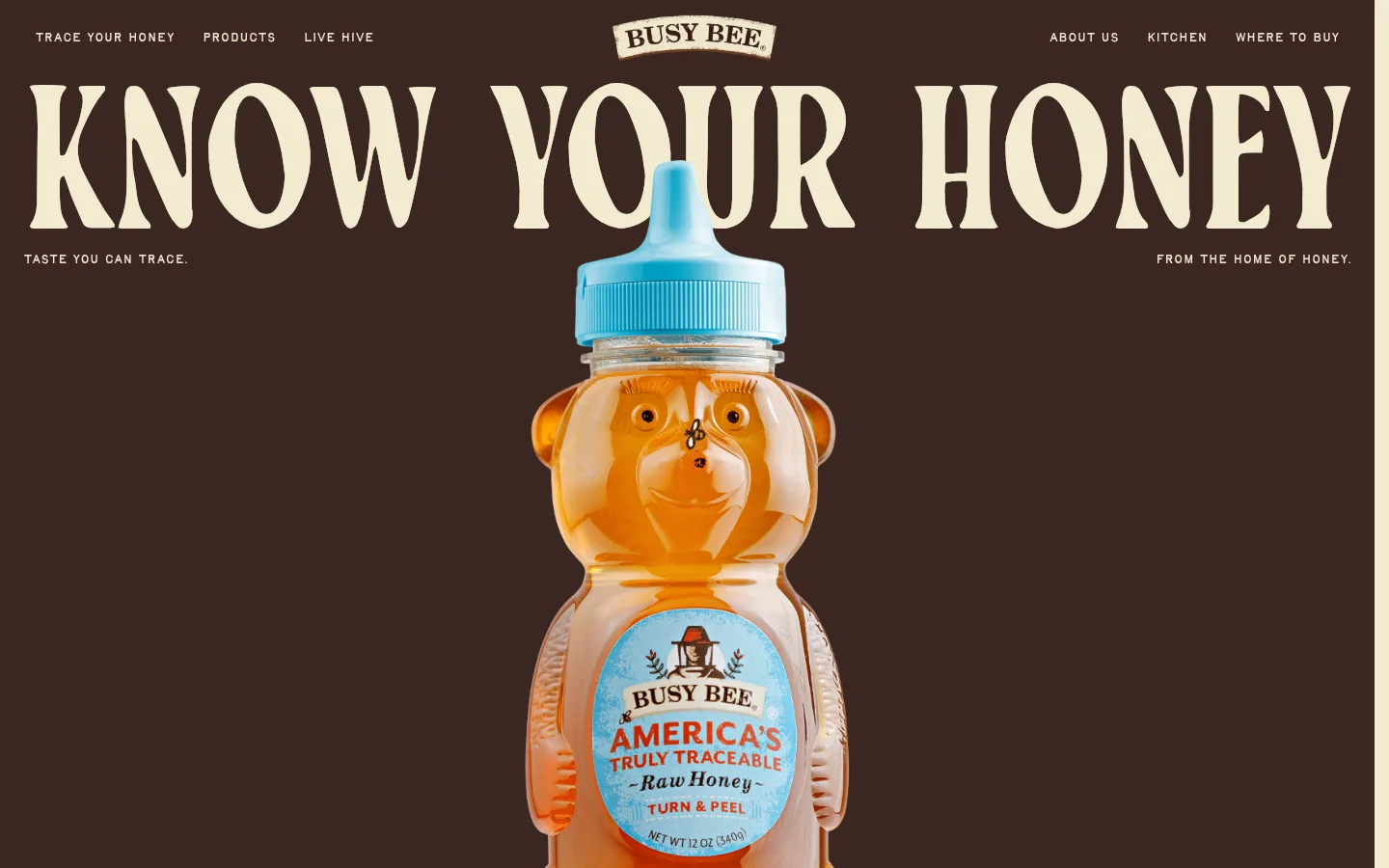
The page opens on a nearly full-bleed dark brown hero, with warm cream lettering and navigation providing crisp contrast. A huge, condensed display headline stretches across the top of the composition, while a centered bear-shaped honey bottle gives the page a playful, product-first focal point. The surrounding colors are drawn from the measured palette: cream and brown establish the brand, with honey yellow, sky blue, brick red and muted taupe appearing in supporting sections or accents. Keep the hero spacious and visually simple; the product label itself brings brighter colors and detail, so avoid adding competing decorative elements. Typography contrasts expressive, irregular display lettering with a compact, readable sans-serif for navigation and body copy. Across the longer page, alternate generous cream-colored canvas areas with more saturated section surfaces, using rounded cards and pill-shaped buttons where they are visible in the measured styles. Treat colors seen only in the product mock-up as image detail, not global UI tokens.
Oversized hero statement and prominent decorative display text.
Busy Bee Honey
238px
400
1
0
一级标题
Primary page headline, prominently set across the hero.
Busy Bee Honey
209px
400
0.8
-0.01em
二级标题
Major section headlines in the long homepage.
Busy Bee Honey
135px
400
0.82
0
三级标题
Subsection or feature headlines.
Busy Bee Honey
90px
400
0.82
0
四级标题
Compact display headings for cards and supporting blocks.
Busy Bee Honey
28px
400
1
0
正文
Product storytelling, descriptions, and supporting paragraphs.
The quick brown fox 敏捷的狐狸
14px
400
1.5
0
辅助文字
Small labels and short supporting annotations.
The quick brown fox 敏捷的狐狸
12px
400
1
0
导航
Compact primary navigation links.
The quick brown fox 敏捷的狐狸
14px
400
1
0
间距与布局
基准单位 8px · 密度:适中
48px版块间距
8px元素间距
40px卡片内边距
—内容最大宽度
8px
12px
16px
20px
24px
28px
32px
35px
36px
40px
48px
52px
80px
The hero spans the viewport, with navigation along the top, a centered brand mark, and an oversized headline aligned across the page. The product image sits centrally beneath the headline and overlaps its visual area, creating a single composed focal point. Keep the first screen sparse rather than dividing it into columns or adding cards. The measured data reports no maximum page width, so use broad, edge-reaching compositions where the screenshot supports them. Across the page, alternate spacious cream canvas with colored sections; use comfortable separation and rounded cards without inventing unmeasured dimensions.
圆角与层次
按钮 · 9999px
卡片 · 40px
没有测到阴影:页面是扁平的,层次靠底色和描边区分。
The measured styles report no shadows, so keep the composition predominantly flat. Use strong color blocks, pill-shaped CTA buttons, and rounded cards rather than drop shadows to distinguish interface elements. The hero's layering comes from the headline and product image occupying overlapping visual space, not from simulated depth or ornamental borders.
组件
下面的预览按实测的按钮、输入框、徽标、卡片样式重建(字体用替代字体)。
Hero navigation
Compact cream links sit across the top of the dark hero, with the Busy Bee mark centered and navigation groups arranged on either side.
Oversized hero headline
A wide, warm-cream display headline dominates the hero, using the expressive TayMakawao-Regular face and a tight line treatment.
Centered product image
A large, isolated bear-shaped honey bottle is centered beneath and partly over the hero headline.
Pill CTA
Use a fully rounded button; measured examples include honey-yellow with brick text or dark brown with cream text.
Rounded feature card
Measured cards use a 40px radius, generous internal padding, and either dark brown or sky-blue fills.
Text link
Product and content links use dark brown text without a filled background; keep them distinct from pill-shaped CTAs.
Imagery · The hero uses a crisp, isolated product photograph of a bear-shaped honey bottle, centered and large enough to overlap the headline area. Its amber contents, blue cap, and illustrated label supply detail against the simple dark field. Keep product photography cleanly cut out or on a restrained background; the package's bright colors belong to the photographed product, not the core interface palette.
该做与不该做
✓ 该做
Use Roasted Brown #3b2722 as the defining dark hero field.
Set primary display headlines in warm cream against dark surfaces.
Give one product image a clear, central focal position.
Use expressive display type for headings and compact sans-serif for utility text.
Reserve Honey Gold #ffca50 and Hive Blue #6aacc2 for accents and section surfaces.
Keep interface depth flat and let color blocks define sections.
✕ 不该做
Don't add gradients or shadows absent from the measured styles.
Don't let product-label colors become global interface colors.
Don't crowd the hero with extra cards or competing imagery.
Don't replace the expressive display face with generic bold sans-serif headings.
Don't introduce new palette colors or unmeasured spacing values.
Don't use rectangular controls where the measured buttons are pill-shaped.
给 AI 的提示词
想快速出一个同风格的新页面,把这段话连同 DESIGN.md 一起发给 AI。
Build a new Busy Bee Honey page that follows the homepage's product-led, vintage editorial style. Use Roasted Brown #3b2722 for strong dark fields and Warm Cream #f2ebd0 for high-contrast text and light canvas. Set oversized headings in an expressive vintage display face, with a restrained sans-serif for navigation and body copy. Anchor the composition with a clean, centered product photograph; treat label colors as image detail, not global UI colors. Use Honey Gold #ffca50, Hive Blue #6aacc2, Brick Nectar #a0342a, and Muted Stone #c2bca6 selectively for accents and section surfaces. Keep sections spacious, layouts broad, cards rounded, and CTA buttons pill-shaped. Avoid shadows, gradients, extra ornament, invented palette values, and overly dense layouts.