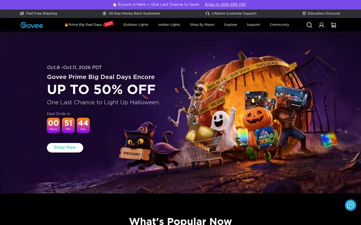
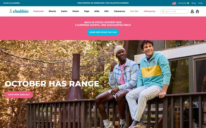
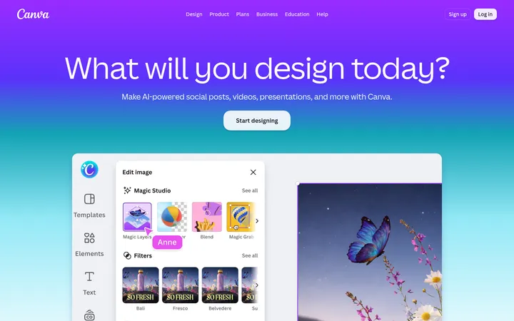
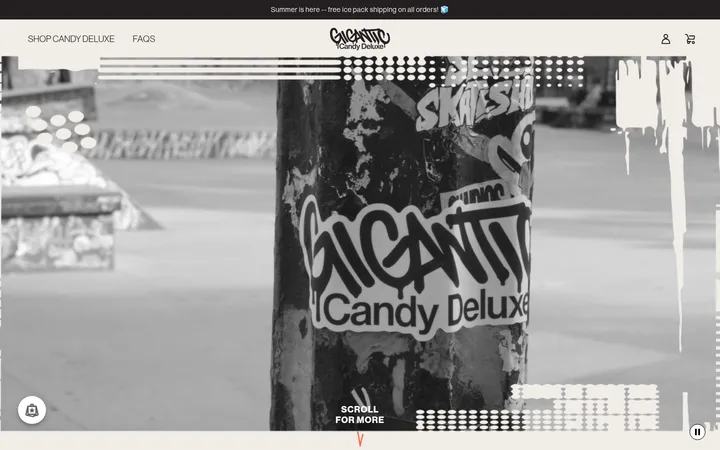
North star · Keep the lavender canvas and electric-blue structure consistent, then use lime and vivid candy imagery as deliberate bursts of contrast.
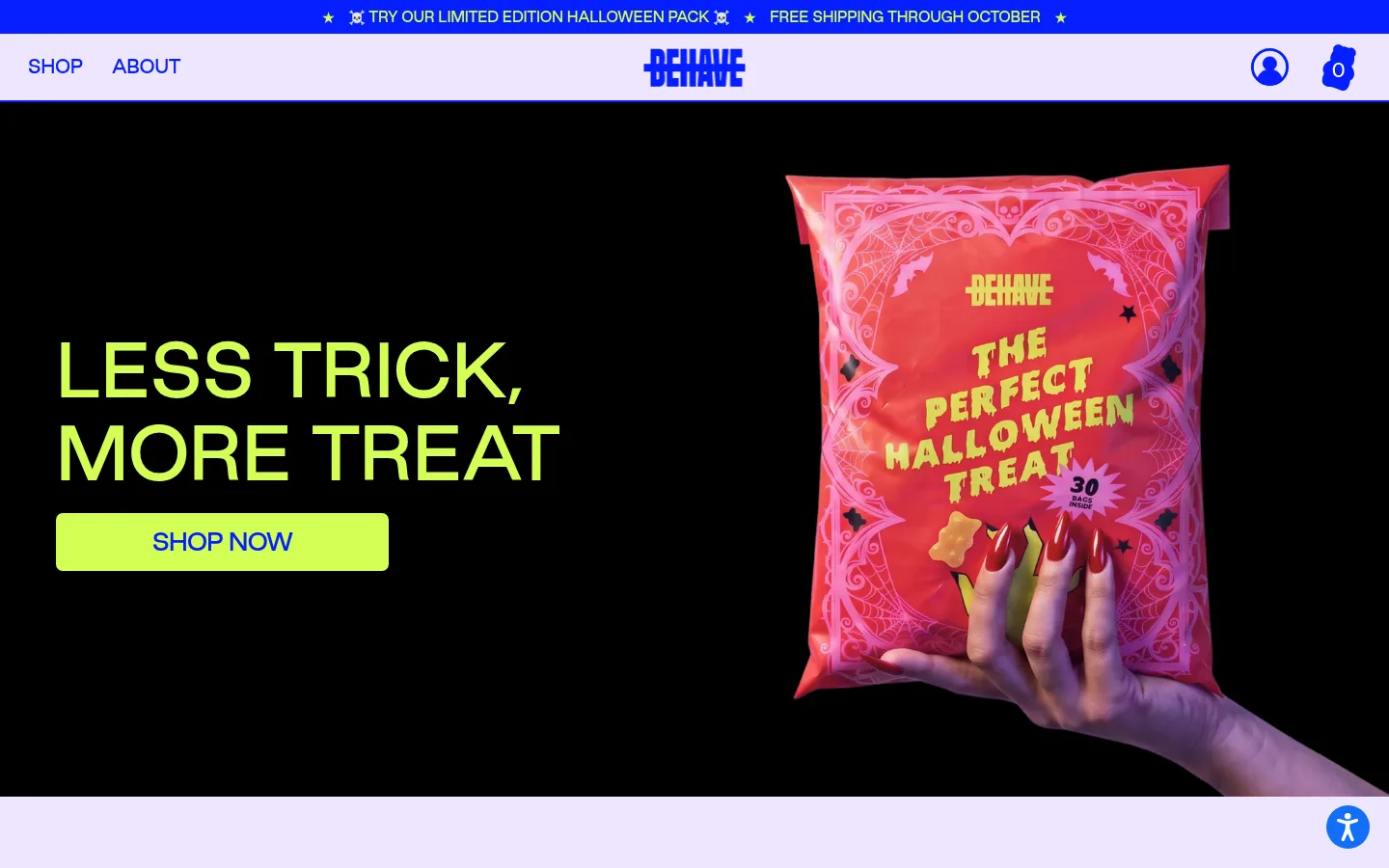
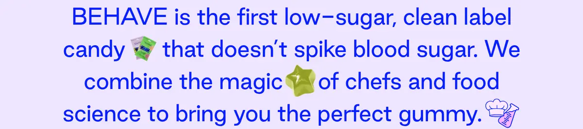
The visual system is led by Gallery Lavender (#efe5ff), which carries most of the page and keeps the busy product content readable. Electric Blue (#061fff) anchors navigation, headings, text, outlines, and product-card actions; Acid Lime (#d3ff56) supplies the strongest CTA contrast and occasional highlighted text. Pink surfaces (#ffe7ff) distinguish product cards, while Lilac Footer (#ceb3ff) gives the closing area a separate field. The first viewport introduces a black hero media area: treat its black background and candy packaging as campaign imagery, not as the core site palette. Good Sans is used throughout, with uppercase, tightly tracked headings and compact uppercase navigation and labels. Large headlines sit beside product images; below, centered copy, a horizontal product carousel, four-column nutrition facts, a full-bleed lifestyle image, and a flavor strip create varied but consistent beats. Comfortable spacing and rounded, blue-outlined cards balance the energetic color and imagery.
配色
点色块复制色值。用途说明来自对页面的实测位置(背景、文字、描边、按钮)与截图判读。
品牌色
强调色
表层色
中性色
页面底色 · Gallery Lavender表层 · Candy Blush表层 2 · Lilac Footer主文字 · Electric Blue描边 · Electric Blue强调 · Electric Blue强调 2 · Lilac Footer
Large introductory copy and supporting statements.
BEHAVE Candy
53px
400
1.51
-0.02em
四级标题
Compact uppercase card or subsection headings.
BEHAVE Candy
32px
500
1.1
-0.02em
正文
Short uppercase product and nutrition labels.
The quick brown fox 敏捷的狐狸
14px
500
1.1
-0.02em
辅助文字
Small uppercase pack details and footnotes.
The quick brown fox 敏捷的狐狸
12px
500
1.1
-0.02em
按钮
Large uppercase shopping and promotional actions.
The quick brown fox 敏捷的狐狸
24px
500
2.5
-0.05em
导航
Compact uppercase header navigation.
The quick brown fox 敏捷的狐狸
12px
500
1.1
-0.02em
链接
Uppercase promotional links and flavor links.
The quick brown fox 敏捷的狐狸
14px
500
1.1
-0.02em
间距与布局
基准单位 2px · 密度:适中
50px版块间距
20px元素间距
—卡片内边距
1000px内容最大宽度
5px
10px
20px
25px
30px
40px
50px
100px
A centered storefront header sits above broad, mostly full-width sections on a comfortable-density page. The measured content max width is 1000px, with single-column promotional and editorial blocks, a two-column product area, four-column nutrition facts, and a twelve-item flavor strip. The hero pairs left-aligned copy with right-side product imagery; following copy is centered. Use measured section and element gaps as rhythm references, while allowing campaign images to run full bleed. Keep the product carousel visibly horizontal rather than compressing its cards into a dense grid.
圆角与层次
按钮 · 7px
输入框 · 7px
卡片 · 20px
没有测到阴影:页面是扁平的,层次靠底色和描边区分。
The interface is mostly flat: no measured shadows or gradients define its depth. Separate product cards with Electric Blue outlines and rounded corners, then use surface-color changes and imagery for hierarchy. Buttons rely on strong contrasting fills rather than shadow. Keep borders crisp and layering simple; let overlapping campaign photography provide the few dramatic depth effects.
组件
下面的预览按实测的按钮、输入框、徽标、卡片样式重建(字体用替代字体)。
Announcement and navigation
A narrow Electric Blue announcement band with lime promotional text sits above a lavender navigation bar. Keep the links compact and uppercase, with the wordmark centered.
Campaign hero
A full-width dark media panel pairs a large lime uppercase headline and lime CTA on the left with oversized candy packaging imagery on the right.
Product carousel cards
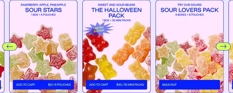
Use Candy Blush card surfaces, Electric Blue outlines, and rounded corners. Show product imagery, concise pack information, and compact blue purchase actions with lime text.
Nutrition facts strip
Present four evenly spaced headline metrics in Electric Blue on the lavender canvas, with short uppercase labels and a small footnote below.
Flavor selector
Center a strong uppercase heading above a horizontal row of colorful candy cutouts; use a lightly framed pink panel against lavender.
Lifestyle promotion
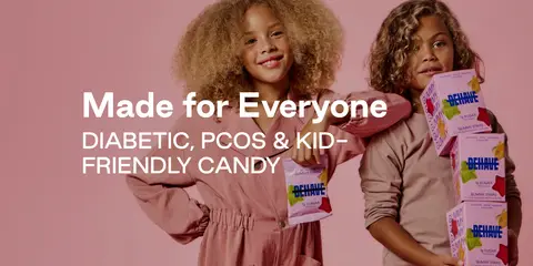
Use full-bleed lifestyle photography with white headline and supporting text over the image; keep the copy block clearly separated from the people and product.
Footer
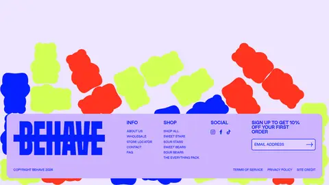
Set a large Electric Blue wordmark and compact link columns on the Lilac Footer surface, with a small email signup field and legal links.
Imagery · Treat product and lifestyle imagery as vivid campaign content: oversized candy packaging, gummy close-ups, and people holding the product. The hero uses a dark, full-width image field, contrasting with the pastel shopping sections; this dark treatment belongs to the media composition rather than the measured core palette. Product cards combine pack graphics and candy photography, while the flavor strip uses small repeated candy cutouts. Preserve image-rich layouts and avoid generic decorative illustrations.
Use Gallery Lavender as the primary shopping canvas.
Set navigation, headings, and outlines in Electric Blue.
Reserve Acid Lime for clear CTAs and selected emphasis.
Use uppercase, tightly tracked Good Sans for interface labels.
Let product photography and candy cutouts bring vivid color.
Keep product cards rounded and sharply outlined.
Alternate centered copy with full-bleed campaign imagery.
✕ 不该做
Do not replace the lavender canvas with plain white.
Do not use lime as a large, continuous page background.
Do not add shadows or gradients as default elevation.
Do not make product cards borderless or visually muted.
Do not crowd the layout with dense, narrow columns.
Do not treat campaign-image colors as core brand tokens.
给 AI 的提示词
想快速出一个同风格的新页面,把这段话连同 DESIGN.md 一起发给 AI。
Build a new BEHAVE-style candy storefront page with a playful, high-contrast visual system. Use Gallery Lavender (#efe5ff) for the primary canvas, Electric Blue (#061fff) for navigation, headings, body text, and crisp outlines, and Acid Lime (#d3ff56) for prominent CTAs. Use Candy Blush (#ffe7ff) on product cards and Lilac Footer (#ceb3ff) in the footer; keep Paper White (#ffffff) to small text details. Set Good Sans throughout, favoring uppercase, tightly tracked interface labels and bold campaign headlines. Create clear section changes through spacing, color fields, and full-bleed imagery rather than shadows. Feature vivid candy packaging and lifestyle photography, with horizontal product cards, a nutrition metrics strip, and a compact flavor gallery. Keep the layout open, rounded, image-led, and easy to scan.