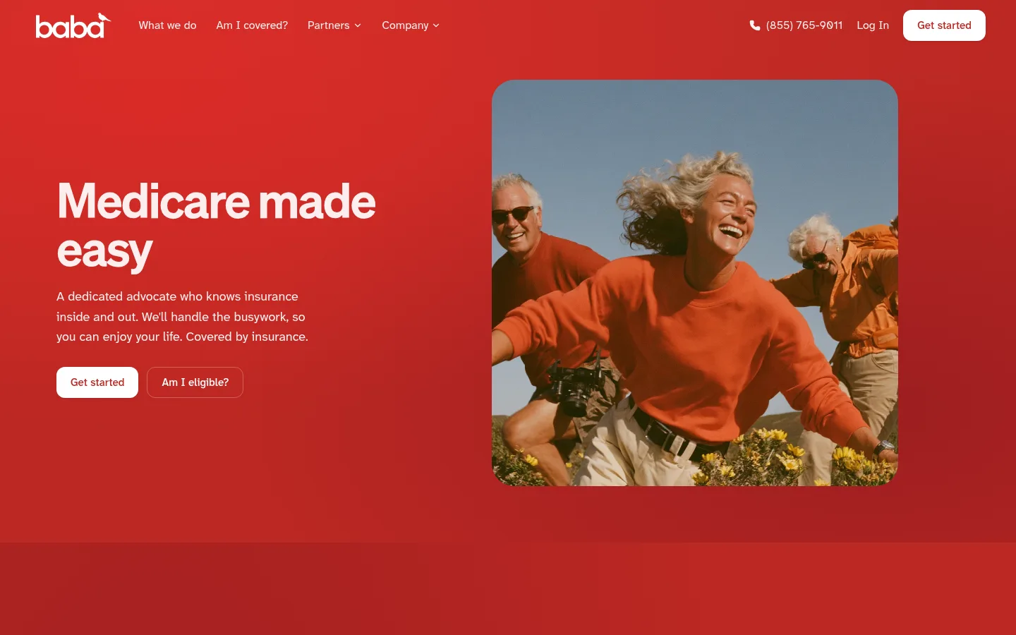
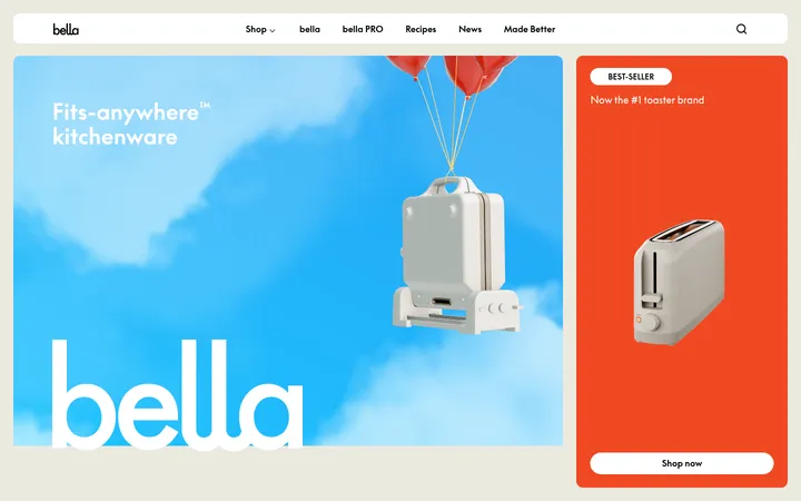
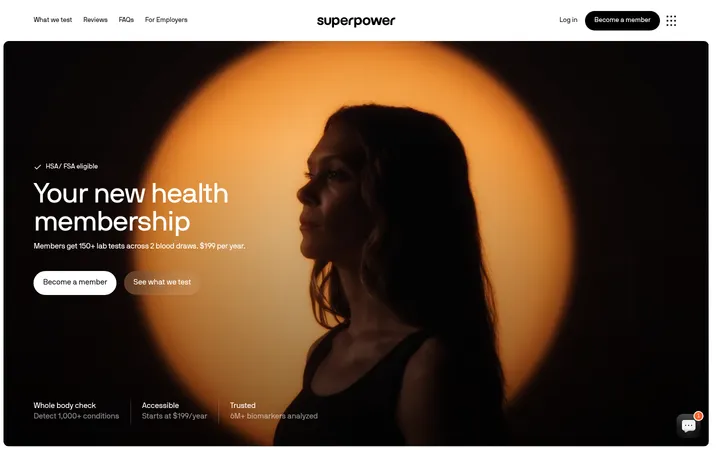
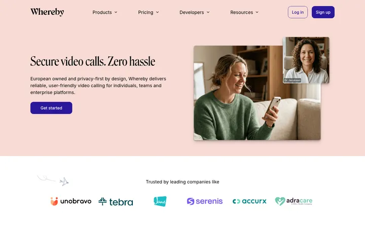
Baba 首页以醒目的红色首屏搭配平和的奶油色内容区,让医疗倡导服务显得亲切、可靠。真实人物照片、清晰易读的字体、用户评价和醒目的资格查询入口,将情感关怀与实用信息结合起来。
North star · Use bold, welcoming red for the emotional opening, then let warm cream, legible type, and human proof make the service feel trustworthy.
The visual strategy opens with a full-width, saturated red field, white navigation and copy, and a large rounded photograph of older adults in motion. The hero’s image and generous surrounding red space make the brand feel energetic and human, while concise copy and paired calls to action keep the offer clear. Below, a warm cream canvas provides a quieter reading environment for service information, dark outcome panels, testimonials, and FAQs. Pale blush appears as a soft CTA band; deep brown-black anchors the metrics panel and supporting text. Söhne headings use confident, compact line breaks, while Atkinson Hyperlegible Next carries navigation, body copy, and controls for clarity. The page alternates broad section bands with restrained cards and hairline dividers rather than dense decoration. Rounded media, cards, and buttons soften the interface; real-life photography gives the healthcare service a personal, reassuring face.
Navigation, body copy, buttons, captions, and readable interface text.
Aa 设计
Söhne
网络字体 · 字重 600 / 500 / 400 · 占比 10%
免费替代:Inter
Display and heading hierarchy across hero, section titles, and card headings.
角色
示例
字号
字重
行高
字距
特大标题
Large hero or campaign headlines, set as a bold focal point.
Baba
68px
600
1
-0.03em
一级标题
Primary hero heading, with compact lines and strong contrast.
Baba
56px
600
1.05
-0.03em
二级标题
Major section headings, including testimonials and CTA.
Baba
48px
400
1.17
-0.045em
三级标题
Subsection titles and prominent content-card headings.
Baba
36px
600
1.15
-0.02em
四级标题
Smaller card headings or FAQ question labels.
The quick brown fox 敏捷的狐狸
24px
500
1.25
-0.015em
正文
Service descriptions and explanatory paragraphs.
The quick brown fox 敏捷的狐狸
18px
400
1.6
0
辅助文字
Small metadata, footnotes, and testimonial details.
The quick brown fox 敏捷的狐狸
12px
400
1.63
0
按钮
CTA labels and compact action controls.
The quick brown fox 敏捷的狐狸
15px
500
1.5
0
导航
Header and footer navigation links.
The quick brown fox 敏捷的狐狸
15px
400
1.63
0
间距与布局
基准单位 8px · 密度:紧凑
32px版块间距
8px元素间距
36px卡片内边距
—内容最大宽度
2px
4px
8px
10px
12px
14px
16px
20px
24px
32px
36px
40px
44px
64px
72px
80px
The homepage uses broad, full-width color bands, with content arranged in centered, restrained-width groups rather than a visible grid system. The hero pairs left-aligned copy and CTAs with a large right-side photo; lower content shifts to cards, a dark metric panel, and a two-column FAQ. A blush CTA creates a distinct transition before the footer. The spacing feels compact between related controls but generous between major sections, leaving breathing room around the hero and content blocks.
圆角与层次
按钮 · 12px
卡片 · 16px
图片 · 24px
导航 · 9999px
sm · button, card, other
lg · card
xl · nav
hairline · other
The interface is mostly flat, using large color fields and subtle card borders instead of prominent shadows. Testimonial cards sit on cream with fine warm-gray outlines and restrained depth. Rounded media and card corners provide separation; the dark metrics panel relies on contrast and internal dividers rather than extra decoration.
组件
下面的预览按实测的按钮、输入框、徽标、卡片样式重建(字体用替代字体)。
Header navigation
Brand mark and compact white links sit over the red hero; include phone and login details, plus a white rounded Get started control.
Hero CTA pair
Place a white filled Get started button with red text beside a transparent, white-outlined Am I eligible? button.
Rounded hero photograph
Large rounded landscape image of older adults outdoors, with small translucent service-caption pills layered over the image.
Outcomes panel
Near-black burgundy rounded section with a bold outcome headline, action link, and horizontally arranged metric cells.
Testimonial cards
Three white cards on cream with thin #e4e3da outlines, dark copy, customer details, and compact review marks.
FAQ list
Question-and-answer rows on cream, with understated separators and simple expand indicators.
Closing CTA and footer
Center the closing message and paired actions on blush, followed by a strong red footer with grouped links and small-print details.
Imagery · Photography is the defining visual: candid older adults outdoors, framed as a large rounded rectangle in the hero. The image’s warm, active, social feeling supports the promise of human advocacy; it is visually integrated into the red field rather than isolated in a white frame. Small floating caption elements appear over the photo in the page screenshot. No illustrative or 3D style defines the brand.
该做与不该做
✓ 该做
Use #faf9f1 as the calm canvas beneath the high-energy hero.
Keep the first viewport red-led, with white navigation and copy.
Pair Söhne headlines with Atkinson Hyperlegible Next interface and body text.
Use real, personable photography as a major emotional anchor.
Make the primary action visually distinct from the outlined eligibility action.
Use thin warm borders and dark contrast to organize cards and metrics.
✕ 不该做
Do not replace the warm cream canvas with stark white throughout.
Do not use red gradients as decoration across every section.
Do not make supporting copy compete with the hero headline.
Do not add heavy shadows or dense ornamental borders.
Do not use abstract stock illustrations in place of human photography.
Do not crowd FAQs, testimonials, or footer links into the hero.
给 AI 的提示词
想快速出一个同风格的新页面,把这段话连同 DESIGN.md 一起发给 AI。
Build a healthcare advocacy page in Baba’s warm, human-centered style. Use Baba Cream (#faf9f1) for the main reading canvas and a confident red hero field anchored by Advocate Red (#bc2823); keep the exact measured palette values. Set large, tightly tracked headlines in Söhne or a close free substitute, and use Atkinson Hyperlegible Next for body copy, navigation, and controls. Create a two-column hero with concise white copy, paired CTAs, and a large rounded photograph of real people. Follow with quiet cream content, a Night Merlot (#1d0b10) metrics panel, restrained testimonial cards, and a scannable FAQ. Use Blush Wash (#f5dfde) for the closing CTA. Favor clear hierarchy, roomy section transitions, subtle borders, and minimal shadow; preserve legibility and avoid decorative clutter.