North star · Keep the message unmistakably readable in a spacious white panel, and let one carefully cropped botanical image provide the visual weight.
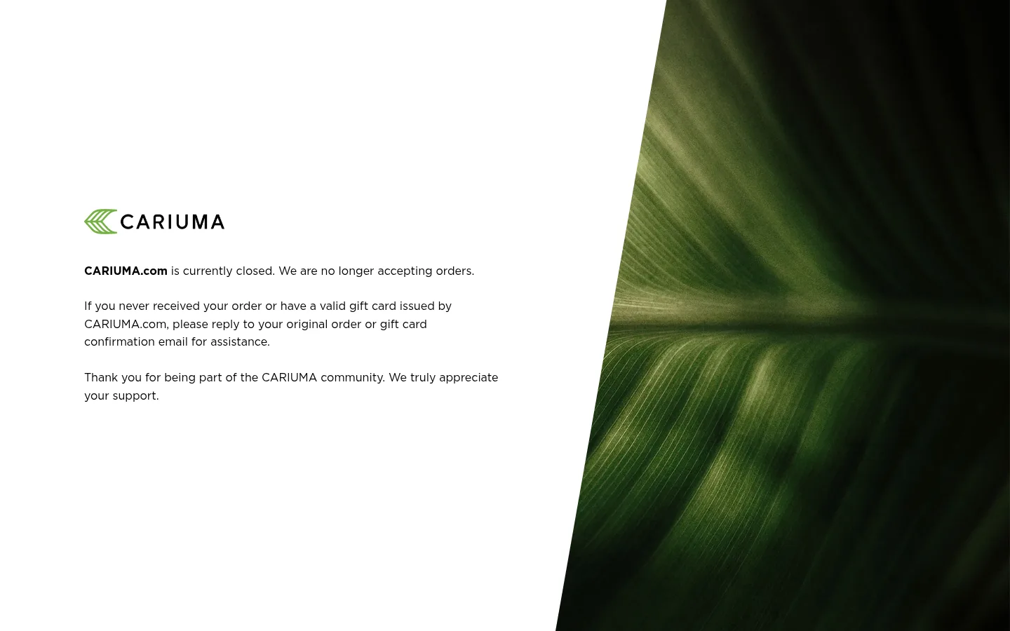
The page uses a quiet, high-contrast palette: white is the dominant canvas, black carries the notice and wordmark, and the measured green accent belongs to the brand mark and accessible skip control rather than to a broad interface band. A large botanical photograph supplies most of the visible green, but its deep tones are image content, not additional UI palette colours. HCo Gotham gives the notice a clean, contemporary voice; body copy is regular weight, while the initial store-status phrase is bold for quick scanning. The composition is a two-part, full-height split, with a white text panel on the left and a tightly cropped leaf image on the right, separated by a strong diagonal edge. Copy sits in a compact, left-aligned block with generous surrounding white space. The result feels editorial and calm, prioritizing legibility and a clear final message over navigation, product modules, or decorative interface elements.
Notice copy, brand-adjacent text, and uppercase utility controls
角色
示例
字号
字重
行高
字距
正文
Closure notice and customer-support guidance paragraphs.
The quick brown fox 敏捷的狐狸
16px
400
1.6
0
辅助文字
Small uppercase utility or supporting labels, if present.
The quick brown fox 敏捷的狐狸
14px
700
1.25
0.071em
按钮
Uppercase skip-to-content control.
The quick brown fox 敏捷的狐狸
14px
700
1.25
0.071em
眉题
No visible eyebrow on this notice; reserve for compact uppercase context.
The quick brown fox 敏捷的狐狸
14px
700
1.25
0.071em
间距与布局
基准单位 8px · 密度:适中
80px版块间距
—元素间距
—卡片内边距
1360px内容最大宽度
25px
40px
60px
80px
A single full-height section is divided into a broad white copy area and a full-height image area. The left block is aligned to a consistent inset and vertically centered around the brand mark and three short paragraphs. The image fills the right side, cropped edge-to-edge; its diagonal boundary adds movement without extra modules. The page is intentionally sparse, with comfortable paragraph breaks and substantial unused canvas.
圆角与层次
按钮 · 5px
没有测到阴影:页面是扁平的,层次靠底色和描边区分。
The composition is essentially flat: no cards, visible shadows, or layered panels. The white field and photograph meet directly along a crisp diagonal edge. Keep controls simple and avoid adding borders or ornamental separators that compete with the image boundary.
组件
下面的预览按实测的按钮、输入框、徽标、卡片样式重建(字体用替代字体)。
Brand mark
A compact green emblem and black CARIUMA wordmark sit above the notice, anchoring the text without a surrounding header bar.
Closure message
A brief status paragraph begins with bold CARIUMA.com text, followed by regular-weight black copy explaining that orders are no longer accepted.
Customer-support guidance
A separate paragraph directs customers with missing orders or valid gift cards to reply to their original confirmation email.
Closing note
A short thank-you paragraph closes the message, with a clear paragraph break from the support instructions.
Botanical image panel
Full-height, right-side leaf photography provides the main colour and visual contrast, cropped to the panel with an angled inner edge.
Skip-to-content control
Measured as a green button with white uppercase bold text, generous horizontal padding, and a subtle rounded corner; it is not prominent in the screenshot.
Imagery · One full-height botanical photograph dominates the right side. It is a close, abstracted view of layered green leaves, rendered in deep forest tones with directional highlights and soft focus. Crop the image to fill its panel and retain the slanted boundary; treat its greens as photographic material rather than additional interface colours. No product renders, icons, or decorative illustrations are needed.
Use Gallery White as the dominant text-panel surface.
Set the notice in left-aligned black body copy.
Emphasize only the opening status phrase in bold.
Keep the brand mark compact and above the message.
Use a single edge-to-edge botanical image as the visual counterweight.
Preserve generous empty space around the message.
✕ 不该做
Do not add product cards or shopping calls to action.
Do not turn the notice into a dense, multi-column text layout.
Do not treat photographic leaf tones as measured interface colours.
Do not add heavy shadows, card frames, or ornamental borders.
Do not introduce extra accent colours beyond the measured palette.
Do not center the notice copy or over-style its typography.
给 AI 的提示词
想快速出一个同风格的新页面,把这段话连同 DESIGN.md 一起发给 AI。
Build a new page in the CARIUMA notice style: calm, legible, and editorial rather than promotional. Use Gallery White (#ffffff) for the main text canvas and Soft Ink (#000000) for copy and wordmark. Reserve Leaf Green (#66a443) for a restrained brand accent or utility control. Use a clean Gotham-like sans serif, with regular body copy and selective bold emphasis. Compose the page as a spacious text area beside one edge-to-edge botanical photograph; a diagonal image boundary may echo the reference. Keep the brand mark small, align message paragraphs to the left, and give them clear separation. Avoid card UI, prominent shadows, extra palette colours, and shopping modules. The measured page is a single quiet notice, so prioritize message hierarchy, open space, and a purposeful image crop.