North star · Keep the interface calm and open, then use oversized black typography and precise saturated color blocks to make each key moment unmistakable.
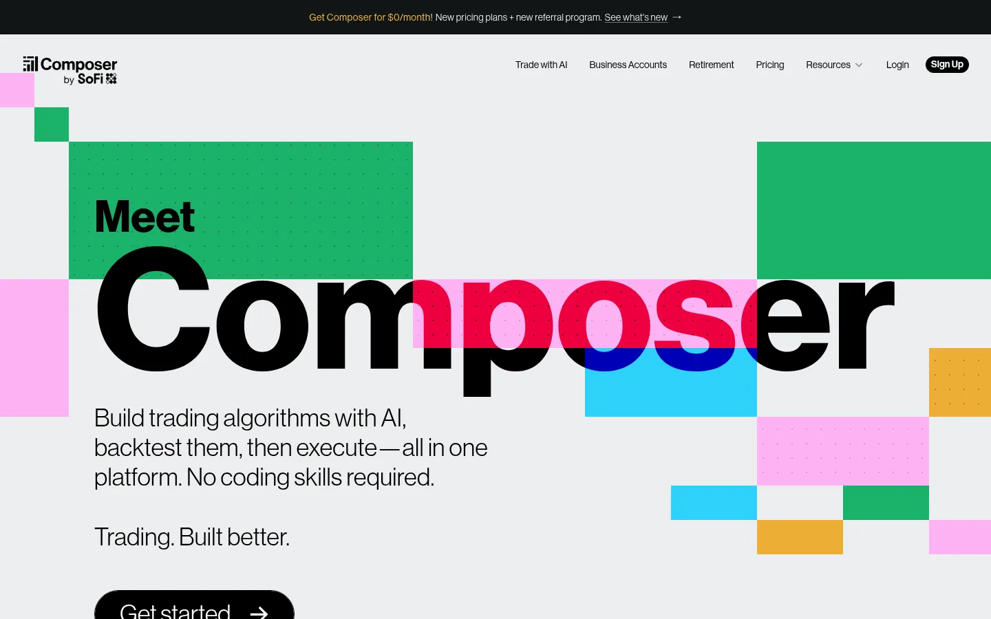
The page balances a cool, pale gray canvas with crisp white areas and moments of near-black, creating a restrained frame for saturated green, blue, and pink accents. The hero establishes the visual identity with a huge black wordmark-style headline crossing a grid of flat color rectangles; the accents are graphic blocks, not decorative gradients. Neue Haas Grotesk Display carries most of the interface, from oversized display text to compact navigation, while Inter is reserved for small labels and dense product-card content. The layout alternates wide, airy bands with tight feature grids and product demonstrations, generally aligning content to the left and letting media occupy substantial space. Later sections use dark backgrounds and green panels to signal a change in emphasis. Hairline borders, softly rounded cards, and selective layered shadows distinguish product mockups without making the interface feel skeuomorphic.
Primary display, headings, body copy, navigation, links, and buttons.
Aa 设计
Inter
网络字体 · 字重 400 / 600 / 500 / 700 · 占比 6%
免费替代:Inter
Compact captions, badges, and product-card or data-interface text.
角色
示例
字号
字重
行高
字距
特大标题
Oversized hero headline and standout display moments.
Composer
64px
600
1
0
一级标题
Primary section headings and major feature statements.
Composer
36px
400
1.2
0.01em
二级标题
Secondary feature and content-section headings.
Composer
32px
400
1.2
0.02em
三级标题
Feature-card and subsection headings.
The quick brown fox 敏捷的狐狸
24px
400
1
0.025em
四级标题
Smaller supporting headings in content areas.
The quick brown fox 敏捷的狐狸
20px
400
1.4
0.025em
正文
Descriptions, feature copy, and general interface text.
The quick brown fox 敏捷的狐狸
14px
400
1.43
0.025em
辅助文字
Compact labels, metadata, and fine-print notes.
The quick brown fox 敏捷的狐狸
10px
400
1.5
0
按钮
Large primary CTA label styling.
The quick brown fox 敏捷的狐狸
24px
400
1
0.025em
导航
Header navigation links.
The quick brown fox 敏捷的狐狸
14px
400
1.43
0.025em
链接
Inline links and secondary calls to action.
The quick brown fox 敏捷的狐狸
14px
400
1.25
0.02em
间距与布局
基准单位 8px · 密度:紧凑
32px版块间距
4px元素间距
12px卡片内边距
1376px内容最大宽度
2px
4px
6px
8px
12px
16px
24px
32px
40px
56px
Use a broad centered content area, measured up to 1376px, with a compact 8px-based spacing system. The first viewport has a slim dark announcement strip above a spacious header and a left-led hero; its oversized title spans across the geometric artwork. Below, alternate full-width section bands with two- or three-column feature layouts, product mockups, and statistics. Maintain generous canvas around major content while keeping cards and supporting UI compact. Use fine separators to organize dense grids without heavy framing.
圆角与层次
按钮 · 9999px
卡片 · 6px
图片 · 50%
徽标 · 2px
导航 · 4px
链接 · 9999px
hairline · other
xl · media
xl · card
xl · badge
Most sections sit flat on the canvas, with thin gray hairlines defining grids and card edges. Use restrained layered shadows only on prominent product mockups or select interface cards to lift them from the background. Keep color geometry and section bands flush and graphic rather than treating them as floating cards.
组件
下面的预览按实测的按钮、输入框、徽标、卡片样式重建(字体用替代字体)。
Announcement strip
A narrow near-black bar at the very top with centered offer copy and a small linked announcement.
Site navigation
Logo at left and compact, black Neue Haas Grotesk links aligned across the right; the sign-up action appears as a dark pill.
Hero title and artwork
Large black headline over a pale gray canvas, intersected by vivid rectangular color tiles and dotted details.
Primary CTA
Black pill-shaped action with white text and a directional arrow; keep the label prominent and simple.
Product cards
White interface cards with dark text, thin #bdbebe borders, modest rounding, and selective soft shadow.
Feature bands
Full-width light, blue, green, or near-black sections pair concise copy with product imagery or interface previews.
Imagery · Favor crisp product-interface mockups, portfolio and chart previews, and financial app visuals over lifestyle photography. The hero uses flat, rectangular color geometry and a subtle dotted-grid treatment around the giant headline. Product imagery is framed like floating interface cards, sometimes with soft shadows; later sections include a landscape image and branded illustrations. Keep imagery clean and legible, and let its vivid colors remain distinct from the restrained page canvas.
Use Neue Haas Grotesk Display as the dominant interface voice.
Anchor broad content areas on the Cool Canvas #ecedee.
Use Pure Ink #000000 for primary text and high-contrast actions.
Treat vivid green, blue, and pink as deliberate geometric accents.
Keep dividers thin and product cards lightly elevated.
Alternate open feature bands with compact, clearly aligned grids.
✕ 不该做
Don't replace the geometric color blocks with decorative gradients.
Don't use saturated accents as the main page background everywhere.
Don't crowd the hero or shrink its headline into ordinary heading scale.
Don't add heavy shadows to every card or section.
Don't use rounded, soft styling on every visual element.
Don't let product mockups overwhelm the surrounding page hierarchy.
给 AI 的提示词
想快速出一个同风格的新页面,把这段话连同 DESIGN.md 一起发给 AI。
Build a new fintech page in Composer’s visual style. Use Cool Canvas #ecedee as the spacious base, Pure Ink #000000 for crisp type, and Gallery White #ffffff for cards or clean bands. Set headings and most interface copy in Neue Haas Grotesk Display, with Inter for compact data labels. Establish each major section with bold, oversized typography and a restrained palette of geometric accents: Composer Blue #1871da, Strategy Green #31805a, and Composer Pink #f6609f. Keep layout broad and left-aligned, alternating airy full-width bands with compact product grids. Show realistic trading interfaces as clean cards with fine #bdbebe borders and selective soft shadows. Add dark panels sparingly for contrast; avoid gradient-heavy decoration and excessive rounding.