North star · Make complex wealth services feel calm and legible by pairing generous white space with crisp type and tangible product previews.
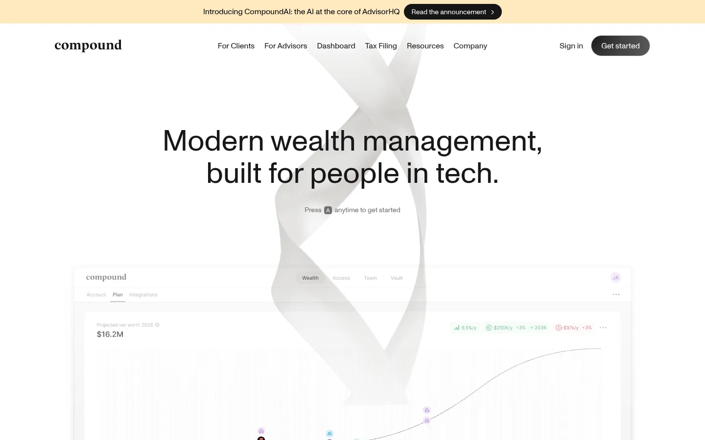
The page builds a quiet, premium fintech identity from white canvas, near-black typography, and carefully restrained gray surfaces. A pale warm announcement strip is the only noticeable chromatic interruption; the measured page palette itself remains monochrome. Monument Grotesk carries both large centered headlines and compact navigation, keeping the experience contemporary without relying on heavy weights or decorative type. The hero establishes a clear hierarchy above a large, softly faded dashboard preview, with the product UI serving as evidence rather than decoration. Across the long page, spacious white sections alternate with light gray service areas and deep black product or closing panels. Cards use rounded silhouettes, subtle borders, and soft shadows to separate content without making the interface feel dense. The layout combines centered editorial statements, card grids, wide product demonstrations, and concise comparison content. Treat graphics inside dashboard previews and award marks as product imagery, not as core brand colors.
All measured typography, from display headlines and body copy to navigation and buttons.
角色
示例
字号
字重
行高
字距
特大标题
Large showcase headline, especially dark product-section messaging.
Compound
72px
400
1
0
一级标题
Primary hero headline, centered above the product dashboard preview.
Compound
60px
400
1.1
0
二级标题
Major section headings introducing advice and membership benefits.
Compound
58px
400
1.1
0
三级标题
Feature and product panel headings within content sections.
Compound
48px
400
1
0
四级标题
Card titles, service labels, and smaller section introductions.
Compound
36px
400
1.11
0
正文
Descriptive copy, navigation labels, and general interface text.
The quick brown fox 敏捷的狐狸
14px
400
1.43
0
辅助文字
Fine-print notes and compact labels around product previews.
The quick brown fox 敏捷的狐狸
12px
400
1.38
0
按钮
Primary and secondary pill-shaped call-to-action labels.
The quick brown fox 敏捷的狐狸
16px
400
1.5
0
导航
Top navigation items and announcement-bar text.
The quick brown fox 敏捷的狐狸
16px
400
1.5
0
间距与布局
基准单位 8px · 密度:紧凑
32px版块间距
4px元素间距
—卡片内边距
1200px内容最大宽度
4px
7px
8px
16px
24px
32px
48px
64px
Use a centered desktop composition within the measured 1200px maximum page width and a 12-column grid. The opening viewport has a slim announcement bar, a horizontally arranged navigation row, and a centered hero with full-bleed-feeling product media. Maintain a compact underlying spacing system, but let broad section bands and large gaps create a spacious reading pace. Alternate centered statements, multi-column cards, wide product previews, and comparison content. Keep text blocks narrow enough to read comfortably and use alignment changes to distinguish editorial content from interface demonstrations.
圆角与层次
按钮 · 9999px
卡片 · 28px
图片 · 50%
链接 · 20px
xl · link
xl · card
xl · card
xl · card
Favor subtle elevation over hard separation: cards sit on light backgrounds with soft, diffuse shadows and restrained gray borders. Rounded card edges and pill CTAs create a tactile but controlled interface. Dark panels rely on tonal gradients and media layering instead of conspicuous outlines; avoid strong drop shadows around ordinary text blocks.
组件
下面的预览按实测的按钮、输入框、徽标、卡片样式重建(字体用替代字体)。
Announcement bar
A narrow pale warm strip above the navigation with centered product news and a dark pill link to the announcement.
Primary CTA
Near-black, fully rounded button with white text; used for the prominent Get started action.
Dashboard hero
Centered headline and compact prompt above a broad, softly faded financial dashboard preview.
Service cards
Light rounded cards organize advisor expertise, exclusive services, and technology with concise copy and small icons.
Advisor cards
Portrait-led advisor profiles in individual softly elevated cards with name, role, and location details.
Dark product showcase
A black, gradient-backed interface presentation with a centered product preview, compact feature navigation, and a light demo button.
Comparison table
A restrained feature comparison with clear provider columns, fine horizontal rules, and simple checkmarks.
Imagery · Use large, polished dashboard previews as the primary visual evidence, with charts, financial summaries, and product controls visible but softly subordinate to the headline. Abstract translucent ribbon-like forms add depth behind the hero and comparison area. Keep imagery pale and low-contrast in light sections; reserve dramatic, dark product framing for the showcase. Small advisor portraits and award badges appear as supporting assets rather than brand-defining visuals.
Keep the canvas predominantly white and the palette tightly monochrome.
Use Monument Grotesk or a close, neutral sans-serif substitute.
Center the hero headline and give the dashboard preview visual prominence.
Use deep black panels selectively for product demonstrations and closing calls to action.
Separate cards with restrained borders, rounded corners, and soft shadows.
Treat interface imagery as proof of the financial product, not as background clutter.
✕ 不该做
Do not introduce bright accent colors into the core interface palette.
Do not use heavy display weights or all-caps styling.
Do not crowd the hero with dense copy or competing calls to action.
Do not turn subtle gray section transitions into high-contrast stripes.
Do not overuse shadows or hard outlines on light cards.
Do not mistake colors inside charts, portraits, badges, or mockups for core brand colors.
给 AI 的提示词
想快速出一个同风格的新页面,把这段话连同 DESIGN.md 一起发给 AI。
Create a new Compound-style fintech page with an understated, premium editorial feel. Use Gallery White (#ffffff) as the main canvas, Graphite Ink (#171717) for headlines and primary text, Quiet Gray (#6f6f6f) for supporting copy, and Soft Divider (#e8e8e8) for delicate card edges. Reserve True Black (#000000), Nightfall (#0d0d0d), and Blackout (#070707) for selective product-showcase panels; use Mist Surface (#f2f2f2) for gentle section contrast. Set all text in a clean, regular-weight grotesk, with centered oversized headings and compact, readable supporting copy. Build a clear top announcement and navigation, generous hero with a real product-preview area, rounded service cards, concise comparison content, and a strong closing CTA. Keep layout centered, spacing calm, borders subtle, and interface imagery legible rather than decorative.