North star · Keep the midnight canvas quiet and spacious, letting oversized type, precise product imagery, and selective blue actions carry the story.
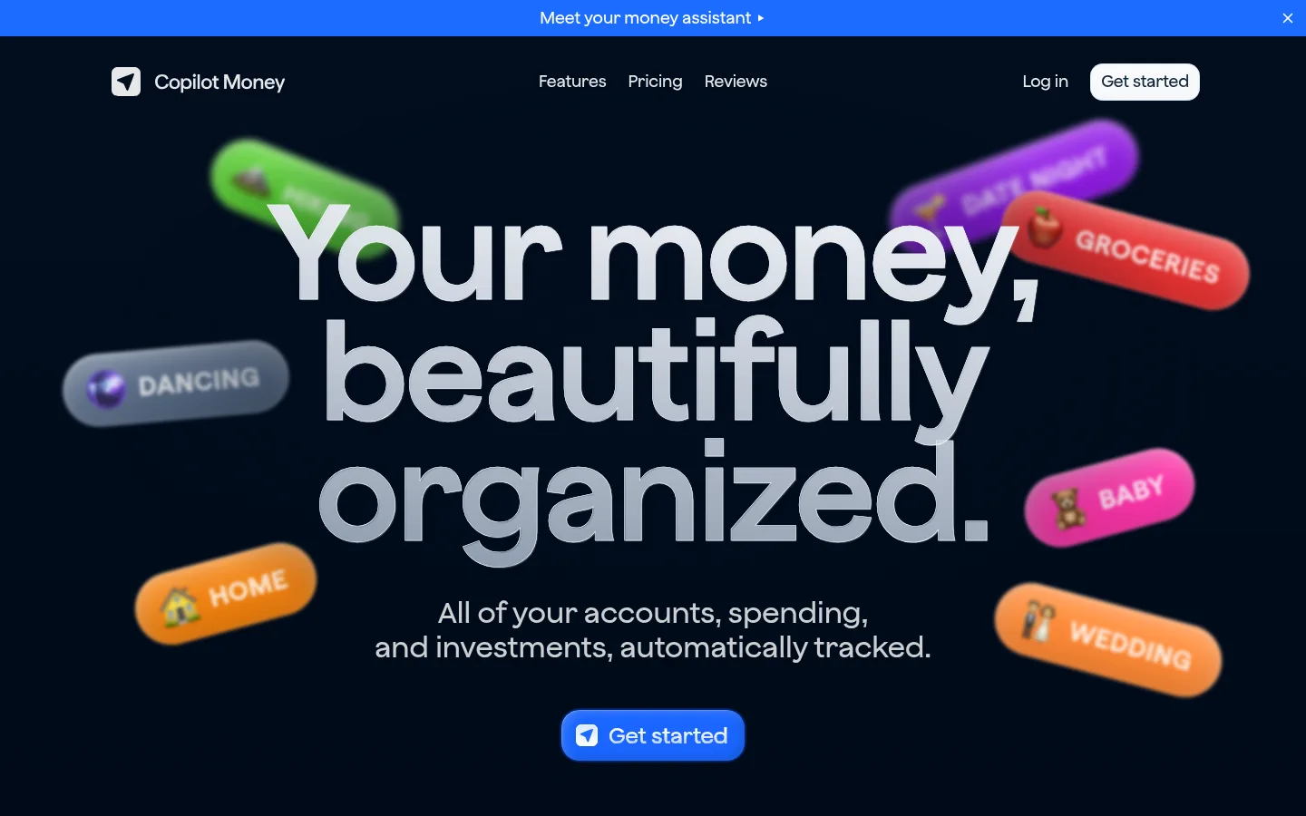
The visual identity is built on a nearly black navy canvas (#000814), with subtle shifts into deep blue surfaces (#010d1e) rather than heavy dividers. Large, pale headlines and thin, understated body copy create a quiet editorial hierarchy; the hero headline is particularly oversized and tightly composed. Bright blue appears selectively in the announcement strip, primary actions, and interface highlights, while muted blue-gray links and captions keep secondary information restrained. Layout moves from a centered hero into spacious product demonstrations, then briefly reverses to a white wealth-tracking section before returning to dark pricing and testimonials. Product UI screenshots provide dense detail against the open page, while colorful floating category pills add a playful accent around the hero. Rounded controls, cards, and section corners soften the otherwise crisp, dark composition. Treat saturated colors inside screenshots and floating mockup labels as product imagery, not as the page’s core palette.
配色
点色块复制色值。用途说明来自对页面的实测位置(背景、文字、描边、按钮)与截图判读。
品牌色
强调色
表层色
中性色
功能色
页面底色 · Midnight Canvas表层 · Deep Surface表层 2 · Clean White主文字 · Soft Alloy次要文字 · Quiet Steel弱文字 · Blue Haze强调 · Slate Link强调 2 · Electric Blue强调 3 · Blue Haze
Primary page headline and major campaign statement.
Copilot Money
64px
600
1.05
0
二级标题
Feature and section headlines.
Copilot Money
32px
500
1.2
0
三级标题
Uppercase eyebrow labels and short section markers.
Copilot Money
28px
670
1
0.04em
四级标题
Smaller feature titles and card headings.
The quick brown fox 敏捷的狐狸
24px
600
1.2
0
正文
Light-weight explanatory copy beneath headlines.
The quick brown fox 敏捷的狐狸
16px
100
1.4
0
辅助文字
Compact image captions and supporting details.
The quick brown fox 敏捷的狐狸
15px
100
1.2
0.01em
链接
Navigation items and secondary text links.
The quick brown fox 敏捷的狐狸
16px
500
1.4
0
眉题
Uppercase section labels, used sparingly.
Copilot Money
28px
670
1
0.04em
间距与布局
基准单位 4px · 密度:适中
64px版块间距
8px元素间距
7px卡片内边距
1360px内容最大宽度
2px
4px
5px
6px
8px
10px
12px
14px
16px
20px
24px
28px
32px
40px
The measured page max width is 1360px, with a comfortable density and a modular four-column footer. The hero is centered, framed by floating labels, while later feature and pricing sections pair headings with wide product-interface images. Large section gaps establish a slow, premium rhythm; compact spacing is reserved for interface details and navigation. A broad light section interrupts the dark sequence, and rounded section edges make the transition feel intentional. Keep content aligned to a consistent central page frame rather than stretching every text block edge to edge.
圆角与层次
按钮 · 17px
卡片 · 40px
图片 · 50%
链接 · 16px
inset · card
sm · card, link, button
md · card
inset · other
The page favors layered product imagery and dark tonal contrast over visible outlines or hairlines. Cards and device screens sit subtly above the canvas with restrained shadows; some measured cards use inset highlights for a glassy, dimensional impression. Use rounded card and control shapes, but avoid adding strong borders or generic drop shadows.
组件
下面的预览按实测的按钮、输入框、徽标、卡片样式重建(字体用替代字体)。
Announcement strip
A vivid blue full-width band sits at the very top with a centered assistant message and a small close control.
Primary CTA
Rounded Get started actions stand out in blue or pale inverse treatment; keep labels short and contrast strong.
Product showcase
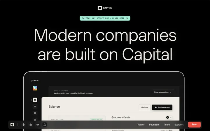
Wide desktop dashboard screenshots are paired with phone mockups to show the app across devices.
Feature heading
Centered pale headline introduces a product benefit, with concise supporting copy nearby.
Light wealth section
A broad near-white panel contrasts with dark sections and contains portfolio UI and green performance marks.
Review cards
Dense dark testimonial tiles use small author details and rating marks, arranged as a multi-column collage.
Footer navigation
Compact multi-column link groups sit on the dark canvas beside the brand mark and privacy details.
Imagery · Product screenshots and device mockups are the main visual evidence, showing finance dashboards, charts, transactions, and investment views. They sit against dark backgrounds as detailed interface showcases rather than decorative photography. The hero adds colorful, soft-focus floating category pills around the headline; treat them as dimensional product illustration. Testimonials use compact review cards, while the closing CTA groups desktop, tablet, and phone screens.
Set major headings in pale, confident display type.
Reserve vivid blue for announcements and primary actions.
Show product screens as detailed, layered evidence.
Use generous section breaks between major stories.
Keep supporting copy muted and visually secondary.
✕ 不该做
Do not turn the whole page into a bright interface.
Do not add frequent borders to separate sections.
Do not use saturated mockup colors as the core palette.
Do not make every heading uppercase.
Do not crowd the hero with explanatory copy.
Do not flatten device imagery into generic illustrations.
给 AI 的提示词
想快速出一个同风格的新页面,把这段话连同 DESIGN.md 一起发给 AI。
Build a new finance product page in Copilot Money’s style. Use Midnight Canvas (#000814) across most of the page, with Deep Surface (#010d1e) and Abyss Blue (#01122d) for subtle depth. Set large, pale headlines in a clean, confident sans; keep body copy light and secondary. Use Electric Blue (#1c6cff) selectively for announcement and CTA emphasis, while Slate Link (#597caa) handles restrained links. Compose a centered hero with a bold headline, short supporting copy, and dimensional floating category labels. Follow with spacious feature sections featuring authentic-looking finance dashboards and device mockups. Include a single Cloud White (#f9fafb) or white portfolio section for contrast, then return to dark surfaces. Keep cards rounded, layering subtle, and dividers minimal.