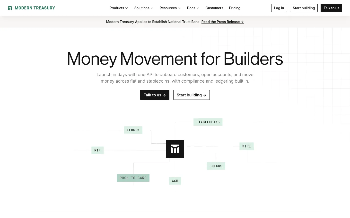
Modern Treasury 以宽松的编辑式排版、克制的绿色点缀和清晰的产品示意图,呈现金融交易平台。首页将明确的企业销售转化路径与 API、支付和平台能力介绍结合起来。
North star · Keep the page bright, precise, and spacious; use dark ink for structure and green only to identify money movement and action.
The page builds its identity from a white canvas, near-black text, and quiet green accents rather than from large colour fields. A pale warm surface separates product cards and form areas from the surrounding white; a deep green footer provides the strongest full-width contrast. Large, light display headlines establish an editorial tone, while compact sans-serif navigation, body copy, and buttons keep the interface practical. Monospaced labels lend technical character to payment rails and code examples. The layout is centered and spacious, alternating broad headline-led sections with two- and three-column product modules, metric bands, and a linear API workflow. Product visuals are mostly diagrams, interface mockups, and code panels rather than photography. Thin dividers and restrained card treatment preserve clarity, with nearly all visual emphasis coming from typography, alignment, and content hierarchy.
Body copy, navigation, links, buttons, and captions
Aa 设计
mt-mono
网络字体 · 字重 400 / 500 · 占比 13%
免费替代:Roboto Mono
Code samples, payment-rail labels, and technical microcopy
Aa 设计
mt-neue-display
网络字体 · 字重 450 · 占比 4%
免费替代:DM Sans
Large display headline and primary page heading
Aa 设计
mt-neue-text
网络字体 · 字重 400 · 占比 3%
免费替代:DM Sans
Section headings and smaller editorial headings
角色
示例
字号
字重
行高
字距
特大标题
Oversized hero headline introducing the money-movement platform.
Modern Treasury
71px
450
1.1
0
一级标题
Primary page-level heading when the hero uses a smaller heading scale.
Modern Treasury
47px
450
1.25
0
二级标题
Centered section headings for platform, workflow, and contact blocks.
Modern Treasury
32px
400
1.25
0
三级标题
Product-card and supporting subsection headings.
The quick brown fox 敏捷的狐狸
21px
400
1.3
0
正文
Descriptions, explanatory copy, and customer or platform context.
The quick brown fox 敏捷的狐狸
16px
360
1.5
0
辅助文字
Supporting labels, field notes, and low-priority details.
The quick brown fox 敏捷的狐狸
14px
330
1.5
0
按钮
Strong, compact CTA labels, typically in sentence case.
The quick brown fox 敏捷的狐狸
14px
600
1.5
0
导航
Header navigation and prominent footer navigation labels.
The quick brown fox 敏捷的狐狸
14px
600
1.5
0
链接
Text links and secondary actions, often paired with an arrow.
The quick brown fox 敏捷的狐狸
14px
600
1.5
0
代码
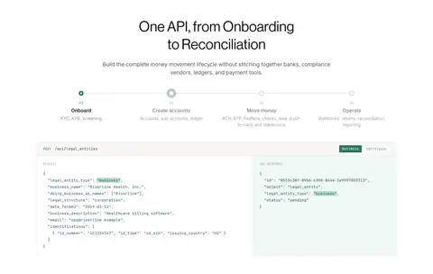
API requests, responses, and technical labels in monospaced panels.
const style = 1;
13px
400
1.69
0
间距与布局
基准单位 4px · 密度:适中
48px版块间距
4px元素间距
—卡片内边距
1200px内容最大宽度
2px
4px
6px
8px
12px
14px
16px
20px
22px
24px
32px
40px
48px
60px
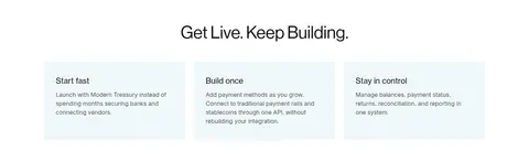
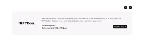
Use a centered content frame with a measured maximum width of 1200px and broad outer whitespace. The header is a single horizontal navigation row; the hero centers its headline and supporting copy above a two-action CTA and a rail diagram. Follow with a logo strip, centered introduction, two-column product cards, a three-part metric band, and a horizontally structured API lifecycle. Continue with compact benefit cards, a testimonial, and a two-column contact form. Maintain a comfortable section rhythm, clear alignment, and low-to-moderate information density.
圆角与层次
按钮 · 2px
输入框 · 2px
卡片 · 8px
徽标 · 2px
导航 · 2px
链接 · 2px
inset · button, nav, link
lg · nav
The interface is mostly flat: white canvas, soft neutral modules, and fine gray dividers define hierarchy. Cards use restrained rounding rather than pronounced shadows. Primary buttons are near-black with a subtle inset outline. Reserve stronger layering for the header navigation treatment, not content panels.
组件
下面的预览按实测的按钮、输入框、徽标、卡片样式重建(字体用替代字体)。
Header navigation
White horizontal header with green wordmark, compact sans-serif navigation, and outlined or filled account and sales actions.
Announcement strip
Narrow pale band below navigation with centered news copy and an underlined press-release link.
Hero CTA pair
Centered headline and supporting copy above a filled Carbon Ink #151515 Talk to us button and outlined Start building action.
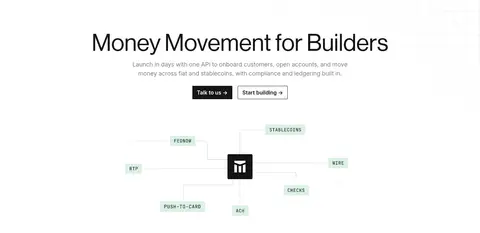
Payment rail diagram
Central brand mark connected by fine lines to pale-green, monospaced labels for payment rails.
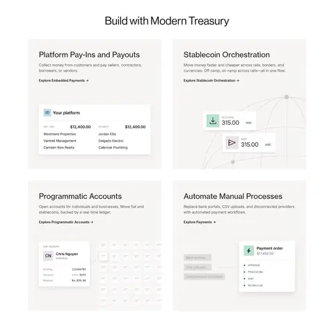
Product cards
Two-column modules on pale warm surfaces, combining concise headings, links, and contained platform mockups.
Metric band
Three evenly distributed proof points with large dark figures and small muted labels, separated by fine rules.
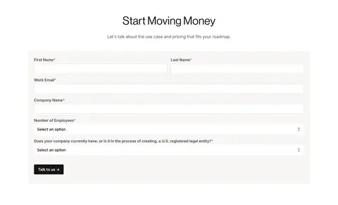
Lead form
Two-column contact area with light inputs, fine borders, concise labels, select controls, and a dark submit button.
Footer
Forest Night #0c221d full-width footer with newsletter signup, grouped links, and muted sage legal details.
Imagery · Avoid relying on lifestyle photography. The hero uses a clean payment-rail diagram with a central mark, fine connector lines, and pale-green monospace labels. Product cards show restrained interface and transaction mockups, while the API section uses code-like panels and process graphics. Keep illustrations pale, low-contrast, and contained within the modular layout so headlines and calls to action remain dominant.
Keep headlines large, centered, and lightly weighted.
Use green sparingly for brand and payment signals.
Separate content with whitespace and fine rules.
Present product capabilities through diagrams and UI mockups.
Keep calls to action dark, compact, and clearly labeled.
✕ 不该做
Do not introduce saturated gradients or large coloured hero backgrounds.
Do not add decorative photography that competes with product diagrams.
Do not use heavy shadows to separate ordinary cards.
Do not crowd the centered sections with dense copy.
Do not turn every link or label green.
Do not make the technical details look like an unstructured dashboard.
给 AI 的提示词
想快速出一个同风格的新页面,把这段话连同 DESIGN.md 一起发给 AI。
Build a new Modern Treasury-style fintech page with a bright, editorial interface and clear enterprise information hierarchy. Use Gallery White #ffffff as the main canvas, Warm Porcelain #f8f7f5 for quiet modules, Carbon Ink #151515 for text and primary actions, and Treasury Green #29735c only for brand and key links. Set large, light display headings above concise sans-serif copy; use monospaced type only for code and technical labels. Center content in a measured 1200px maximum frame, alternating spacious headline sections with modular cards, metrics, workflows, and a practical form. Prefer payment diagrams and restrained interface mockups over photography. Keep borders fine, cards flat, buttons compact, and finish with a Forest Night #0c221d footer.