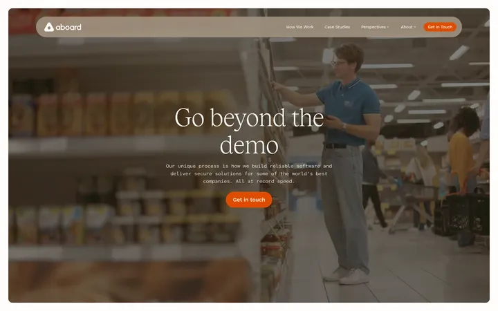
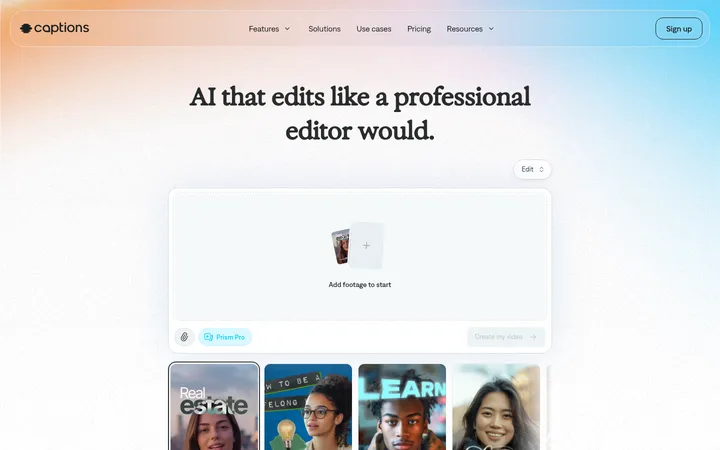
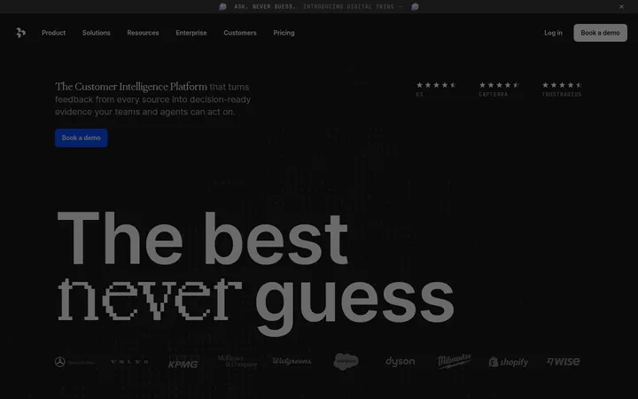
North star · Use the burgundy canvas and oversized editorial serif headlines as the frame, letting real product media demonstrate the workflow.
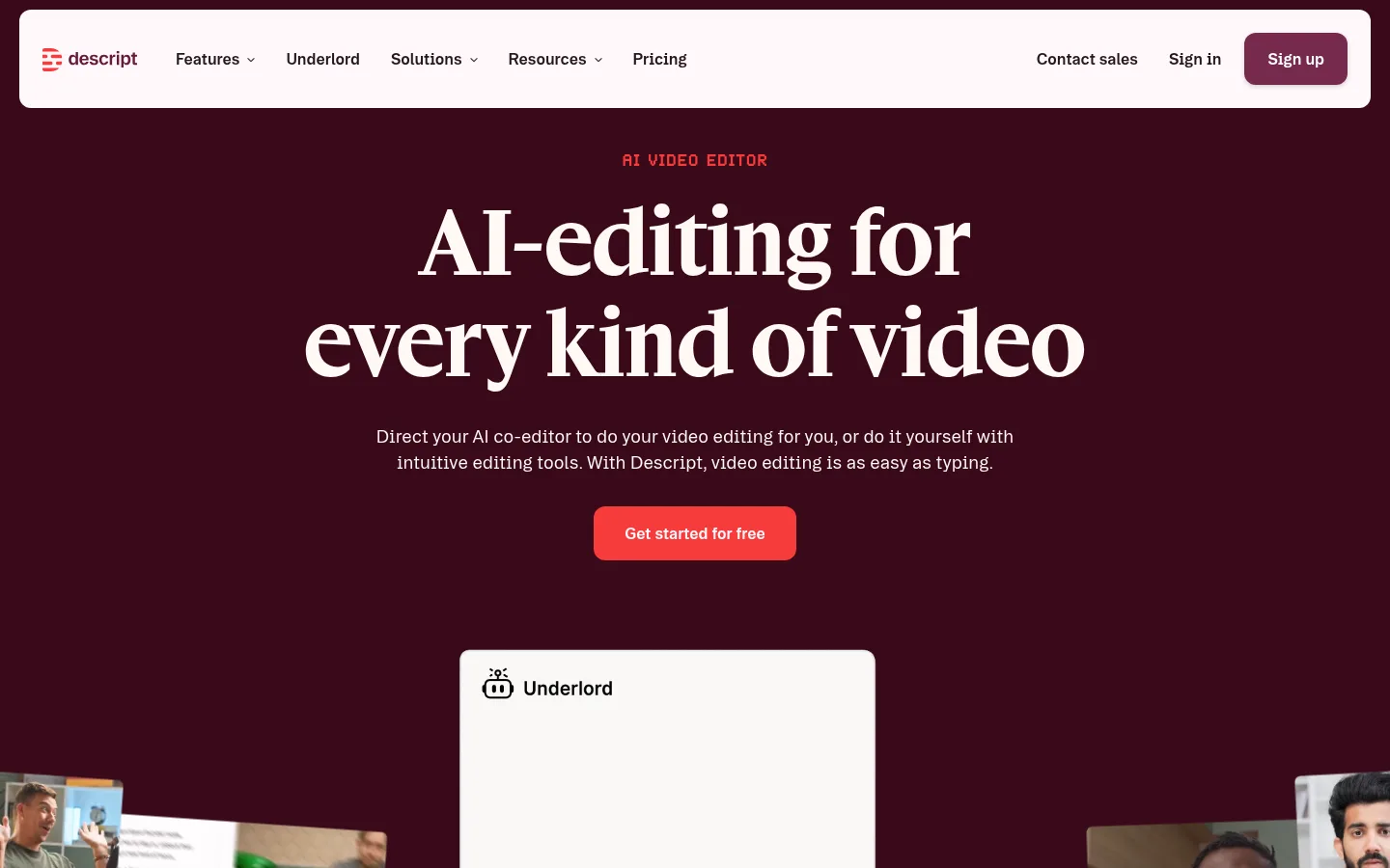
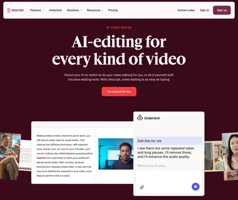
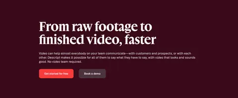
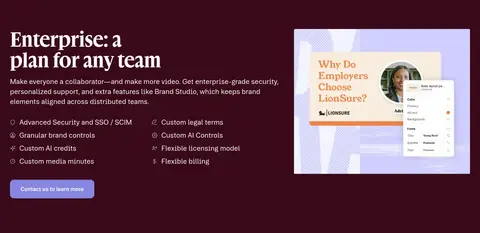
The page is built around a deep burgundy canvas (#390a1a), with nearly white type and compact coral calls to action. Alternating dark section bands—especially #190308 and #180101—give the long page structure without introducing a new visual theme. Large display headlines use the measured gamuthDisplay serif, creating a refined editorial contrast with booton’s clean sans-serif body copy and navigation. Centered hero copy sits above a product interface composition; later sections alternate centered statements, split layouts, carousels, and card groups. Real product screenshots and video frames provide evidence of the editor, while customer and enterprise proof uses logos, testimonials, and metric cards. A broad pale section at #fff7fa resets the rhythm for security, reviews, and FAQs. Keep spacing deliberate and compact, preserve generous breathing room around headline clusters, and use borders or shallow shadows sparingly so media and color bands—not ornament—define hierarchy.
配色
点色块复制色值。用途说明来自对页面的实测位置(背景、文字、描边、按钮)与截图判读。
品牌色
强调色
表层色
中性色
功能色
页面底色 · Deep Burgundy表层 · Gallery Blush表层 2 · Media Black表层 3 · Black Cherry表层 4 · Footer Charcoal主文字 · Gallery Blush次要文字 · Deep Burgundy弱文字 · Muted Blush描边 · Pale Divider强调 · Signal Coral强调 2 · Berry Button强调 3 · Dark Berry
Primary sans-serif for body copy, navigation, buttons, and captions.
Aa 设计
Arial
系统字体 · 字重 400 · 占比 6%
免费替代:Arial
System fallback for small portions of text.
Aa 设计
gamuthDisplay
网络字体 · 字重 700 / 400 / 600 · 占比 5%
免费替代:DM Serif Display
Display serif for hero and section headlines.
Aa 设计
brett
网络字体 · 字重 400 · 占比 2%
免费替代:Space Mono
Uppercase eyebrow labels above major headings.
角色
示例
字号
字重
行高
字距
特大标题
Oversized hero display headline.
Descript
88px
400
normal
0
一级标题
Primary hero headline and dominant page statement.
Descript
72px
700
1.1
0
二级标题
Major workflow, feature, enterprise, and CTA headings.
Descript
56px
700
1.1
0
三级标题
Subsection headings and product-use-case titles.
Descript
40px
700
1.1
0
四级标题
Card and smaller content headings.
Descript
28px
700
1.2
0
正文
Introductory copy, descriptions, and testimonial text.
The quick brown fox 敏捷的狐狸
18px
400
1.4
0
辅助文字
Small card, attribution, and supporting interface labels.
The quick brown fox 敏捷的狐狸
16px
400
1.4
0
导航
Top navigation items and prominent navigation controls.
The quick brown fox 敏捷的狐狸
16px
600
1.5
0
眉题
Uppercase category labels above large headings.
The quick brown fox 敏捷的狐狸
18px
400
1
0.04em
间距与布局
基准单位 8px · 密度:紧凑
32px版块间距
12px元素间距
24px卡片内边距
1112px内容最大宽度
4px
8px
12px
14px
16px
20px
24px
30px
32px
40px
48px
64px
72px
80px
96px
The desktop page uses a centered content frame with a measured maximum width of 1112px, while hero and media compositions can run full bleed. The compact spacing system is based on an 8px unit, with measured section and element gaps guiding a dense but breathable rhythm. Center hero and feature headlines; use split columns for FAQ, enterprise, and workflow content. Long dark and light section bands alternate to organize the scroll, with card groups and carousels breaking up text-heavy stretches.
圆角与层次
按钮 · 12px
卡片 · 4px
图片 · 5px
导航 · 4px
sm · card
sm · button
sm · button
The page is mostly flat: large color bands and media panels establish depth. Cards use subtle measured shadows, while pale cards and FAQ rows can use fine borders. Reserve layering for overlapping product previews and hero media; avoid broad, dramatic shadows or ornamental borders.
组件
下面的预览按实测的按钮、输入框、徽标、卡片样式重建(字体用替代字体)。
Floating navigation bar
Wide pale rounded bar set against the burgundy canvas, with logo and links on the left and sales, sign-in, and berry Sign up actions on the right.
Hero CTA
Centered coral Get started for free button with white text and a measured 12px radius, placed beneath the serif headline and concise intro.
Product preview composition
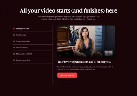
Overlapping editor and video panels demonstrate the text-based workflow; keep the surrounding dark field uncluttered.
Workflow feature panel
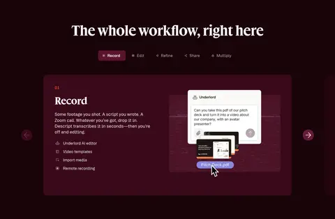
Dark band with centered serif heading, compact step navigation, and a prominent product card with supporting copy.
Proof cards
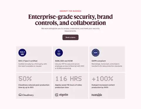
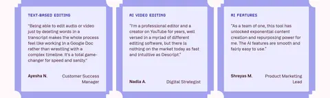
Testimonial and enterprise proof use grouped cards, logos, certification marks, and metrics; separate content with restrained borders and pale surfaces.
FAQ rows
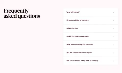
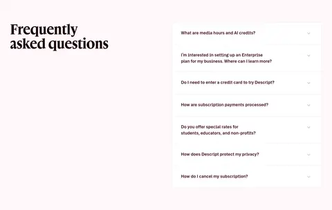
White question panels with fine #e4dde0 dividers and dark text, paired with a left-aligned serif section heading.
Footer link columns
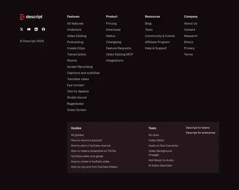
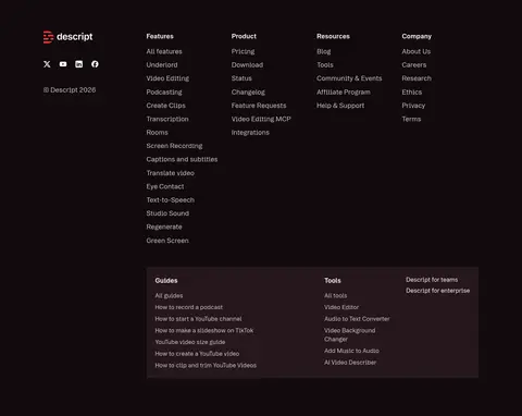
Dense multi-column navigation on #110a0d, with subdued text and a contained secondary guides-and-tools panel.
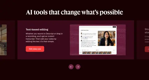
Imagery · Use authentic video stills, faces, and product-interface screenshots as the main visual proof. The hero layers editor windows and video fragments over the burgundy field; lower sections use contained interface previews, testimonial cards, logos, and a horizontal strip of video thumbnails. Keep media rectangular and readable, with restrained rounding rather than decorative illustration or heavy effects.
Use Gallery Blush (#fff7fa) for high-contrast resets and inverse text.
Set major headlines in an expressive display serif.
Keep body copy and navigation in a clean sans-serif.
Make product screenshots and video the primary proof.
Use Signal Coral (#f73b3b) for the principal action.
Alternate section bands to pace the long page.
✕ 不该做
Do not replace the burgundy palette with generic black.
Do not make every section the same background color.
Do not use oversized gradients or decorative textures.
Do not crowd the hero headline with extra copy.
Do not use illustrations in place of product media.
Do not add heavy shadows to flat cards.
Do not style secondary actions as primary coral CTAs.
给 AI 的提示词
想快速出一个同风格的新页面,把这段话连同 DESIGN.md 一起发给 AI。
Build a new SaaS page in Descript’s visual language. Use Deep Burgundy (#390a1a) as the primary canvas, with near-white Gallery Blush (#fff7fa) typography and occasional light section resets. Set large statements in an editorial display serif; use a clean sans-serif for navigation, body copy, and controls, with small uppercase eyebrow labels. Make Signal Coral (#f73b3b) the unmistakable primary CTA and use berry tones only for secondary actions. Organize content into alternating dark bands and pale proof or FAQ sections within a centered content frame. Pair concise copy with real product-interface screenshots, video stills, faces, and customer evidence. Keep cards mostly flat, borders subtle, corners restrained, and spacing deliberate. Preserve clear hierarchy and avoid decorative gradients, excess ornament, or generic stock-style layouts.