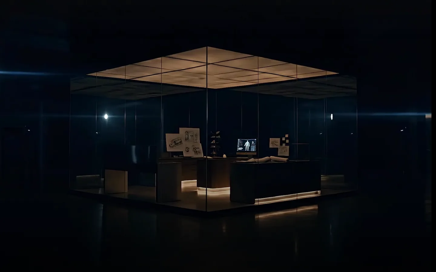
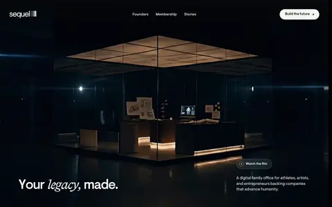
North star · Keep the page as a continuous black cinematic canvas, using editorial type and real human stories as the primary contrast.
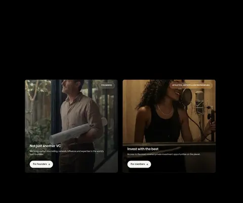
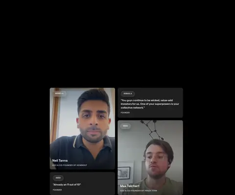
The visual system is anchored by a near-black canvas (#000000), with white (#ffffff) for prominent text and softer grays for supporting copy and footer details. Dark surfaces distinguish cards and the footer without breaking the continuous black field; fine charcoal borders define separation quietly. VisueltPro carries nearly all typography, from light, spacious headlines to compact body copy and uppercase eyebrows. Bradford appears sparingly as an editorial contrast, notably in italicized legacy language. The layout alternates centered statements and media-led blocks, with two-up founder and membership cards, then an asymmetrical testimonial composition and a restrained metrics band. Large vertical pauses give the page a deliberate pace. Photography and video dominate: people, workspaces, and founder portraits are darkened with overlays so text remains legible. Pill-shaped light CTAs provide the strongest interface contrast; other actions remain understated text links.
Primary display, heading, body, navigation, button, and caption type.
Aa 设计
Bradford
网络字体 · 字重 500 · 占比 5%
免费替代:Cormorant Garamond
Occasional editorial serif contrast in legacy-focused display language.
角色
示例
字号
字重
行高
字距
特大标题
Oversized legacy statements and prominent brand moments.
Sequel
128px
500
1
-0.025em
一级标题
Primary hero and major section statements.
Sequel
54px
300
1.2
0
二级标题
Editorial serif contrast for select section headlines.
Sequel
32px
500
1.2
-0.05em
三级标题
Supporting feature and content-section headings.
Sequel
30px
300
1.2
-0.025em
四级标题
Card titles, smaller feature headings, and emphasized labels.
The quick brown fox 敏捷的狐狸
21.5px
500
1.2
-0.02em
正文
Descriptions, founder context, and supporting narrative.
The quick brown fox 敏捷的狐狸
13px
400
1.4
0
辅助文字
Image captions, testimonials, and compact footer details.
The quick brown fox 敏捷的狐狸
12px
400
1.33
0
眉题
Uppercase section labels and card category markers.
The quick brown fox 敏捷的狐狸
11px
500
1.5
0.05em
间距与布局
基准单位 8px · 密度:适中
80px版块间距
16px元素间距
—卡片内边距
—内容最大宽度
4px
5px
8px
11px
12px
16px
19px
20px
24px
28px
29px
32px
40px
80px
96px
Use a full-width black canvas with centered content areas and occasional media-led panels. The measured page includes single-column full-bleed moments, two-column feature layouts, a twelve-column media strip, and compact three-column footer locations. Center major statements, while the footer aligns its content to the left. Maintain a comfortable, spacious rhythm with large gaps between major sections; use closer spacing within cards and navigation. Keep density low, letting imagery and empty black space carry the pacing. Do not infer a fixed maximum width from the measurements.
圆角与层次
按钮 · 9999px
卡片 · 10px
inset · other
md · button
inset · footer
The interface is mostly flat against black, with dark cards differentiated by surface tone and restrained borders. Use subtle inset and button shadows only where appropriate; avoid stacked, glossy elevation. Media overlays provide depth and text legibility, while the footer separates through its charcoal fill rather than a pronounced shadow.
组件
下面的预览按实测的按钮、输入框、徽标、卡片样式重建(字体用替代字体)。
Primary pill CTA
Light #f5f5f0 fill, black label, fully rounded silhouette, and subtle button shadow; used for founder-oriented actions.
Text action
White label on the black canvas, presented as an understated pill-shaped or text-led action rather than a filled control.
Audience cards
Two side-by-side photographic panels for founders and members, with dark overlays, concise copy, and light pill CTAs.
Testimonial cards
#202020 cards combine founder portraits, small uppercase category labels, compact quotes, and identity details.
Hero media
Wide cinematic workspace imagery with dark tonal treatment; overlay navigation and concise brand messaging.
Footer location columns
Three-location footer area on #0d0d0d, balancing navigation, company links, and location names.
Imagery · Use cinematic photography and video stills of founders, performers, and workspaces rather than decorative illustration. Frame images as broad panels or compact testimonial cards, and apply dark overlays or gradients so white copy remains readable. The hero image’s warm architectural lighting and cool shadows are photographic content, not additional brand palette colors. Keep image treatment subdued and let faces and environments feel documentary.
Reserve white for high-priority text and controls.
Use editorial serif type as a rare contrast.
Let photography carry the emotional storytelling.
Place dark overlays behind copy on imagery.
Separate cards with subtle tonal shifts, not bright borders.
✕ 不该做
Do not introduce bright accent colors.
Do not turn every section into a card grid.
Do not use dense paragraphs or crowded layouts.
Do not make shadows the main source of hierarchy.
Do not treat photographic browns and blues as brand colors.
Do not overuse serif typography or uppercase labels.
给 AI 的提示词
想快速出一个同风格的新页面,把这段话连同 DESIGN.md 一起发给 AI。
Build a new Sequel-style page as a cinematic, editorial experience on Stage Black (#000000). Use Gallery White (#ffffff) for key headlines and actions, Soft Silver (#d9d9d9) for supporting copy, and Footer Charcoal (#0d0d0d) for a distinct closing band. Use VisueltPro or a close sans-serif substitute for nearly all interface text, with rare Bradford-like italic serif accents. Keep the layout spacious and quiet: alternate centered statements, broad photography, and selective two-column content. Treat photographs with dark overlays so text remains readable; do not sample their warm or blue tones as brand accents. Use Panel Charcoal (#202020) for testimonial cards, subtle charcoal hairlines, and rounded light CTAs. Preserve strong negative space and avoid decorative gradients, crowded grids, or excessive elevation.