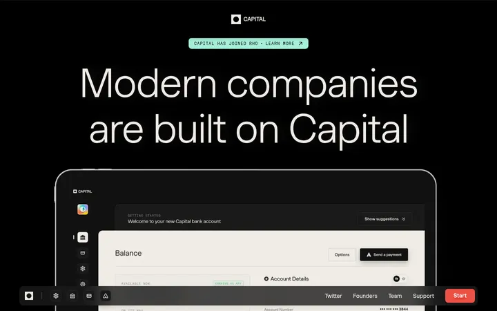
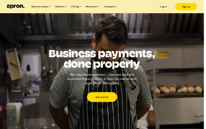
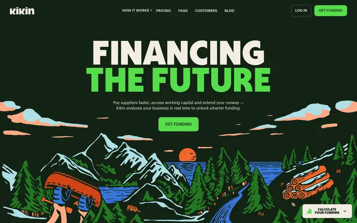
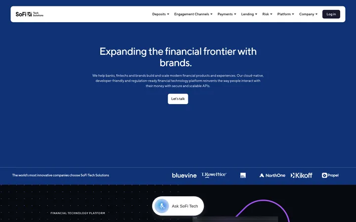
Origin 以近黑画布、优雅衬线标题、鲜明影像和细致的金融产品界面,呈现一体化财务平台。长页从沉浸式顾问介绍展开,依次展示产品功能、用户评价、下载引导和精简页脚。
North star · Keep the interface nearly black and let elegant serif headlines, restrained UI detail, and a few vivid image-led panels tell the story.
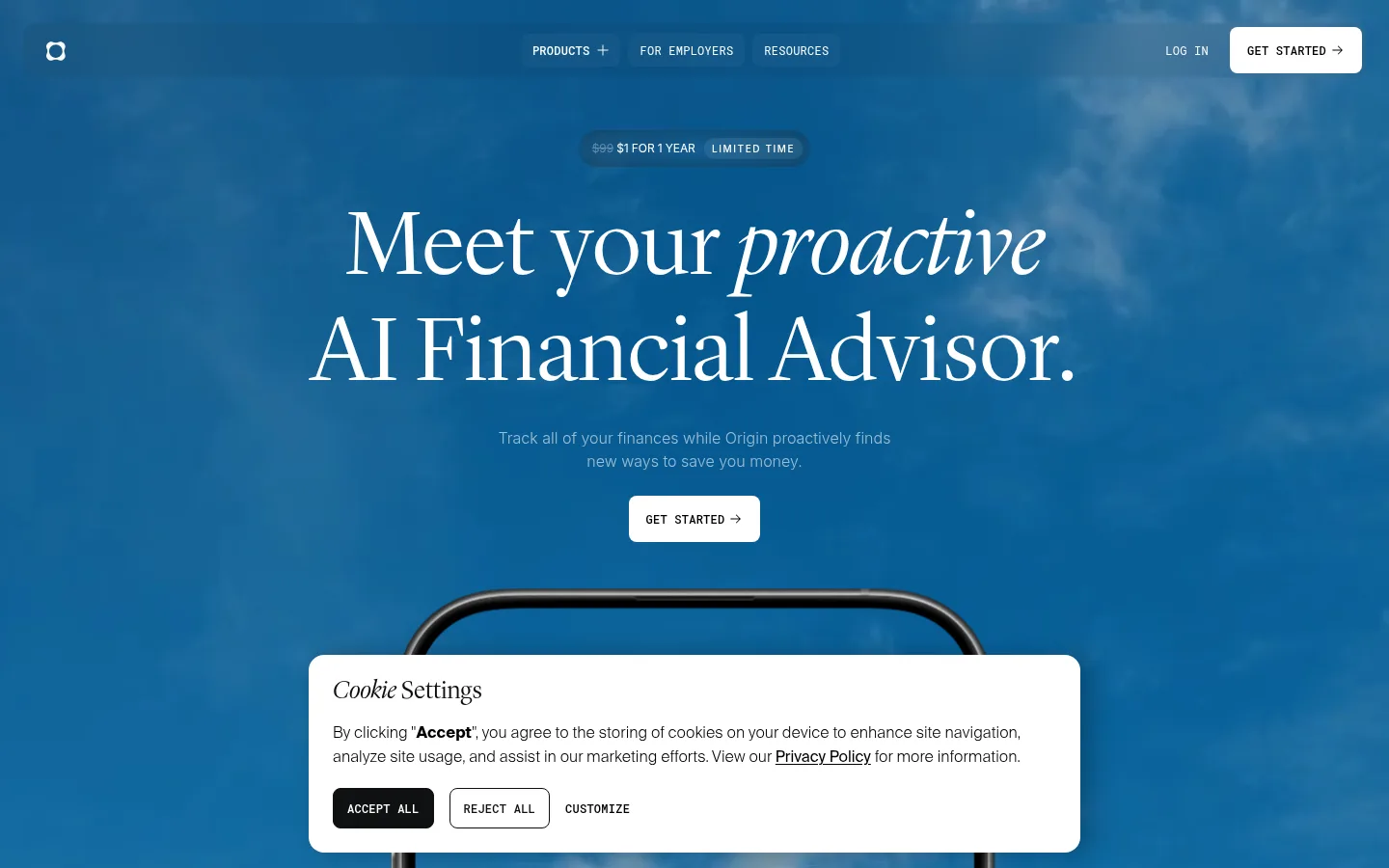
The defining surface is near-black (#050505), kept visually quiet so oversized white serif headlines and product imagery carry the page. A full-bleed blue photographic sky opens the homepage; later, rounded image panels introduce flowers, greenery, and warm landscape tones. These colors belong mainly to photography and product mockups, not to the core interface palette. Display headlines use a light, high-contrast serif with occasional italic emphasis, while Inter supports readable explanatory copy and Roboto Mono gives navigation, captions, and uppercase CTA labels a technical register. Sections alternate centered editorial introductions with dense product cards and paired image/UI panels. Consistent dark space separates the feature stories; thin charcoal borders and rounded corners define cards without heavy shadows. Blue-violet gradients appear as restrained atmosphere around select product moments, while white buttons provide the clearest interaction contrast.
配色 点色块复制色值。用途说明来自对页面的实测位置(背景、文字、描边、按钮)与截图判读。
品牌色
Obsidian Canvas
#050505
Dominant page canvas across navigation, hero, feature sections, and footer.
强调色
Iris Glow
#847dff
Blue-violet gradient accent around select product and atmospheric panels.
Electric Azure
#219ff8
Bright blue partner to violet in gradient treatments and product imagery.
表层色
Hairline Charcoal
#191919
Borders and dark fills on compact links and secondary controls.
Card Edge
#212121
Subtle outline for compact financial data cards and mockup elements.
Deep Black
#030303
Near-black alternate section and media surface, visually close to the main canvas.
Midnight Violet
#26253f
Deep violet undertone in product-card gradient artwork.
Ink Violet
#141324
Dark indigo gradient detail within product-card imagery.
中性色
Paper White
#ffffff
Primary headlines, body text, logos, and high-contrast CTA surfaces.
Quiet Graphite
#646464
Low-emphasis footer copy and secondary informational text.
Soft Silver
#cdcdcd
Muted supporting copy and secondary headings on dark sections.
Muted Alloy
#9b9b9b
Secondary footer and interface text with moderate contrast.
Slate Text
#5c5c5c
Low-emphasis text detail within the dark interface.
功能色
Amber UI
#cc7c01
Warm accent seen inside financial product illustrations, not a dominant site color.
Leaf UI
#61a133
Green detail within product mockups and illustrative financial data.
Terracotta UI
#a7612e
Warm surface color appearing in imagery or mockups rather than core site chrome.
文字 背景 对比度 WCAG #ffffff Paper White#050505 Obsidian Canvas20.38:1 AAA #ffffff Paper White#030303 Deep Black20.62:1 AAA #ffffff Paper White#a7612e Terracotta UI4.78:1 AA #646464 Quiet Graphite#050505 Obsidian Canvas3.44:1 AA-large #646464 Quiet Graphite#030303 Deep Black3.49:1 AA-large #646464 Quiet Graphite#a7612e Terracotta UI1.24:1 不达标
字体 字号阶梯:Perfect Fifth(比例约 1.495,正文 16px)。示例用免费替代字体渲染,数值为实测。
Aa 设计
Inter 网络字体 · 字重 300 / 400 / 500 / 700 · 占比 56%
免费替代:Inter
Body copy, feature headings, and standard links
Aa 设计
Roboto Mono 网络字体 · 字重 400 / 500 · 占比 32%
免费替代:Roboto Mono
Uppercase navigation, captions, and CTA labels
Aa 设计
Suisseintltrial 网络字体 · 字重 400 · 占比 4%
免费替代:Inter
Navigation and financial product interface text
Aa 设计
Suisseintl 网络字体 · 字重 300 · 占比 4%
免费替代:Inter
Form input text
Aa 设计
Lyondisplay App 网络字体 · 字重 300 / 400 · 占比 4%
免费替代:Cormorant Garamond
Display headlines and major section titles
角色 示例 字号 字重 行高 字距 特大标题 Oversized editorial hero and campaign headlines.
Origin Financial
80px 300 1 -0.01em 一级标题 Primary hero title and top-level page headline.
Origin Financial
48px 300 1.15 0 二级标题 Centered feature-section titles and major story headings.
Origin Financial
36px 300 1.15 0 三级标题 Feature-card headings and smaller explanatory titles.
The quick brown fox 敏捷的狐狸
20px 300 1.42 -0.01em 正文 Supporting descriptions and section explanatory copy.
The quick brown fox 敏捷的狐狸
16px 300 1.35 -0.01em 辅助文字 Compact uppercase labels, metadata, and technical notes.
The quick brown fox 敏捷的狐狸
10px 400 1.35 0 链接 Small understated inline and card-action links.
The quick brown fox 敏捷的狐狸
12px 300 1 -0.01em 代码 Uppercase mono labels in product and data-like UI.
const style = 1;
10px 400 1.35 0
间距与布局 基准单位 4px · 密度:紧凑
32px 版块间距
12px 元素间距
— 卡片内边距
1376px 内容最大宽度
4px
8px
10px
12px
13px
16px
18px
24px
32px
48px
96px
100px
The measured content max width is 1376px, with a compact overall density and a base spacing unit of 4px. The page is a long, mostly single-column sequence: centered editorial headings introduce stories, then multi-column cards or wide media panels carry the detail. Feature areas range from two-column image/UI pairings to three- and five-column arrangements. Full-bleed media anchors the hero and selected stories; dark breathing room separates the otherwise continuous black sections. Preserve the centered alignment and broad visual margins rather than compressing content into a conventional dashboard grid.
圆角与层次 inset · other
sm · other
sm · other
inset · card
The page relies on flat dark surfaces rather than pronounced drop shadows. Thin charcoal borders distinguish cards from the canvas, while large rounded panels and product mockups create depth through layering and imagery. Reserve inset highlights and subtle glow effects for UI artwork or gradient moments; keep main content surfaces restrained.
组件 下面的预览按实测的按钮、输入框、徽标、卡片样式重建(字体用替代字体)。
Top navigation Minimal dark navigation with compact links, a log-in action, and a white uppercase mono GET STARTED button.
Primary CTA White surface with black uppercase Roboto Mono label; measured button radius is 8px and padding is 12px 18px.
Feature card Large dark card with a 1px #191919 border, 24px radius, generous 48px padding, and centered feature content.
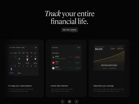
Compact product card Financial mockup card on #050505 with a 1px #212121 border and tight, data-oriented UI.
Image story panel Wide rounded photographic tile with a centered light serif title, short supporting copy, and darkened image treatment where needed.
Secondary link Small, restrained action treatment, often white text on #191919 with an 8px radius.
Newsletter form Footer email input on black with light text, rounded corners, and a compact adjoining submit action.
Imagery · Use cinematic photography as full-width or large rounded panels, particularly for the blue-sky hero and nature-led feature stories. Product screenshots, phone frames, and finance dashboard mockups should feel crisp and dark, with compact realistic data details. Images may carry strong blue, green, or amber color, but keep those hues confined to the media rather than extending them across interface chrome. Video and phone imagery support the story without replacing the clear headline-first composition.
页面版块 共 13 个版块,按页面从上到下排列,每个都标了类型、布局和交互套路。
首页
首屏 顾问式理财首屏
Full-bleed photographic hero with centered headline, supporting copy, CTA, and phone imagery.
功能网格 轻松管理财务
Centered section introduction above four feature columns and a branded media panel.
品牌墙 品牌背书
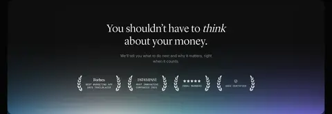
Single centered row of company and publication marks on the dark canvas.
功能网格 财务管理功能
Centered section title and link followed by a multi-card product feature carousel.
图文交替 持续财务建议
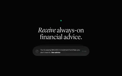
Full-bleed story with centered title and a floating advice notification mockup.
功能网格 全面分析财务
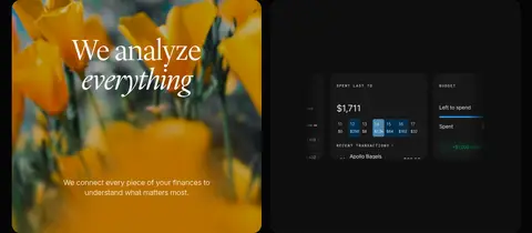
Two-column story grid pairing a nature image tile with a product-data panel.
功能网格 发现省钱机会
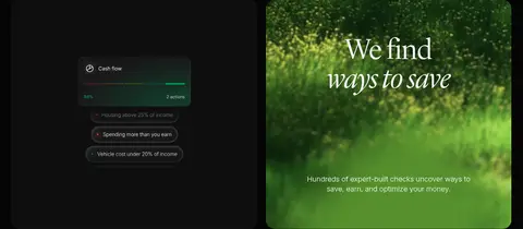
Two-column pairing of a dark cash-flow interface and a green photographic feature tile.
功能网格 规划下一步
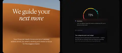
Two-column feature pairing an orange photographic title panel with a financial health score interface.
图文交替 伴侣共同理财
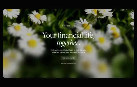
Wide full-bleed nature image with centered copy and a compact call to action.
产品展示 了解你的财务
Single centered app story with gradient atmosphere, headline, and prominent phone mockup.
用户评价 用户真实评价
Three-column review layout with repeated image or review assets and compact quote text.
行动号召 下载Origin
Wide campaign image with centered download headline, proof marks, and CTA.
页脚 页脚与订阅
Multi-column footer with newsletter form, product and resource links, app downloads, and legal text.
该做与不该做 ✓ 该做 Use #050505 as the dominant page canvas. Set major storytelling headlines in a light editorial serif. Keep body copy understated and comfortably readable. Use white CTA surfaces for the clearest primary actions. Reserve vivid color for photography, mockups, and restrained gradients. Build feature stories from centered titles and spacious media panels. ✕ 不该做 Do not turn the homepage into a bright dashboard. Do not spread illustration-only greens or ambers across the core interface. Do not use heavy shadows to separate every card. Do not make navigation or CTA labels large and decorative. Do not crowd the serif headlines with dense supporting copy. Do not replace the varied image-led story rhythm with uniform cards. 给 AI 的提示词 想快速出一个同风格的新页面,把这段话连同 DESIGN.md 一起发给 AI。
复制 Build a new Origin-style fintech page with #050505 Obsidian Canvas as the dominant background and #ffffff Paper White for high-contrast headlines and primary actions. Use a light editorial serif for large centered titles, with occasional italic emphasis; set supporting copy in a quiet sans serif and compact labels in uppercase mono. Keep the navigation minimal and make the main CTA a white, rounded button with dark text. Alternate centered introductions with spacious photographic panels and detailed dark product UI cards. Use #191919 Hairline Charcoal and #212121 Card Edge for subtle borders, not heavy shadows. Let blue, green, and warm tones live mainly inside photography or mockups; use #219ff8 Electric Azure and #847dff Iris Glow sparingly for atmospheric gradients. Maintain broad dark breathing space and a varied long-form storytelling rhythm.
DESIGN.md Tailwind v4 CSS 变量 Design Tokens
---
title: "Origin Financial design system"
variant: extended
source: https://useorigin.com/
captured_at: 2026-10-12
theme: dark
industry: fintech
generator: Design DNA (https://four.wiralomi.com/style/useorigin-com)
ai_generated: true
ai_label: "本文件由 AI 辅助生成:数值取自公开网页的实测样式,命名、用途说明与建议为模型解读。商标归原所有者。 / AI-assisted content"
---
# Origin Financial · Design System
> Editorial calm for an always-on financial life
**Theme:** dark · **Industry:** fintech · **Source:** https://useorigin.com/ · **Captured:** 2026-10-12 (1440×900 desktop)
_AI-assisted content: values are measured from the public page at capture time; names, roles and guidance are model-written interpretations. Trademarks belong to their owners._
Origin pairs a near-black canvas and refined serif headlines with vivid photographic panels and detailed financial product UI. The long-form homepage moves from a cinematic advisor introduction through feature demonstrations, customer reviews, a download call to action, and a compact footer.
## North star
Keep the interface nearly black and let elegant serif headlines, restrained UI detail, and a few vivid image-led panels tell the story.
## Overview
The defining surface is near-black (## Colors
| Name | Hex | Token | Group | Role |
|---|---|---|---|---|
| Obsidian Canvas | ` | `--color-obsidian-canvas` | brand | Dominant page canvas across navigation, hero, feature sections, and footer. |
| Paper White | ` | `--color-paper-white` | neutral | Primary headlines, body text, logos, and high-contrast CTA surfaces. |
| Quiet Graphite | ` | `--color-quiet-graphite` | neutral | Low-emphasis footer copy and secondary informational text. |
| Hairline Charcoal | ` | `--color-hairline-charcoal` | surface | Borders and dark fills on compact links and secondary controls. |
| Soft Silver | ` | `--color-soft-silver` | neutral | Muted supporting copy and secondary headings on dark sections. |
| Card Edge | ` | `--color-card-edge` | surface | Subtle outline for compact financial data cards and mockup elements. |
| Deep Black | ` | `--color-deep-black` | surface | Near-black alternate section and media surface, visually close to the main canvas. |
| Iris Glow | ` | `--color-iris-glow` | accent | Blue-violet gradient accent around select product and atmospheric panels. |
| Electric Azure | ` | `--color-electric-azure` | accent | Bright blue partner to violet in gradient treatments and product imagery. |
| Muted Alloy | ` | `--color-muted-alloy` | neutral | Secondary footer and interface text with moderate contrast. |
| Amber UI | ` | `--color-amber-ui` | semantic | Warm accent seen inside financial product illustrations, not a dominant site color. |
| Leaf UI | ` | `--color-leaf-ui` | semantic | Green detail within product mockups and illustrative financial data. |
| Terracotta UI | ` | `--color-terracotta-ui` | semantic | Warm surface color appearing in imagery or mockups rather than core site chrome. |
| Slate Text | ` | `--color-slate-text` | neutral | Low-emphasis text detail within the dark interface. |
| Midnight Violet | ` | `--color-midnight-violet` | surface | Deep violet undertone in product-card gradient artwork. |
| Ink Violet | ` | `--color-ink-violet` | surface | Dark indigo gradient detail within product-card imagery. |
### Semantic aliases
`--color-canvas` → ` (Obsidian Canvas) · `--color-surface` → ` (Deep Black) · `--color-surface-2` → ` (Terracotta UI) · `--color-text` → ` (Paper White) · `--color-text-muted` → ` (Quiet Graphite) · `--color-text-subtle` → ` (Soft Silver) · `--color-border` → ` (Hairline Charcoal) · `--color-accent` → ` (Iris Glow) · `--color-accent-2` → ` (Electric Azure) · `--color-accent-3` → ` (Amber UI)
### Contrast (WCAG 2.x)
| Text | Background | Ratio | Level |
|---|---|---|---|
| ` | ` | 20.38:1 | AAA |
| ` | ` | 20.62:1 | AAA |
| ` | ` | 4.78:1 | AA |
| ` | ` | 3.44:1 | AA-large |
| ` | ` | 3.49:1 | AA-large |
| ` | ` | 1.24:1 | fail |
| ` | ` | 12.82:1 | AAA |
| ` | ` | 12.97:1 | AAA |
| ` | ` | 3.01:1 | AA-large |
| ` | ` | 6.17:1 | AA |
### Gradients
- `linear-gradient(70deg, rgb(33, 159, 248), rgb(132, 125, 255) 52%)`
- `linear-gradient(90deg, rgb(4, 31, 51), rgb(11, 56, 89) 15%, rgb(23, 110, 171) 30%, rgb(255, 255, 255) 51%, rgb(117, 201, 212) 65%, rgb(132, 125, 255) 85%)`
- `linear-gradient(rgba(5, 5, 5, 0), rgb(5, 5, 5))`
- `radial-gradient(58.63% 38.68% at 50% 0%, rgba(132, 125, 255, 0.2) 0%, rgba(132, 125, 255, 0.016) 100%)`
## Typography
| Family | Token | Source | Weights | Role | Free substitute |
|---|---|---|---|---|---|
| Inter | `--font-body` | webfont | 300, 400, 500, 700 | Body copy, feature headings, and standard links | Inter |
| Roboto Mono | `--font-mono` | webfont | 400, 500 | Uppercase navigation, captions, and CTA labels | Roboto Mono |
| Suisseintltrial | `--font-suisseintltrial` | webfont | 400 | Navigation and financial product interface text | Inter |
| Suisseintl | `--font-suisseintl` | webfont | 300 | Form input text | Inter |
| Lyondisplay App | `--font-display` | webfont | 300, 400 | Display headlines and major section titles | Cormorant Garamond |
- **Inter:** Light weights dominate; compact tracking and sentence case keep supporting copy understated.
- **Roboto Mono:** Use 400–500 weights, uppercase treatment, and a crisp technical feel for short labels.
- **Suisseintltrial:** Regular-weight sans serif appears in interface mockups and nav; keep it neutral and legible.
- **Suisseintl:** Light interface text; preserve restrained emphasis and dark-field legibility.
- **Lyondisplay App:** Light serif display with editorial contrast; use occasional italic emphasis and generous line spacing.
### Type scale — Perfect Fifth (ratio ≈ 1.495, base 16px)
| Role | Size | Weight | Line height | Letter spacing | Case | Family | Used for |
|---|---|---|---|---|---|---|---|
| display | 80px | 300 | 1 | -0.01em | — | Lyondisplay App | Oversized editorial hero and campaign headlines. |
| h1 | 48px | 300 | 1.15 | 0 | — | Lyondisplay | Primary hero title and top-level page headline. |
| h2 | 36px | 300 | 1.15 | 0 | — | Lyondisplay App | Centered feature-section titles and major story headings. |
| h3 | 20px | 300 | 1.42 | -0.01em | — | Inter | Feature-card headings and smaller explanatory titles. |
| body | 16px | 300 | 1.35 | -0.01em | — | Inter | Supporting descriptions and section explanatory copy. |
| caption | 10px | 400 | 1.35 | 0 | uppercase | Roboto Mono | Compact uppercase labels, metadata, and technical notes. |
| link | 12px | 300 | 1 | -0.01em | — | Inter | Small understated inline and card-action links. |
| code | 10px | 400 | 1.35 | 0 | uppercase | Roboto Mono | Uppercase mono labels in product and data-like UI. |
## Spacing & layout
- Base unit **4px**, density **compact**.
- Scale (most used values): 4, 8, 10, 12, 13, 16, 18, 24, 32, 48, 96, 100 px.
- Section rhythm 32px · element gap 12px · card padding — · max content width 1376px.
The measured content max width is 1376px, with a compact overall density and a base spacing unit of 4px. The page is a long, mostly single-column sequence: centered editorial headings introduce stories, then multi-column cards or wide media panels carry the detail. Feature areas range from two-column image/UI pairings to three- and five-column arrangements. Full-bleed media anchors the hero and selected stories; dark breathing room separates the otherwise continuous black sections. Preserve the centered alignment and broad visual margins rather than compressing content into a conventional dashboard grid.
## Shape & elevation
- Radius: button `8px` · input `8px` · card `24px` · nav `8px` · link `8px` · xs `8px` · sm `10px` · md `12px` · lg `24px` · xl `245px` · 2xl `0px` · pill `9999px`
- Shadow `inset` (other): `rgba(255, 255, 255, 0.2) 2px 2px 8px 0px inset, rgba(255, 255, 255, 0.2) -1px -1px 2px 0px inset`
- Shadow `sm` (other): `rgba(0, 156, 90, 0.85) 0px 0px 2.35731px 1.17865px`
- Shadow `sm-2` (other): `rgba(252, 74, 74, 0.85) 0px 0px 2.35731px 1.17865px`
- Shadow `inset-2` (card): `rgba(255, 255, 255, 0.15) 0px 2px 0px -1px inset`
- Shadow `inset-3` (other): `rgba(255, 255, 255, 0.2) 1px 1px 0px 0px, rgba(255, 255, 255, 0.3) 1px 1px 0px 0px inset`
- Shadow `sm-3` (other): `rgba(0, 0, 0, 0) 0px 0px 2.52298px 1.26149px`
- Motion: standard transition `0.3s ease-in-out` on interactive elements.
The page relies on flat dark surfaces rather than pronounced drop shadows. Thin charcoal borders distinguish cards from the canvas, while large rounded panels and product mockups create depth through layering and imagery. Reserve inset highlights and subtle glow effects for UI artwork or gradient moments; keep main content surfaces restrained.
## Imagery
Use cinematic photography as full-width or large rounded panels, particularly for the blue-sky hero and nature-led feature stories. Product screenshots, phone frames, and finance dashboard mockups should feel crisp and dark, with compact realistic data details. Images may carry strong blue, green, or amber color, but keep those hues confined to the media rather than extending them across interface chrome. Video and phone imagery support the story without replacing the clear headline-first composition.
## Components
### Top navigation
Minimal dark navigation with compact links, a log-in action, and a white uppercase mono GET STARTED button.
### Primary CTA
White surface with black uppercase Roboto Mono label; measured button radius is 8px and padding is 12px 18px.
### Feature card
Large dark card with a 1px ### Compact product card
Financial mockup card on ### Image story panel
Wide rounded photographic tile with a centered light serif title, short supporting copy, and darkened image treatment where needed.
### Secondary link
Small, restrained action treatment, often white text on ### Newsletter form
Footer email input on black with light text, rounded corners, and a compact adjoining submit action.
### Measured component styles
- **Primary button** (“GET STARTED”): background ## Do
- Use ## Don't
- Do not turn the homepage into a bright dashboard.
- Do not spread illustration-only greens or ambers across the core interface.
- Do not use heavy shadows to separate every card.
- Do not make navigation or CTA labels large and decorative.
- Do not crowd the serif headlines with dense supporting copy.
- Do not replace the varied image-led story rhythm with uniform cards.
## Agent prompt
Build a new Origin-style fintech page with ## Page sections (top to bottom)
| # | Type | Layout | UX patterns | UI patterns |
|---|---|---|---|---|
| 1 | hero | Full-bleed photographic hero with centered headline, supporting copy, CTA, and phone imagery. | Primary get-started action, Promotional offer cue | Centered serif headline, White CTA, Blue sky imagery |
| 2 | feature-grid | Centered section introduction above four feature columns and a branded media panel. | Explain the platform promise, Show proof-oriented feature cues | Centered serif title, Dark canvas, Wide image panel |
| 3 | logo-cloud | Single centered row of company and publication marks on the dark canvas. | Establish credibility | Small grayscale logos, Generous horizontal spacing |
| 4 | feature-grid | Centered section title and link followed by a multi-card product feature carousel. | Browse feature highlights, Use carousel controls | Dark bordered cards, Finance UI previews, Compact navigation controls |
| 5 | feature-split | Full-bleed story with centered title and a floating advice notification mockup. | Highlight timely recommendations | Large serif heading, Dark notification pill, Minimal surrounding content |
| 6 | feature-grid | Two-column story grid pairing a nature image tile with a product-data panel. | Explain connected financial analysis | Rounded image tile, Dashboard-style data view |
| 7 | feature-grid | Two-column pairing of a dark cash-flow interface and a green photographic feature tile. | Surface potential savings, Show financial checks | Cash-flow mockup, Nature photography, Rounded panels |
| 8 | feature-grid | Two-column feature pairing an orange photographic title panel with a financial health score interface. | Explain prioritized next actions | Serif title on image, Score gauge, Dark recommendation card |
| 9 | feature-split | Wide full-bleed nature image with centered copy and a compact call to action. | Invite partner collaboration, Promote couples feature | Rounded floral background, Centered serif title, Small CTA |
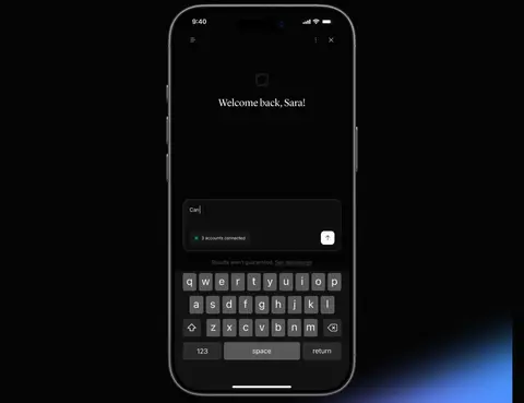
| 10 | product-showcase | Single centered app story with gradient atmosphere, headline, and prominent phone mockup. | Introduce app interaction, Show mobile experience | Blue-violet glow, Phone frame, Dark interface |
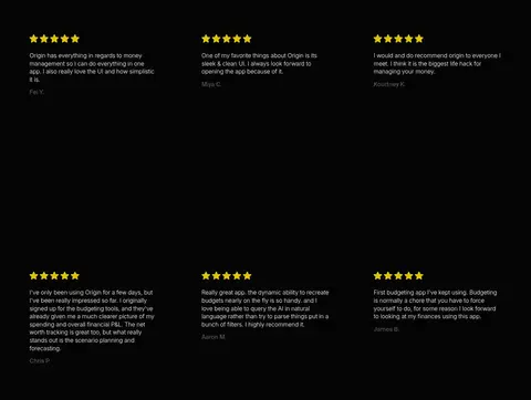
| 11 | testimonials | Three-column review layout with repeated image or review assets and compact quote text. | Build trust through customer voices | Star ratings, Small review copy, Dark background |
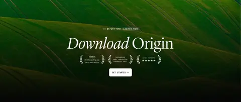
| 12 | cta | Wide campaign image with centered download headline, proof marks, and CTA. | Prompt app download, Reinforce credibility | Green image background, Large serif title, White CTA |
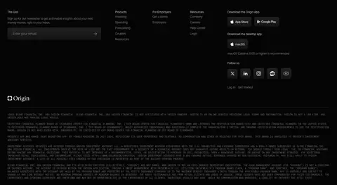
| 13 | footer | Multi-column footer with newsletter form, product and resource links, app downloads, and legal text. | Subscribe by email, Navigate product and resources, Download apps | Compact link columns, Dark input, Small legal copy |
## Source CSS custom properties (selected)
```css
--radius: 230px;
```
---
本文件由 AI 辅助生成:数值取自公开网页的实测样式,命名、用途说明与建议为模型解读。商标归原所有者。
Generated by Design DNA · https://four.wiralomi.com/style/useorigin-com