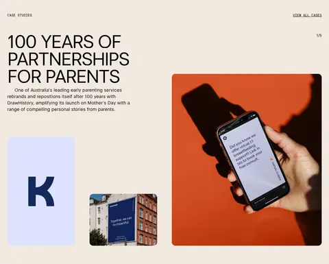
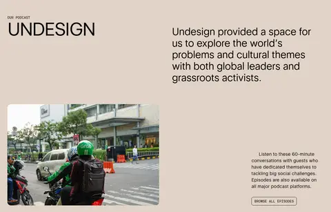
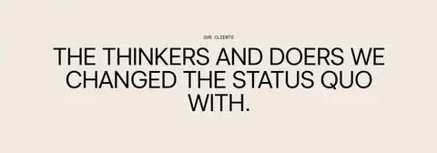
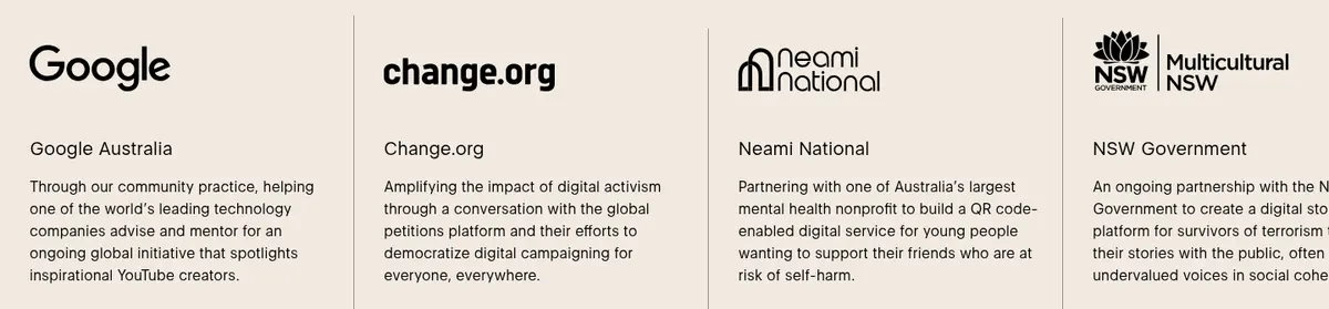
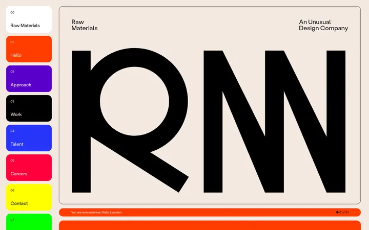
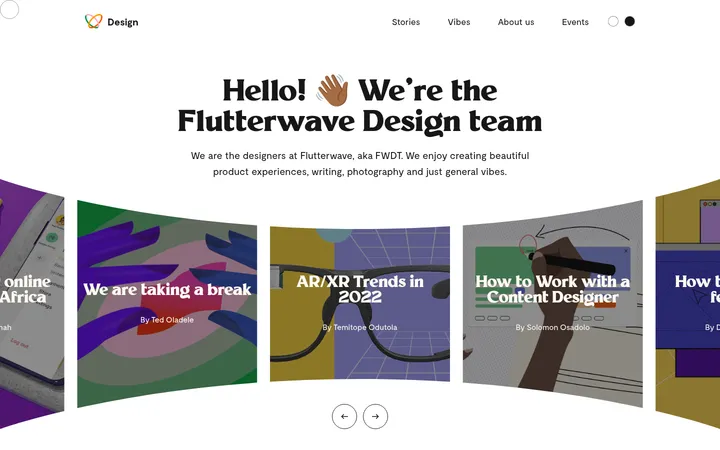
North star · Let oversized editorial type and warm open space lead; use imagery and fine rules to support, never compete with, the message.
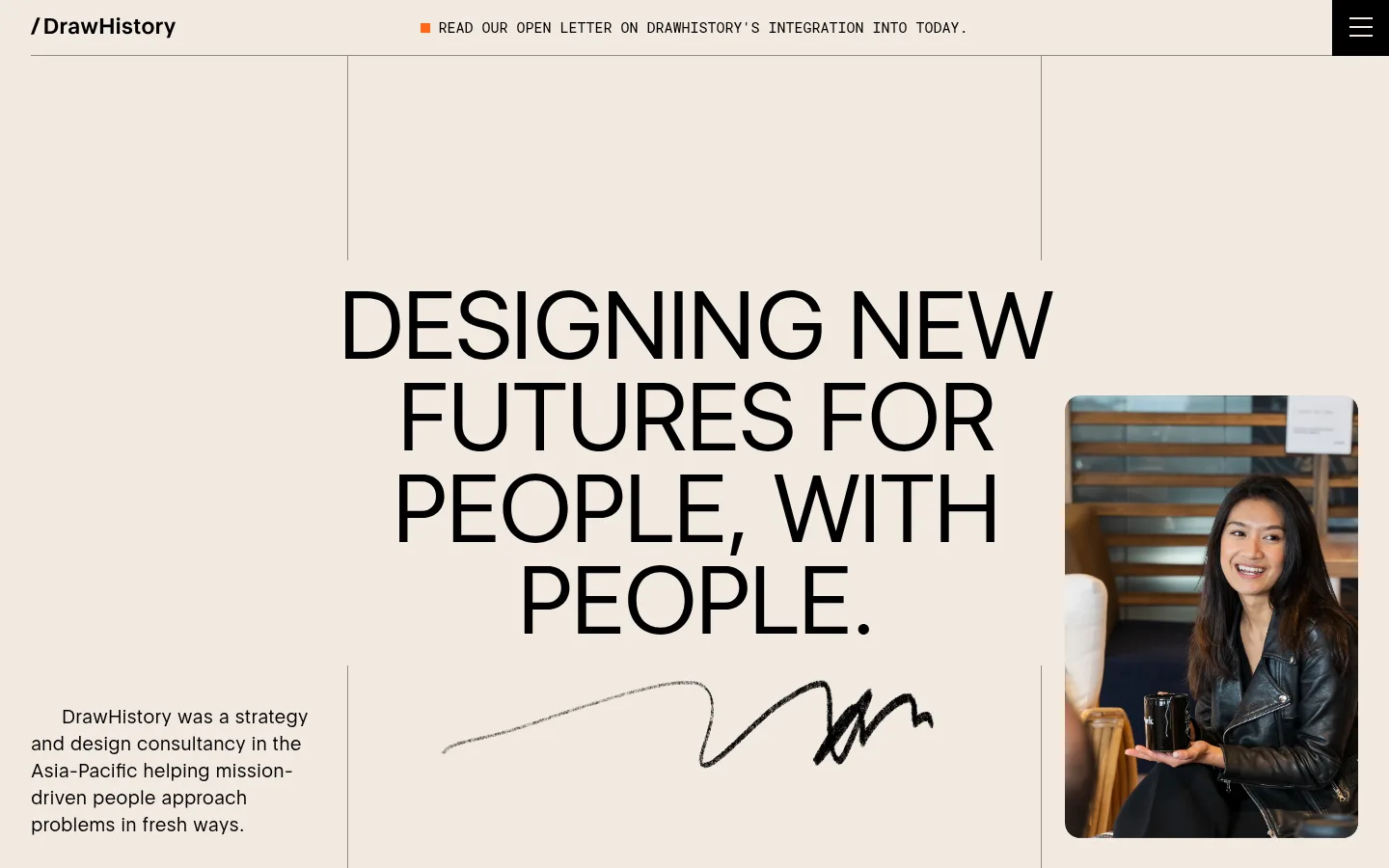
The visual identity is built on a quiet, warm-neutral palette: white and pale sand carry most sections, with a deeper wet-sand band reserved for podcast content and black used for typography and the closing footer. Warm orange and other vivid hues belong to project photography, not the core interface. Eloquia Text gives the page its distinctive editorial voice, from large uppercase manifesto headlines to readable body copy; Roboto Mono handles compact uppercase navigation, labels, and buttons. Layout alternates broad single-column statements with asymmetric image-and-copy splits and compact multi-column news or client rows. Generous open space in the hero and feature sections contrasts with denser case-study and footer content. Photography is candid and documentary, often shown in softly rounded frames. Hairline rules and outlined controls define structure without shadows, so the page remains flat, calm, and distinctly editorial.
Display headlines, section titles, body copy, captions, and large link-like labels.
Aa 设计
Roboto Mono
网络字体 · 字重 400 · 占比 10%
免费替代:Roboto Mono
Navigation, buttons, small labels, and compact utility text.
角色
示例
字号
字重
行高
字距
特大标题
Large hero statement and prominent editorial display text.
DrawHistory
104px
400
1.1
-0.009em
一级标题
Primary uppercase manifesto and page-level headline.
DrawHistory
100px
400
0.95
-0.05em
二级标题
Large uppercase section and feature headlines.
DrawHistory
80px
400
0.95
-0.05em
三级标题
Secondary editorial headings and case-study titles.
DrawHistory
44px
400
1.14
-0.025em
四级标题
Smaller feature or content headings.
DrawHistory
40px
400
1.13
0
正文
Explanatory copy in feature and story sections.
The quick brown fox 敏捷的狐狸
20px
400
1.4
0
辅助文字
Compact descriptions, metadata, and supporting copy.
The quick brown fox 敏捷的狐狸
16px
400
1.5
0
按钮
Uppercase monospace outlined action labels.
The quick brown fox 敏捷的狐狸
15px
400
1.25
0
导航
Uppercase monospace navigation and announcement text.
The quick brown fox 敏捷的狐狸
15px
400
1.5
0
链接
Large editorial link labels, including prominent navigation links.
DrawHistory
104px
400
1.1
-0.009em
代码
Compact uppercase utility labels and metadata.
const style = 1;
15px
400
1.33
0
间距与布局
基准单位 8px · 密度:紧凑
32px版块间距
2px元素间距
8px卡片内边距
1376px内容最大宽度
8px
12px
16px
20px
24px
28px
32px
40px
48px
64px
80px
112px
144px
The measured page max width is 1376px, with layouts ranging from a single-column hero to asymmetric feature splits and multi-column news or client rows. Hero headlines sit centrally within a broad warm field, while small copy and photography anchor opposing sides. Section backgrounds alternate between white, Warm Sand, and Wet Sand to mark content shifts. Spacing uses a compact measured scale with generous visual breathing room in the long hero and feature panels; denser grids are reserved for feeds, clients, and the footer.
圆角与层次
按钮 · 8px
图片 · 16px
没有测到阴影:页面是扁平的,层次靠底色和描边区分。
The page is largely flat, with no measured shadows. Use fine grey hairlines to separate cards and sections, and black outlines for compact actions. Media uses measured rounded corners, while text and section bands remain unboxed. The footer creates depth through a full black surface rather than elevated cards.
组件
下面的预览按实测的按钮、输入框、徽标、卡片样式重建(字体用替代字体)。
Announcement bar
A slim top-row message pairs uppercase Roboto Mono text with a small orange marker and a black menu control.
Hero statement
Large uppercase Eloquia Text sits on Warm Sand, balanced by a brief supporting paragraph, portrait, and signature-like graphic.
Latest stories
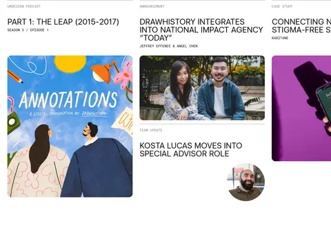
A white content feed uses compact uppercase metadata, thin grey rules, headline text, and image-led story cards.
Editorial feature split
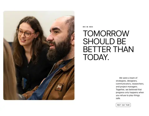
A large headline and candid image share a white or sand field, with supporting copy and a small outlined action.
Podcast panel
The Undesign feature uses Wet Sand, a two-column heading-and-copy arrangement, documentary image, and compact link.
Newsletter form
A white section pairs a concise signup message with an email field and uppercase outlined submit control.
Black footer
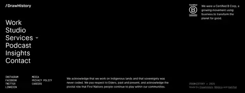
A black closing area groups navigation, social links, acknowledgement copy, and muted legal details.
Imagery · Use candid documentary photography of people, workshops, and community-facing work. Images sit within editorial layouts as large standalone portraits or supporting case-study tiles, often with softly rounded corners. Project thumbnails may contain vivid campaign colours, but keep interface surfaces restrained. The hero combines a portrait with a hand-drawn signature-like mark; imagery should feel observational rather than glossy or synthetic.
Use the measured warm backgrounds as broad section fields.
Set major statements in large, tightly tracked uppercase editorial type.
Reserve Roboto Mono for compact navigation, labels, and actions.
Alternate open feature splits with denser content rows.
Use candid people-centered photography in rounded media frames.
Define structure with thin rules and outlined controls.
✕ 不该做
Do not introduce unmeasured brand colours or gradients.
Do not add drop shadows or elevated-card styling.
Do not center every section; retain asymmetric editorial composition.
Do not make interface labels large or decorative.
Do not let vivid campaign imagery recolour the surrounding interface.
Do not crowd the hero with cards or extra interface chrome.
给 AI 的提示词
想快速出一个同风格的新页面,把这段话连同 DESIGN.md 一起发给 AI。
Build a new social-impact agency page in DrawHistory’s editorial style. Use Warm Sand (#f2e9e1) and Gallery White (#ffffff) as the main section surfaces, with Wet Sand (#e1d3c7) for one distinct feature band and Editorial Ink (#000000) for core text and the footer. Use Eloquia Text or a close free substitute for oversized, tightly tracked uppercase headlines and readable body copy; use Roboto Mono for compact uppercase navigation and controls. Compose asymmetric image-and-copy sections, a spacious statement-led opening, and denser editorial rows. Use candid documentary photography with softly rounded frames. Keep the interface flat: rely on hairline Rule Grey (#999999) dividers and outlined actions rather than shadows. Keep campaign colours inside imagery, and preserve generous open space around major statements.