North star · Use oversized athletic typography and spacious white framing to make real runner and product imagery—not decoration—the page’s energy.
The page uses a white canvas as a quiet frame for full-bleed runner videos, pale product cards, and large typographic statements. The measured palette’s orange, #ff4c00, is the clearest brand signal: it marks benefit headings, review details, promotional imagery, and the newsletter panel rather than colouring every control. Headlines use Helvetica Neue LT Std in heavy-looking uppercase forms, tight tracking, and compressed line spacing; GT Pressura LC Standard carries navigation, buttons, and compact supporting copy. Content alternates between broad, airy sections and three-column product or editorial cards, with generous separation that lets imagery register. Product photography emphasizes reflective single-serve packs, while lifestyle imagery feels candid and kinetic. Pale greys distinguish cards and headings from the canvas; a deep burgundy band creates a rare, deliberate contrast. Keep interaction surfaces simple, rely on clear labels, and avoid decorative depth.
配色
点色块复制色值。用途说明来自对页面的实测位置(背景、文字、描边、按钮)与截图判读。
品牌色
强调色
表层色
中性色
功能色
页面底色 · Gallery White表层 · Cool Card Grey表层 2 · Maple Cream表层 3 · Deep Reddish Brown主文字 · Ash Text次要文字 · Gallery White弱文字 · Runner Ink描边 · Pale Graphite强调 · Sap Orange强调 2 · Track Blue
Oversized page masthead and prominent campaign statements.
SAPGOODENERGY
62.5px
500
0.91
-0.05em
一级标题
Large uppercase hero and newsletter headlines.
SAPGOODENERGY
50px
500
0.9
-0.06em
二级标题
Major section titles such as WHY SAP.
SAPGOODENERGY
42px
500
0.88
-0.05em
三级标题
Feature and benefit headings.
SAPGOODENERGY
40px
500
1
-0.05em
四级标题
Product-card and smaller section headings.
SAPGOODENERGY
30px
500
1.03
-0.05em
正文
Compact uppercase product, benefit, and supporting copy.
The quick brown fox 敏捷的狐狸
14px
500
1.14
0
按钮
Shop, story, and bundle action labels.
The quick brown fox 敏捷的狐狸
14px
500
1.14
0
导航
Uppercase header navigation labels.
The quick brown fox 敏捷的狐狸
16px
500
1
0
链接
Editorial, product, and supporting text links.
The quick brown fox 敏捷的狐狸
14px
500
1.6
0
间距与布局
基准单位 4px · 密度:宽松
96px版块间距
4px元素间距
27px卡片内边距
1432px内容最大宽度
4px
7px
8px
10px
12px
16px
18px
20px
23px
24px
27px
29px
32px
35px
36px
40px
A spacious, long-form storefront sits on a white canvas, with measured maximum content width of 1432px and section separation around 96px. Full-bleed hero media and a dark feature band interrupt otherwise contained sections. Product, feature, review, and editorial content commonly uses three columns; the benefit section splits copy from imagery. Alignment shifts between centered display headings and left-aligned card content. The overall density is low, with wide white gaps around cards and large campaign areas.
圆角与层次
按钮 · 7px
卡片 · 18px
链接 · 18px
sm · button
inset · link
The interface is mostly flat: white canvas, pale card fills, and fine grey borders do most of the separation. Cards have softly rounded corners, with product and review tiles feeling restrained rather than elevated. A small measured button shadow exists, but avoid relying on shadows or layered effects as a defining visual device.
组件
下面的预览按实测的按钮、输入框、徽标、卡片样式重建(字体用替代字体)。
Hero media
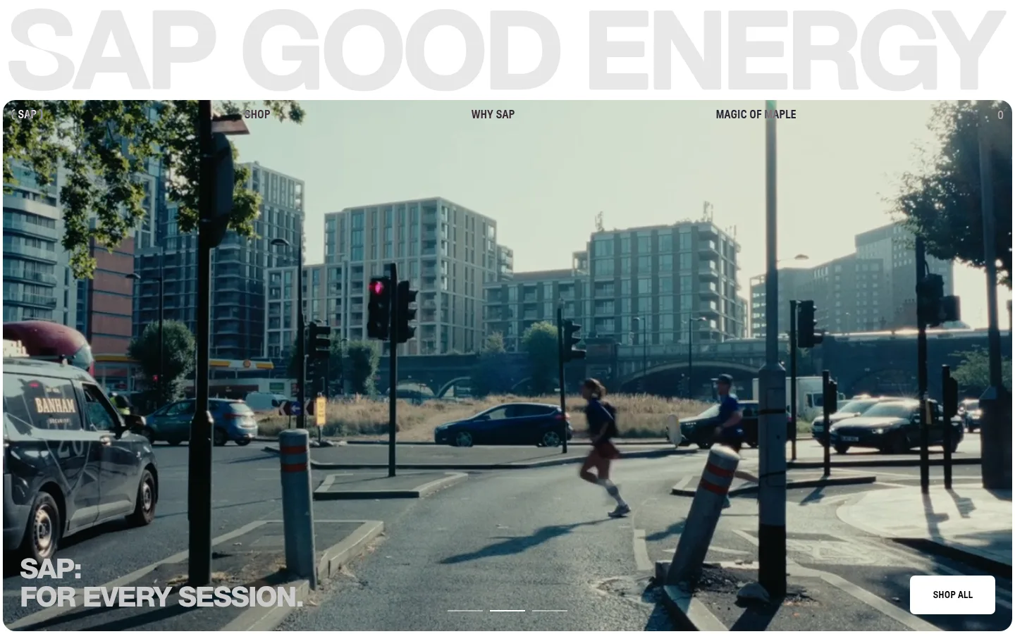
Large rounded, full-width runner video with small overlaid uppercase navigation, a lower-left campaign line, and a light SHOP ALL button.
Product cards
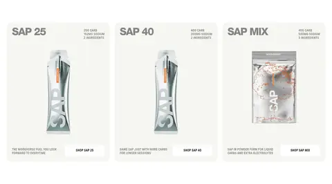
Three-column product presentation with pale cream or grey surfaces, package imagery, concise product facts, and compact shop links.
Benefit split
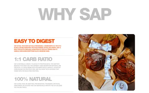
Large WHY SAP heading followed by explanatory benefit text beside lifestyle photography; orange marks the featured benefit.
Dark campaign band
Full-width #2a0a0a Maple feature area with a centered, light-colored exploration CTA.
Review cards
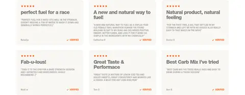
Light, rounded testimonial tiles with orange rating details, compact copy, and verification cues.
Bundle promotion
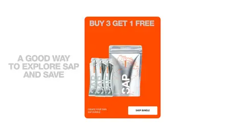
Orange promotional visual featuring a product bundle, short offer headline, and a contrasting shop button.
Newsletter panel
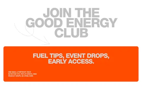
Prominent orange signup area with oversized club headline, supporting copy, email inputs, and clear submission actions.
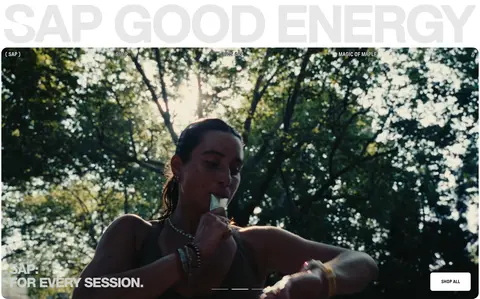
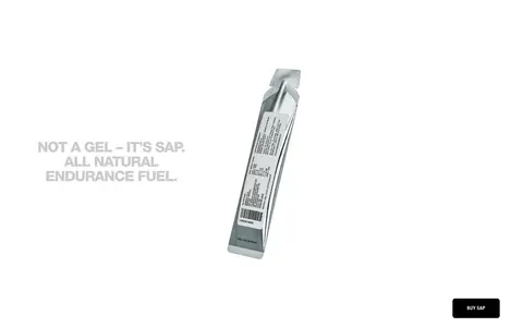
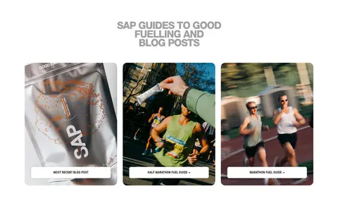
Imagery · Use runner-focused video and candid lifestyle photography as the main emotional content, with full-bleed framing in the opening hero. Product imagery shows reflective sachets and mix packaging against pale, unobtrusive backgrounds. Review tiles use runner portraits; editorial cards pair fuel and running scenes. The measured screenshot’s green-blue tones belong chiefly to photography, not the core UI palette.
Keep the page canvas white and let images carry much of the color.
Set major headings in uppercase with tight, compressed spacing.
Reserve #ff4c00 for brand moments, highlighted benefits, and promotions.
Use GT Pressura LC Standard-style compact typography for navigation and controls.
Give content sections generous breathing room.
Use pale, rounded cards for products and reviews.
✕ 不该做
Do not make every section a colored panel.
Do not use gradients as a substitute for the flat measured palette.
Do not add heavy shadows or elaborate layered UI.
Do not treat photographic green and blue tones as core brand colors.
Do not set supporting copy in oversized display typography.
Do not crowd the product cards with extra decoration.
给 AI 的提示词
想快速出一个同风格的新页面,把这段话连同 DESIGN.md 一起发给 AI。
Build a new SAPGOODENERGY-style storefront page with a spacious white canvas and a clear athletic editorial character. Use Gallery White (#ffffff) as the frame, Runner Ink (#000000) for navigation and copy, and Sap Orange (#ff4c00) sparingly for key benefits and promotional emphasis. Use Track Blue (#2491c4) only for a measured primary shop action when appropriate. Pair oversized, tightly tracked uppercase display headings with compact sans-serif navigation and controls. Create wide image-led hero areas, pale product and review cards, and occasional full-width campaign bands in Deep Reddish Brown (#2a0a0a). Favor real runner photography and pack imagery over decorative illustration. Keep sections generously separated, cards simple and softly rounded, and interactions easy to scan. Avoid gradients, heavy shadows, and unnecessary visual clutter.