North star · Keep the interface quiet and near-white, letting expressive book artwork and clear listening actions provide the visual emphasis.
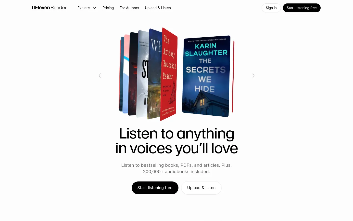
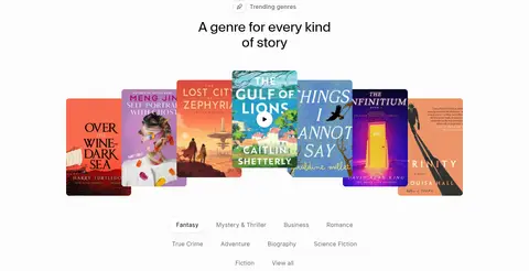
The page uses a near-white canvas (#fdfcfc) from hero through footer, so colour comes primarily from the books, app screens, and video rather than large branded bands. Black (#000000) anchors headlines, navigation, links, and the pill-shaped primary actions; muted greys keep supporting copy quiet. Warm off-white cards (#f5f3f1) distinguish upload, testimonial, and pricing surfaces without breaking the restrained palette. Waldenburg headlines have a light, open editorial character, while Inter handles compact navigation, body copy, controls, and metadata. The centered hero pairs a floating stack of book covers with a large two-line headline and concise calls to action. Lower sections alternate centered introductions with left-aligned feature areas, horizontal book and genre displays, app mockups, reviews, and pricing cards. Generous vertical separation lets each content-rich showcase breathe. Rounded pills and soft card corners temper the otherwise flat, minimal interface; accent colours are sparse and mostly belong to book or product imagery.
Navigation, body copy, buttons, links, captions, badges, and compact product labels.
Aa 设计
Waldenburg
网络字体 · 字重 375 / 400 / 700 · 占比 9%
免费替代:Inter
Headlines, including the hero statement and section titles.
角色
示例
字号
字重
行高
字距
一级标题
Large, light hero headline; concise statement with a close two-line composition.
ElevenReader
36px
375
1.17
-0.01em
二级标题
Section titles introducing features, reviews, pricing, and content collections.
The quick brown fox 敏捷的狐狸
24px
400
1.33
0
三级标题
Subheads within feature areas and supporting content blocks.
The quick brown fox 敏捷的狐狸
20px
400
1.35
0
正文
Descriptions, feature explanations, review copy, and pricing details.
The quick brown fox 敏捷的狐狸
15px
400
1.47
0.01em
辅助文字
Small metadata, author names, book details, and supporting labels.
The quick brown fox 敏捷的狐狸
13px
400
1.38
0.01em
按钮
Primary and secondary listening, upload, and subscription actions.
The quick brown fox 敏捷的狐狸
16px
400
1.4
0.01em
导航
Header navigation and compact in-product navigation labels.
The quick brown fox 敏捷的狐狸
14px
400
1.43
0.01em
链接
Small text links for books, authors, and supporting destinations.
The quick brown fox 敏捷的狐狸
13px
400
1.38
0.01em
间距与布局
基准单位 4px · 密度:适中
56px版块间距
16px元素间距
18px卡片内边距
780px内容最大宽度
2px
4px
8px
10px
11px
12px
16px
18px
20px
22px
24px
28px
32px
56px
64px
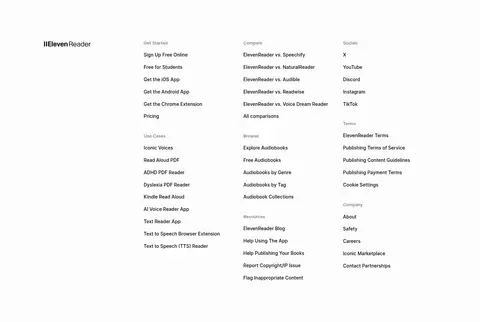
The page is arranged as a long, single-column sequence with a measured 780px maximum content width and comfortable density. Hero and selected section introductions are centered; feature demonstrations, review content, and footer columns shift to left-aligned or multi-column layouts. Horizontal carousels and cover rows create breadth within the otherwise contained page. The measured spacing system uses a 4px base, with a 56px section rhythm and 16px element gap. Preserve large visual pauses between showcases rather than filling every available area.
圆角与层次
按钮 · 50%
输入框 · 24px
卡片 · 24px
徽标 · 9999px
导航 · 9999px
链接 · 20px
sm · other, button
hairline · button, link
sm · other
hairline · input, button
Most sections sit flat on the near-white canvas. Warm off-white cards provide separation through fill and rounded corners rather than strong shadows; controls use faint hairline outlines, with only restrained soft shadowing on selected buttons or layered surfaces. Avoid heavy dark drop shadows and strong dividing bands.
组件
下面的预览按实测的按钮、输入框、徽标、卡片样式重建(字体用替代字体)。
Pill actions
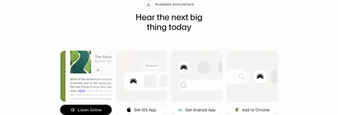
Use fully rounded controls; the main listening action is black with white Inter text, while secondary actions are light with a delicate outline.
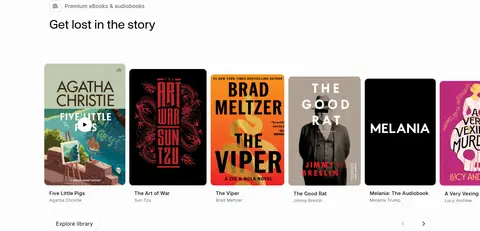
Book-cover carousel
Present cover artwork in horizontal rows or overlapping stacks, with compact title and author metadata beneath where appropriate.
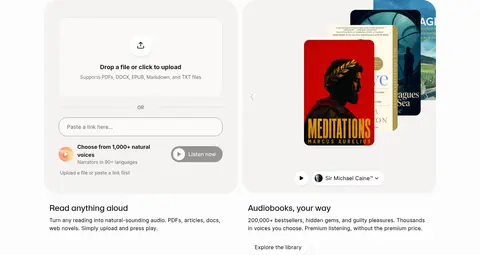
Upload-and-listen panel
Pair a warm off-white upload surface with file guidance, a rounded link input, and a compact listening action.
Feature showcase
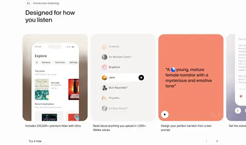
Combine app or voice-selection mockups with short headings and concise supporting copy; keep each surface softly rounded.
Review cards
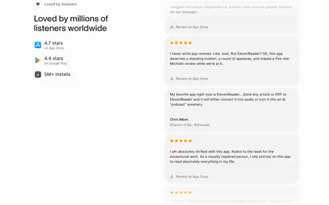
Set listener quotes in pale warm cards with small rating details and subdued attribution.
Pricing cards
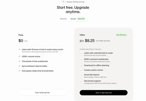
Use parallel plan panels, clear price hierarchy, concise benefit lists, and a prominent dark pill action.
FAQ rows
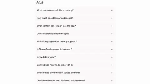
Keep questions in a clean vertical list with compact plus affordances and generous separation.
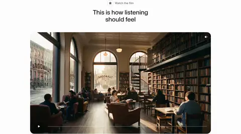
Imagery · Book covers are the dominant expressive imagery, shown as layered stacks in the hero and as horizontal collections in library and genre sections. Product areas use app-interface mockups and voice-selection panels; one wide video preview adds cinematic photography. Keep images crisp and recognizably content-led, with rounded presentation surfaces where shown. Their saturated colours are largely artwork, not a reason to colour the surrounding interface.
Keep the page canvas near-white and visually uninterrupted.
Use black for core text and the primary listening action.
Let book covers supply most of the vivid colour.
Reserve warm off-white fills for cards and product surfaces.
Use rounded pills for prominent actions and compact controls.
Leave generous vertical pauses between major showcases.
✕ 不该做
Do not introduce large saturated section backgrounds.
Do not treat illustration colours as primary brand colours.
Do not use heavy shadows to separate ordinary cards.
Do not crowd the hero with extra supporting elements.
Do not make secondary copy as dark or prominent as headings.
Do not replace the editorial whitespace with dense dashboard grids.
给 AI 的提示词
想快速出一个同风格的新页面,把这段话连同 DESIGN.md 一起发给 AI。
Build a new page in ElevenReader’s calm editorial style. Use Reader White (#fdfcfc) as the continuous canvas, Listening Ink (#000000) for headings, navigation, and the primary pill action, and Paper Warmth (#f5f3f1) for softly rounded cards. Keep muted copy in Soft Charcoal (#4b4a4a) or Caption Grey (#656565), with Quiet Divider (#e4e2e0) for restrained outlines. Set headlines in Waldenburg or a close Inter substitute; use Inter for body, controls, captions, and links. Center the main introduction, then alternate concise copy with book-cover collections, app previews, or a wide video surface. Let vivid artwork provide colour; keep interface accents sparse. Preserve the measured 780px content maximum, comfortable spacing, rounded controls, and flat, low-shadow treatment.