North star · Keep the page predominantly white and typographic, using vivid green bands and precise geometric artwork as deliberate, high-contrast interruptions.
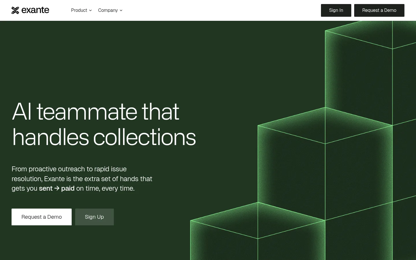
The visual system is built around a bright white canvas, near-black green-tinted text, and a sharp lime accent. White space keeps the long page readable, while green section bands interrupt the neutral flow with stats, process steps, and calls to action. The first viewport uses a deep forest-toned visual field with luminous geometric forms; that dark green imagery is a defining visual treatment, though its sampled shades come from the artwork rather than the measured brand palette. Headlines are large, lightly weighted, and tightly tracked, with small uppercase mono labels providing a technical counterpoint. Body copy stays compact and subdued. Layouts alternate between centered statements, multi-column feature cards, and wide panels, with consistent restrained corner rounding and thin separators. Product imagery is abstract and architectural rather than photographic, lending the collections workflow a precise, engineered character.
Light, oversized hero and campaign display headlines.
Exante
80px
300
1.1
-0.05em
一级标题
Primary page headline and strongest section statements.
Exante
72px
400
1
-0.04em
二级标题
Large section headlines, often centered.
Exante
58px
400
1.2
-0.05em
三级标题
Feature and narrative section headings.
Exante
52px
400
1.2
-0.04em
四级标题
Card titles and smaller content headings.
Exante
28px
400
1.2
-0.02em
正文
Introductory descriptions and feature-card copy.
The quick brown fox 敏捷的狐狸
19px
300
1.4
0
辅助文字
Small supporting notes and secondary card text.
The quick brown fox 敏捷的狐狸
17px
400
1.4
0
导航
Top navigation links and feature navigation labels.
The quick brown fox 敏捷的狐狸
19px
400
1.4
-0.01em
眉题
Short uppercase labels above section headings.
The quick brown fox 敏捷的狐狸
12px
400
1.2
0.06em
代码
Technical-looking micro-labels and compact metadata.
const style = 1;
12px
400
1.2
0.06em
间距与布局
基准单位 4px · 密度:紧凑
40px版块间距
10px元素间距
36px卡片内边距
1360px内容最大宽度
4px
10px
11px
12px
16px
20px
24px
28px
32px
34px
36px
40px
64px
The measured page uses a wide desktop canvas with a maximum content width of 1360px. Sections shift between full-width color bands and inset content areas, with centered headline-led blocks alongside left-aligned hero and feature content. Feature cards use multi-column rows; other stretches rely on generous blank space and simple alignment rather than dense grids. The measured spacing scale is compact, but section transitions feel deliberate. Keep the page rhythm varied: broad visual panels, quieter text sections, then focused conversion bands.
圆角与层次
按钮 · 2px
卡片 · 4px
图片 · 4px
链接 · 2px
没有测到阴影:页面是扁平的,层次靠底色和描边区分。
The interface is largely flat, without measured shadows. Cards rely on white or warm near-white fills and modest corner rounding, while thin gray hairlines separate rows and FAQ items. Stronger depth comes from contrast between green panels, white cards, and dark media artwork rather than layered drop shadows.
组件
下面的预览按实测的按钮、输入框、徽标、卡片样式重建(字体用替代字体)。
Top navigation
White horizontal bar with the Exante mark, Product and Company links, and compact dark Sign In and Request a Demo buttons.
Hero
Dark geometric visual field with a large, lightly weighted headline, concise supporting copy, and contrasting primary and secondary actions.
Green metric band
Bright lime panel with a small uppercase mono label and four white statistic cards arranged in a row.
Feature cards
Three-column collection-agent cards with green visual areas, concise headings, short explanatory copy, and dark Get Started buttons.
Workflow panel
Green process band containing four white step cards and a full-width dark Request a Demo action.
FAQ list
Centered section title above a narrow stack of question rows separated by fine gray rules.
Footer
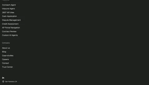
Near-black full-width footer with a light logo and text, certification badge, and vertically grouped feature and company links.
Imagery · The page uses abstract geometric artwork rather than conventional product photography. The hero contrasts a dark green field with luminous wireframe-like stacked forms; other vivid green panels carry crisp dark geometric line art. Feature and workflow cards reserve substantial space for visual blocks. Keep imagery architectural, clean-edged, and integrated into section backgrounds, with dark overlays only where needed for contrast.
Reserve lime green for prominent bands and focused highlights.
Use dark ink for headings, body copy, and primary dark buttons.
Set section eyebrows in small uppercase monospace.
Pair large, tightly tracked headlines with compact readable body text.
Use geometric artwork to echo the hero’s architectural forms.
✕ 不该做
Do not make every section dark or green.
Do not add shadows where flat contrast is sufficient.
Do not use colorful gradients as a substitute for the measured palette.
Do not crowd the layout with dense, persistent UI.
Do not use decorative imagery that competes with headline hierarchy.
Do not treat sampled artwork greens as additional brand colors.
给 AI 的提示词
想快速出一个同风格的新页面,把这段话连同 DESIGN.md 一起发给 AI。
Build a new Exante page with a bright, mostly white canvas and a restrained enterprise-finance feel. Use Gallery White (#ffffff) for the page and cards, Forest Ink (#1e211e) for typography and dark CTAs, Soft Graphite (#4b4d4b) for muted copy, Quiet Line (#d2d3d2) for separators, and Signal Lime (#90fc95) for focused feature or process bands. Keep Media Shadow (#191919) within illustration shading rather than expanding the interface palette. Use oversized, tightly tracked sans headlines, readable light body copy, and tiny uppercase mono eyebrows. Alternate wide vivid panels with calm white sections and compact card grids. Favor flat surfaces, modest rounding, subtle rules, and crisp geometric artwork; avoid unnecessary shadows, gradients, or visual clutter.