浅色主题AIAI web data API homepage极简浅色编辑式排版开发者导向橙色点缀原网页 firecrawl.dev ↗ · 2026-10-12 采集 · 1440×900 桌面端
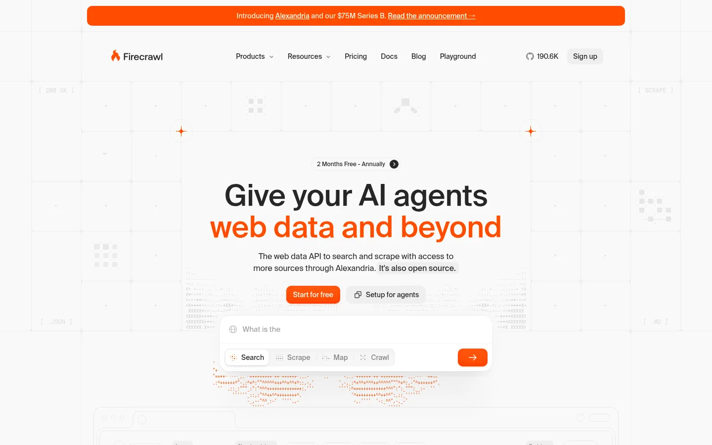
Firecrawl 以近白色画布和克制的排版为主,用鲜明的橙色按钮与标题重点营造视觉焦点。页面通过宽松的长篇叙事、代码片段和产品界面演示,让面向开发者的 API 更易理解。
North star · Keep the page calm and near-white, using orange sparingly to mark actions, key phrases, and product moments.
The page builds its identity from a near-white #f9f9f9 canvas, dark charcoal text, hairline borders, and a small but unmistakable orange signal. Orange highlights key headline phrases, text links, buttons, and selected decorative marks; it is not used as a general section background except for the Alexandria feature panel. The hero centers a large Suisse headline, with the second line picked out in orange, then layers a product prompt interface over a pale technical grid. Across the long page, centered section titles give way to airy two-column feature explanations, code samples, comparison visuals, and product mockups. Roboto Mono makes technical content feel native, while Suisse keeps the surrounding narrative clean and human. Generous vertical pauses separate content groups; fine rules and pale UI surfaces provide structure without heavy cards. Most illustrations are intentionally low-contrast so the information and orange accents remain dominant.
Code samples, technical labels, and compact data-like interface text.
Aa 设计
suisse
网络字体 · 字重 400 / 450 / 500 · 占比 17%
免费替代:Inter
Headings, body copy, navigation, links, buttons, and the main interface narrative.
Aa 设计
GeistMono
网络字体 · 字重 400 / 500 · 占比 4%
免费替代:Geist Mono
Secondary monospace UI and technical details where present.
角色
示例
字号
字重
行高
字距
特大标题
Large hero or major section display headlines.
Firecrawl
60px
500
1.07
-0.005em
一级标题
Primary hero headline and top-level page statement.
Firecrawl
52px
500
1.08
-0.01em
二级标题
Centered feature and section headlines.
Firecrawl
40px
500
1.1
-0.01em
三级标题
Feature names and supporting subsection headings.
The quick brown fox 敏捷的狐狸
20px
400
1.4
-0.005em
正文
Descriptions, explanatory copy, and general content.
The quick brown fox 敏捷的狐狸
13px
400
1.54
0
辅助文字
Small metadata, helper text, and supporting labels.
The quick brown fox 敏捷的狐狸
12px
450
1.67
0
按钮
Primary and secondary action labels.
The quick brown fox 敏捷的狐狸
14px
450
1.43
0
导航
Header navigation and menu items.
The quick brown fox 敏捷的狐狸
14px
450
1.43
0
链接
Inline documentation links and supporting actions.
The quick brown fox 敏捷的狐狸
16px
450
1.5
0
代码
Code snippets and compact technical readouts.
const style = 1;
8.5px
400
1.12
0
间距与布局
基准单位 4px · 密度:适中
90px版块间距
8px元素间距
—卡片内边距
1112px内容最大宽度
1px
2px
3px
4px
6px
8px
10px
12px
15px
16px
20px
24px
28px
32px
40px
48px
The page uses a centered content frame with a measured maximum width of 1112px and a comfortable, low-density rhythm. The hero is centered and layered over a broad, pale technical illustration; later sections alternate centered introductions with two-column feature layouts, code examples, and product visuals. Section backgrounds stay consistently near-white, so changes in content structure and fine rules—not color bands—signal transitions. Large vertical gaps separate the major story beats, while related details sit closer together. Navigation and announcement content are aligned within the same overall frame.
圆角与层次
按钮 · 9999px
卡片 · 16px
图片 · 50%
徽标 · 4px
导航 · 8px
链接 · 9999px
hairline · other
xl · card, other
inset · button
xl · other, card
Most structure is flat, separated by #ededed hairlines and pale surface changes. White interface mockups sit slightly above the canvas with restrained, broad shadows; buttons use a more distinct inset orange treatment. Keep cards visually light, with the measured rounded card treatment used selectively rather than enclosing every section.
组件
下面的预览按实测的按钮、输入框、徽标、卡片样式重建(字体用替代字体)。
Announcement banner
A long orange pill-shaped notice sits above the navigation, with small centered light text and an inline announcement link.
Primary CTA
Orange button with white Suisse text, a rounded pill-like silhouette, and subtle inset orange shadow treatment.
Navigation
A centered, restrained header with dark Suisse labels, small dropdown indicators, and a light neutral sign-up control.
Hero search prompt
White rounded prompt interface with a text-entry area, mode tabs, and a prominent orange arrow action.
Feature/code panel
Light, hairline-separated content with explanatory copy paired with compact monospace snippets or rendered API output.
Inline link
Orange Suisse link text integrated into copy or used as a short follow-up action.
Product showcase panel
A vivid orange Alexandria feature area with centered white messaging and compact actions, distinct from the otherwise pale page.
Imagery · There is no dominant photography. The page relies on SVG-led technical illustrations, API and browser mockups, code panes, logo marks, and small data visualizations. Mockups sit on white or near-white surfaces, with low-contrast gray details and occasional orange highlights. Hero imagery stretches broadly behind the centered message; later visuals are arranged beside copy or in compact comparison layouts. The Alexandria panel is the clearest full-bleed illustration moment, using vivid orange as a contained feature backdrop.
Reserve #ff4d00 for actions, key words, and small highlights.
Set large headings in Suisse or a close sans-serif substitute.
Use monospace only for code and technical labels.
Build structure with whitespace and fine #ededed rules.
Pair feature copy with quiet product or code demonstrations.
✕ 不该做
Do not introduce dark section bands.
Do not use orange as a general page background.
Do not turn every feature into a heavy card.
Do not add photography that competes with product UI.
Do not use all-caps for large display headings.
Do not make muted interface details high contrast.
给 AI 的提示词
想快速出一个同风格的新页面,把这段话连同 DESIGN.md 一起发给 AI。
Build a new Firecrawl-style page with a calm, near-white #f9f9f9 canvas and a centered content frame. Use Charcoal Ink #262626 for readable headings and navigation, with Suisse-like sans-serif typography and large, tightly tracked headline lines. Use Fire Signal #ff4d00 sparingly for primary actions, inline links, and selected headline phrases; buttons should be rounded and clearly actionable. Place technical examples in Roboto Mono-like text. Organize content into spacious, centered section introductions followed by paired copy and product/code demonstrations. Prefer fine Faint Rule #ededed dividers over boxed cards, and use white raised surfaces only for interface mockups. Keep decorative technical graphics pale and low-contrast. Maintain generous pauses between sections, with orange full-panel treatment reserved for a single standout product feature.