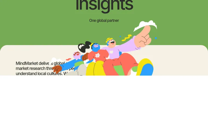
Handsome Frank 首页以深靛蓝开场,随后展开插画师作品与商业项目展示。醒目的大标题、色彩分区和以作品为主角的版式,共同呈现机构多元的创作风格。
North star · Give expressive illustration the spotlight, using confident color-blocked sections and oversized editorial type to guide the scroll.
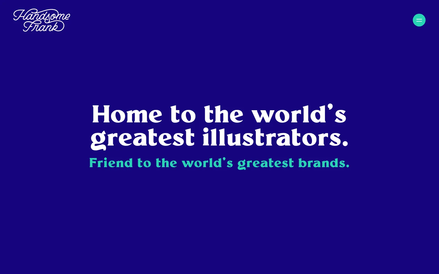
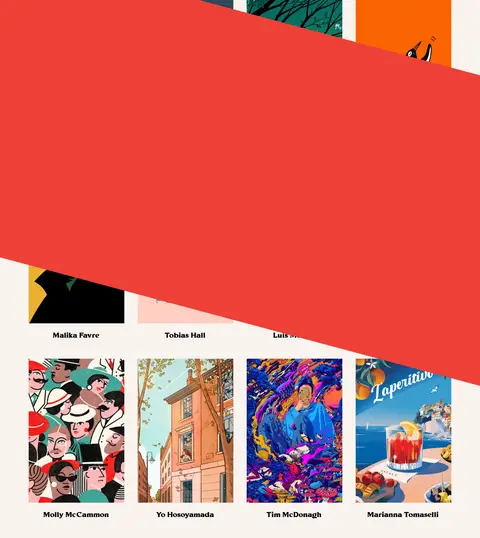
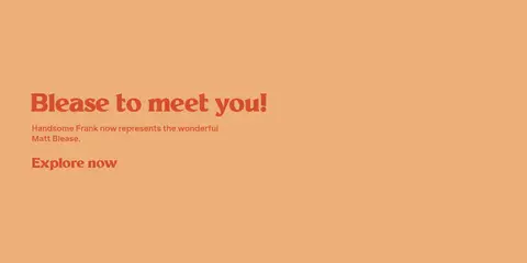
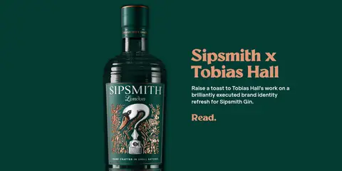
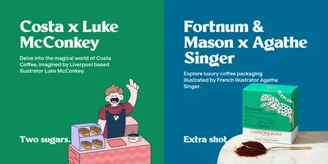
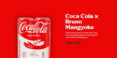
The page opens with a nearly full-screen deep indigo hero, a small white script wordmark, and centered oversized white display text with a vivid turquoise supporting line. A warm cream artist area follows, using a dense, image-led roster and a bold diagonal red-orange interruption to bring movement to the grid. Below, project features alternate between split layouts and compact paired panels, each using a strong, distinct section color—warm orange, deep green, blues, red, mint, and lilac—while the artwork and project copy remain legible. Large rounded, expressive serif display lettering contrasts with small, clean sans-serif descriptions and captions. Generous vertical section bands give each project room, while image grids and article covers tighten the rhythm near the bottom. The result is editorial and playful without relying on shadows: color, typography, illustration, and changing compositions provide the hierarchy.
Supporting sans-serif labels and compact interface copy.
Aa 设计
Millik Regular
网络字体 · 字重 700 · 占比 42%
免费替代:DM Serif Display
Expressive display headlines, project titles, and prominent links.
Aa 设计
Klarheit Grotesk Bold
网络字体 · 字重 700 · 占比 5%
免费替代:Inter
Navigation and emphasis within short sans-serif interface labels.
角色
示例
字号
字重
行高
字距
特大标题
Hero statement and oversized campaign or section headlines.
Handsome Frank
80px
700
0.95
0.02em
一级标题
Primary page or feature headline, with tight display leading.
Handsome Frank
70px
700
0.98
-0.023em
二级标题
Large project and editorial section titles.
Handsome Frank
54px
700
0.96
0
三级标题
Secondary campaign and feature headlines.
Handsome Frank
42px
700
0.95
0.038em
四级标题
Smaller project titles and supporting feature headings.
Handsome Frank
38px
700
0.98
-0.042em
正文
Short supporting statements and prominent description copy.
The quick brown fox 敏捷的狐狸
20px
700
1
0
辅助文字
Artist names, fine print, and compact image captions.
The quick brown fox 敏捷的狐狸
12px
700
1.36
0
导航
Menu labels and prominent navigation text.
The quick brown fox 敏捷的狐狸
24px
700
1.36
0
链接
Large editorial links and calls to explore featured work.
Handsome Frank
70px
700
0.98
-0.023em
间距与布局
基准单位 4px · 密度:宽松
80px版块间距
40px元素间距
—卡片内边距
1267px内容最大宽度
2px
10px
15px
16px
18px
20px
24px
32px
36px
38px
40px
60px
80px
86px
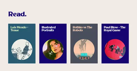
The page uses broad, vertically stacked color bands and a spacious overall rhythm. The measured maximum content width is 1267px; the hero centers its headline, while project bands alternate between text-and-artwork splits and paired panels. The artist section is a dense image grid, with a diagonal red-orange overlay disrupting its regular pattern. Later, a four-column Read grid and six-column social strip create tighter editorial endings. Section spacing is generous, with measured 80px section and 40px element gaps.
圆角与层次
按钮 · 50%
输入框 · 9999px
卡片 · 50%
导航 · 50%
没有测到阴影:页面是扁平的,层次靠底色和描边区分。
The page is predominantly flat: saturated section backgrounds and image placement establish depth instead of shadows. Hairline borders are a minor measured detail, not a framing system. The artist area adds visual layering through a large diagonal coral banner crossing the artwork grid; project images themselves provide the other depth and texture.
组件
下面的预览按实测的按钮、输入框、徽标、卡片样式重建(字体用替代字体)。
Hero
Deep-indigo opening field with a compact white script logo, small circular turquoise menu control, centered Millik headline, and turquoise supporting line.
Artist roster
Warm cream gallery of illustrator images and captions, interrupted by a large diagonal coral band and followed by an all-illustrators link.
Project feature
Full-width color-blocked campaign section pairing illustration or product imagery with a Millik project title, concise description, and short link.
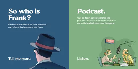
Paired feature panels
Adjacent project cards with distinct backgrounds, separate artwork and text, and strong white headings.
Newsletter form
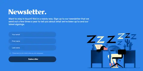
Bright blue signup section with white headline, short copy, stacked rounded fields, and a dark subscribe button.
Read grid
Blush-cream editorial area with a large dark heading and four colorful illustrated cover cards in a row.
Browse strip
Full-width deep-indigo footer link with centered white text and a small orange circular marker.
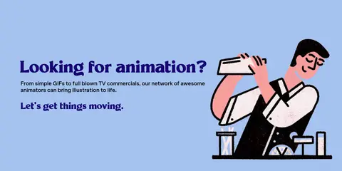
Imagery · Illustration is the core visual material, shown as artist portfolios, commissioned campaign art, editorial covers, and playful character scenes. Project images sit beside large copy or fill paired color panels; the artist grid presents many distinct styles at a glance. Product photography appears within illustrated brand campaigns, and video content supports feature sections. Use artwork with its original colors and avoid generic stock imagery or uniform image treatments.
Use saturated, distinct color bands to separate stories.
Set display headlines in expressive, oversized serif type.
Keep supporting copy compact and readable.
Vary split layouts with paired panels and image grids.
Use turquoise as a focused accent against indigo.
✕ 不该做
Do not flatten the whole page into one background color.
Do not replace the artist work with generic stock photography.
Do not add heavy shadows or card chrome.
Do not make every section use the same layout.
Do not use the display face for dense explanatory paragraphs.
Do not treat incidental illustration colors as global brand colors.
给 AI 的提示词
想快速出一个同风格的新页面,把这段话连同 DESIGN.md 一起发给 AI。
Build a new editorial page in the Handsome Frank style. Start with a confident Hero Indigo (#15047d) field, white Millik-like serif display type, and a focused Electric Turquoise (#24e3dc) accent. Use Warm Gallery (#f8f3ef) for quieter image-led content and assign each featured story its own strong color band, such as Apricot Feature (#edaf78), Bottle Green (#043b33), or Powder Blue (#a5c3ef). Let original illustrations dominate the compositions; pair them with concise descriptions in a clean sans-serif. Alternate split features, paired panels, and compact image grids rather than repeating one template. Keep the page flat and spacious, with hierarchy created by color, typography, and artwork instead of shadows. Finish with a clear editorial link or browse strip.