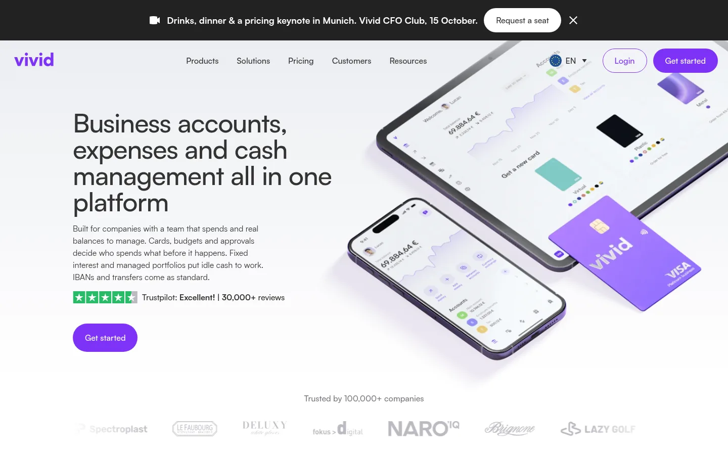
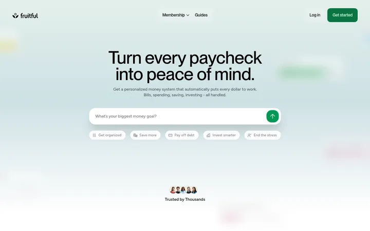
页面以明亮白底搭配鲜明紫色行动按钮和柔和色调的产品卡片,呈现清晰的金融科技视觉。Satoshi 大标题、宽松的区块节奏与精致的金融产品图像,让复杂的企业金融功能更易理解。
North star · Keep the page predominantly white and let precise purple accents, soft product panels, and real product imagery do the visual work.
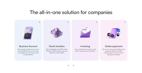
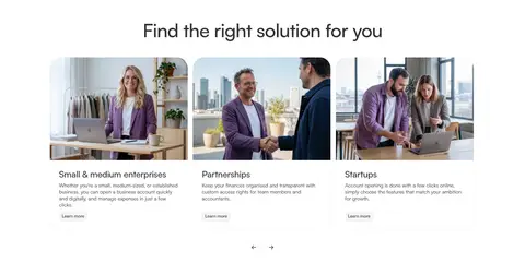
Vivid’s visual strategy uses white as the dominant canvas, keeping a long, information-rich business-finance page open and legible. Ink-like charcoal headings and body text provide strong contrast, while saturated purple is reserved for primary calls to action, selected links, and small status accents. Cool pale blue and near-white gray panels separate feature cards without creating heavy visual bands; lavender and blush gradients are used selectively for promotional moments and signup areas. Satoshi carries the page throughout: headings are medium-weight, compactly tracked, and prominent, while smaller body copy stays neutral and readable. The layout alternates centered feature sections with broad card grids and split hero content. Product screenshots, banking devices, people, and customer-story video thumbnails make the offer tangible, while soft corners, fine borders, and generous whitespace keep the overall presentation calm rather than corporate-heavy.
配色 点色块复制色值。用途说明来自对页面的实测位置(背景、文字、描边、按钮)与截图判读。
品牌色
Vivid Violet
#7d33f6
Primary CTA fill, selected links, small badges, and interactive emphasis.
强调色
Lilac Edge
#e5d6fd
Subtle card outline accent; secondary to the primary violet.
Soft Amethyst
#aa93ea
Secondary purple gradient color and restrained decorative accent.
表层色
Gallery White
#ffffff
Dominant page canvas, light cards, and white text on purple controls.
Cloud Blue
#ecf1fa
Cool-tinted cards, subtle section surfaces, and fine dividers.
Mist Gray
#f5f5f7
Pale feature-card and link-panel backgrounds.
Lavender Haze
#f4edff
Soft purple-tinted card and link surfaces.
Blush Tint
#f7ecee
Soft blush hue within occasional promotional gradients.
Orchid Mist
#f2e4f0
Mid-tone in the brand’s soft lilac promotional gradient.
中性色
Soft Graphite
#333333
Primary headings and body copy, navigation text, and dark card content.
Quiet Slate
#79797f
Muted supporting copy, footer text, and secondary links.
Deep Charcoal
#2b2b2b
Minor dark text variation; use sparingly alongside the main graphite.
功能色
Illustration Black
#000000
Gradient and product-image detail only; not a defining interface color.
Pale Leaf
#f1faec
Tiny link or status surface, not part of the dominant page palette.
Night Detail
#1f1f1f
Occasional dark media or gradient detail, not a general page surface.
Warm Cream
#faf5ec
Minor warm link surface, appearing only as a small supporting tint.
文字 背景 对比度 WCAG #333333 Soft Graphite#ffffff Gallery White12.63:1 AAA #333333 Soft Graphite#ecf1fa Cloud Blue11.15:1 AAA #333333 Soft Graphite#f5f5f7 Mist Gray11.6:1 AAA #79797f Quiet Slate#ffffff Gallery White4.33:1 AA-large #79797f Quiet Slate#ecf1fa Cloud Blue3.82:1 AA-large #79797f Quiet Slate#f5f5f7 Mist Gray3.97:1 AA-large
字体 字号阶梯:Augmented Fourth(比例约 1.388,正文 14px)。示例用免费替代字体渲染,数值为实测。
Aa 设计
Satoshi 网络字体 · 字重 400 / 500 / 700 · 占比 97%
免费替代:Inter
All primary page typography, from navigation and headings to body copy and buttons.
Aa 设计
ui-monospace 系统字体 · 字重 400 / 700 · 占比 3%
免费替代:Roboto Mono
Tiny code-like or technical labels only.
角色 示例 字号 字重 行高 字距 一级标题 Hero headline; large, compact, left-aligned display copy.
Vivid Europe
52px 500 1 -0.02em 二级标题 Main section headings, generally centered above feature groups.
Vivid Europe
36px 500 1 -0.005em 三级标题 Feature, product, and trust-panel titles.
The quick brown fox 敏捷的狐狸
24px 500 1.17 -0.01em 四级标题 Subsection and card-level headings.
The quick brown fox 敏捷的狐狸
20px 500 1.2 -0.01em 正文 Supporting paragraphs and explanatory feature descriptions.
The quick brown fox 敏捷的狐狸
14px 400 1.29 0 辅助文字 Fine print, helper text, and compact supporting labels.
The quick brown fox 敏捷的狐狸
12px 400 1.17 0 按钮 Primary and secondary action labels.
The quick brown fox 敏捷的狐狸
16px 500 1.5 0 导航 Header navigation and top-level menu links.
The quick brown fox 敏捷的狐狸
16px 500 1.5 0 链接 Text links and smaller card actions.
The quick brown fox 敏捷的狐狸
14px 500 1.29 0 眉题 Small uppercase category labels with expanded tracking.
The quick brown fox 敏捷的狐狸
12px 500 1.33 0.06em 代码 Occasional technical or code-like detail.
const style = 1;
8px 400 1.88 0
间距与布局 基准单位 8px · 密度:适中
56px 版块间距
8px 元素间距
6px 卡片内边距
1152px 内容最大宽度
1px
2px
4px
6px
8px
10px
12px
13px
15px
16px
23px
24px
30px
32px
48px
56px
Use a centered content frame capped at the measured 1152px page max width, with broad white section backgrounds and comfortable breathing room. The page alternates a two-column, left-copy/right-product hero with centered headings above modular card grids. Three- and multi-column arrangements support feature, trust, and pricing content; a few full-width promotional panels interrupt the rhythm. Measured section rhythm is 56px, with an 8px base unit. Keep cards and text readable rather than compressing the long page into dense blocks.
圆角与层次 没有测到阴影:页面是扁平的,层次靠底色和描边区分。
The interface is mostly flat: measured shadow data is absent, so avoid adding conspicuous drop shadows. Separate cards with pale fills, generous whitespace, and occasional thin outlines. Rounded panels and overlapping product imagery provide the sense of depth; gradients belong to selected promotional sections rather than every card.
组件 下面的预览按实测的按钮、输入框、徽标、卡片样式重建(字体用替代字体)。
Primary CTA Bright Vivid Violet #7d33f6 pill button with white 16px, weight-500 Satoshi text; the measured primary button uses a fully rounded radius.
Top navigation Minimal header with the vivid wordmark, compact menu links, locale and login controls, and a prominent purple Get started action.
Feature cards Modular product cards use pale gray or blue-tinted surfaces, rounded corners, concise text, and product photography or interface imagery.
Product feature grid Centered section title above card groups; pair short headings and copy with visual product details, keeping panels distinct but light.
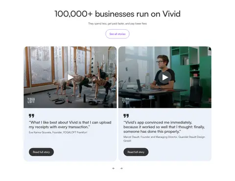
Trust and testimonial cards Customer stories combine video imagery, short quotation text, and restrained supporting actions in soft-tinted rounded panels.
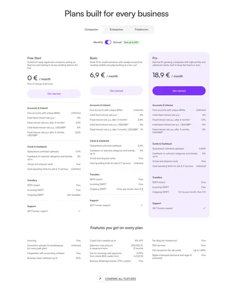
Pricing cards Three plan columns compare rates and features; emphasize the selected tier with a subtle lavender surface and purple action.
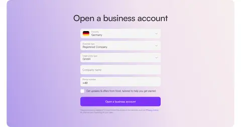
Signup panel Broad rounded promotional panel with a soft lilac-to-blush gradient, centered form fields, and a violet submission button.
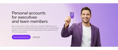
Imagery · Use polished product visuals—banking app screens, cards, phones, and interface mockups—alongside candid business photography and customer-story video stills. The hero’s device imagery is large, angled, and allowed to dominate its half of the composition. Feature cards crop imagery cleanly within rounded containers; illustrations and product renderings can carry lavender and purple, while ordinary page chrome stays restrained.
页面版块 共 12 个版块,按页面从上到下排列,每个都标了类型、布局和交互套路。
该做与不该做 ✓ 该做 Keep white as the dominant canvas. Reserve vivid purple for primary actions and focused accents. Use Satoshi-style geometric sans typography throughout. Give section headings room to breathe. Group complex features into pale, rounded panels. Use genuine product and business imagery to explain the offer. ✕ 不该做 Do not turn the page into a dark interface. Do not use purple as a full-page background. Do not add unmeasured shadows or heavy outlines. Do not crowd feature cards with long blocks of copy. Do not treat incidental illustration colors as brand colors. Do not replace the calm whitespace with dense decorative elements. 给 AI 的提示词 想快速出一个同风格的新页面,把这段话连同 DESIGN.md 一起发给 AI。
复制 Build a new fintech page in the Vivid Europe visual style. Use Gallery White (#ffffff) as the dominant canvas, Soft Graphite (#333333) for headings and body copy, and Vivid Violet (#7d33f6) for primary actions and focused accents. Use Cloud Blue (#ecf1fa), Mist Gray (#f5f5f7), and Lavender Haze (#f4edff) as restrained card surfaces; reserve Soft Amethyst (#aa93ea) and Orchid Mist (#f2e4f0) for occasional gradients. Set a geometric sans such as Satoshi or Inter, with medium-weight compact headings and readable regular body text. Organize content in a centered, measured-width frame with generous whitespace, centered section titles, modular rounded cards, and occasional split layouts. Use polished product imagery and real business photography. Keep elevation subtle and avoid invented shadows.
DESIGN.md Tailwind v4 CSS 变量 Design Tokens
---
title: "Vivid Europe design system"
variant: extended
source: https://vivid.money/en-eu/
captured_at: 2026-10-12
theme: light
industry: fintech
generator: Design DNA (https://four.wiralomi.com/style/vivid-money)
ai_generated: true
ai_label: "本文件由 AI 辅助生成:数值取自公开网页的实测样式,命名、用途说明与建议为模型解读。商标归原所有者。 / AI-assisted content"
---
# Vivid Europe · Design System
> Clear business finance in a calm, vivid interface
**Theme:** light · **Industry:** fintech · **Source:** https://vivid.money/en-eu/ · **Captured:** 2026-10-12 (1440×900 desktop)
_AI-assisted content: values are measured from the public page at capture time; names, roles and guidance are model-written interpretations. Trademarks belong to their owners._
A bright fintech homepage pairs a restrained white canvas with vivid purple calls to action and soft, tinted product panels. Large Satoshi headings, generous section breaks, and polished banking imagery make dense business-finance features approachable.
## North star
Keep the page predominantly white and let precise purple accents, soft product panels, and real product imagery do the visual work.
## Overview
Vivid’s visual strategy uses white as the dominant canvas, keeping a long, information-rich business-finance page open and legible. Ink-like charcoal headings and body text provide strong contrast, while saturated purple is reserved for primary calls to action, selected links, and small status accents. Cool pale blue and near-white gray panels separate feature cards without creating heavy visual bands; lavender and blush gradients are used selectively for promotional moments and signup areas. Satoshi carries the page throughout: headings are medium-weight, compactly tracked, and prominent, while smaller body copy stays neutral and readable. The layout alternates centered feature sections with broad card grids and split hero content. Product screenshots, banking devices, people, and customer-story video thumbnails make the offer tangible, while soft corners, fine borders, and generous whitespace keep the overall presentation calm rather than corporate-heavy.
## Colors
| Name | Hex | Token | Group | Role |
|---|---|---|---|---|
| Soft Graphite | ` | `--color-soft-graphite` | neutral | Primary headings and body copy, navigation text, and dark card content. |
| Vivid Violet | ` | `--color-vivid-violet` | brand | Primary CTA fill, selected links, small badges, and interactive emphasis. |
| Gallery White | ` | `--color-gallery-white` | surface | Dominant page canvas, light cards, and white text on purple controls. |
| Cloud Blue | ` | `--color-cloud-blue` | surface | Cool-tinted cards, subtle section surfaces, and fine dividers. |
| Mist Gray | ` | `--color-mist-gray` | surface | Pale feature-card and link-panel backgrounds. |
| Quiet Slate | ` | `--color-quiet-slate` | neutral | Muted supporting copy, footer text, and secondary links. |
| Lavender Haze | ` | `--color-lavender-haze` | surface | Soft purple-tinted card and link surfaces. |
| Illustration Black | ` | `--color-illustration-black` | semantic | Gradient and product-image detail only; not a defining interface color. |
| Lilac Edge | ` | `--color-lilac-edge` | accent | Subtle card outline accent; secondary to the primary violet. |
| Blush Tint | ` | `--color-blush-tint` | surface | Soft blush hue within occasional promotional gradients. |
| Deep Charcoal | ` | `--color-deep-charcoal` | neutral | Minor dark text variation; use sparingly alongside the main graphite. |
| Pale Leaf | ` | `--color-pale-leaf` | semantic | Tiny link or status surface, not part of the dominant page palette. |
| Night Detail | ` | `--color-night-detail` | semantic | Occasional dark media or gradient detail, not a general page surface. |
| Orchid Mist | ` | `--color-orchid-mist` | surface | Mid-tone in the brand’s soft lilac promotional gradient. |
| Soft Amethyst | ` | `--color-soft-amethyst` | accent | Secondary purple gradient color and restrained decorative accent. |
| Warm Cream | ` | `--color-warm-cream` | semantic | Minor warm link surface, appearing only as a small supporting tint. |
### Semantic aliases
`--color-canvas` → ` (Gallery White) · `--color-surface` → ` (Cloud Blue) · `--color-surface-2` → ` (Mist Gray) · `--color-surface-3` → ` (Soft Graphite) · `--color-surface-4` → ` (Lavender Haze) · `--color-text` → ` (Soft Graphite) · `--color-text-muted` → ` (Quiet Slate) · `--color-text-subtle` → ` (Gallery White) · `--color-border` → ` (Cloud Blue) · `--color-accent` → ` (Vivid Violet) · `--color-accent-2` → ` (Soft Amethyst) · `--color-on-accent` → ` (Gallery White)
### Contrast (WCAG 2.x)
| Text | Background | Ratio | Level |
|---|---|---|---|
| ` | ` | 12.63:1 | AAA |
| ` | ` | 11.15:1 | AAA |
| ` | ` | 11.6:1 | AAA |
| ` | ` | 4.33:1 | AA-large |
| ` | ` | 3.82:1 | AA-large |
| ` | ` | 3.97:1 | AA-large |
| ` | ` | 2.92:1 | fail |
| ` | ` | 1.13:1 | fail |
| ` | ` | 1.09:1 | fail |
| ` | ` | 12.63:1 | AAA |
### Gradients
- `linear-gradient(rgba(0, 0, 0, 0), rgb(0, 0, 0))`
- `linear-gradient(251deg, rgb(248, 240, 237) -9.1%, rgb(242, 228, 240) 36.43%, rgb(170, 147, 234) 105.93%)`
- `linear-gradient(rgb(236, 238, 242) 0px, rgb(255, 255, 255) 100%)`
- `linear-gradient(rgba(236, 238, 242, 0.7), rgba(236, 238, 242, 0) 20.323%)`
## Typography
| Family | Token | Source | Weights | Role | Free substitute |
|---|---|---|---|---|---|
| Satoshi | `--font-body` | webfont | 400, 500, 700 | All primary page typography, from navigation and headings to body copy and buttons. | Inter |
| ui-monospace | `--font-mono` | system | 400, 700 | Tiny code-like or technical labels only. | Roboto Mono |
- **Satoshi:** Use measured weights 400, 500, and 700; headings are medium-weight with subtly tight tracking, while eyebrow text is uppercase.
- **ui-monospace:** Rare usage; keep it secondary and compact rather than introducing a second prominent type voice.
### Type scale — Augmented Fourth (ratio ≈ 1.388, base 14px)
| Role | Size | Weight | Line height | Letter spacing | Case | Family | Used for |
|---|---|---|---|---|---|---|---|
| h1 | 52px | 500 | 1 | -0.02em | — | Satoshi | Hero headline; large, compact, left-aligned display copy. |
| h2 | 36px | 500 | 1 | -0.005em | — | Satoshi | Main section headings, generally centered above feature groups. |
| h3 | 24px | 500 | 1.17 | -0.01em | — | Satoshi | Feature, product, and trust-panel titles. |
| h4 | 20px | 500 | 1.2 | -0.01em | — | Satoshi | Subsection and card-level headings. |
| body | 14px | 400 | 1.29 | 0 | — | Satoshi | Supporting paragraphs and explanatory feature descriptions. |
| caption | 12px | 400 | 1.17 | 0 | — | Satoshi | Fine print, helper text, and compact supporting labels. |
| button | 16px | 500 | 1.5 | 0 | — | Satoshi | Primary and secondary action labels. |
| nav | 16px | 500 | 1.5 | 0 | — | Satoshi | Header navigation and top-level menu links. |
| link | 14px | 500 | 1.29 | 0 | — | Satoshi | Text links and smaller card actions. |
| eyebrow | 12px | 500 | 1.33 | 0.06em | uppercase | Satoshi | Small uppercase category labels with expanded tracking. |
| code | 8px | 400 | 1.88 | 0 | — | ui-monospace | Occasional technical or code-like detail. |
## Spacing & layout
- Base unit **8px**, density **comfortable**.
- Scale (most used values): 1, 2, 4, 6, 8, 10, 12, 13, 15, 16, 23, 24, 30, 32, 48, 56 px.
- Section rhythm 56px · element gap 8px · card padding 6px · max content width 1152px.
Use a centered content frame capped at the measured 1152px page max width, with broad white section backgrounds and comfortable breathing room. The page alternates a two-column, left-copy/right-product hero with centered headings above modular card grids. Three- and multi-column arrangements support feature, trust, and pricing content; a few full-width promotional panels interrupt the rhythm. Measured section rhythm is 56px, with an 8px base unit. Keep cards and text readable rather than compressing the long page into dense blocks.
## Shape & elevation
- Radius: button `9999px` · card `24px` · media `50%` · badge `8px` · link `24px` · xs `4px` · sm `6px` · md `8px` · lg `10px` · xl `24px` · 2xl `30px` · pill `9999px`
- No box shadows measured: the page is flat.
- Motion: standard transition `0.3s ease` on interactive elements.
The interface is mostly flat: measured shadow data is absent, so avoid adding conspicuous drop shadows. Separate cards with pale fills, generous whitespace, and occasional thin outlines. Rounded panels and overlapping product imagery provide the sense of depth; gradients belong to selected promotional sections rather than every card.
## Imagery
Use polished product visuals—banking app screens, cards, phones, and interface mockups—alongside candid business photography and customer-story video stills. The hero’s device imagery is large, angled, and allowed to dominate its half of the composition. Feature cards crop imagery cleanly within rounded containers; illustrations and product renderings can carry lavender and purple, while ordinary page chrome stays restrained.
## Components
### Primary CTA
Bright Vivid Violet ### Top navigation
Minimal header with the vivid wordmark, compact menu links, locale and login controls, and a prominent purple Get started action.
### Feature cards
Modular product cards use pale gray or blue-tinted surfaces, rounded corners, concise text, and product photography or interface imagery.
### Product feature grid
Centered section title above card groups; pair short headings and copy with visual product details, keeping panels distinct but light.
### Trust and testimonial cards
Customer stories combine video imagery, short quotation text, and restrained supporting actions in soft-tinted rounded panels.
### Pricing cards
Three plan columns compare rates and features; emphasize the selected tier with a subtle lavender surface and purple action.
### Signup panel
Broad rounded promotional panel with a soft lilac-to-blush gradient, centered form fields, and a violet submission button.
### Measured component styles
- **Primary button** (“Get started”): background ## Do
- Keep white as the dominant canvas.
- Reserve vivid purple for primary actions and focused accents.
- Use Satoshi-style geometric sans typography throughout.
- Give section headings room to breathe.
- Group complex features into pale, rounded panels.
- Use genuine product and business imagery to explain the offer.
## Don't
- Do not turn the page into a dark interface.
- Do not use purple as a full-page background.
- Do not add unmeasured shadows or heavy outlines.
- Do not crowd feature cards with long blocks of copy.
- Do not treat incidental illustration colors as brand colors.
- Do not replace the calm whitespace with dense decorative elements.
## Agent prompt
Build a new fintech page in the Vivid Europe visual style. Use Gallery White (## Page sections (top to bottom)
| # | Type | Layout | UX patterns | UI patterns |
|---|---|---|---|---|
| 1 | hero | Two-column hero: large left-aligned headline and copy beside oversized angled banking device imagery. | Primary Get started action, Trust rating and review count, Brand logo proof | White canvas, Purple pill CTA, Product mockup |
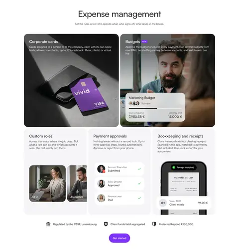
| 2 | feature-grid | Centered section heading above a three-column feature composition with large image cards and smaller feature panels. | Feature discovery, Get started action, Regulatory reassurance | Rounded image cards, Pale feature panels, Product interface overlays |
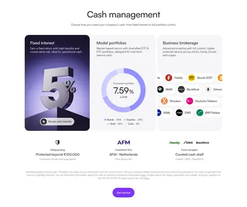
| 3 | product-showcase | Centered heading above three product cards, followed by partner and protection details. | Compare cash options, Scan investment choices, Get started action | Three-column cards, Product illustrations, Partner marks |
| 4 | feature-grid | Centered section title above a multi-column carousel-like row of compact product cards. | Browse product offerings, Previous and next controls | Pastel card surfaces, Small product illustrations, Carousel arrows |
| 5 | category-nav | Centered heading above three image-led audience cards with compact copy and card-level links. | Audience self-selection, Learn more links, Carousel navigation | Business photography, Three-column cards, Light card framing |
| 6 | feature-split | Full-width horizontal promotional band with copy on the left and a person holding a card on the right. | Open personal account CTA, Secondary learn-more link | Lilac gradient band, Person-and-card image, Purple pill button |
| 7 | testimonials | Centered proof heading above two wide story cards with media thumbnails and quotation panels. | Read customer stories, Video playback, Browse story carousel | Video thumbnails, Soft blue quote panels, Rounded cards |
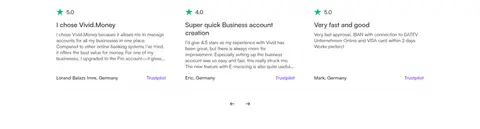
| 8 | reviews | Centered review heading followed by rating statistics and a horizontal row of review excerpts. | Compare rating sources, Browse review cards | Large rating numerals, Compact review text, Carousel arrows |
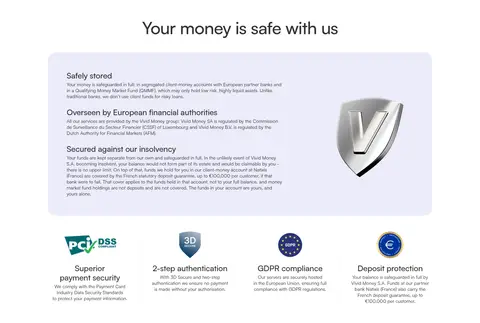
| 9 | other | Centered heading above a broad rounded information panel, with security marks arranged beneath. | Review safeguarding information, Scan compliance assurances | Pale lavender panel, Shield visual, Certification icons |
| 10 | pricing | Centered pricing heading, account-type and billing selectors, three plan columns, and a feature comparison below. | Switch business type, Toggle billing period, Compare plans | Three pricing cards, Highlighted lavender plan, Feature rows and checkmarks |
| 11 | contact | Broad rounded gradient panel with a centered heading and vertically stacked account-registration fields. | Select country and entity, Enter company and phone details, Submit application | Lilac-to-blush background, White form fields, Purple submit button |
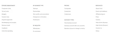
| 12 | footer | Four-column footer link directory with compact category labels and stacked text links. | Navigate product categories, Find company and resource links | Multi-column link lists, Small uppercase labels, Muted text |
## Source CSS custom properties (selected)
```css
--swiper-theme-color: