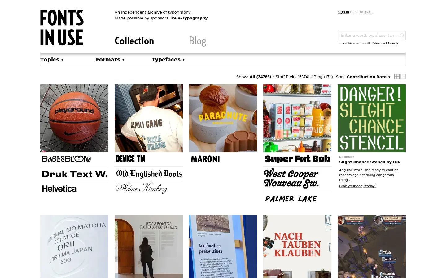
Fonts In Use 以紧凑的图片网格展示真实项目中的字体应用,构成可检索的设计档案。界面保持黑白克制,让每个条目里的字体与作品图像呈现色彩和个性。
North star · Keep the interface monochrome and orderly, and let the archived typographic work supply the visual variety.
The page uses a white canvas and black text as a quiet frame for a varied archive of typographic work. Pale gray marks card surfaces and fine separators, while the measured palette avoids a distinct brand accent; colour mainly enters through the project images. BentonSansRE handles small navigation, controls, captions, and metadata with a compact, utilitarian voice. RelayCond supplies the more expressive display and editorial text. A wide, centered desktop composition places the wordmark and introductory copy above a heavy horizontal rule, followed by a slim category bar and a dense multi-column stream of image cards. Each card pairs a project image with typeface names and supporting labels. Generous gaps between rows and ample outer margins keep the busy collection legible without making the overall page feel sparse. Borders and shadows are restrained, so the archive reads as a flat catalog rather than a stack of elevated panels.
Utility sans-serif for navigation, captions, links, buttons, and archive metadata.
Aa 设计
RelayCond
网络字体 · 字重 700 / 400 · 占比 2%
免费替代:Bodoni Moda
Expressive serif display and editorial text, including prominent page and content headings.
角色
示例
字号
字重
行高
字距
一级标题
Prominent page heading and display-level editorial title.
Fonts In Use
36px
700
1
0
正文
Editorial copy and larger text accompanying archive entries.
The quick brown fox 敏捷的狐狸
18px
700
1.6
0
辅助文字
Small image captions and compact supporting metadata.
The quick brown fox 敏捷的狐狸
10px
400
1.1
0
按钮
Search and other compact interface controls.
The quick brown fox 敏捷的狐狸
12px
400
1.6
0
导航
Header links and category navigation.
The quick brown fox 敏捷的狐狸
10px
400
1.1
0
链接
Small archive filters and linked metadata.
The quick brown fox 敏捷的狐狸
10px
400
1.6
0
间距与布局
基准单位 1px · 密度:宽松
220px版块间距
3px元素间距
55px卡片内边距
—内容最大宽度
1px
3px
5px
10px
30px
Use a centered, wide desktop composition with broad outer margins and a header organized into wordmark, introductory copy, primary navigation, and search. Separate the header from a thin category strip with a strong black rule. The archive is a dense five-column image grid on desktop, with text labels directly below each image. Allow images and entry text to vary naturally while keeping columns aligned. Preserve spacious gaps between rows and avoid adding a measured maximum width that the source data does not specify.
圆角与层次
按钮 · 2px
输入框 · 3px
inset · input
inset · other
Keep the interface predominantly flat. Use black rules and pale gray hairlines to separate navigation and content rather than relying on cards with shadows. Archive items sit directly on the white canvas; the measured input alone has a subtle inset shadow. Avoid floating panels and pronounced layering.
组件
下面的预览按实测的按钮、输入框、徽标、卡片样式重建(字体用替代字体)。
Brand header
Large black stacked wordmark sits beside a short archive description; primary links and a compact search field share the header area.
Primary navigation
Collection and Blog links are prominent beneath the introduction, with a strong black horizontal divider below.
Category strip
A pale gray, finely ruled row exposes Topics, Formats, and Typefaces as compact dropdown-style links.
Archive filters
Small result and sort controls sit above the cards, aligned toward the right side of the content area.
Archive card
A project image leads each flat grid item; bold or expressive typeface names and smaller supporting labels follow beneath.
Sponsor feature
A colorful typographic artwork and brief sponsor copy appear as a featured item within the first grid row.
Footer
Compact text-link columns and pagination close the archive, separated from the content by a strong black rule.
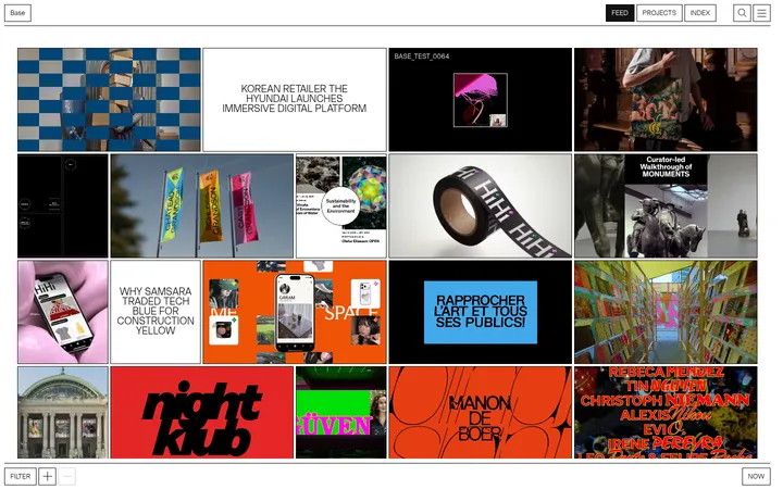
Imagery · Use documentary project images: printed matter, packaging, signage, editorial layouts, and other examples of typography in context. Crop each image into a consistent grid slot while preserving its original colours and recognizable composition. The artwork, rather than interface decoration, supplies most of the page’s visual variety; avoid filters, overlays, or synthetic illustrations.
该做与不该做
✓ 该做
Use white as the uninterrupted main canvas.
Use black for the wordmark, navigation, and primary text.
Let archive artwork provide nearly all interface colour.
Place labels directly below their corresponding images.
Keep metadata compact and visually secondary.
Use rules and gray hairlines for separation.
✕ 不该做
Do not introduce an unmeasured brand accent colour.
Do not put heavy shadows behind archive cards.
Do not make every card image the same subject or palette.
Do not replace the image-led archive with decorative illustrations.
Do not crowd category navigation into the card grid.
Do not over-style utility text or controls.
给 AI 的提示词
想快速出一个同风格的新页面,把这段话连同 DESIGN.md 一起发给 AI。
Build a new page in the Fonts In Use visual style: a searchable, editorial archive where real project images and lettering are the main attraction. Use Gallery White (#ffffff) as the canvas, Archive Ink (#000000) for the wordmark, headings, navigation, labels, and rules, and Catalog Mist (#f0f0f0) only for subtle surfaces and separators. Pair a compact utility sans like Libre Franklin with a distinctive serif display face like Bodoni Moda. Create a broad centered header, a clear category-navigation strip, and a dense multi-column image grid with each title directly below its image. Keep controls small, dividers crisp, and spacing generous between rows. Preserve the source artwork’s natural colour and avoid decorative gradients, prominent shadows, or invented accent colours.