North star · Keep the product interface prominent and the page calm: use generous white space, dark rounded typography, and orange only for meaningful emphasis.
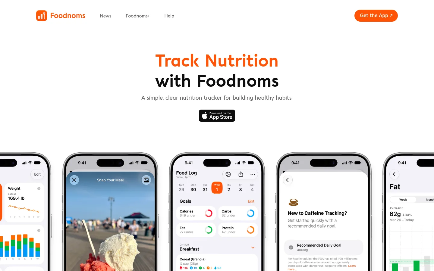
The page uses a white canvas as its dominant visual field, with soft light-gray panels separating feature cards and review tiles. Near-black headings provide strong contrast, while the measured orange accent marks the brand, key calls to action, and small interface highlights. Aquawax Pro gives the page a distinctive rounded, friendly voice: bold display and heading styles anchor the hero and section titles, while the medium weight carries smaller navigation and supporting text. The hero is centered and restrained, with a short two-line headline, compact explanatory copy, and an app-store badge above a wide row of phone screens. Lower sections alternate product-feature cards, trust statements, reviews, and a device lineup, keeping the app visible throughout. Generous whitespace separates these blocks, while rounded card corners and pill-like actions soften the otherwise crisp, product-focused presentation.
Display, page and section headings, and prominent bold copy.
Aa 设计
Aquawax Pro Medium
网络字体 · 字重 500 · 占比 29%
免费替代:Nunito Sans
Navigation, links, captions, and supporting copy.
角色
示例
字号
字重
行高
字距
特大标题
Large hero headline and high-impact page statements.
Foodnoms
56px
700
1.1
0
一级标题
Primary page heading where a display-scale title is not used.
Foodnoms
36px
700
1.2
0
二级标题
Section titles such as feature and review headings.
Foodnoms
28px
700
1.2
0
三级标题
Compact feature-card headings.
The quick brown fox 敏捷的狐狸
24px
700
normal
0
四级标题
Smaller subsection titles and supporting callouts.
The quick brown fox 敏捷的狐狸
22px
700
1.4
0
正文
Prominent explanatory copy and feature descriptions.
The quick brown fox 敏捷的狐狸
18px
700
1.4
0
辅助文字
Secondary explanatory text and review details.
The quick brown fox 敏捷的狐狸
16px
500
1.6
0
链接
Navigation, inline actions, and footer links.
The quick brown fox 敏捷的狐狸
15px
500
1
0
间距与布局
基准单位 8px · 密度:紧凑
32px版块间距
8px元素间距
32px卡片内边距
1376px内容最大宽度
8px
10px
12px
20px
24px
32px
40px
48px
The hero is centered, followed by a wide, edge-spanning row of phone mockups. Content then moves through a press logo band, a two-column feature-card grid, a three-part trust row, horizontally arranged testimonial cards, and a centered device-led CTA. The measured page max width is 1376px, with a compact density, 8px base spacing unit, and 32px section gap. Keep content aligned and orderly, but allow product imagery and review rows to extend broadly.
圆角与层次
按钮 · 9999px
卡片 · 25px
链接 · 9999px
没有测到阴影:页面是扁平的,层次靠底色和描边区分。
The measured system has no prominent shadows or border colors. Cards read as flat, pale-gray panels with 25px measured corner radii; buttons and links use pill-like rounding. Build hierarchy through whitespace, background contrast, and image overlap rather than strong outlines or layered shadows.
组件
下面的预览按实测的按钮、输入框、徽标、卡片样式重建(字体用替代字体)。
Primary app action
A compact orange pill-shaped action with white label and arrow in the header; use the measured accent #ff5407.
Hero
Centered two-line headline with orange emphasis on the first line, muted supporting sentence, and an App Store badge.
Phone showcase
A wide horizontal row of tall app-screen mockups, cropped at the viewport edges to make the product feel expansive.
Feature cards
Rounded light-gray panels pair short colored feature titles and copy with a phone screen; the measured card radius is 25px.
Trust and press bands
Compact press logos and privacy or control claims sit between product sections, with centered alignment and ample surrounding white space.
Review cards
Repeated rounded pale-gray cards use orange star ratings, short user quotes, and attribution; show them in horizontally flowing rows.
Footer
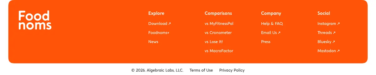
A broad orange panel groups the wordmark and link columns, followed by a small legal row on white.
Imagery · Use crisp product screenshots framed inside realistic smartphone mockups as the primary imagery. The hero presents several phones side by side; feature panels pair concise copy with individual device screens, and the closing CTA shows multiple Apple devices together. Keep screenshots legible and colorful, while the surrounding page remains restrained. Small icons and press marks support the content rather than defining the brand palette.
Reserve orange for brand emphasis and key actions.
Use rounded bold headings and medium-weight supporting text.
Show real app screens prominently in device frames.
Separate content with generous whitespace.
Use soft gray fills for cards and review panels.
✕ 不该做
Do not introduce unmeasured brand colors.
Do not make the page feel dark or visually dense.
Do not replace product screens with abstract decorative art.
Do not rely on heavy shadows or strong borders.
Do not scatter orange across large areas without purpose.
Do not use sharp, square card corners.
给 AI 的提示词
想快速出一个同风格的新页面,把这段话连同 DESIGN.md 一起发给 AI。
Build a new Foodnoms-style page with a calm white canvas and clear product-first hierarchy. Use Clean White (#ffffff) for open sections, Soft Gray (#f2f2f2) for rounded cards, Near Black (#0d0d0d) for headings, Charcoal Gray (#333333) and Muted Slate (#666666) for supporting copy and quieter links, and Citrus Orange (#ff5407) for the wordmark and important actions. Use a rounded sans-serif close to Nunito Sans, with bold headings and medium supporting text. Center the opening message, show authentic app screens in phone frames, and arrange features, trust claims, reviews, and a device-led CTA in distinct spacious blocks. Keep surfaces flat, corners rounded, and decoration subordinate to the product.