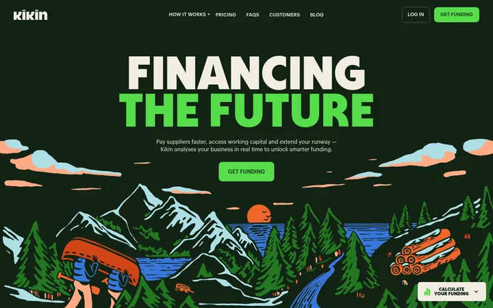
North star · Use a calm cream canvas and confident editorial type, reserving vivid yellow for unmistakable primary actions.
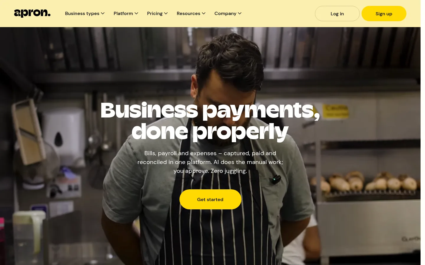
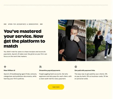
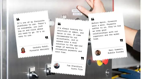
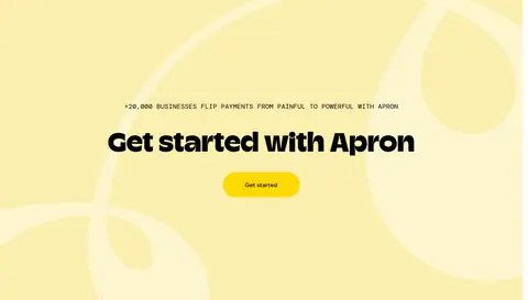
The visual identity is built around a pale cream canvas (#fefcef), with occasional light butter section bands (#fbefaf) and a strong black footer. Saturated yellow (#ffd801) is reserved for primary actions, so buttons stand out without making the page feel loud; a muted ochre hairline (#c9bf8c) outlines secondary navigation actions. Champ display type gives headlines a distinctive, weighty silhouette, while DM Sans keeps body copy and controls accessible. Small, monospaced audience labels add an editorial, product-documentation accent. The layout is spacious and modular: audience-specific feature sections alternate image and text placement, with three-column benefit rows and fine dividers separating long content bands. Photography is candid and human, showing business owners and teams at work; a full-bleed video anchors the hero, while customer quotes sit over another photographic backdrop. Flat surfaces and pill-shaped buttons keep the interface crisp. The closing yellow CTA and black footer create a clear, deliberate ending.
配色
点色块复制色值。用途说明来自对页面的实测位置(背景、文字、描边、按钮)与截图判读。
品牌色
强调色
表层色
中性色
功能色
页面底色 · Apron Cream表层 · Buttercream表层 2 · Ink Black表层 3 · Paper White主文字 · Ink Black次要文字 · Paper White描边 · Muted Ochre强调 · Signal Yellow
Body copy, navigation, buttons, captions, and general interface text.
Aa 设计
Departure Mono
网络字体 · 字重 400 · 占比 13%
免费替代:Space Mono
Small audience labels and editorial-style metadata.
Aa 设计
Champ
网络字体 · 字重 800 / 700 · 占比 7%
免费替代:Bricolage Grotesque
Display headlines and section headings.
Aa 设计
DM Mono
网络字体 · 字重 400 · 占比 4%
免费替代:DM Mono
Occasional monospaced supporting or utility text.
角色
示例
字号
字重
行高
字距
特大标题
Oversized promotional headline treatment where a section needs maximum emphasis.
Apron
72px
800
1.01
0
一级标题
Hero headline over the full-bleed video.
Apron
54px
800
1.16
0.01em
二级标题
Feature-section and content-card headings.
Apron
30px
700
1.2
0
正文
Feature descriptions, introductory copy, and explanatory text.
The quick brown fox 敏捷的狐狸
20px
400
1.5
0.01em
辅助文字
Compact navigation, testimonial attribution, and supporting details.
The quick brown fox 敏捷的狐狸
16px
400
1.5
0.01em
按钮
Primary and secondary pill-button labels.
The quick brown fox 敏捷的狐狸
16px
500
1
0.01em
代码
Small monospace audience labels and editorial-style metadata.
const style = 1;
18px
400
1.5
0.01em
间距与布局
基准单位 8px · 密度:宽松
120px版块间距
16px元素间距
34px卡片内边距
—内容最大宽度
2px
4px
6px
8px
10px
12px
16px
20px
24px
28px
32px
36px
40px
48px
56px
64px
Build a long, spacious landing page on a centered canvas, with no measured max-width constraint to reproduce. The hero is centered over edge-to-edge video; subsequent audience sections use broad alternating image-and-copy arrangements, followed by three-column benefit rows. Repeat generous vertical pauses and fine horizontal dividers between feature bands. Keep text left-aligned in most content sections, while the hero, testimonials, and final CTA center their emphasis. Use a compact multi-column footer.
圆角与层次
按钮 · 9999px
没有测到阴影:页面是扁平的,层次靠底色和描边区分。
The interface is predominantly flat, with no measured shadows. Separate sections through background changes, whitespace, and restrained ochre hairlines rather than raised cards. White testimonial and content surfaces stay clean and simple; pill buttons rely on their bright fill and shape, not shadow.
组件
下面的预览按实测的按钮、输入框、徽标、卡片样式重建(字体用替代字体)。
Primary CTA
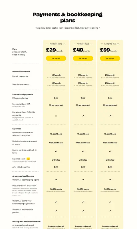
Bright yellow (#ffd801) pill with black DM Sans text; used for Get started and Sign up. Maintain a clearly prominent, rounded silhouette.
Secondary login action
Transparent pill with black Log in text and a thin muted-ochre (#c9bf8c) outline.
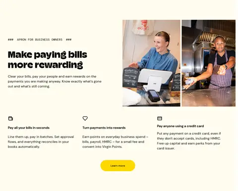
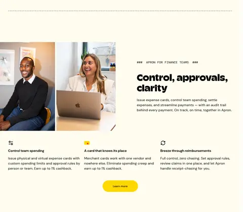
Audience feature section
Pair an audience label and Champ headline with candid photography; alternate image and text placement between owner, finance-team, and accountant sections.
Benefit row
Three concise benefits beneath each audience feature, led by a small icon, short bold title, and compact explanatory copy.
Customer testimonial band
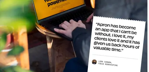
Use a full-bleed photographic backdrop with overlapping white quote notes and compact customer attributions.
Editorial content cards
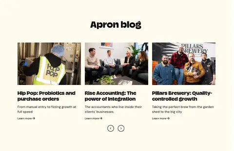
Present three article cards in a row with a rectangular photo, bold headline, short summary, and simple Learn more link.
Footer
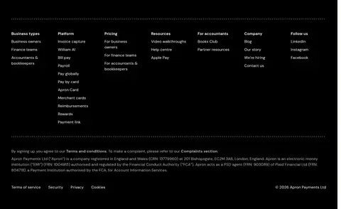
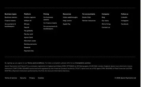
Full-width black section with white navigation groups, fine dotted dividers, small legal text, and secondary policy links.
Imagery · Lead with full-bleed, darkened documentary-style video of a business owner at work, placing centered white type over the image. Use candid photographs of owners, operators, and finance teams in alternating feature layouts and blog cards. Customer quotes appear as paper-like notes over a photographic scene. Keep images natural and editorial rather than glossy; pale decorative artwork supports the closing CTA.
Alternate imagery and copy across audience sections.
Keep feature benefits concise and icon-led.
Separate long sections with whitespace and fine rules.
✕ 不该做
Do not introduce unmeasured brand colors.
Do not add heavy shadows or glossy card effects.
Do not make every section a bordered card.
Do not use yellow as the main text color.
Do not crowd the layout with dense, continuous copy.
Do not replace candid business photography with abstract product renders.
给 AI 的提示词
想快速出一个同风格的新页面,把这段话连同 DESIGN.md 一起发给 AI。
Create a new fintech landing page in Apron’s warm editorial style. Use Apron Cream (#fefcef) as the main canvas, Ink Black (#000000) for type and footer surfaces, Signal Yellow (#ffd801) for primary pill actions, Muted Ochre (#c9bf8c) for subtle outlines, Paper White (#ffffff) for light quote surfaces, and Buttercream (#fbefaf) for a warm CTA band. Set display headlines in a bold, distinctive sans similar to Champ, with DM Sans for body and controls and restrained monospace labels. Keep the page spacious: pair candid business photography with audience-focused copy, alternate image placement, and organize benefits in three-column rows. Use fine dividers, flat surfaces, simple links, and a full-width black footer. Avoid unmeasured styling flourishes, heavy shadows, and decorative gradients.