North star · Use forest-green and cream as the foundation, then let monumental uppercase type and vivid sustainability-led imagery carry the story.
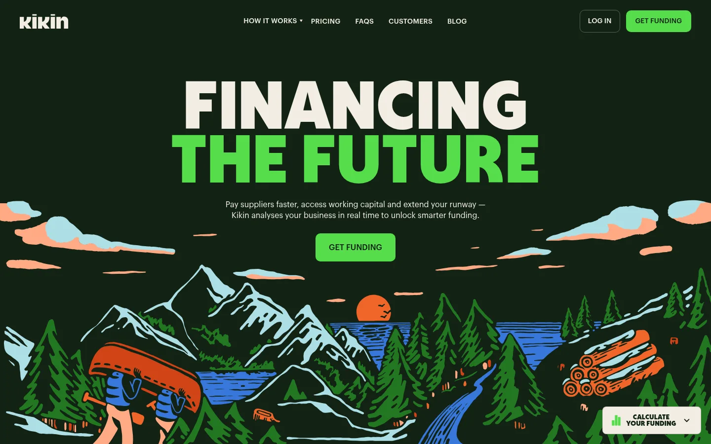
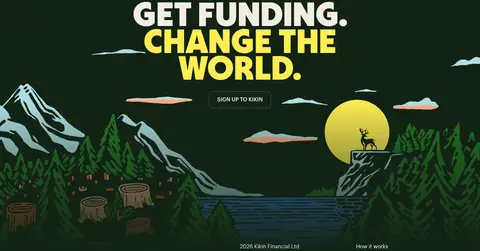
The visual identity is built around a forest-green canvas (#122315), softened by warm cream (#f3ede4) content bands and punctuated with vivid green calls to action (#55dd4a). Sky blue (#73d3eb) marks the partner-logo strip and funding audience sections, creating a strong contrast in the page’s long sequence of bands. Oversized uppercase Deacon headlines create an assertive display voice; Graphik keeps navigation, explanatory copy, and controls calm and legible. The hero centers its headline and CTA above a hand-drawn landscape illustration, while later sections alternate centered statements, split feature rows, and image-led blocks. Product screenshots and sustainability badges appear as supporting proof, not as the core brand palette. Hairline separators and lightly rounded controls structure content without introducing heavy card elevation. Generous section changes and tightly grouped text give the page a deliberate editorial rhythm.
Largest uppercase campaign statements and oversized brand headlines.
Kikin
137px
900
0.8
-0.011em
一级标题
Primary hero headline and major top-level statements.
Kikin
101px
900
0.8
-0.015em
二级标题
Section titles such as funding, ESG, and testimonial headings.
Kikin
72px
900
0.8
-0.021em
三级标题
Feature-row headlines and secondary section headings.
Kikin
57.5px
700
0.85
-0.026em
四级标题
Smaller emphatic headings and compact content titles.
Kikin
36px
900
0.85
-0.042em
正文
Paragraphs explaining the funding offer, features, and customer stories.
The quick brown fox 敏捷的狐狸
16px
400
1.4
0
辅助文字
Compact supporting details, labels, and footer metadata.
The quick brown fox 敏捷的狐狸
12px
400
1.4
0
按钮
Uppercase funding and signup call-to-action labels.
The quick brown fox 敏捷的狐狸
16px
500
1.25
0
导航
Uppercase primary navigation labels and menu items.
The quick brown fox 敏捷的狐狸
14px
500
1.43
0.018em
链接
Inline links, FAQs, and supporting text links.
The quick brown fox 敏捷的狐狸
16px
400
1.4
0
间距与布局
基准单位 4px · 密度:紧凑
40px版块间距
6px元素间距
—卡片内边距
1360px内容最大宽度
5px
6px
8px
9px
10px
12px
15px
16px
20px
24px
32px
40px
48px
80px
The page uses a wide, centered desktop composition, with measured content capped at 1360px. A single-column hero gives way to broad full-width color bands; feature rows pair text with large product imagery, and later content alternates editorial blocks, audience panels, testimonials, and FAQ columns. The overall density is compact, but major background changes and generous section breaks keep the long page readable. Headings are centered in the hero and selected statements, with left alignment used for content-led sections.
圆角与层次
按钮 · 10px
没有测到阴影:页面是扁平的,层次靠底色和描边区分。
The interface is mostly flat: large color fields and hairline separators organize the page instead of elevated cards or pronounced shadows. Buttons have softly rounded corners, while the hero illustration and image blocks provide the strongest layered effect. Keep outlines restrained and use contrast, spacing, and section bands to establish hierarchy.
组件
下面的预览按实测的按钮、输入框、徽标、卡片样式重建(字体用替代字体)。
Primary CTA
Bright green GET FUNDING button with dark text and a rounded rectangular shape; use the measured 10px radius where reproducing this control.
Hero
Centered, oversized uppercase two-line headline with the second line in green, concise supporting copy, and a centered funding CTA above an illustrated landscape.
Navigation
Compact horizontal header with cream uppercase links on the dark canvas, a restrained outlined login control, and a green funding button.
Feature row
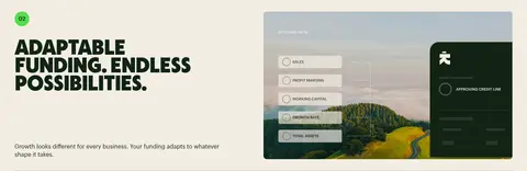
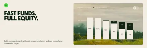
Cream background, bold numbered feature title and short explanation alongside a wide product image; thin dividers separate repeated rows.
Color-band audience block
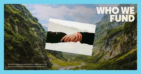
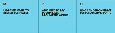
Sky-blue section combining a large funding audience image-led panel with adjacent eligibility statements and fine vertical separators.
FAQ
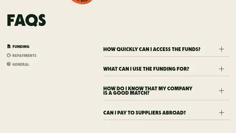
Cream two-column area with a bold title and category labels on one side, question rows and plus controls on the other.
Footer
Dark closing area with contact details, company information, and a compact set of navigation and social links.
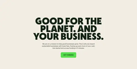
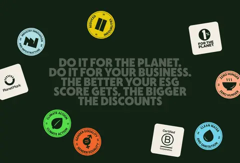
Imagery · The hero and final CTA use colorful hand-drawn environmental landscapes, with flat outlines, forests, water, mountains, and warm sunset details. Product examples appear as large landscape-oriented screenshots within cream feature rows. Sustainability marks and customer imagery add evidence and texture; they sit within the page’s brand system rather than defining its core colors.
Reserve #f3ede4 for light editorial sections and reverse text.
Make Deacon-style uppercase display headings the strongest typographic element.
Use #55dd4a selectively for primary calls to action and emphasis.
Alternate broad cream and sky-blue bands to pace long content.
Pair product screenshots with short, clear benefit copy.
✕ 不该做
Do not replace the forest-green and cream foundation with a generic white SaaS palette.
Do not use small, light display headlines where the page calls for bold uppercase type.
Do not treat illustration colors as the core interface palette.
Do not add heavy shadows or stacked elevated cards.
Do not make every section green; preserve the cream and blue contrast bands.
Do not overdecorate navigation or supporting copy.
给 AI 的提示词
想快速出一个同风格的新页面,把这段话连同 DESIGN.md 一起发给 AI。
Build a new fintech page in Kikin’s visual language. Use Forest Ink (#122315) as the principal canvas, Warm Parchment (#f3ede4) for light content bands, Clear Sky (#73d3eb) for selected section blocks, and Signal Green (#55dd4a) for primary CTAs. Set major headings in a heavy, tightly tracked, uppercase display face similar to Deacon; use a clean Graphik-like sans serif for body copy, links, and navigation. Favor wide, editorial section bands, a centered hero, image-led feature rows, restrained separators, and softly rounded buttons. Use sustainability-themed hand-drawn landscapes or product imagery as supporting content. Keep the interface mostly flat, the copy legible, and the strongest emphasis on headline, CTA, and section contrast.